The network for creativity
Join 1.25M professional creatives like you
Connect with clients, get discovered, and run your business 100% commission-free
Creatives on Contra have earned over $150M and we are just getting started
Back to feedPost

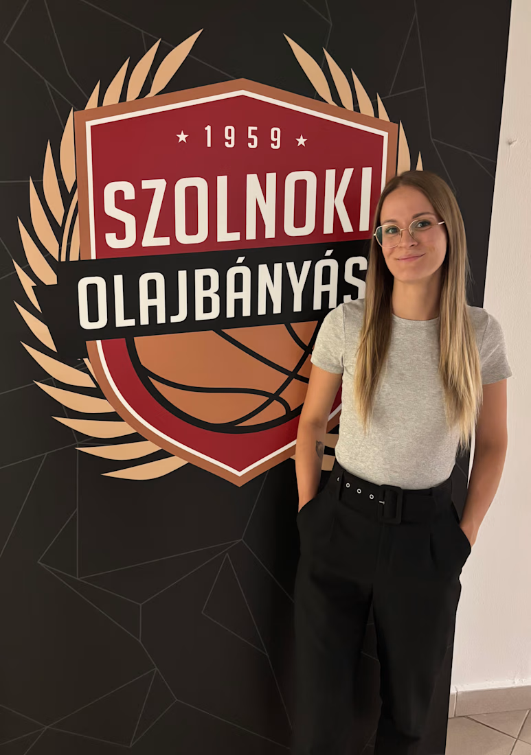
NHSZ Szolnoki Olajbányász – Locker Room Corridor Branding
Environmental Graphics / Sports Branding / Large-Format Design
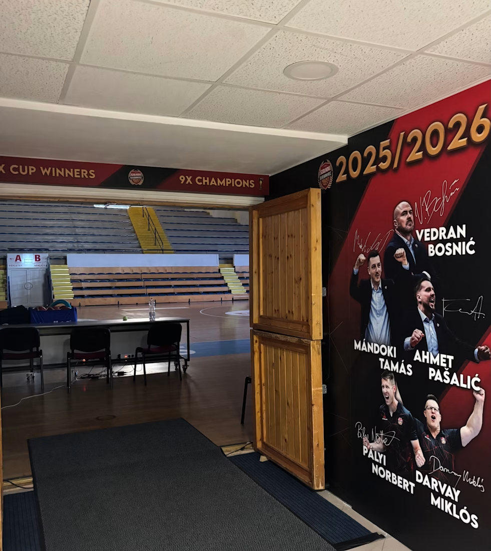
The project focused on the complete visual transformation of the locker room corridor for NHSZ Szolnoki Olajbányász during the 2025/2026 season.
The brief called for a bold, dynamic and highly energetic environment that reflected the club’s existing identity while creating a much more intense physical experience inside the arena.
The Challenge
This was not simply a decorative project.
The corridor is used by both the home team and visiting players on their way to the court, so the space had to serve two purposes: strengthen the identity and confidence of the home team, while also creating a strong psychological first impression for opponents.
The goal was to make the feeling of home-court advantage begin before players even entered the arena.
The Approach
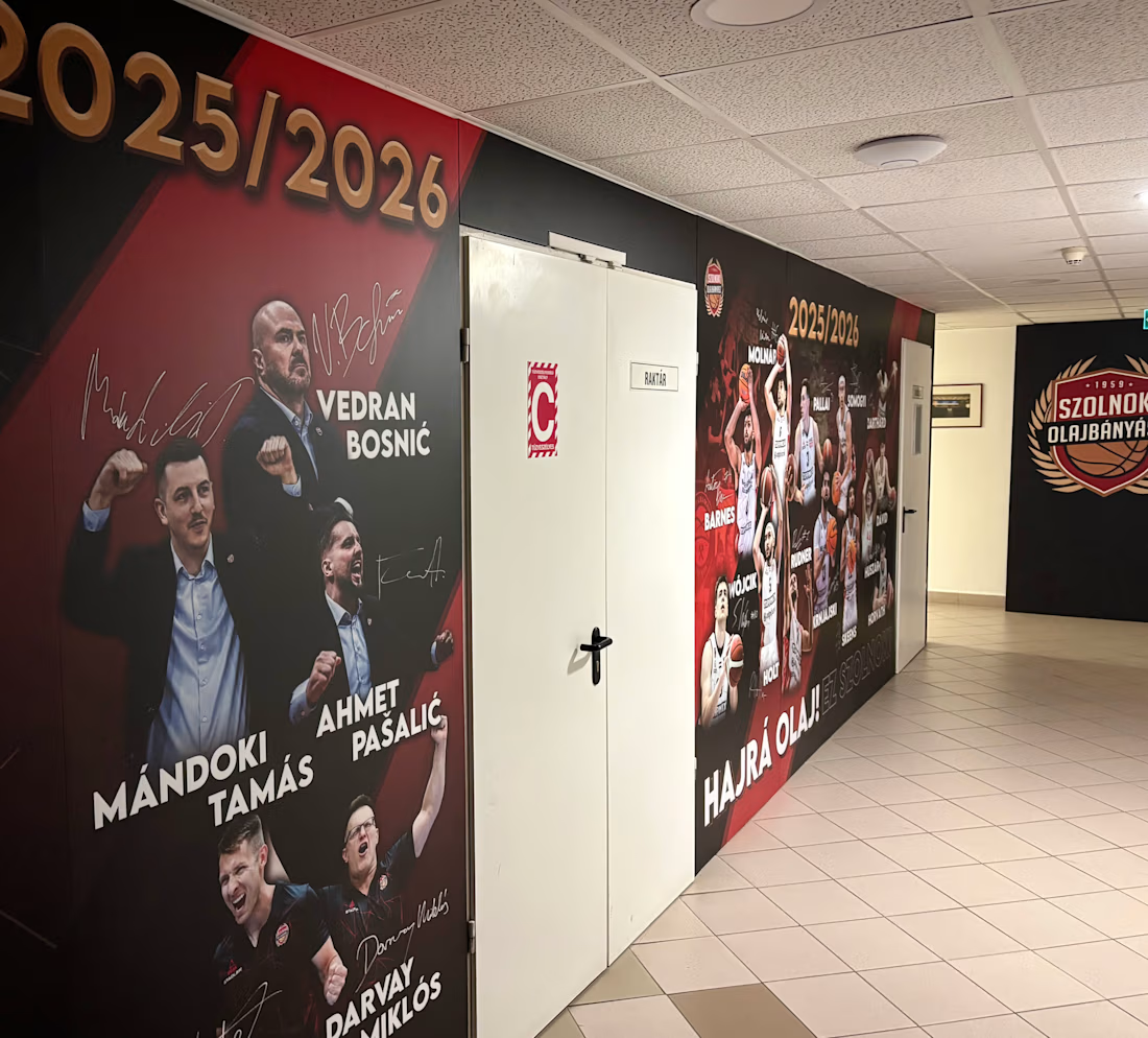
The visual concept was built around the club’s distinctive black, red and gold colour palette, combined with strong diagonal structures, dark backgrounds and large-scale player imagery.
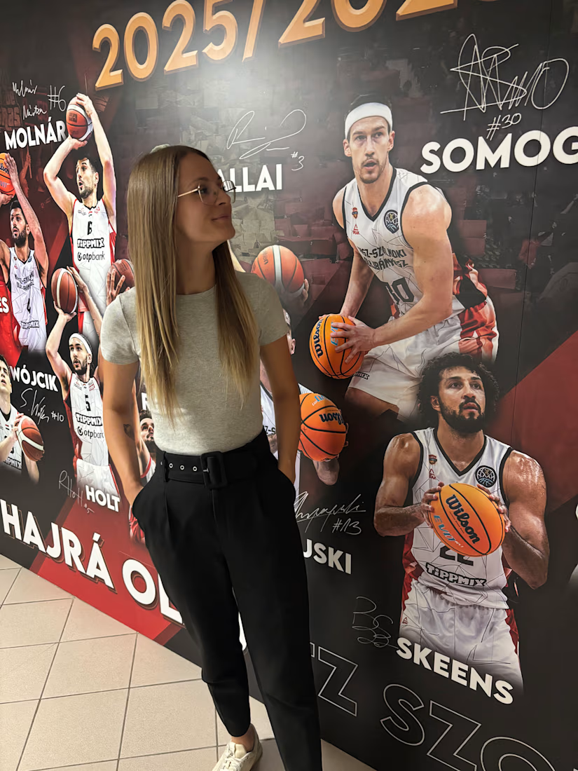
Oversized cut-out portraits of players and coaching staff became the dominant visual elements, supported by signatures, seasonal typography and bold graphic details.
The visual language was intentionally more aggressive and dramatic than traditional corporate branding, creating a sense of energy, unity and competitive intensity.
Designing the Experience
Each wall was designed to work as an individual composition while still forming part of one continuous visual journey through the corridor.
Special attention was given to the integration of the sponsor wall, team and staff presentation, and key club messages such as “Hajrá Olaj! Ez Szolnok!”
The scale, composition and visual rhythm were designed specifically for the architecture of the corridor and for the way players experience the space while moving through it.
The Result
The finished environment functions as more than wall decoration.
It creates an immersive club space and a visual build-up to game time — reinforcing team identity, representing the club’s character and creating a strong psychological atmosphere before players reach the court.
My role: Creative concept, environmental graphic design, layout design and production preparation
Deliverables: Large-format wall graphics, player compositions, sponsor wall design, team and staff presentation graphics and production-ready artwork:


The network for creativity
Join 1.25M professional creatives like you
Connect with clients, get discovered, and run your business 100% commission-free
Creatives on Contra have earned over $150M and we are just getting started











Related posts

Pulse Athletics... Branding & App design✨
Check it out
#app #sport #productdesign #uiuxdesign #uidesigner #uxdesigner #pulse #branding #brandidentity #brandstrategy #brandguidelines #logo #homepage


That's really stunning app design🔥🔥🔥
Great job Ziva🎉🎉🎉

I created this font & it is free to download and use in your free or paid projects. Enjoy 🚀 find it at https://twaperdigital.com/anima-editorial


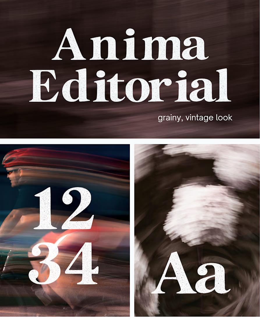



I like this font

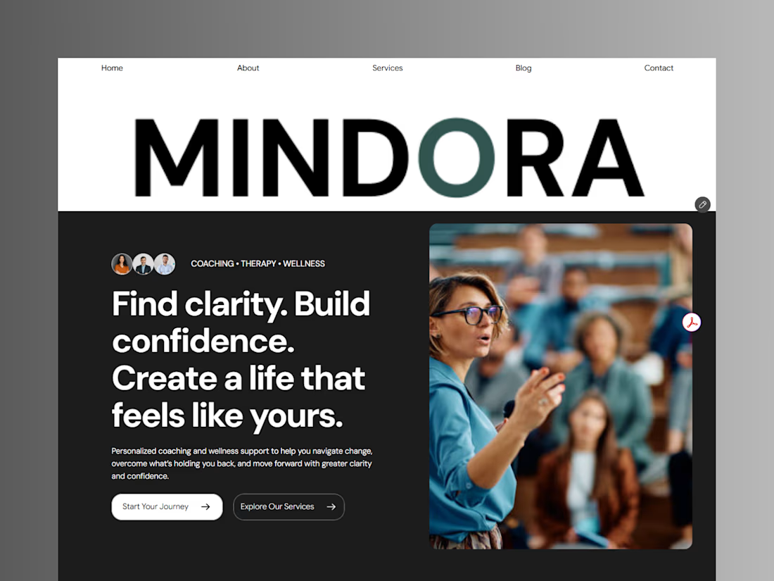
Introducing Mindora — a Life Coaching & Wellness Framer Template.
I designed Mindora for life coaches, wellness professionals, and personal growth brands looking for a calm, modern, and welcoming online presence.
Inspired by clarity, confidence, and meaningful growth, Mindora features a thoughtful layout, dedicated service sections, a blog for sharing valuable insights, and a clean visual style designed to help brands connect with their audience.
Built with Framer, it's a customizable starting point for creating a professional coaching or wellness website.
Explore Mindora and bring your next website idea to life.
Kindly check it out the template: https://www.framer.com/marketplace/templates/mindora-life-coach/



Great work


