The network for creativity
Join 1.25M professional creatives like you
Connect with clients, get discovered, and run your business 100% commission-free
Creatives on Contra have earned over $150M and we are just getting started
Back to feedPost
Taste Test
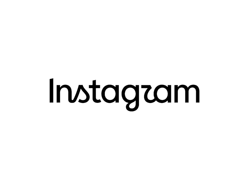
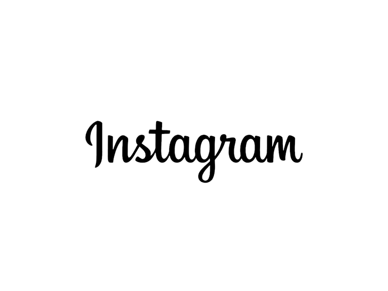
What does the Contra community think of this update,
Are we liking the new version or we stick with the old one?

31 voted
58%
22 voted
42%
53 votes
Closed

can't lie, i love the new!

It’s growing on me!
oh, for sure! that original will forever be iconic.
true!

looks feels premium
Interesting review

The new wordmark reads cleaner to me at avatar size, the old script gets a little muddy that small. Is this for a client rebrand or something you're testing out for yourself?
This was actually an effort from the internal design team at Meta, I had nothing to do with it, just seeing what others thought about it. You can read more on it here.

techcrunch.com
Instagram introduces a redesigned wordmark | TechCrunch
The social media giant says it was time for a sharper and more modern look after a decade.

Without any context, and just from a designing perspective, the new version looks better
Smart answer!
I posted a link to context here on one of the responses.

Old seems more legible for me!
Ture! but when a brand has massive global following, is legibility still a concern?

Nice work
nice!

Old one was better in my opinion
That's fair!
I'm not sure I feel strongly about either of them, I understand that's a decision their team took and I respect how they tried to keep some similar lines from the old mark in order to move forward, even if that meant legibility issues, which I'm not sure I see.

They need to adapt to the current trend, this is how any brand grows

I just love the new one.
Solid choice!

The new version looks more creative and advanced
Its the future of the brand!

New one is nice
I agree

the only reason we might think that the old one is better is because we are used to it, the new upgrade is not bad at all, same thing happened when google made some updates
Spoken like a true designer!

solid choice!
sure!
The network for creativity
Join 1.25M professional creatives like you
Connect with clients, get discovered, and run your business 100% commission-free
Creatives on Contra have earned over $150M and we are just getting started











Related posts


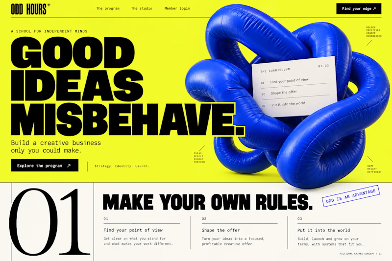
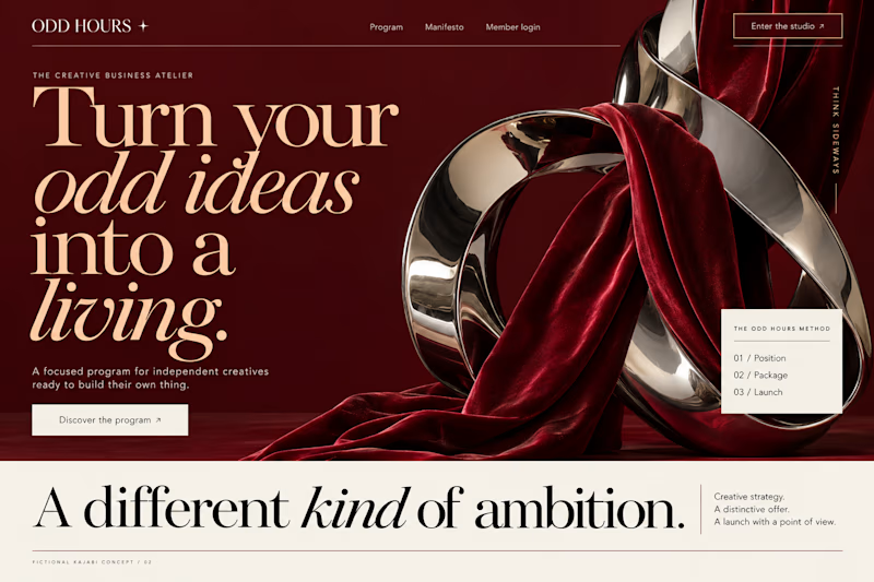
Which Kajabi direction would stop your scroll?
Meet ODD HOURS, a creative-business academy concept.
A / Acid Play: electric yellow, oversized type and a sculptural blue knot.
B / Velvet Rebellion: oxblood, chrome and velvet with fashion-editorial typography.
Two original AI-generated concepts. Same offer. Completely different energy.
Which one pulls you in, and why?

15 voted
65%
8 voted
35%
23 votes
Closed

It's only Acid Play it's unbelievable 🔥🔥🔥🔥
Great job Kraig🎉🎉

Hey everyone! 👋
Working on Cortiva, an AI-first hospital branding project.
I've already finalized the color direction, but I thought it would be fun to explore two different moods.
Option 01💚 or Option 02? 💜
Both have their own personality, and I'm curious to see which one you prefer!
Let's see which one wins! 👀
5 voted
33%
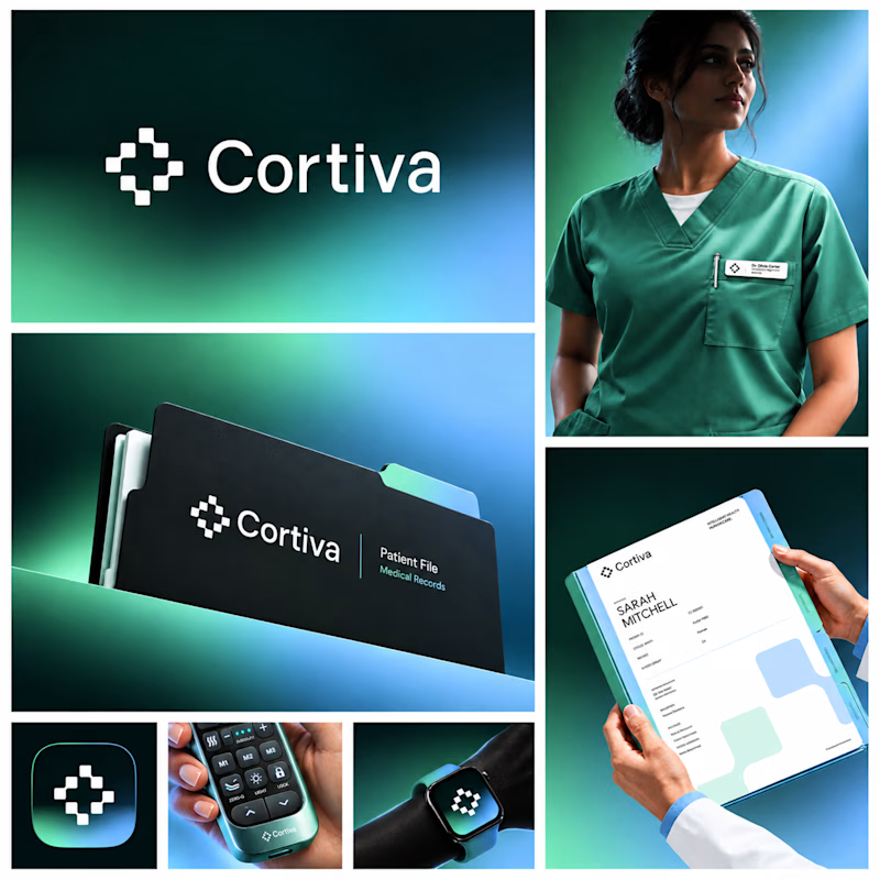
10 voted
67%
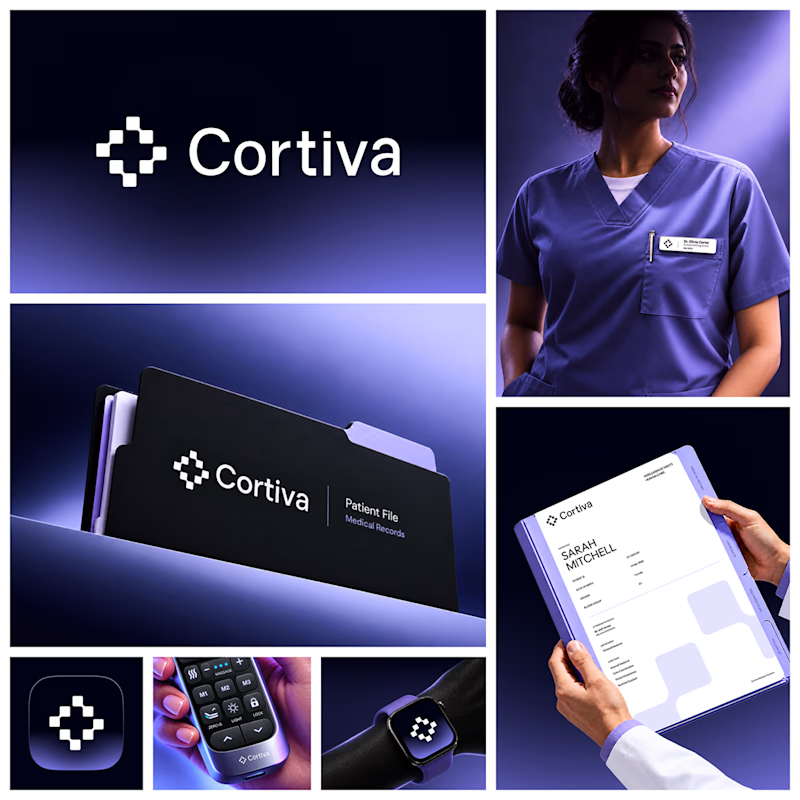
15 votes
Closed

Both directions are strong, but I'm leaning towards Option 01. The green feels instantly like "care" and trust, which is perfect for a hospital. Option 02 looks more techy and premium. Curious, which mood are you aiming for - clinical and calm, or friendly and modern?
Which Kajabi photography-course design makes you want to explore?
Two original AI-generated concepts for FIELD / FORM, a fictional architectural-photography school. Gallery Study pairs expressive serif type with warm stone and generous space. Field Journal uses forest green, bold condensed type and a layered photo study.
Same course, two directions. Which would you choose, and why?
15 voted
75%
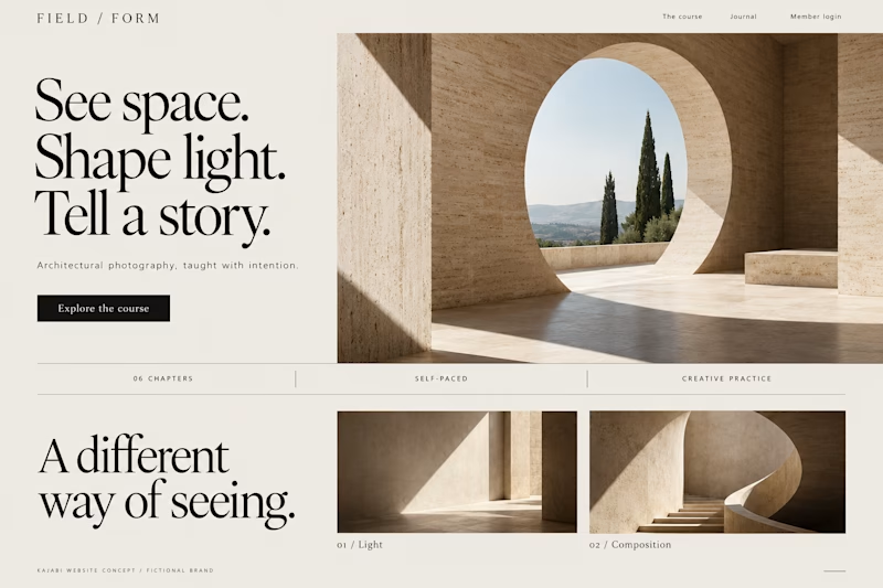
5 voted
25%
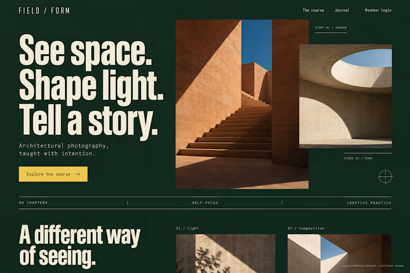
20 votes
Closed
Galary study Hits better to me❤️❤️
great job Kraig🔥🔥