The network for creativity
Join 1.25M professional creatives like you
Connect with clients, get discovered, and run your business 100% commission-free
Creatives on Contra have earned over $150M and we are just getting started
Back to feedPost

Sonulim - Creative Agency Website
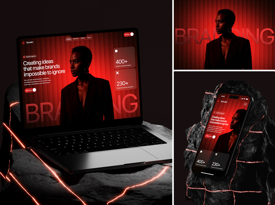
Red and black is the most overused "premium" combo in web design. Everybody reaches for it. Almost nobody makes it work because they treat red as decoration instead of direction.
Here the red isn't sitting on top of the layout. It's built into it - the gradient bleeds through the photography, the neon cracks in the 3D mockups, the stat cards sitting in frosted glass so the red breathes underneath. One color system doing three jobs at once: atmosphere, hierarchy, and brand recall.
The oversized watermark behind the hero is doing more than you think. It anchors the composition so the editorial photo doesn't float, and it gives the headline something to push against typographically. Remove it and the whole thing falls flat.
#WebDesign #DarkUI #BrandDesign #CreativeAgency #EditorialDesign

The network for creativity
Join 1.25M professional creatives like you
Connect with clients, get discovered, and run your business 100% commission-free
Creatives on Contra have earned over $150M and we are just getting started
Trending
retrofuturism
Share your favorite designs from the past exploring the distant future. Or your own take on the aesthetic 🚀
halftone
Dots. Texture. Grain. Let's see your designs using the halftone technique.

Midjourney
Creatives are showing off what they're making with Midjourney.
colorgrade
Video editors sound off: How do you enhance the mood of your video in color grading?





Related posts


A beautiful website can lose a surprising amount of its character on a phone.
Not because it’s broken.
The buttons work, the sections stack, and everything technically fits. But the rhythm feels flatter, the hierarchy becomes weaker, and the mobile version starts to feel like a leftover from the desktop.
I wanted to avoid that with Sirnik, TOSOO, and APVist.
Each project needed its own mobile edit: deciding what belonged first, what could be simplified, and which visual moments were worth protecting.
I brought a few of those screens together in this short reel.
Different brands and different visual systems, but the same goal:
The mobile version should feel designed - not adapted.
If you’re working on a website and want that same level of care across every screen, let’s talk!


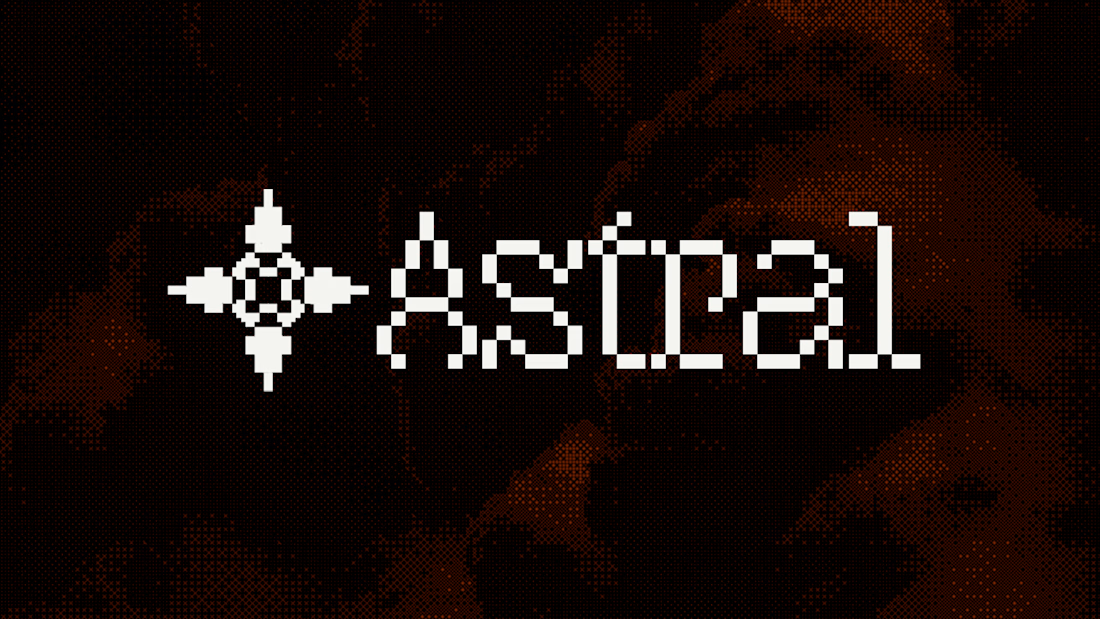
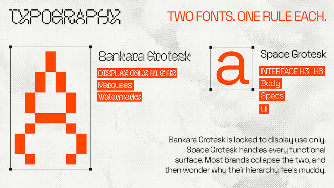
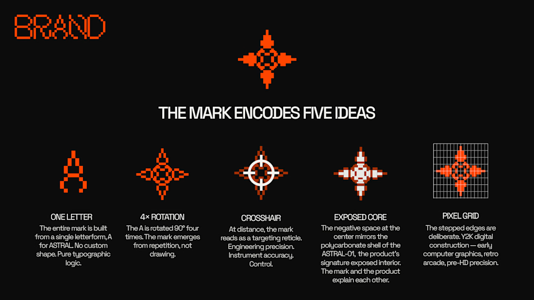
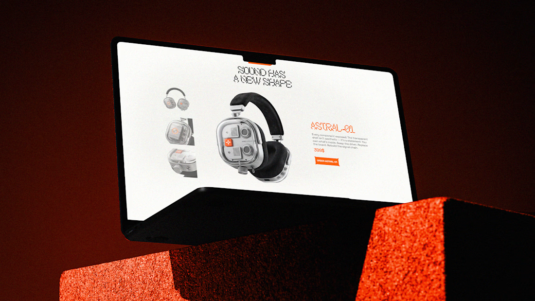
We've been sharing ASTRAL piece by piece. Here's a look at what holds the whole identity together. ↓
A brand starts getting interesting when the logo stops doing all the work.
→ Two typefaces, each with a clear role
→ A restrained palette built around one unmistakable signal
→ A visual language that moves naturally from product to interface
Every decision belongs to the same world. From the mark and typography to the product and digital experience.
The goal was simple: make ASTRAL recognizable wherever it shows up.
We've been seeing some incredible work from the Contra community lately. Curious to hear what part of the ASTRAL identity stands out to you most. 👀


Such good work!

A promotional video for MerchantSpring - an analytics platform built for e-commerce agencies.
The client initially reached out for a consultation. We discussed the product, its goals, and how the video could be used in marketing. Based on that, we structured the concept and moved into storyboard development, followed by full animation production.
The video was created as a promotional asset, focusing on clearly presenting the product’s value and showcasing its AI-powered capabilities through clean, modern motion design.


awesome!