The network for creativity
Join 1.25M professional creatives like you
Connect with clients, get discovered, and run your business 100% commission-free
Creatives on Contra have earned over $150M and we are just getting started
Back to feedPost
A beautiful website can lose a surprising amount of its character on a phone.
Not because it’s broken.
The buttons work, the sections stack, and everything technically fits. But the rhythm feels flatter, the hierarchy becomes weaker, and the mobile version starts to feel like a leftover from the desktop.
I wanted to avoid that with Sirnik, TOSOO, and APVist.
Each project needed its own mobile edit: deciding what belonged first, what could be simplified, and which visual moments were worth protecting.
I brought a few of those screens together in this short reel.
Different brands and different visual systems, but the same goal:
The mobile version should feel designed - not adapted.
If you’re working on a website and want that same level of care across every screen, let’s talk!


Amazing work!


Thank you! ☺️


Amazing work!
Thanks, Subash! Glad you liked it 🙌

Amazing work!
Thank you, Sujon! 🙌

The visual hierarchy is really strong here. Everything feels intentional without being overworked. Great job!
Thanks, Aligwe! Keeping the layouts clear without stripping away their character was one of the main challenges here)

I start with what needs to survive, rather than what needs to be cut.
What should someone understand first? Which action matters most? Which visual moment carries the brand?
Anything that competes with those priorities gets moved lower, simplified, or removed 🙂↕️🫡
That’s the part I keep coming back to. Once the core action is clear, most mobile decisions become much easier)

Outstanding work, I really like it! 🔥
Thanks, Mostofa!


Responsive design isn't just about stacking components it's about preserving spatial drama and visual rhythm! Adapting custom hierarchy for smaller screens is what keeps the brand feel alive on mobile
“Preserving spatial drama” is a good way to describe it! The challenge is keeping that rhythm and character without turning the mobile layout into a flat stack. Thanks, Abdul!


Exactly. Mobile should feel intentionally designed, not like a compressed desktop version.
Yes! the goal isn’t to preserve every desktop element. It’s to preserve the intention behind the design. Thanks, Kabir!


Amazing Work😍
Thanks, Anna! 😍

The trap I see is treating mobile as the same layout at a smaller width. I rebuild the type scale and vertical rhythm for the phone rather than reusing desktop values, and most of that lost character comes right back.
I’ve found the same. Type scale and vertical rhythm do most of the work. Once they’re rebuilt for the screen instead of inherited from desktop, the layout starts to feel intentional again 🙂↕️

Beautifully done! ✨✨
Thank you so much!

this hits. the trap is treating mobile as a compression exercise instead of its own edit. i try to ask what earns the first screen on mobile vs desktop separately, usually a very different answer. reel looks clean btw
That’s a good way to look at it. Mobile needs its own priorities. Thanks, Jaideep!

looks amazing.
Thank you ☺️

Hell yeah man, I'd say you definitely avoided that, great job! 🎉
Thanks, Tan! Glad it came through 🙌


Amazing!
Thanks, Julian! 🙌

"Designed, not adapted" should honestly be pinned somewhere every client can see it. My take is this only really works if mobile gets its own pass early, not bolted on after desktop is approved. Is that how you pitch it, or do most clients still want desktop signed off first?
Most clients still approve the desktop direction first, but I test key sections on mobile before it’s fully locked) That way, mobile isn’t left until the end!

That’s the tricky part - keeping the hierarchy and character intact on a smaller screen. Thanks!

Starting from what needs to survive rather than what to cut is a sharper frame than the usual mobile-simplification checklist - it forces you to rank the primary action and the one brand-carrying visual moment before touching layout, instead of trimming desktop elements one by one.
Getting those priorities clear first makes the mobile layout much easier to solve. Thanks, Mark!

which tool used for video editing? btw nice design in screens

The hierarchy weakening on mobile is such an underrated problem in web design. Everything technically works but the soul of the layout gets lost in translation. Designing with mobile rhythm first rather than adapting it after makes such a difference.
That gap between “it works” and “it still feels like the same brand” is where most mobile designs fall apart. Thanks, Isabella!

Hmm, storytelling on a different level
Thanks!

Supreme work 🧡
Thank you! 🙏
The network for creativity
Join 1.25M professional creatives like you
Connect with clients, get discovered, and run your business 100% commission-free
Creatives on Contra have earned over $150M and we are just getting started


Related posts


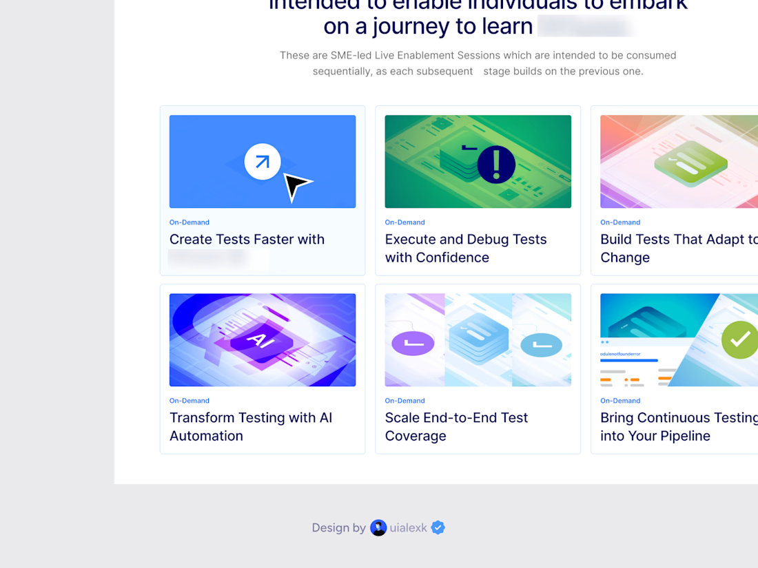

The visuals are really nice, but I feel like the style is a little safe for an AI brand. Would be cool to see something a bit more unexpected so it feels less like other tech websites. Did you try any bolder directions too?
THE BEST APP ICON MAY NOT EXPLAIN THE PRODUCT.
It may trigger the next open.
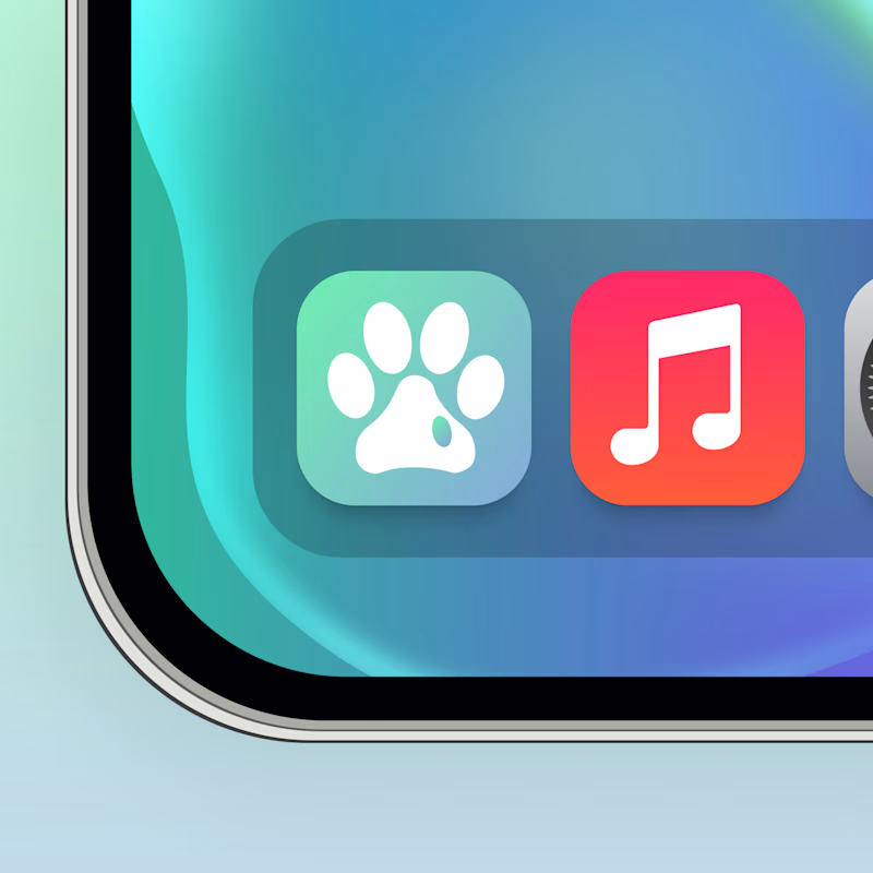
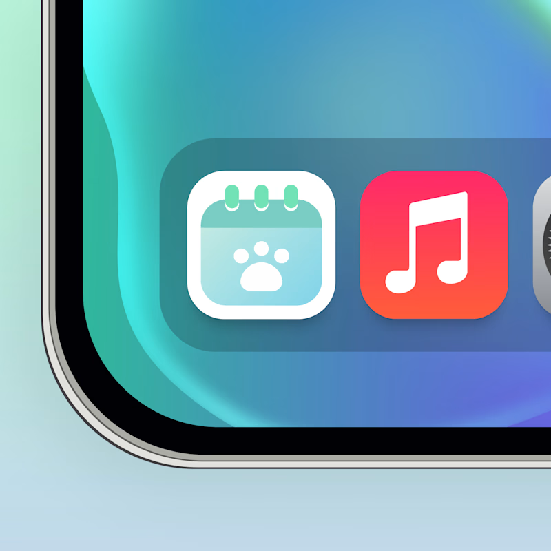
Same pet app. Two behavioral cues.
🐾 A creates instant recognition. The brain connects the icon with the pet before processing a feature or task.
📅 B creates functional context. It signals there is something to remember, check or manage.
Both work, but for different parts of retention
Recognition builds familiarity. Context creates a reason to return.
The real growth question:
Which cue is stronger once the user already understands the product?
🐾 A Emotional recognition
📅 B Functional intent
👇 Which one would make you reopen the app?
👉 BOOK A MOBILE APP STRATEGY SESSION
https://calendly.com/asol_design/book-diagnostic-call-linkedin-clone
106 voted
67%
53 voted
33%
159 votes
Closed

I think B is the better option, though it could use a little more contrast. A feels too generic, if my Paws & Palms became an app, its icon could end up looking very similar to A and get confused with other apps. Something more unique and instantly identifiable would help it stand out.


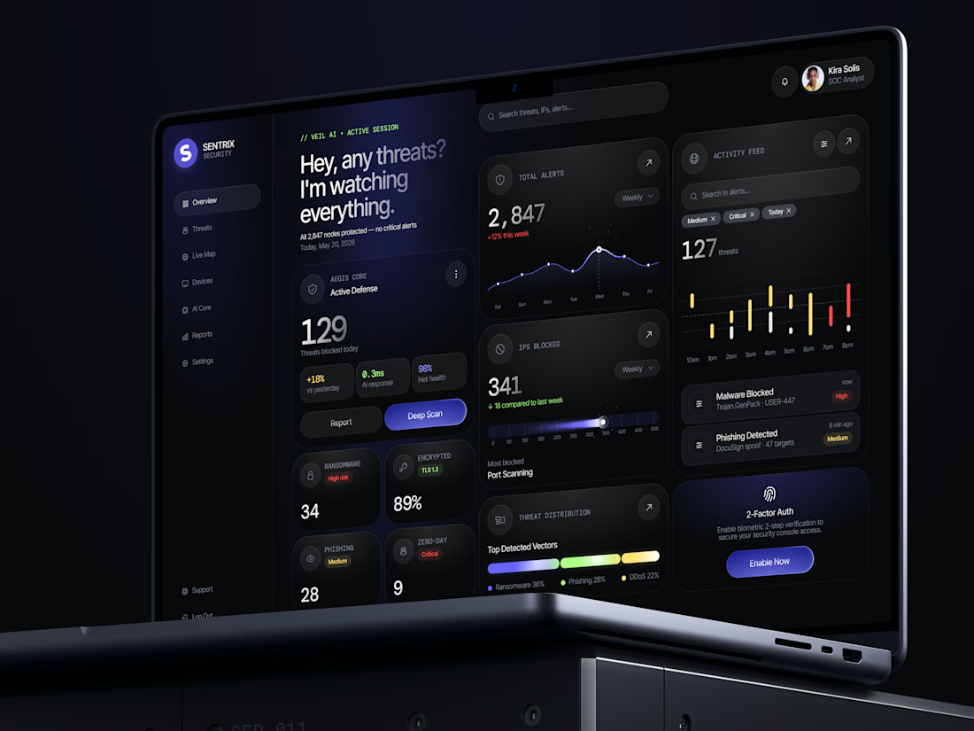
"I'm watching everything" sounds like "I'm watching you" 😊 😂
Great design!
Trending
retrofuturism
Share your favorite designs from the past exploring the distant future. Or your own take on the aesthetic 🚀
halftone
Dots. Texture. Grain. Let's see your designs using the halftone technique.

Midjourney
Creatives are showing off what they're making with Midjourney.
colorgrade
Video editors sound off: How do you enhance the mood of your video in color grading?