The network for creativity
Join 1.25M professional creatives like you
Connect with clients, get discovered, and run your business 100% commission-free
Creatives on Contra have earned over $150M and we are just getting started
Back to feedPost

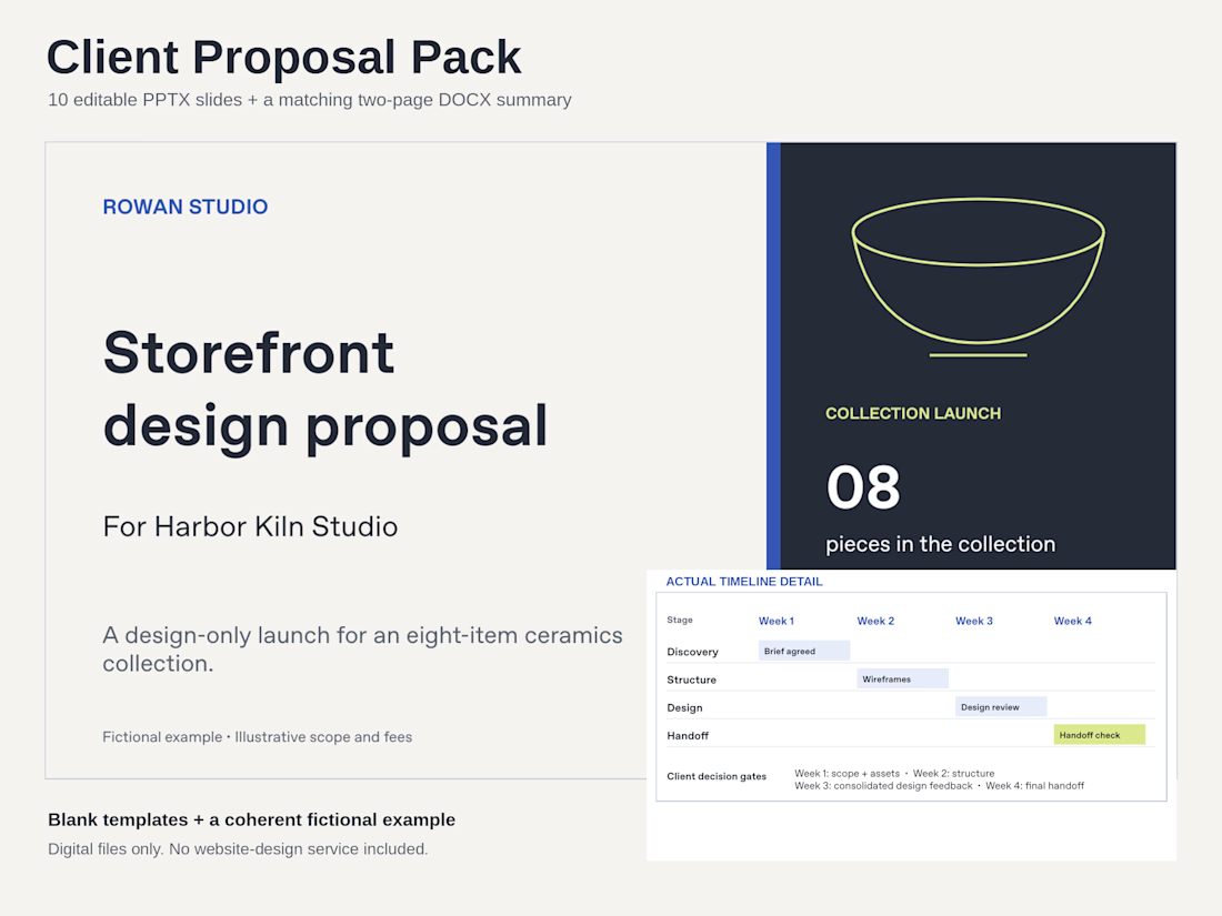
Before sending a client proposal, make four things easy to find:
• The outcome the client asked for.
• The work included and the boundaries around it.
• The points where the client reviews the work.
• The decision needed to move forward.
This fictional example carries one brief through an editable presentation and a matching scope summary. The files are separate, so you can tailor each to the conversation.
The complete PPTX + DOCX pack is $7.99 USD. Previews and included files: https://contra.com/products/ZCCWyjsE-client-proposal-pack-editable-pptx-and-docx
The network for creativity
Join 1.25M professional creatives like you
Connect with clients, get discovered, and run your business 100% commission-free
Creatives on Contra have earned over $150M and we are just getting started



Related posts

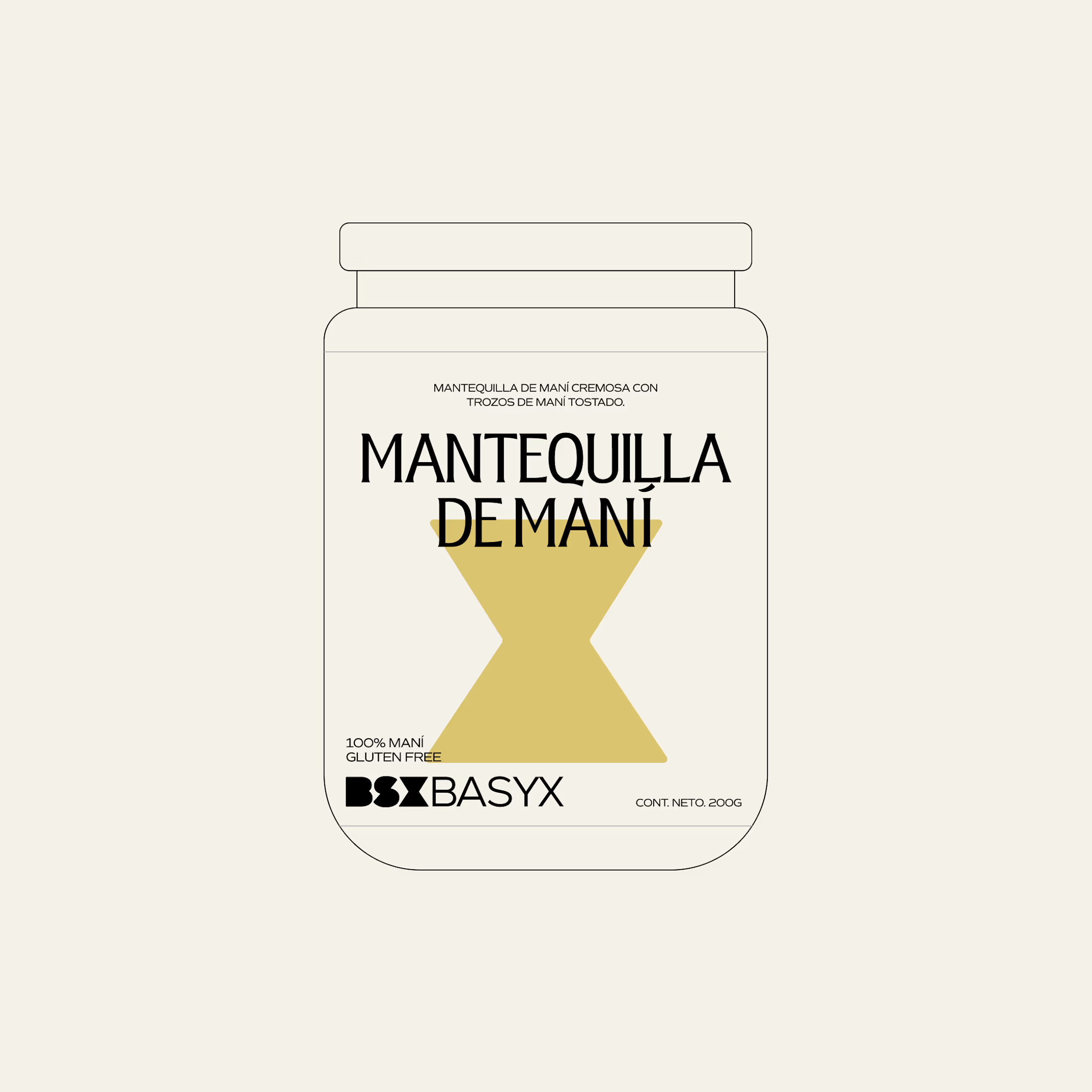
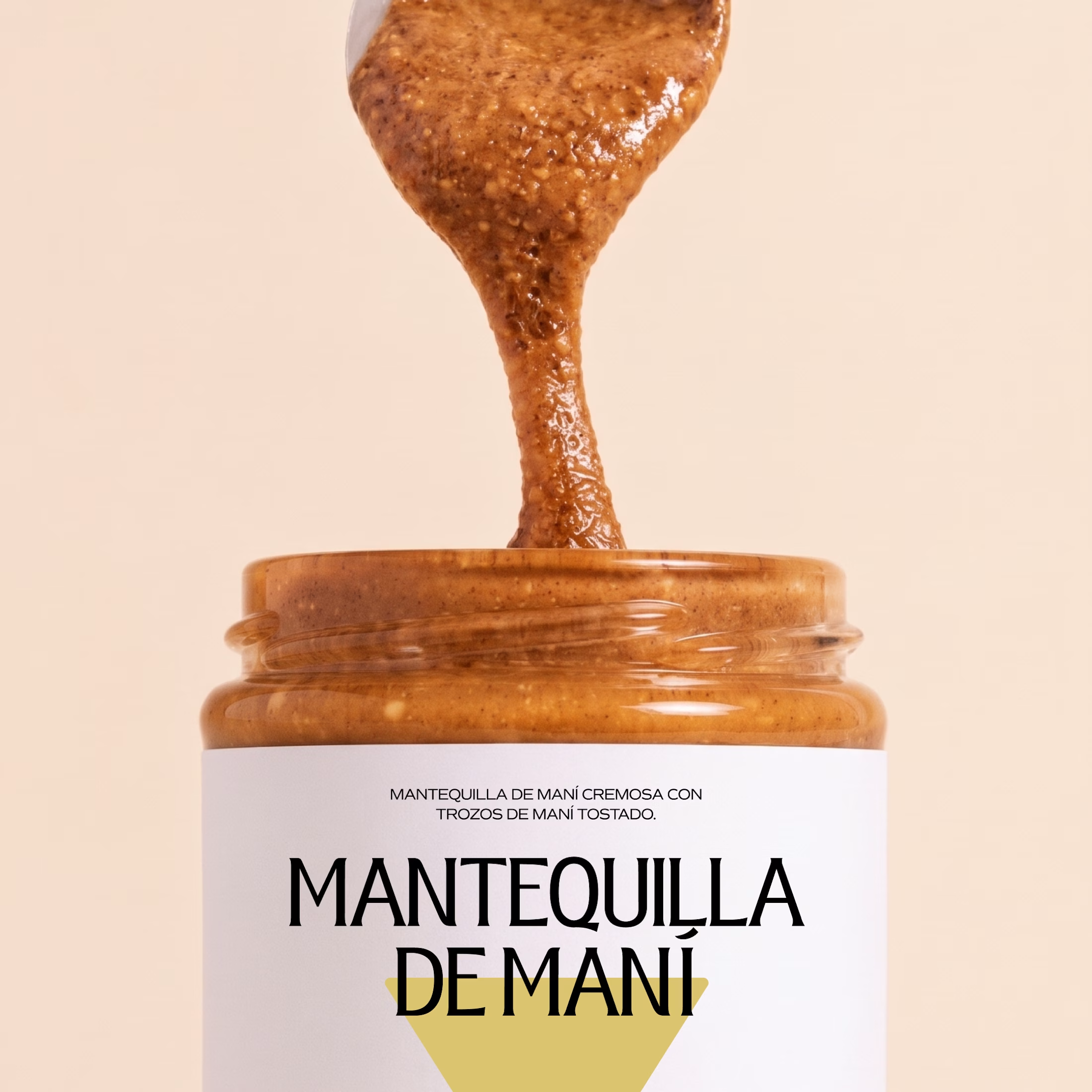
Minimal packaging is not less work. It’s MORE decisions 🤍
On a recent project, I spent a whole day on one thing: the spacing between two phrases in a label. Nobody will ever notice it. But everyone will feel it.
When there is nothing else on the label, every small adjustment has to carry the brand.
Do you also lose hours on details no client will ever mention? 😅

Packaging and Ads Packages for Skincare and Cosmetic Brands
A visual storytelling case study, followed by packaging, labels, and ad packages for small ...


The dark teal band with the VEGAN, FRAGRANCE FREE and DERM TESTED pills makes the claims easy to read on the white jar. Did you check the label at the 30 ml size for legibility?


The Powermatic case study is now on Contra.
It's the full story in six chapters: the challenge, the home page, the brand, Careers, the grid and the build. This time with the motion too: the home page scroll, the menu drum and the logo animation.
One detail I didn't mention last time. The preloader fills the logo with the page's real loading progress, fonts and the hero photo included. When it's full, the page is ready.
Everything is designed and hand-coded by me, no framework.
If you have a minute, a like or a comment helps the work reach more people.
The orange light catching the edges of the Powermatic mark on the dark tiles looks tactile and premium. Which of the six chapters took the longest, the grid or the build?