The network for creativity
Join 1.25M professional creatives like you
Connect with clients, get discovered, and run your business 100% commission-free
Creatives on Contra have earned over $150M and we are just getting started
Back to feedPost
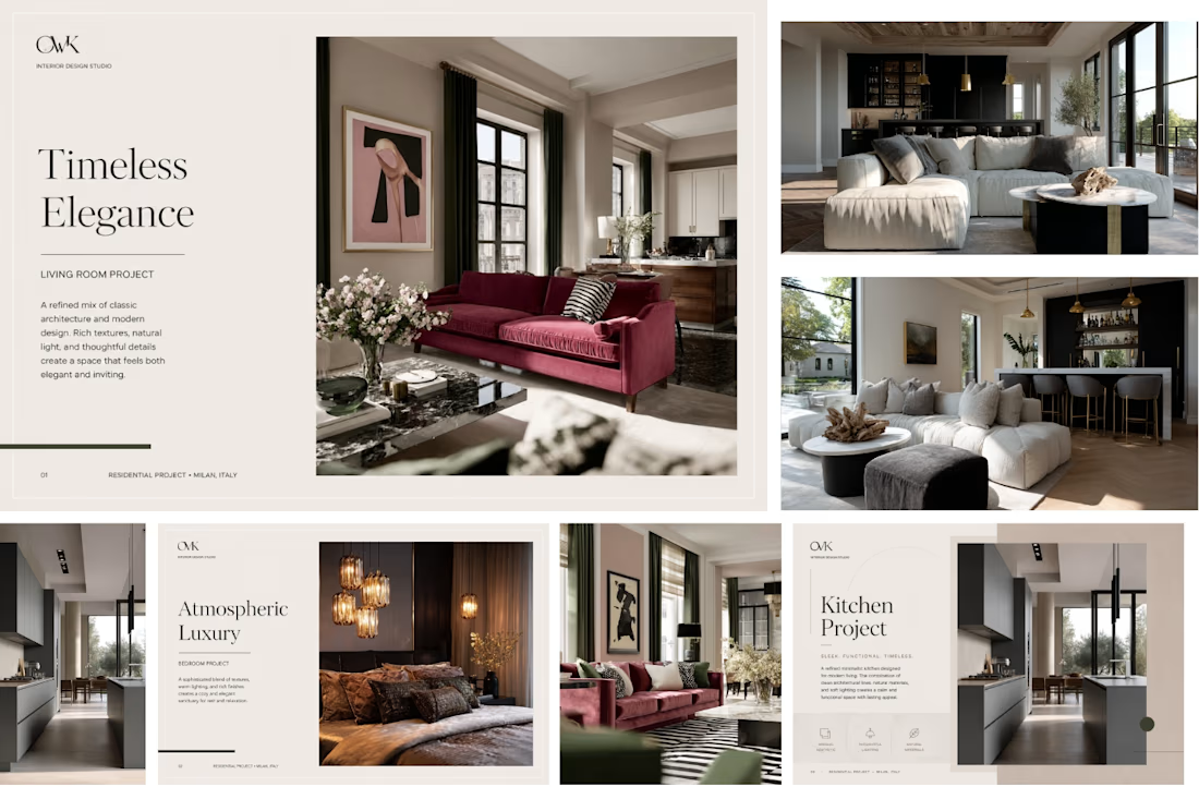
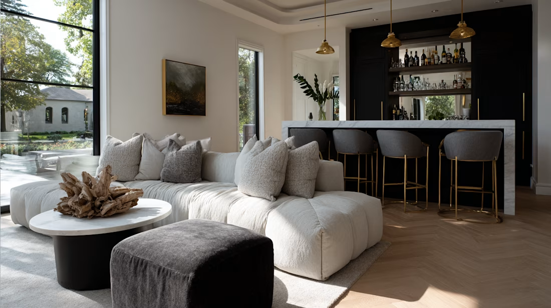
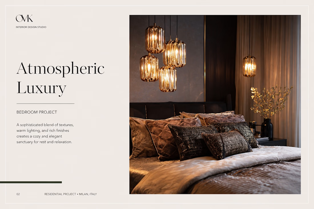
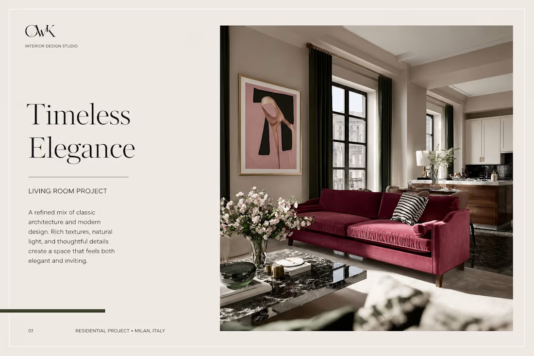
Built a full visual presentation for an interior design studio - took client references and turned them into photorealistic AI visuals for every room. Lighting, textures, materials - all matched to the studio's style


Beautiful

thank you😊

Elegant design elements with great visual balance.
Thank you☺️
The network for creativity
Join 1.25M professional creatives like you
Connect with clients, get discovered, and run your business 100% commission-free
Creatives on Contra have earned over $150M and we are just getting started

Challenges
View all


Related posts

La Princesa de la Luna.
New visuals for EXOT Imaginary, my personal space to explore new ways of creating through AI, visual storytelling and experimentation.
Hope you like it! a.exot


The fractured mirror effect on the faces gives it a shattered stained glass quality that fits "princesa de la luna" better than a straight portrait would. Good use of the black negative space to let those fragments breathe.

Project Showcase: Brand Identity Design for Burger Lover 🍔🎨
As a designer working with small businesses, I recently led the visual identity design for Burger Lover, a fast-casual restaurant looking to establish a distinct, memorable presence in a competitive market.
My focus was on translating the brand’s core personality into a clean, cohesive visual system that bridges the gap between digital marketing and physical packaging.
Key Design Deliverables
Logo & Visual Identity: Crafted a modern, scale able mark built for high legibility on everything from app icons to storefront signage.
Packaging & Touch points: Designed branded takeout boxes, custom burger wraps, and sticker seals engineered to create an elevated unboxing experience.
Color Palette & Typography: Paired appetite-stimulating primary tones with strong display typography to establish instant visual recognition.
Social & Marketing Assets: Developed structured templates to ensure consistent visual hierarchy across digital channels.
I’d love to get feedback from fellow designers! How do you feel about the packaging layout and visual balance? Any insights on the typographic hierarchy would be greatly appreciated.


Sick 🔥

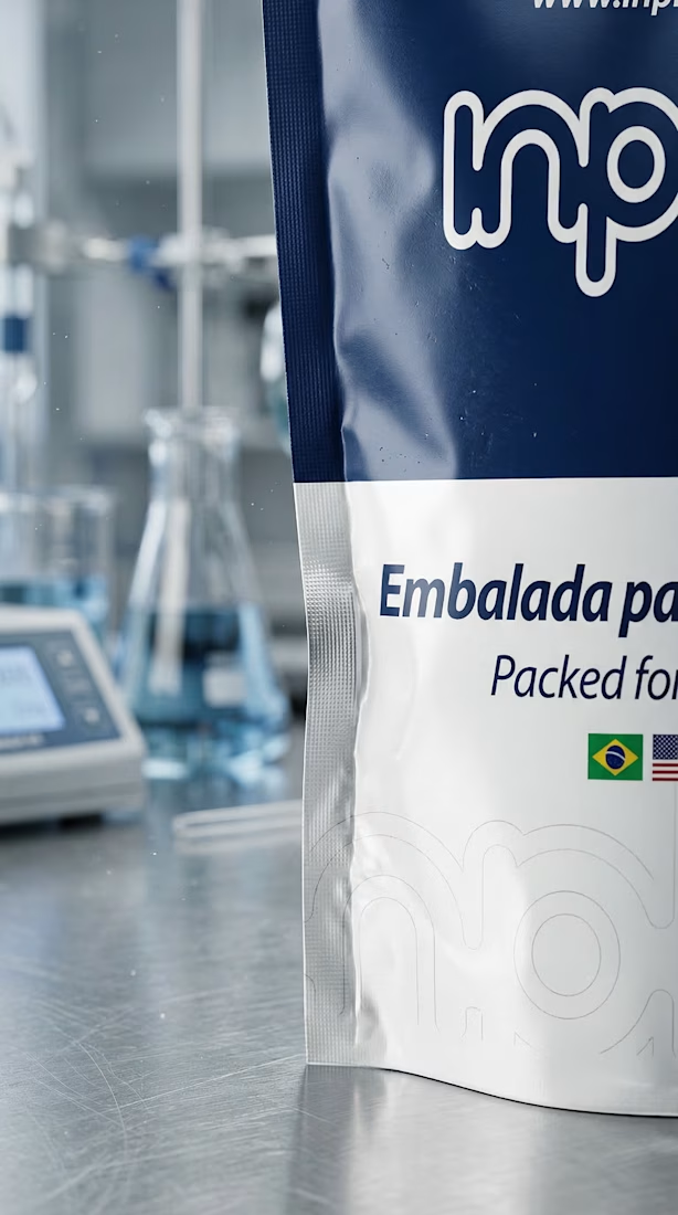
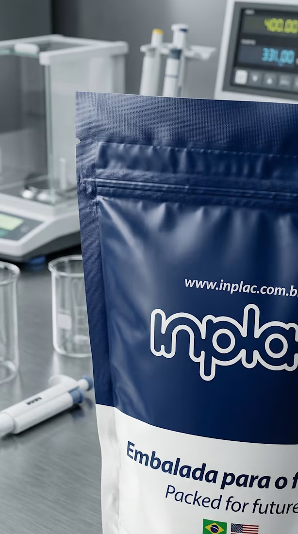
One of the challenges with this Inplac project is that the client doesn’t always have access to strong, current product photography.
I don’t see that as a limitation.
For this piece, we used AI to build highly detailed product visuals from the available references, then developed those images into animated scenes for social content and ads.
The goal wasn’t to create something that simply looked polished. It was to make the product feel tangible, well presented and visually convincing even when the original production material was limited.
A lot of the work comes down to art direction: defining the scene, lighting, materials, framing and movement in a way that still feels coherent with the real product.
For clients with difficult or expensive product shoots, this opens up a lot of possibilities. Limited photography doesn’t have to mean limited content.