The network for creativity
Join 1.25M professional creatives like you
Connect with clients, get discovered, and run your business 100% commission-free
Creatives on Contra have earned over $150M and we are just getting started
Back to feedPost
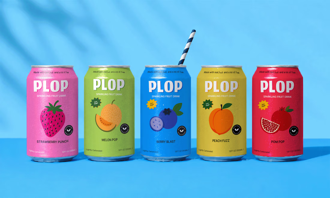
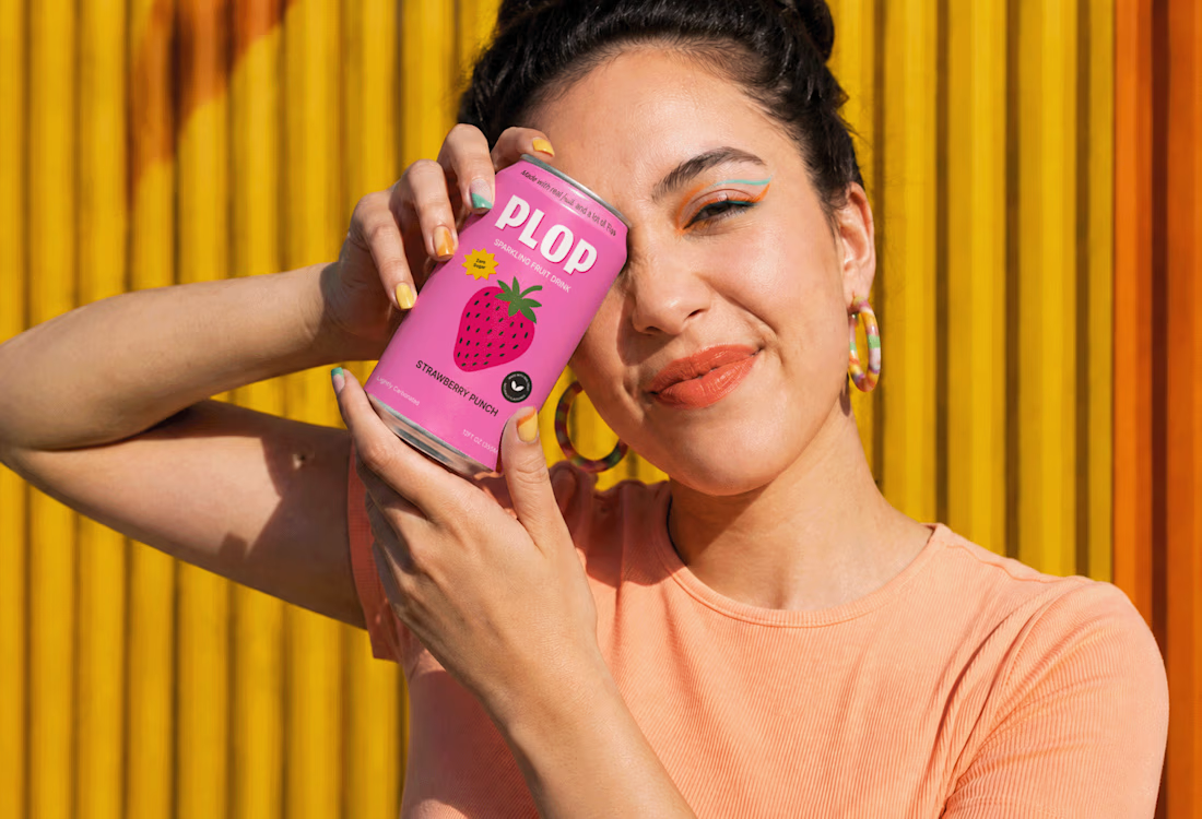
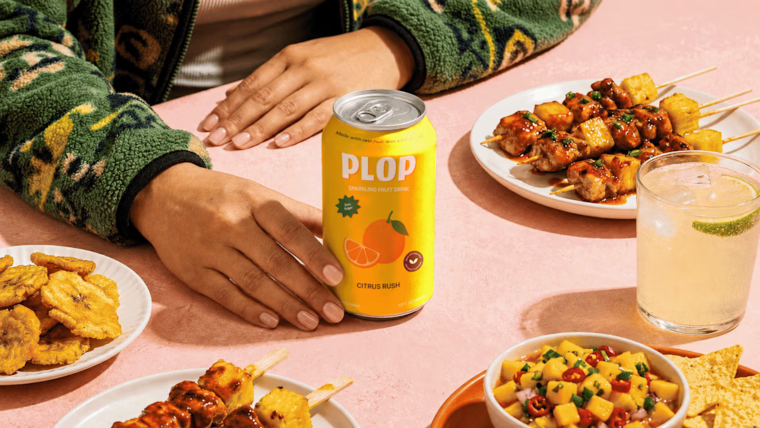
Another round of mockups exploring the world of fruity, fizzy, slightly ridiculous refreshment.



Obsessedddd!!!


Thank you Bella! Love you work too

Beverage is the category where mockups flatter the most — three cans on a clean gradient always look good, then the shelf puts twelve competitors either side and the flavour coding has to do all the work at two metres. The fruit illustrations look like they'd hold up there; have you tested the range in a crowded shelf render?
I am still exploring few other mockups where my beverage brand can standout out amongst the competitors.
Crowded shelf would be a nice idea i guess. Thanks for the suggestion.

Dope!
Thanks , which flavour do you love the most?
Melon 🍈


the pink can looks so fun. how did you make it?
I myself love the pink! I wanted to have a strawberry flavour but not something like a regular strawberry drink , I want it to be poppy playful and different.
I changed the color to deep pink instead of usual red.
What other flavours do you like?

Look's Gooooood!🔥
Thanks Harshana, which flavour do you love the most?
I like strawberry punch!!!😍

Love this, Karan 🔥
Thanks Damilola, which flavour do you love the most?
Sincerely, so hard to pick. They are all good!!
Hahah Thanks

This is amazing
Thank you Rosebeth, what did you like the most?
The berry blast

🔥 🔥
Thank You, Amina. Which flavour do you love the most?

Coool!
Thank you Tushar, which flavour you love the most?

These mockups look really nice, Karan! The photorealism on the environments is incredible. Just out of curiosity, was any AI used in the workflow for this, or is it all pure Photoshop magic?
The images are all AI generated , followed by refinement and mockup conversion in photoshop.

Love the colorsss
Thank you, which flavour you love the most?

Nice mockup ideas.
Thank you Sandaruwani

Awesome!
Thanks Victrex

And this video
Thanks Arthur, this looks super cool. IWas thinking to create a product video. What tools did you use?
Kling AI

looks really good
Thanks Daxesh, what's your favourite flavour?
either orange or pomegranate, wbu?

Thank you

Awesome 🔥
Thank you, what did you love the most

Great Color, Looking Nice
Thanks Zohaib, what flavour do you love the most?

Beautiful 🤩
Thanks Esther, what flavour do you love the most?

Lovely work! So colorful and illustrative, yet simple!
Thanks Pawel, what flavour do you love the most?
Berry Blast looks promising

Great concept and presentation!
Thanks Samuel, what flavour do you love the most?

Thanks Hina

the color and label work is doing all the flavor storytelling here, packaging like this basically sells the drink before anyone tastes it.
Thank you Jaideep

Flawless 🧡


Another brilliant execution, Karan! The multi-SKU color coding is incredibly vibrant and shelf-ready. It feels so crisp, clean, and joyful. Love the summer vibes of this mockup!
Thanks a lot
The network for creativity
Join 1.25M professional creatives like you
Connect with clients, get discovered, and run your business 100% commission-free
Creatives on Contra have earned over $150M and we are just getting started

Challenges
View all


Related posts

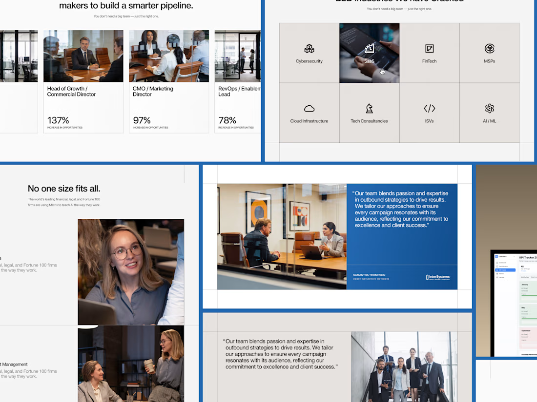
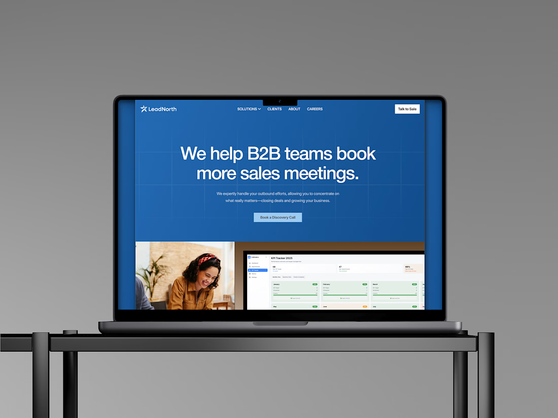
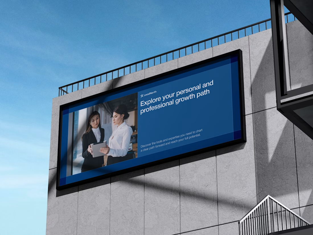
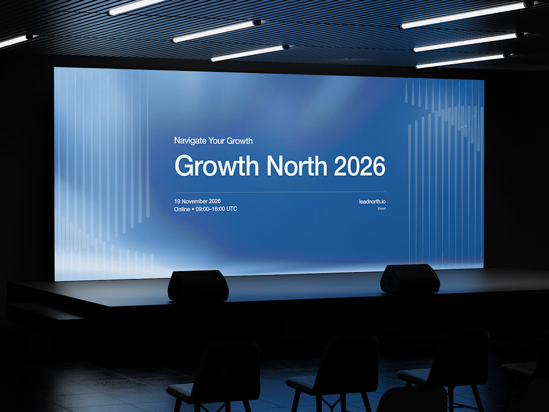


That saturated cobalt blue carries cleanly from the laptop hero onto the outdoor billboard and the Growth North 2026 stage screen.



This one is for teams that hand everyday work to AI agents. In one view you can see what got automated, how much time it saved, how each agent is doing, and you can ask the AI assistant anything.
In the video, I ask "Who might churn this week?" and Lyra replies with three at risk accounts and check in emails ready to send.
My goal was calm and minimal, with lots of white space, while the screen still feels alive.
What would you add or remove? I'd love your feedback.


