The network for creativity
Join 1.25M professional creatives like you
Connect with clients, get discovered, and run your business 100% commission-free
Creatives on Contra have earned over $150M and we are just getting started
Back to feedPost

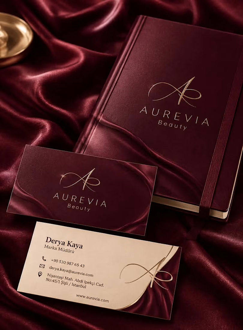
Aurevia Beauty – Brand Identity Design
Project Overview
A branding project developed for Aurevia Beauty, featuring a coordinated set of visual materials designed to create a consistent brand presentation.
Services
Logo Design
Business Card Design
Planner Design
Design Approach
The project focuses on creating a cohesive visual identity across different brand materials. Each design element is intended to complement the others and contribute to a recognizable brand image.
Deliverables
Custom Logo Design
Business Card Design
Branded Planner Design
The network for creativity
Join 1.25M professional creatives like you
Connect with clients, get discovered, and run your business 100% commission-free
Creatives on Contra have earned over $150M and we are just getting started



Related posts

How do you make a construction brand feel consistent from a business card to a building site?
Brixon’s identity brings angular lettering, an assembled geometric symbol, and a lime, black, and white palette together.
I carried those elements into stationery, brand guidelines, team identification, social graphics, and site signage, then brought the system into motion with Adobe After Effects.
The connecting decision: keep the geometry and layout structure consistent while the logo details, messages, and application previews change within the animated panels.
My contribution covered brand design, graphic design, and motion design.
What draws your attention first: the wordmark, the lime palette, or the rotating symbol?
See the full Brixon case study. If you’re shaping a construction or development brand, I’m available for brand identity and motion projects.

Incomparable work!

Hello Nature | Hand and Leaf Logo Mark
A throwback to one of my favourite logo concepts, created about 7 or 8 years ago, it was featured in LogoLounge 13.


clever and clean concept

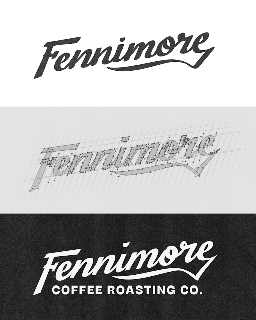
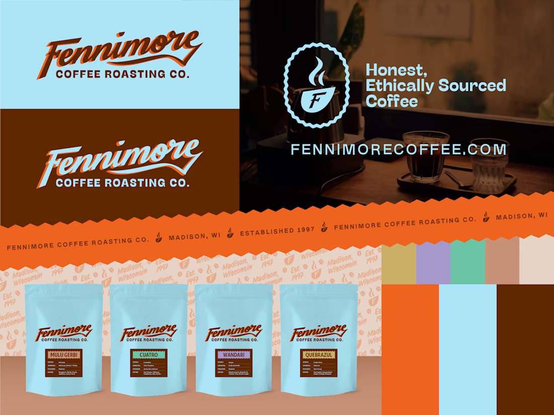
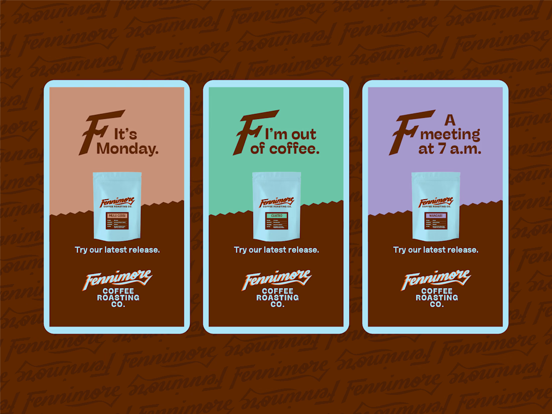
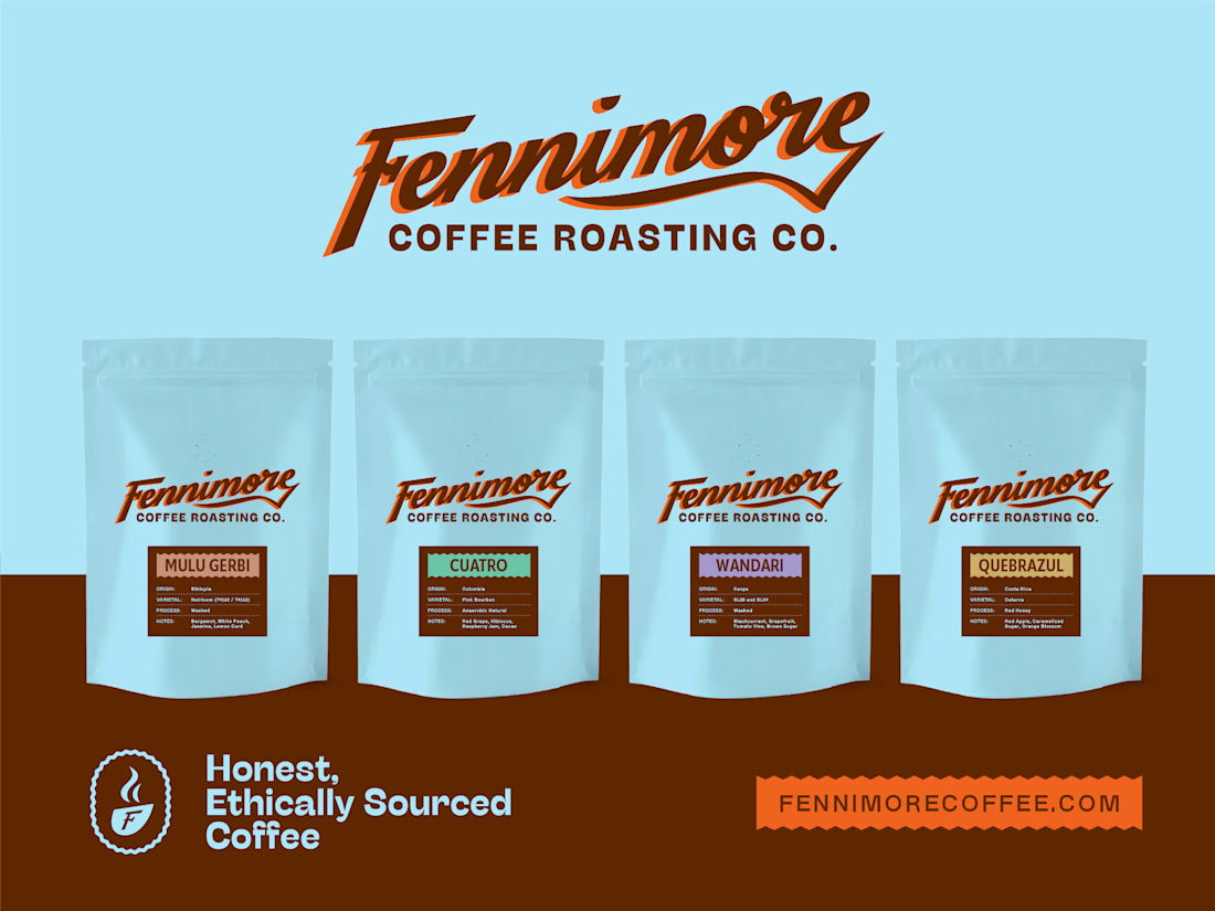
Hand-lettered brand identity, packaging, and marketing materials for Fennimore Coffee Roasting Co.