The network for creativity
Join 1.25M professional creatives like you
Connect with clients, get discovered, and run your business 100% commission-free
Creatives on Contra have earned over $150M and we are just getting started
Back to feedPost

1. The Problem
Traditional therapy can be expensive, intimidating, or difficult to schedule. Many people experiencing "everyday" stress, anxiety, or relationship friction lack a safe, immediate space to process their emotions. There is a gap between "doing nothing" and "booking a clinical session" where users need structured, therapeutic guidance without the friction of a long-term commitment.
2. The Goal
To design a mobile sanctuary that provides instant, AI-driven emotional support. The primary objective was to create a "zero-friction" homepage that allows users to start a conversation within seconds, while organizing deep-learning features like moderated "Co-Conversations" and personalized audio content.
3. User Research & Personas
Through user discovery, we identified three primary needs:
The Overwhelmed Professional: Needs quick check-ins to manage work-induced anxiety.
The Partner in Conflict: Needs an objective "third party" to help navigate difficult conversations.
The Self-Improver: Looking for bite-sized lessons and podcasts to build long-term resilience.
4. The Design Solution (Feature Breakdown)
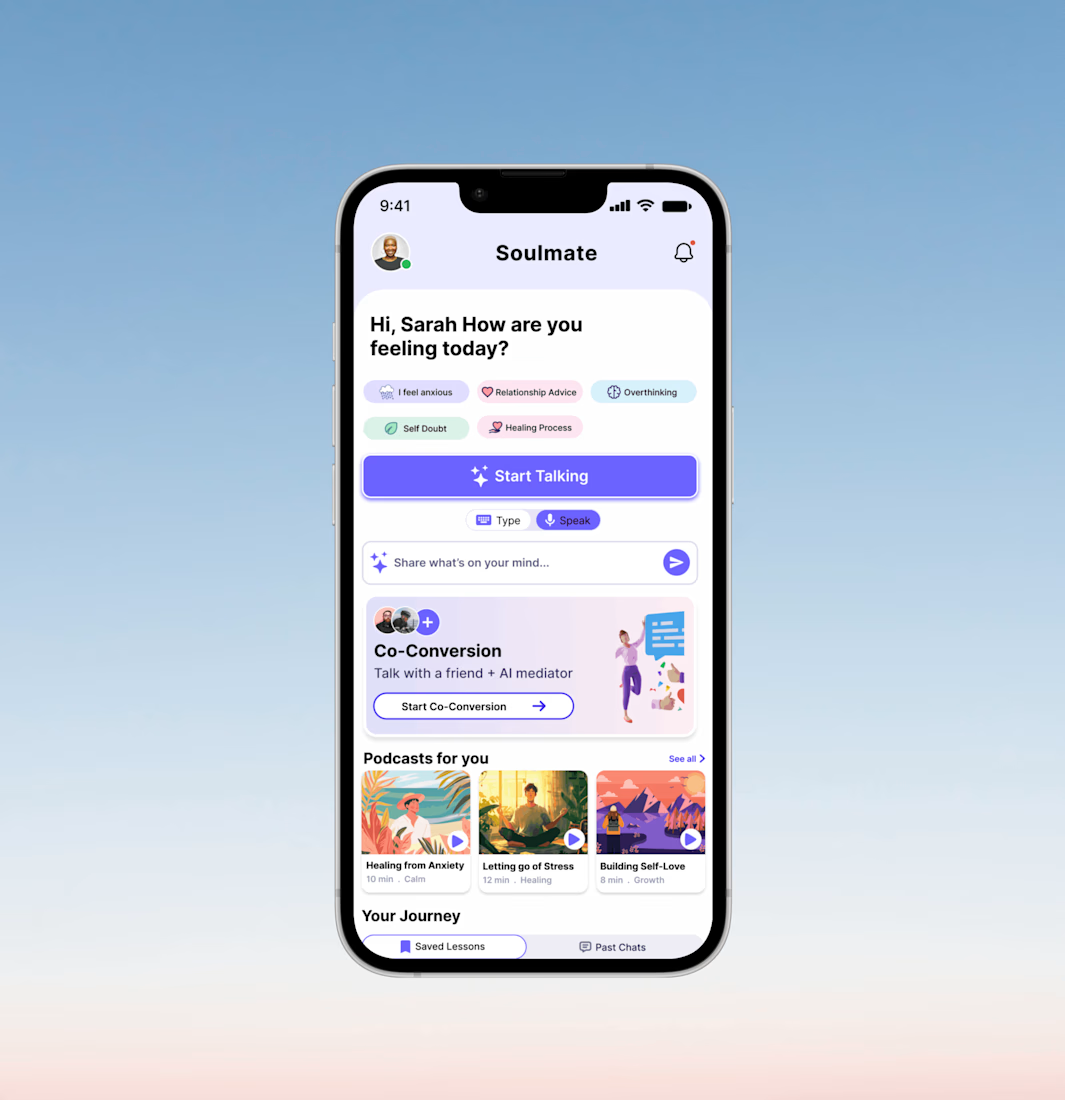
A. Guided Entry Points (Prompts)
Instead of a blank chat screen, we implemented Mood Tags (e.g., "I feel anxious," "Self Doubt").
Why: Lowering the cognitive load. It’s easier to click a feeling than to type it from scratch.
B. Modal Versatility (Type vs. Speak)
The UI features a prominent toggle for Type & Speak modes.
Why: Mental health needs are contextual. A user might want to speak privately in their room but type while on a commute.
C. The "Co-Conversion" Hub
A unique card design for AI-moderated group sessions.
Why: This positions the AI not just as a diary, but as a mediator, solving the "he-said-she-said" deadlock in interpersonal relationships.
D. Personalized Learning (Podcasts & Journey)
Horizontal scrolling cards for "Podcasts for you" and a "Your Journey" section for reflection.
Why: To ensure the app provides value even when the user isn't in a crisis, fostering a habit of proactive wellness.
5. Visual Identity & UI Choices
Color Palette: Soft lavenders, mint greens, and pale blues. These colors are scientifically associated with calmness and trust.
Typography: We used a bold, friendly Sans-Serif for headings to feel modern and accessible.
Micro-Interactions: The "Start Talking" button uses a subtle gradient and "sparkle" icon to signify the "magic" of AI insights.
6. Reflection & Future Iterations
While the current homepage effectively addresses the "immediate need," the next steps for this project would include:
Dark Mode: Essential for users dealing with late-night anxiety or insomnia.
Gamification: Adding "Streaks" or "Growth Milestones" to encourage daily check-ins.
Haptic Feedback: Using gentle vibrations during "Speak" mode to create a more grounded, sensory experience.


The network for creativity
Join 1.25M professional creatives like you
Connect with clients, get discovered, and run your business 100% commission-free
Creatives on Contra have earned over $150M and we are just getting started





Related posts

Credit card landing page design for a fintech startup — an interactive 3D claw machine that turns the offer into the hero instead of another floating card at 15 degrees.
Every card brand ships the same hero: a card hovering over a gradient. Clawd sells one card, not a marketplace, and the entire pitch is "stop comparing — we already did the comparing". So the landing page had to make a single-product offer read as a win rather than a shortage of options, and pull early-access sign-ups from people who are deliberate about money: the ones who actually track spending and read the APR line.
The metaphor does the positioning work. A claw machine that never misses, plus "we already picked the best one", means the visual is the argument and the headline doesn't have to explain itself.
I built the scene in Blender as an interactive element rather than a still render — the claw follows the cursor, the card tilts in the grip, and the pile underneath reacts, so a visitor plays with the product's core idea for a few seconds instead of scrolling past it.
Hero plus full page structure, desktop and mobile designed separately, the Blender scene with web-ready exports, interaction notes, and a developer-ready Figma file.


nice work

Winder is a bold brand identity built around a geometric W-inspired symbol, combining sharp angles and forward movement to represent progress, speed, and direction.
The identity uses a striking red and deep burgundy palette, supported by clean typography and a consistent visual system across brand guidelines, digital applications, and product mockups.
Progress in Motion.




Great logo it feels it really has an identity 🎉🎉




Option B feels nothing but premium