
Haris Ikhlaq
"Crafting seamless digital experiences, one click
Ready for work
Haris is ready for their next project!
Problem
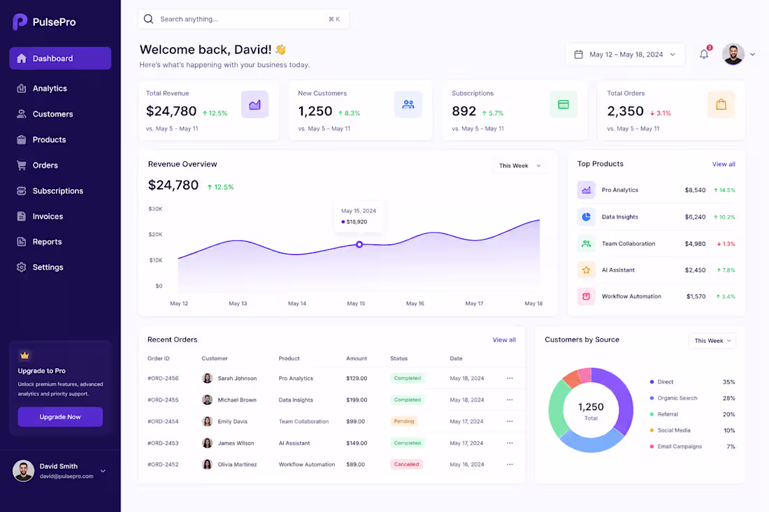
Many SaaS businesses struggle with dashboards that are cluttered, difficult to navigate, and overwhelming for users. Important business metrics are often buried under excessive data, causing decision-makers to spend more time searching for insights rather than acting on them. The existing experience lacked visual hierarchy, clear navigation, and efficient data presentation, resulting in higher cognitive load and reduced productivity.
Solution
I designed a modern SaaS dashboard focused on simplicity, usability, and data-driven decision-making. The design features:
Clear visual hierarchy to highlight key business metrics.
Intuitive sidebar navigation for quick access to core sections.
KPI cards displaying revenue, customers, subscriptions, and orders at a glance.
Interactive charts and data visualizations for better trend analysis.
Clean typography, consistent spacing, and modern UI components.
Responsive design principles to ensure scalability across devices.
Strategic use of whitespace to reduce cognitive load and improve readability.
The overall design follows user-centered design principles, enabling users to quickly understand business performance and take action with confidence.
Result
The redesigned dashboard delivers a more efficient and engaging user experience by:
Reducing information overload through structured content organization.
Improving data discoverability and decision-making speed.
Enhancing user satisfaction with a clean and professional interface.
Increasing dashboard usability through intuitive navigation patterns.
Creating a scalable design system that supports future product growth.
The final solution balances aesthetics and functionality, helping SaaS businesses monitor performance, track growth, and manage operations more effectively.
0
3
Problem:
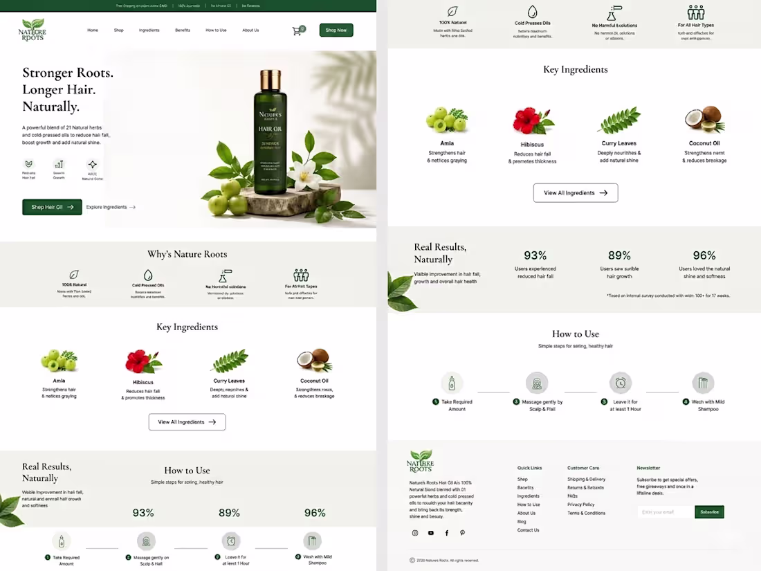
Most hair care brands online feel clinical or generic. Nature Roots —a chemical-free hair oil had a powerful product but lacked a digital presence that reflected its natural credibility and could convert first-time visitors into buyers.
Solution:
Designed a full e-commerce landing page focused on trust-building and ingredient transparency.
Key decisions included:
A nature-inspired color palette (deep greens + warm cream) to reflect purity and authenticity — An ingredient-first section (Amla, Hibiscus, Curry Leaves, Coconut Oil) to educate and build confidence — A "Why Nature Roots" block highlighting cold-pressed, chemical-free, and all-hair-type benefits — Real user statistics (93%, 89%, 96%) for social proof — A simple 4-step "How to Use" flow to reduce hesitation at checkout.
Result:
A clean, conversion-focused landing page that communicates the brand's identity at a glance — designed to reduce bounce rate, build product trust, and drive purchases organically.
0
18
Overview
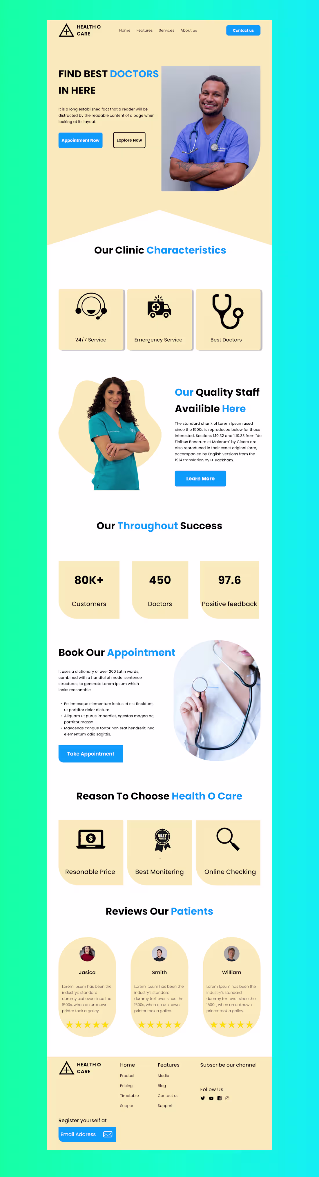
Health O Care is a modern healthcare landing page designed to simplify how users discover doctors and book appointments. The goal was to create a clean, trustworthy, and user-friendly interface that enhances accessibility and engagement.
Problem
Many healthcare websites feel cluttered, outdated, and difficult to navigate. Users often struggle to quickly find doctors, understand services, or book appointments efficiently.
Solution
I designed a minimal and visually appealing landing page that focuses on clarity, hierarchy, and ease of use. The layout ensures users can quickly access key information like services, doctors, and booking options.
Design Approach
Clean and structured layout for better readability
Soft color palette (beige + blue) to convey trust and calmness
Clear CTA buttons for appointment booking
Use of visuals and icons to enhance understanding
Balanced spacing and typography for a modern feel
Key Sections
Hero section with strong value proposition
Clinic features (24/7 service, emergency, expert doctors)
Staff introduction to build trust
Success metrics to add credibility
Appointment booking section
Testimonials for social proof
Tools Used
Figma (UI Design & Prototyping)
Outcome
The final design improves user experience by making navigation intuitive and information easily accessible, helping users take action quickly.
1
38
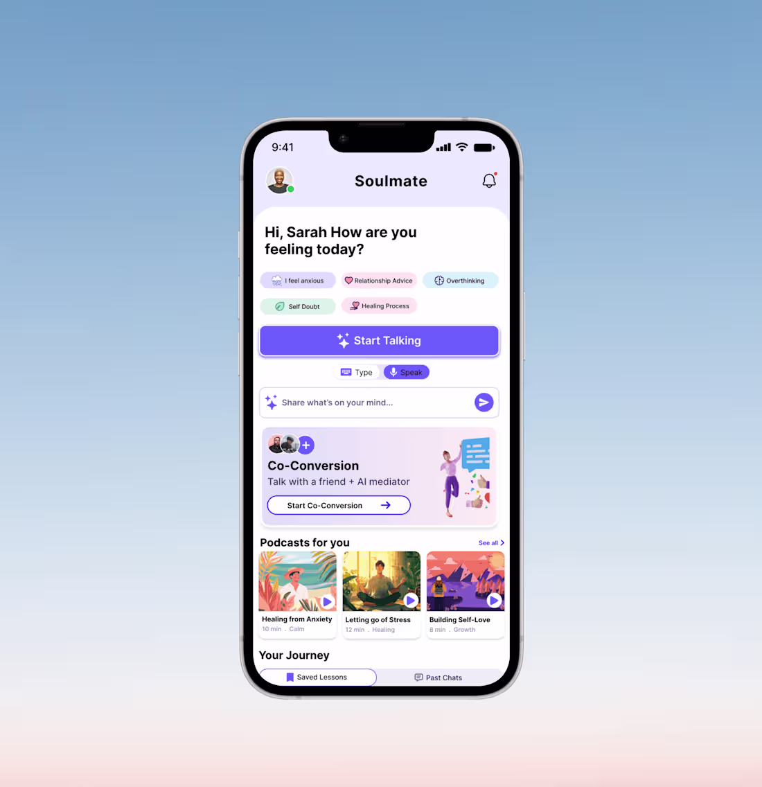
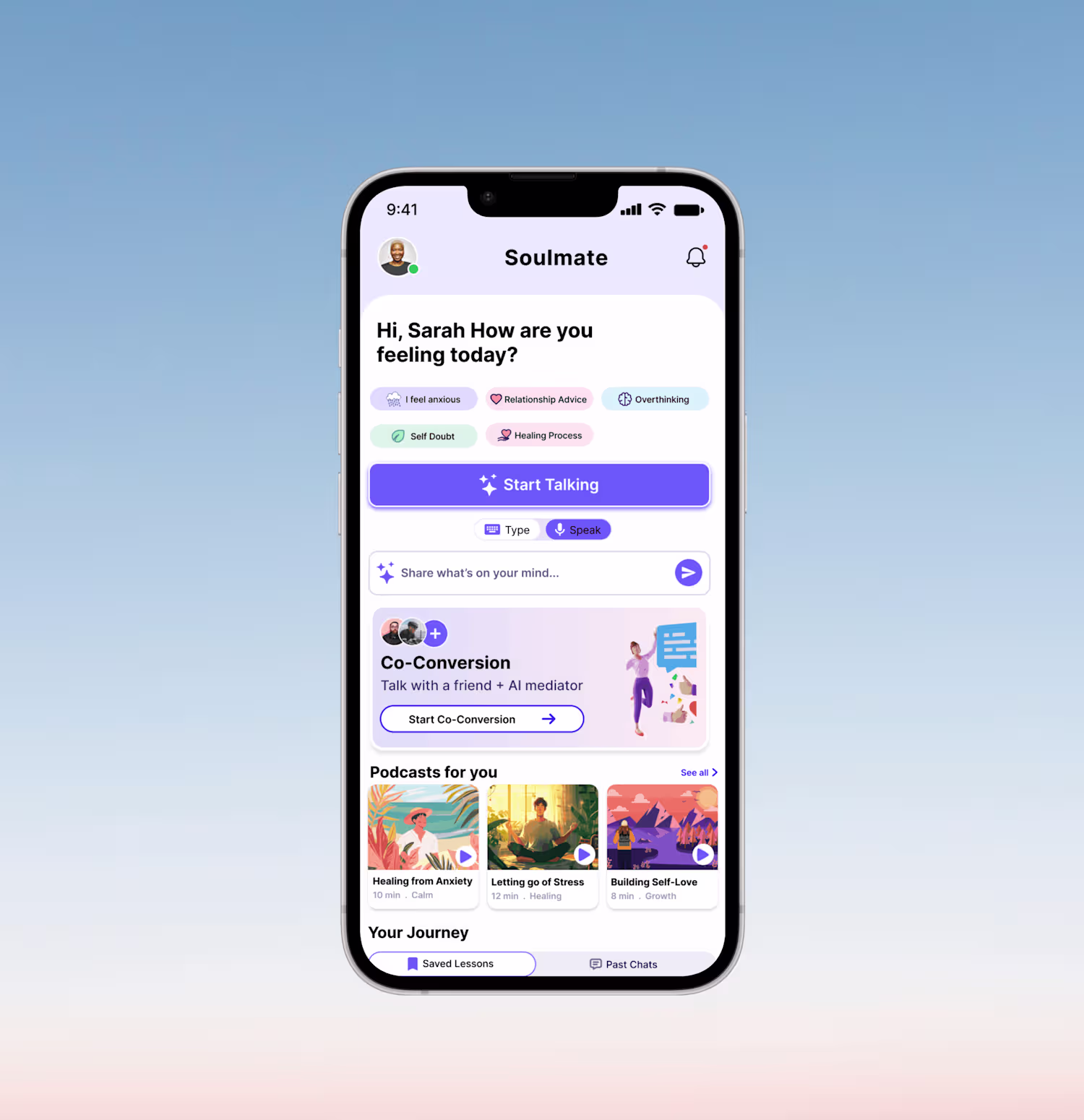
1. The Problem
Traditional therapy can be expensive, intimidating, or difficult to schedule. Many people experiencing "everyday" stress, anxiety, or relationship friction lack a safe, immediate space to process their emotions. There is a gap between "doing nothing" and "booking a clinical session" where users need structured, therapeutic guidance without the friction of a long-term commitment.
2. The Goal
To design a mobile sanctuary that provides instant, AI-driven emotional support. The primary objective was to create a "zero-friction" homepage that allows users to start a conversation within seconds, while organizing deep-learning features like moderated "Co-Conversations" and personalized audio content.
3. User Research & Personas
Through user discovery, we identified three primary needs:
The Overwhelmed Professional: Needs quick check-ins to manage work-induced anxiety.
The Partner in Conflict: Needs an objective "third party" to help navigate difficult conversations.
The Self-Improver: Looking for bite-sized lessons and podcasts to build long-term resilience.
4. The Design Solution (Feature Breakdown)
A. Guided Entry Points (Prompts)
Instead of a blank chat screen, we implemented Mood Tags (e.g., "I feel anxious," "Self Doubt").
Why: Lowering the cognitive load. It’s easier to click a feeling than to type it from scratch.
B. Modal Versatility (Type vs. Speak)
The UI features a prominent toggle for Type & Speak modes.
Why: Mental health needs are contextual. A user might want to speak privately in their room but type while on a commute.
C. The "Co-Conversion" Hub
A unique card design for AI-moderated group sessions.
Why: This positions the AI not just as a diary, but as a mediator, solving the "he-said-she-said" deadlock in interpersonal relationships.
D. Personalized Learning (Podcasts & Journey)
Horizontal scrolling cards for "Podcasts for you" and a "Your Journey" section for reflection.
Why: To ensure the app provides value even when the user isn't in a crisis, fostering a habit of proactive wellness.
5. Visual Identity & UI Choices
Color Palette: Soft lavenders, mint greens, and pale blues. These colors are scientifically associated with calmness and trust.
Typography: We used a bold, friendly Sans-Serif for headings to feel modern and accessible.
Micro-Interactions: The "Start Talking" button uses a subtle gradient and "sparkle" icon to signify the "magic" of AI insights.
6. Reflection & Future Iterations
While the current homepage effectively addresses the "immediate need," the next steps for this project would include:
Dark Mode: Essential for users dealing with late-night anxiety or insomnia.
Gamification: Adding "Streaks" or "Growth Milestones" to encourage daily check-ins.
Haptic Feedback: Using gentle vibrations during "Speak" mode to create a more grounded, sensory experience.
1
44