The network for creativity
Join 1.25M professional creatives like you
Connect with clients, get discovered, and run your business 100% commission-free
Creatives on Contra have earned over $150M and we are just getting started
Back to feedPost
Started by asking Claude to generate a hypothetical brand brief, it came back with Verdra, a sustainable lifestyle brand built around radical transparency and quiet beauty.
Then I went into Blender myself and built the model from my own interpretation of the brand. Soft, organic, abstract shapes. Green, alive. The mood set by hand before Claude touched anything.
Then I handed it over. Claude connected Blender and Paper through MCP, rendered each angle, built the posters in real time, typography and color system included. Adjust the model, new poster appears. Change the material, new mood.
20 posters. 5 material close-ups. A full brand system. One session.
My submission for the paper challenge.


great work

thanks abir!

Great job 👌
thanks istiak!
The network for creativity
Join 1.25M professional creatives like you
Connect with clients, get discovered, and run your business 100% commission-free
Creatives on Contra have earned over $150M and we are just getting started



Related posts

Ovéa — care with character.
One skincare identity across bottles, jars and tubes. I designed the wordmark, pink-and-cobalt packaging system, campaign applications and digital mockups, then brought the collection into motion.
A consistent visual language, with room for each product to feel individual.
View the full case study. Building a skincare brand? Let’s talk about your identity and packaging.

Love the colour direction and the visual language. Everything feels so well thought out. The overall look is beautiful.

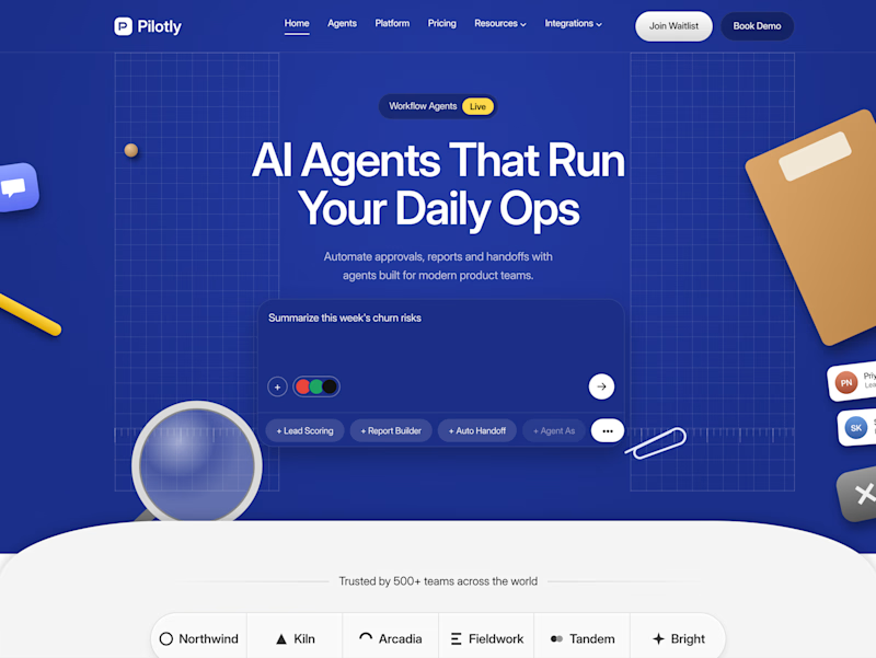
Testing two color directions for Pilotly, an AI agent platform for product teams.
Which direction would you pick for an AI automation product?


3 voted
100%
0 voted
0%
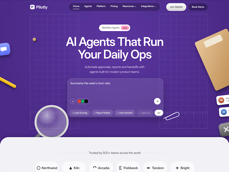
3 votes
Closed

I'd pick Violet Desk. Blue is what every SaaS uses, violet stands out and still says AI, and the orange sticky notes pop more against it. Does the hero chip row under the headline work on mobile?

Kinetic Product Art | 360° Commercial Reveal 🧴
Static renders show a product. Motion creates an experience.
A dynamic 360° orbital camera animation transforming a clay render into a fully textured, photorealistic skincare commercial.
The animation focuses on premium materials, cinematic lighting, camera movement, and product details to create a more engaging brand experience.
3D Product Animation
Product Visualization
Motion Design
Commercial CGI
Created for beauty and skincare brands looking to bring their products to life across advertising, e-commerce, social media, and digital campaigns.
📩 Open for freelance projects, agency collaborations, and commercial work.
#3DProductAnimation #ProductVisualization #MotionDesign #CGIAdvertising #3DArtist #SkincareCGI #CommercialCGI #Cinema4D


The tilted bottle with moss and tiny flowers makes a morning mist feel fresh, and the label stays readable while it turns. Would you cut a 6 second version of this for paid social?