The network for creativity
Join 1.25M professional creatives like you
Connect with clients, get discovered, and run your business 100% commission-free
Creatives on Contra have earned over $150M and we are just getting started
Back to feedPost

Design Concept
Clean & Premium
A minimalist layout creates a refined and professional spa experience.
Natural Colour Palette
Soft ivory and deep botanical green reflect wellness, relaxation, and a natural spa atmosphere.
Clear Information Hierarchy
Treatment names, durations, and prices are structured for quick and easy browsing.
Visual Consistency
Consistent typography, spacing, and imagery create a cohesive treatment menu across different categories.
Credit: HWG


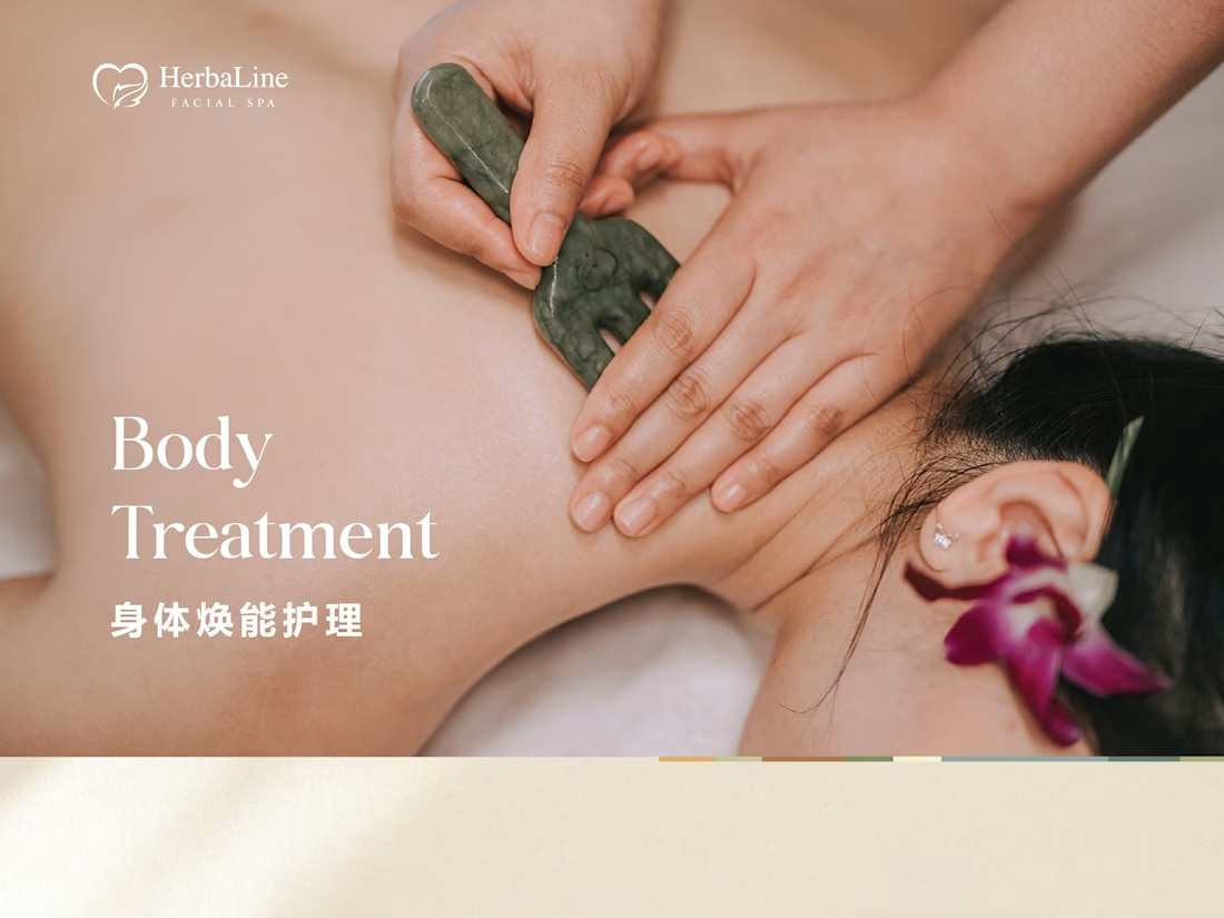
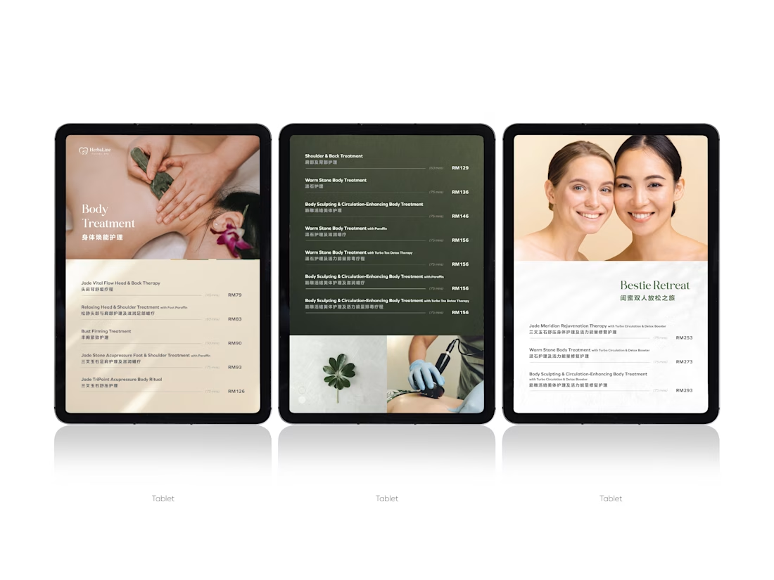
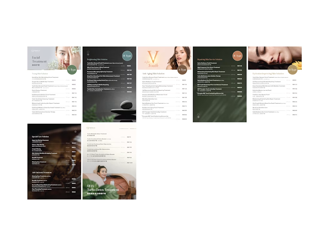

Treatment menus are a nastier hierarchy problem than they look — name, duration and price all want the same eye at the same moment. Curious how you settled it: lighter weight on the durations, or pulling them into their own column?
I kept the duration lighter and the price consistently aligned on the right. Since the menu needs to work in both English and Chinese, I stacked the bilingual treatment names together so they’re easier to scan from left to right without making the layout feel too busy.
The network for creativity
Join 1.25M professional creatives like you
Connect with clients, get discovered, and run your business 100% commission-free
Creatives on Contra have earned over $150M and we are just getting started
Trending
retrofuturism
Share your favorite designs from the past exploring the distant future. Or your own take on the aesthetic 🚀
halftone
Dots. Texture. Grain. Let's see your designs using the halftone technique.

Midjourney
Creatives are showing off what they're making with Midjourney.
colorgrade
Video editors sound off: How do you enhance the mood of your video in color grading?
Challenges
View all


Related posts


Goal:
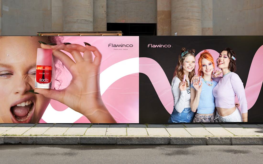
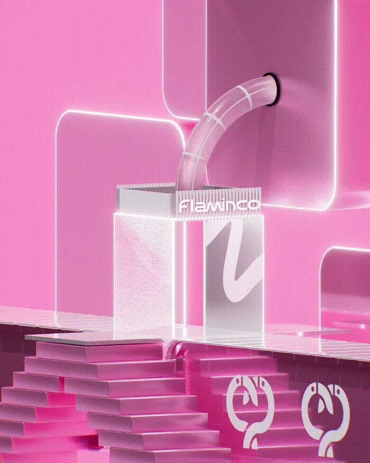
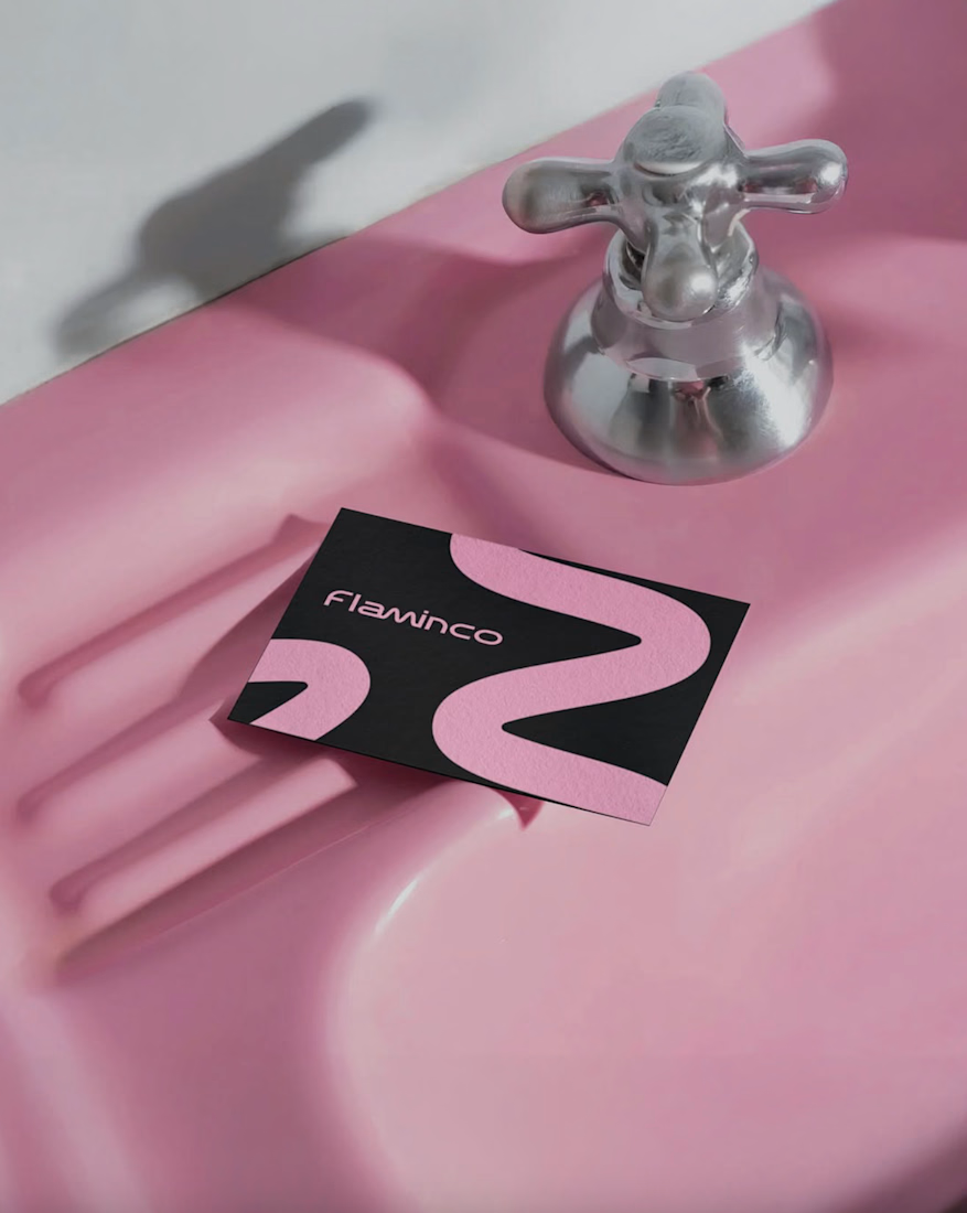
Our goal for Flaminco was to shape the cosmetic product not only as a functional FMCG category, but as a part of everyday self-expression. The main approach of the brand was based on creating a flexible and emotional visual world that adapts to the dynamic lifestyle of a young audience.
The open “M” shape used in the visual system symbolizes the free, changeable and adaptive character of Flaminco. This approach ensures that the brand is distinguished not only through color and aesthetics, but also through behavior and energy.
Target:
The main target audience of the brand is the young generation aged 16–25, who are sensitive to visual trends, value self-expression and seek aesthetic value in the products they use daily. Flaminco was formed with a more open and contemporary approach, aimed not only at a female audience, but also at everyone who cares about their appearance and style. The goal was to create a premium brand experience that is more interactive, flexible and able to build an emotional connection in the FMCG and retail market.
Result:
The result was a unified and flexible visual identity system for Flaminco that stood out in retail environments and could be easily expanded across digital platforms. The resulting visual language more strongly reflected the brand’s energy, flexibility and emotional connection with a young audience. The system was developed to serve as a sustainable and adaptive foundation not only for the current product line, but also for future campaigns, new product categories and communication directions.



excellent work, this is beautiufl!

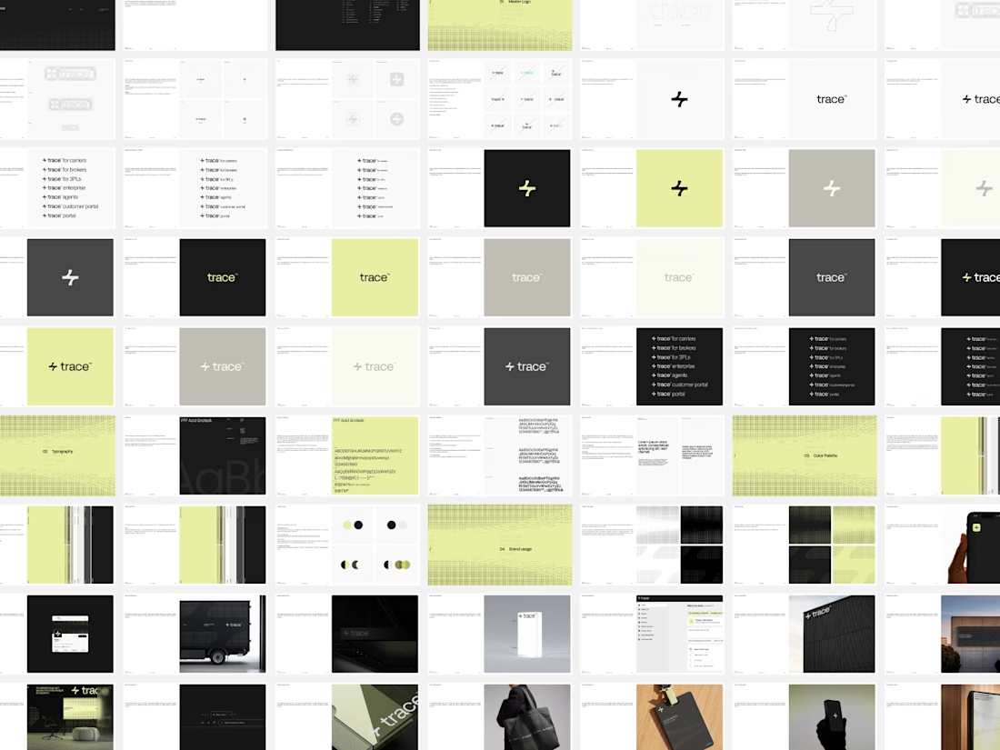
New Brand Guidelines delivered.
While it may seem trivial, this asset remains a key component of our final deliverables for every project. We offer a recommended guide for the proper use of the brand, with various layout options permitted within the visual language. This ensures the brand can expand over time with a truly functional visual system.
We always strive to be as concise as the brand allows, establishing the foundation for its effective use. This empowers the client to make informed decisions and implement each brand element in the ideal scenario with optimal adjustments.

"As concise as the brand allows" is the hard part, because the guidelines that get ignored are almost never the thin ones. Curious whether you pair the PDF with a live component library so the document only has to explain the rules and doesn't also have to enforce them - that split has saved me a lot of pages.

La Princesa de la Luna.
New visuals for EXOT Imaginary, my personal space to explore new ways of creating through AI, visual storytelling and experimentation.
Hope you like it! a.exot


The fractured mirror effect on the faces gives it a shattered stained glass quality that fits "princesa de la luna" better than a straight portrait would. Good use of the black negative space to let those fragments breathe.