The network for creativity
Join 1.25M professional creatives like you
Connect with clients, get discovered, and run your business 100% commission-free
Creatives on Contra have earned over $150M and we are just getting started
Back to feedPost
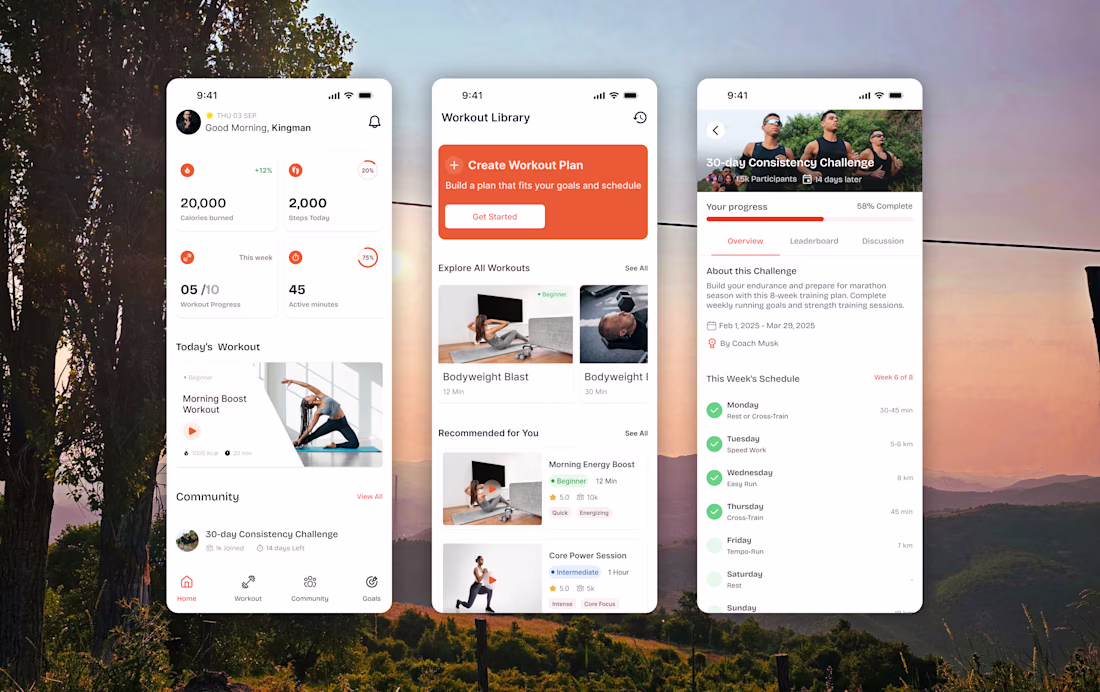
Project: Fitness Tracking App — Full Mobile UI
The brief: Design a fitness app that keeps users motivated and consistent not just on day one, but through week six.
The thinking: Most fitness apps lose users in the first two weeks. Not because the workouts are bad because the app stops feeling rewarding. I designed around three moments that matter most in a user's day.
Morning (Home screen): The user opens the app before a workout. They're looking for motivation. The home screen leads with achievement details, including calories burned and steps taken, before showing what's left to do. Win first, gap second.
Planning (Workout Library): Too many choices create paralysis. The library screen has one prominent primary action "Create Workout Plan" before opening up into the full catalogue. One clear next step always visible.
Accountability (Challenge screen): Individual motivation fades. Community motivation compounds. The challenge screen shows personal progress (58% complete) alongside 15,000 other participants and a structured weekly schedule. It makes the commitment feel shared, not lonely.
Design decisions:
→ Orange accent throughout energetic, warm, action-oriented without being aggressive
→ Progress rings over bars feels personal, like a wearable device
→ Real photography in workout cards makes the next session feel tangible
→ Community section on the home screen social proof built into daily use
Tools: Figma
Deliverable: Full app UI across home, library, challenge, and community screens
Open for mobile app UI and product design projects. Send me a message to talk about yours.
The "win first, gap second" philosophy for the home screen is smart framing. Leading with what the user has already done before showing what's left changes the emotional tone of opening the app. Progress rings over bars is also the right call for something this personal.
Good work
The network for creativity
Join 1.25M professional creatives like you
Connect with clients, get discovered, and run your business 100% commission-free
Creatives on Contra have earned over $150M and we are just getting started
Related posts
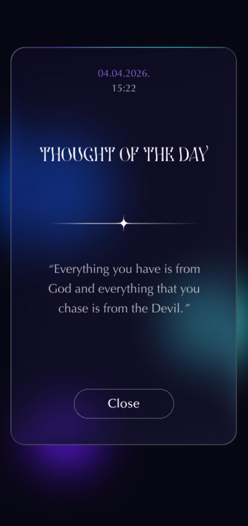
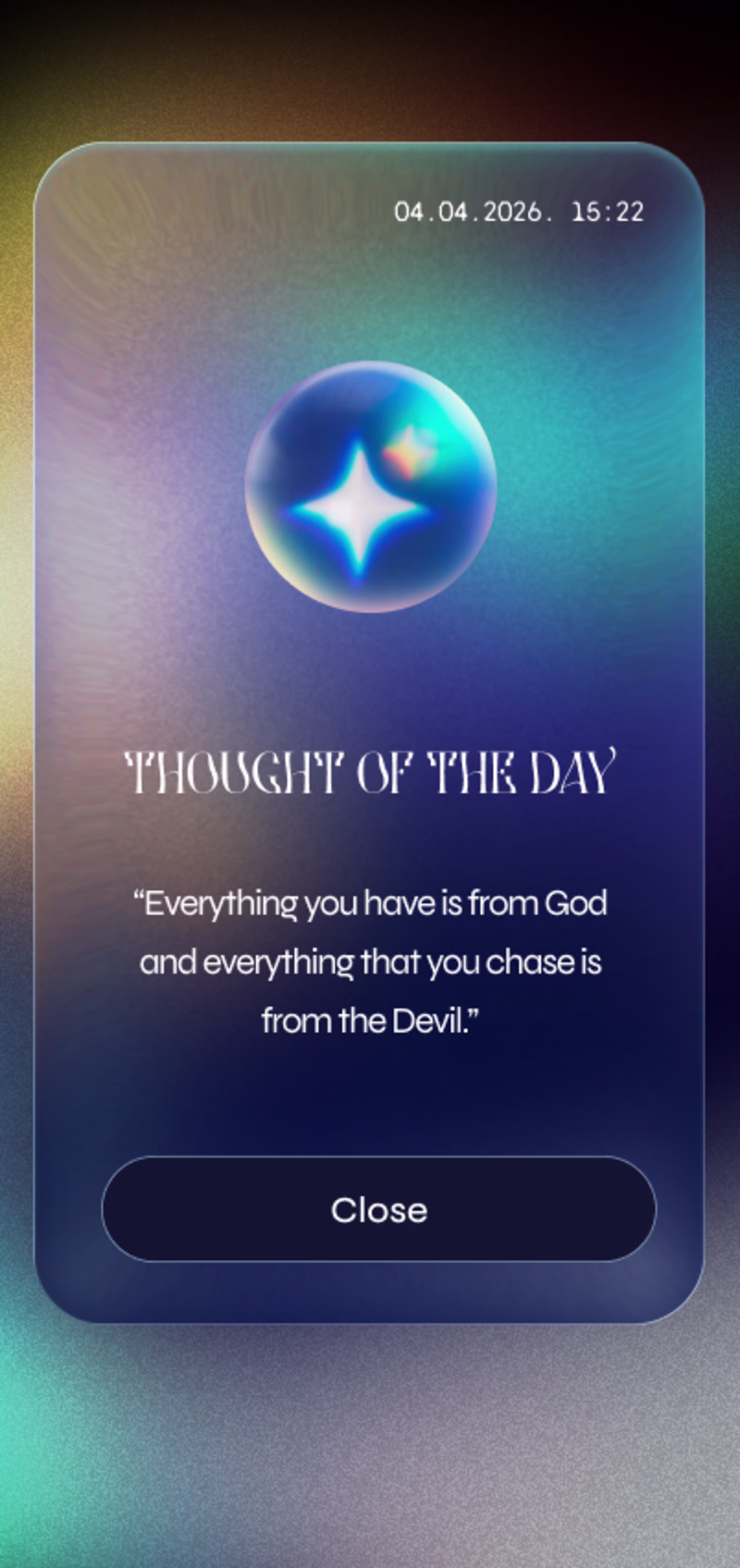
I'm testing out dark themes for the daily motivation app.
Which version you prefer?
6 voted
21%
23 voted
79%
29 votes
Closed
version 1
Most travel apps solve booking. None of them solve the reason people never book in the first place.
The problem is not money. Most people who want to travel actually have enough. The problem is that travel has no due date. Your EMI comes out on the 5th. Your insurance renews in March. Your electricity bill arrives every month without asking. They all get paid - because they have a structure that does not accept someday as an answer.
Your dream trip has none of that structure. So it waits. Every year. Until it stops feeling like a plan and starts feeling like a personality trait.
That insight became Voya.
This is the Original Workflow but due to certain issues I am not able to create prototype in same file so I duplicate that workflow and create new prototype.
Prototype:
https://stitch.withgoogle.com/preview/17661579163113846531?node-id=052829c9edd64f84b05c85db6b5bd998
𝗪𝗵𝗮𝘁 𝗺𝗮𝗸𝗲𝘀 𝗶𝘁 𝗱𝗶𝗳𝗳𝗲𝗿𝗲𝗻𝘁:
→ Saves a fixed amount from your income every month automatically - like an EMI, but for your next trip
→ Shows you where your rupee goes furthest right now based on live currency exchange advantages
→ Monitors flight prices 24/7 and alerts you the moment fares drop on your target routes
→ Tracks hotel pricing cycles so you book the same property for significantly less
→ Forecasts exactly where you can travel with your current savings - and when you unlock better destinations in 3, 6, or 12 months
→ Builds four completely different trip packages for the same destination - one for people who want luxury hotels and economy flights, one for business class comfort with simple stays, one for slow deep travel, one for multi-city discovery - you compare and pick yours
→ Shows you the real cost of waiting - how much more you will pay if you book when you originally planned versus booking now with your savings
→ Gives you back the mental peace of knowing the trip is already funded - so when you return home you return to the exact financial life you left. No investments liquidated. No recovery period.
wow this is very nice man
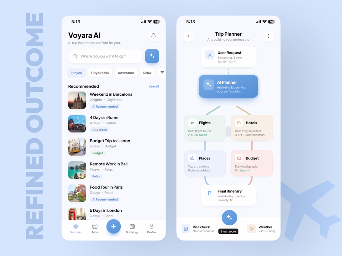
✈️ AI Travel App Concept for the Stitch Challenge
For this Stitch Challenge, I decided to test what AI can do in my strongest zone - mobile app design.
My agency and I have created 350+ mobile apps across AI, hospitality, wellness, hotel platforms, marketplaces, and travel-related products. So instead of creating just a nice UI shot, I wanted to test Stitch on something closer to a real product.
The concept:
An AI Trip Planner App that helps users discover trips, generate a personalized travel plan, optimize the budget, and turn everything into a ready itinerary.The main UX idea was to show how an AI travel agent can guide the user from curiosity to action:
→ Discover trip ideas
→ Generate a plan
→ Build a route
→ Optimize budget
→ Show savings
→ Push the user toward booking
I used:
a product specification
a Claude-generated visual reference
the same prompt direction in Stitch
then Figma polishing to improve spacing, hierarchy, consistency, and final presentation
Claude gave me a strong visual reference.
Stitch gave me the first working structure.
The biggest advantage of Stitch for me was iteration speed. With the free / Gemini access, I could generate and test more without constantly thinking about tokens. Claude is paid in my workflow, so for fast visual exploration Stitch was actually useful.
After Stitch generated the first version, I refined it in Figma and turned it into a cleaner, more premium mobile concept.
Final outcome:
AI Travel mobile app concept
Trip discovery experience
AI trip planning flow
Budget and savings logic
Smart recommendations
This challenge was not only about “can AI generate screens?”
🟢For me, the real question was:
Can AI help a senior mobile designer move faster from reference and prompt to a product idea that actually feels usable, structured, and business-focused?
My answer: yes - but the depth still comes from UX strategy, product thinking, visual direction, and final design judgment.
If your mobile app looks good but users still don’t activate, return, or convert - I can help you find the leak.
Book a Mobile App Diagnostic Call:
https://calendly.com/asol_design/book-diagnostic-call-linkedin-clone
#stitchchallenge #stitch #mobileappdesign #uidesign #uxdesign #productdesign #aitravel #figma #growthdesign #mobileux
Honestly, this is one of the best submissions I’ve seen.
Challenges
View allTrending
Claude
Claude has entered the design space. How are you using Claude Design?
Contra University
Learn from expert creatives how to earn more using next-gen AI tools.
creativeaiflow
Creative AI workflows are evolving. What tools do you use, and what are their strengths and weaknesses?
portfolioreview
The best portfolios tell a story, not just show a grid. Share yours for feedback.
freelancerlife
Freelancer life is wins, pivots, and everything in between. What’s yours right now?