The network for creativity
Join 1.25M professional creatives like you
Connect with clients, get discovered, and run your business 100% commission-free
Creatives on Contra have earned over $150M and we are just getting started
Back to feedPost

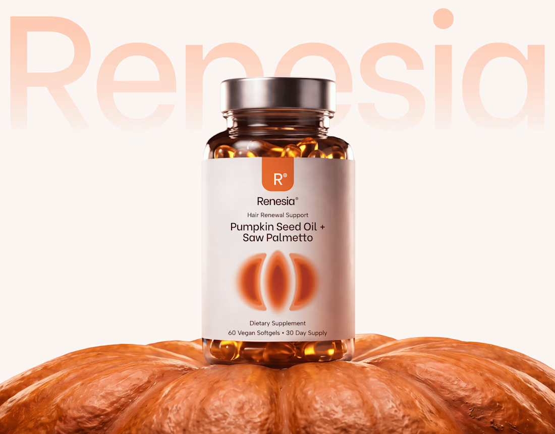
Here we go, check the full case study, I think you will love it! 🎃


Brilliant ✨

That's really great logo and packaging design for seed oil logo it's so suitable for it ❤️❤️
Great job Artur🎉🎉🔥🔥

Excellent work!

Wow

Man, this is jut high end execution

Amazing work


😎 🆒


Great work and presentation

like this! 🎃

Looks solid, love the presentation!

Love it!!!

broo crazyyyy

Framing wellness around everyday rituals instead of big promises is a smart positioning choice. The identity feels calm and grounded, which is exactly what this space needs.
Thanks Timothy! Wellness packaging tends to over-promise, so I kept the palette and type quiet and let the pumpkin shape carry the personality. Good to hear the calm tone reads.

This is beautiful

Putting the bottle on the pumpkin is a simple idea that makes the whole concept click. Was the oversized wordmark behind it always the plan?
Thanks, Rafee! The oversized wordmark grew out of the pumpkin idea: once the bottle sat on it, a big confident mark was the one thing that could hold its own against that shape while keeping everything else quiet.


Yes you're right, I LOVED IT!!! Super clean work! 💯💯

This product visual looks top-tier! 🤩 Excited to dive into the full case study.

Went through the complete case-study, OMG I really love the feeling this visual language evokes. Great work Artur❣
The network for creativity
Join 1.25M professional creatives like you
Connect with clients, get discovered, and run your business 100% commission-free
Creatives on Contra have earned over $150M and we are just getting started





Related posts

A fashion storefront needs to show the outfit and make its individual pieces easy to find.
For FORM, I paired a warm, editorial lookbook with clearly grouped product names, prices, and size choices.
Cream surfaces, charcoal typography, and consistent product cards connect the homepage with the desktop and mobile screen concepts.
One useful design principle from this project: give campaign imagery and shopping details their own readable zones. The collection can have a strong visual presence while the next product decision stays clear.
Explore the complete design case study:
https://contra.com/p/rNPRqooQ-form-fashion-e-commerce-website-design
When exploring a clothing collection, what helps you most: a styled outfit or an individual product grid?

Adorable

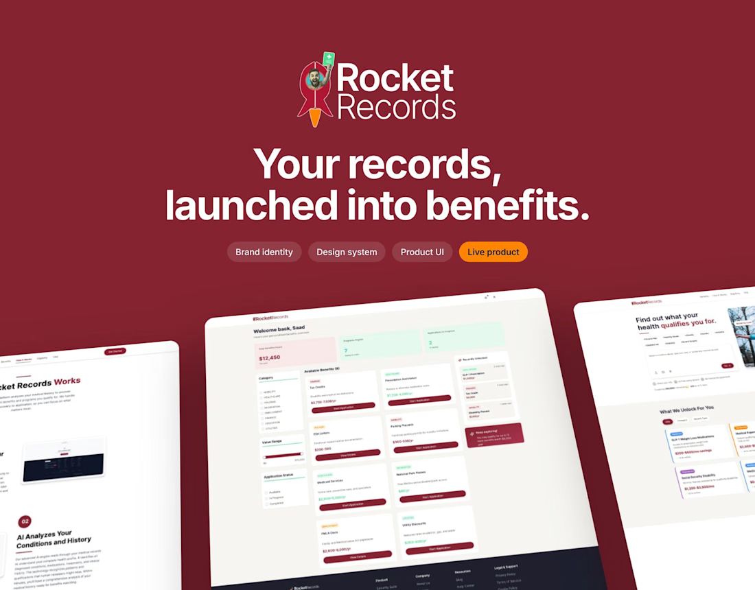
Creating a brand identity and actually seeing it developed and launch feels really good! 😊
Great work


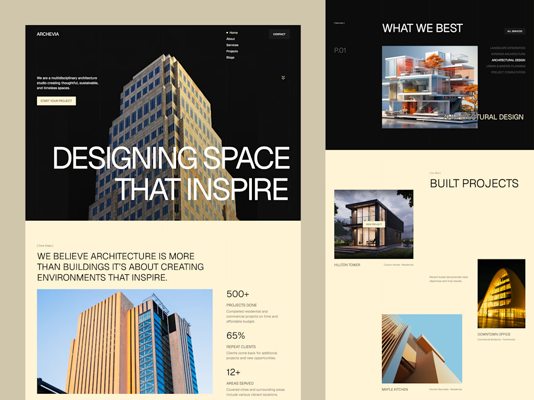
Archevia, Architecture & Design Website Template.
An editorial-style template built for architecture studios.
It features a CMS-powered project portfolio, service pages, testimonials, a contact form, and a blog.
Archevia is a device-friendly template with gallery-first layouts.
This is perfect for visual storytelling for design-led studios.
Check the comment.



nice work