The network for creativity
Join 1.25M professional creatives like you
Connect with clients, get discovered, and run your business 100% commission-free
Creatives on Contra have earned over $150M and we are just getting started
Back to feedPost

One of the first branding projects of last year. Working on a project from your own culture always hits different.
Lusitano Culture Club focuses on bringing tourists lesser-known experiences rooted in Portugal's culture.
The main concept was to modernize what is traditionally known and recognizable from the country- in this case, the Lusitano horse and the street tiles- and blend it with a modern take, updated patterns, typography and imagery.

Wow, this is amazing 😍
Thank you so much, Celia!

There's something different about designing for your own culture versus a random client brief, you already know what feels authentic versus what feels like a tourist's guess. Between the horse motif and the street tiles, which one gave you more trouble to modernize without losing what makes it recognizable?
The horse design was probably the one that gave me a bit more trouble in order to get the proper silhouette. The Lusitano has distinct features, so capturing them in a simplified shape was a challenge because the client didn't want a generic horse design. But I think combining...
Going from a full-body horse with ornamental elements down to something that reads instantly is a big jump, most of that work probably happened in what you chose to cut rather than what you kept. Was there a version partway through the iterations that felt close but still didn't fully click?
Hard to say. The full-horse idea with ornamental elements was meant to read as a full tile (a direct representation of the traditional tile shapes and composition), but it didn't work as a logomark because it was too complex. Client feedback was crucial. We moved to a cropped...

Thank you 🙌

great work.
Thank you, Ahsan 🔥


Amazing work🔥👏👏
Thank you 🙌

Creative work
Thank you, Rahman 🙌

ok the yellow against the black is so good. is that mark based on a tile pattern?
Thanks, Ajibola! Yes. The colors and shapes are directly based on tile patterns. The logo is meant to be a direct translation

Thank you, Vivek!

Super cool trailer Tiago, amazing work! 🎉
Thank you so much! 🙌

This is 🔥
Thank you, Jitinder! 🙌

Very polished! 💎
Thank you so much! 🙌

This is good and amazing
Thank you, Adeokun! 🙌

Designing for your own culture instead of a random client brief must hit different, love that framing. Curious how people back home reacted when they saw the modern take on the horse motif and the tiles, did it land the way you hoped?
Thank you, Maty! The client was super happy with the result. Not sure about the impact after the project was delivered.

Wow these look really clean!
Excellent work, man.
Thank you! 🙌

Amazing🔥
Thank you, Amina! 🙌

A well-thought-out design that clearly solves a real business problem.
Thank you, Samuel!

What an eye-catching concept! Super useful and innovative design.
Thank you! 🙌

Omg this logo feels awesome in first glance, Do you have the full case-study of this project? I would love to see!
Thank you! Yes. You can find it on my profile, or in the following link: https://www.behance.net/gallery/223832687/Lusitano-Culture-Club
Went through this, As expected this was great💯
Thank you 🙌

Beautiful
Thank you, Louis!
You are welcome

Great work!
Thank you, Enmanuel!

Nice work, everything blends really well.
Thank you, Nabeel!

Thank you for the kind words 🙌

Really like the artisan style mark! 🤩👌
Thank you, Vijay!
The network for creativity
Join 1.25M professional creatives like you
Connect with clients, get discovered, and run your business 100% commission-free
Creatives on Contra have earned over $150M and we are just getting started

Related posts
Another category comparison, and this one's going to make you look twice.
The fashion category needed a fresh point of view. Most established players relied on functional wordmarks and relatively restrained visual identities.
With Ru’asā, we took a different route. We challenged those conventions and built an identity designed to stand apart, be remembered and give the brand a world of its own.
Distinctive by design. Unconventional by nature.
Which would you choose?
Familiar category conventions
A fresh point of view
1 voted
11%
8 voted
89%
9 votes
Closed


Motion wins


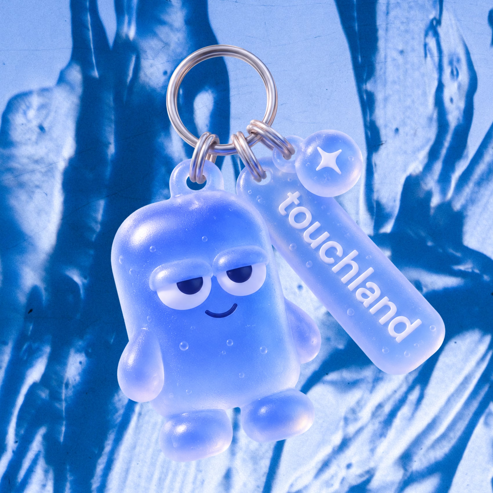
Why don’t more DTC brands have mascots?!
I feel like mascots are such a fun way to give brands more personality and create something people can actually connect with.
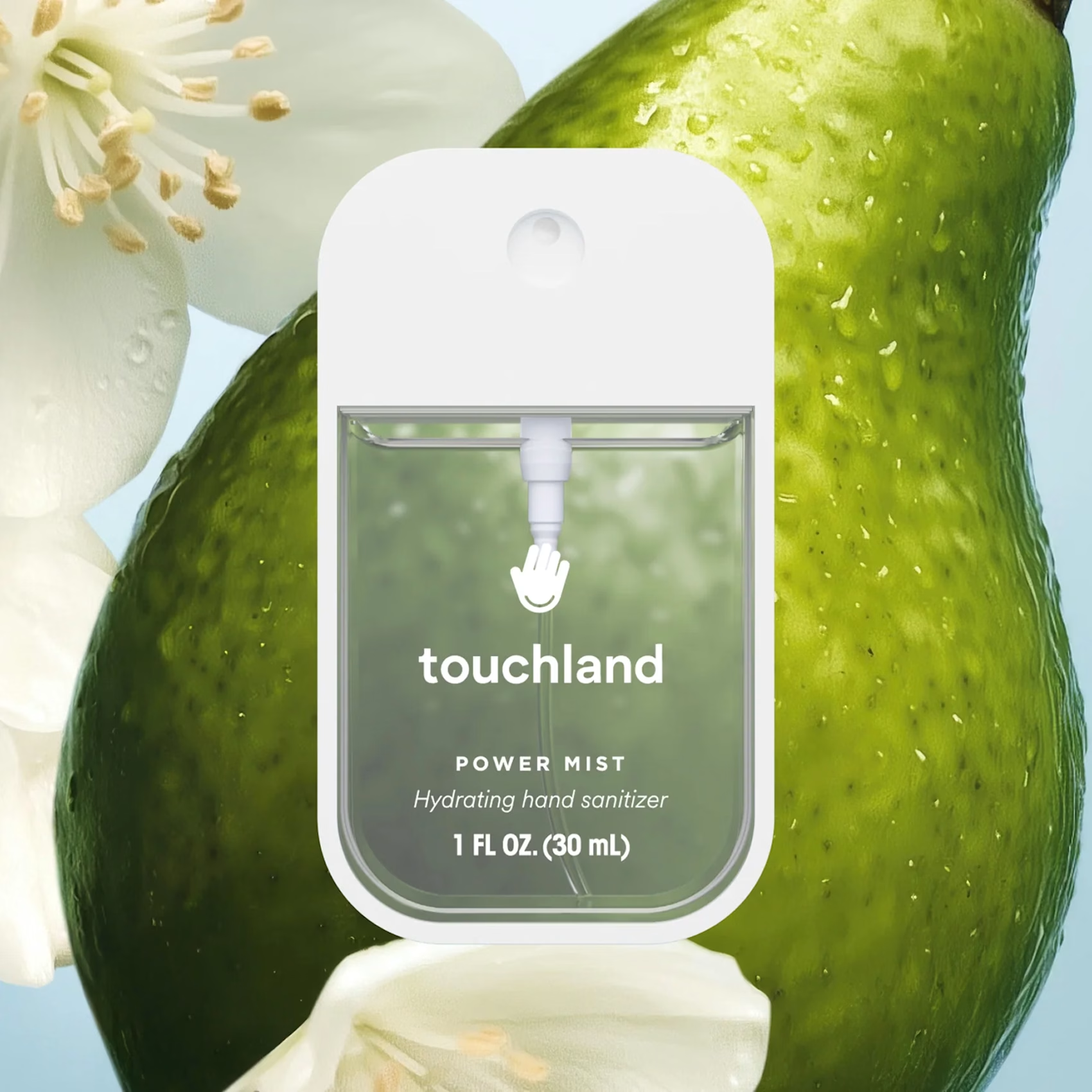
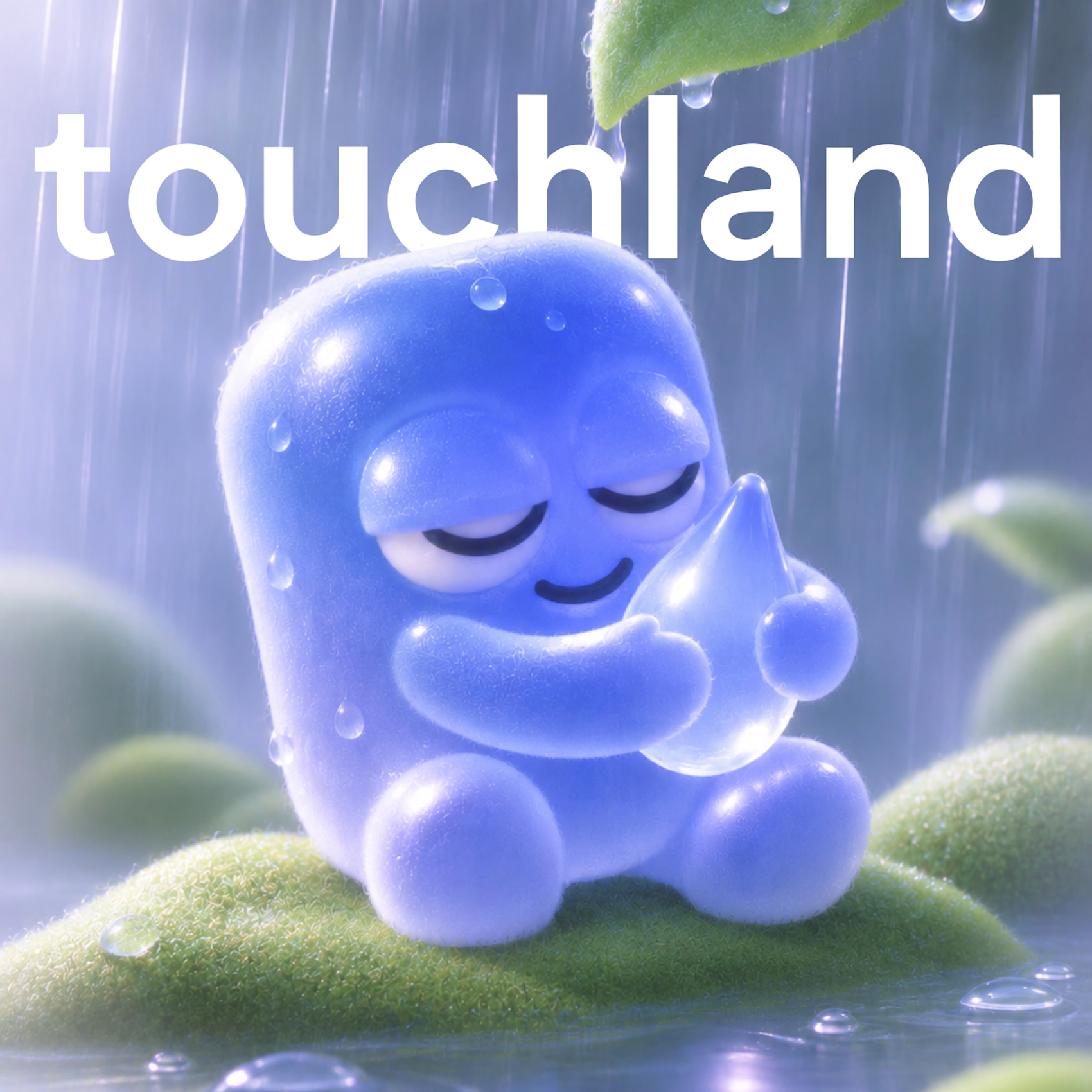
So I decided to give touchland its own little character! A squishy, jelly-like mascot that changes colors, expressions, and moods depending on the scent. And obviously, I had to turn it into a keychain too.
What other brands deserve their own mascot? 👀

This morning: a design exploration.
Tonight: a whole brand.
Calling. Numbered, glitched, answered.
Case study dropping soon.
Pick up.