The network for creativity
Join 1.25M professional creatives like you
Connect with clients, get discovered, and run your business 100% commission-free
Creatives on Contra have earned over $150M and we are just getting started
Back to feedPost

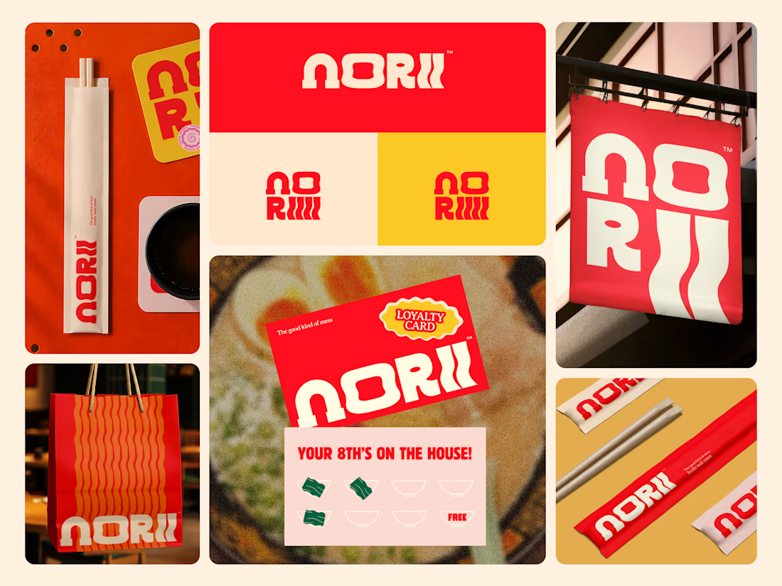
Some food brands play it safe. Norii was designed to do the opposite.
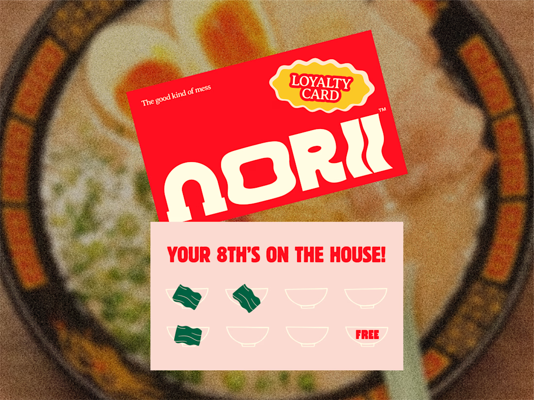
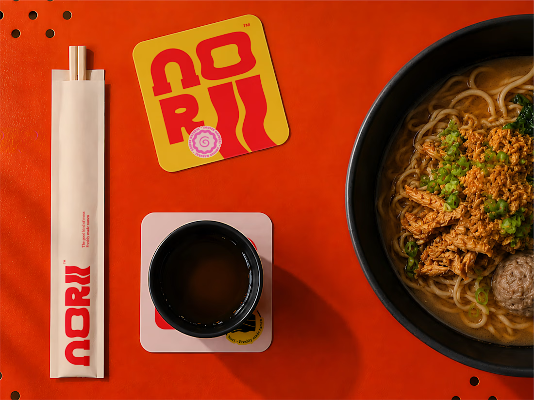
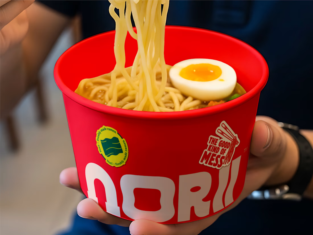
Bold red, warm yellow, a wavy wordmark that moves like noodles in a bowl, and a brand voice confident enough to put "the good kind of mess" on a loyalty card. Every touchpoint chopstick sleeves, takeaway bags, hanging signage, and sticker collateral is built to feel like the same world from street level to tabletop.
"Your 8th's on the house." Even the reward mechanic has personality.
This is restaurant branding that works as hard outside the door as it does inside it.
Does this make you want to find the nearest Norii? 👇
Tools: Illustrator · Figma
#FoodBranding #BrandIdentity #PackagingDesign #LogoDesign #RestaurantBranding #ContraFreelance


Really like how every touchpoint reinforces the same personality. That's what turns a visual identity into a memorable brand experience

Amazing Branding ✨

Amazing work

Mind-blowing work, keep creating awesome stuff.
Thank you so much! Really appreciate the encouragement. More exciting work is on the way!

Really nice balance between visual interest and clarity.
Thank you! Glad that balance came through it was one of our key design goals.

Impressive Work
thanks a lot


Good work and noticably different/bold design!

"The good kind of mess" as brand voice on a loyalty card is such a specific choice, most food brands would never let messy be part of the pitch. The chopstick sleeve and takeaway bag consistency is what actually makes it feel like a system instead of a logo slapped on packaging.

the design a lone can make someone want more
Nice Design btw

Orbix amazing work

nice work
The network for creativity
Join 1.25M professional creatives like you
Connect with clients, get discovered, and run your business 100% commission-free
Creatives on Contra have earned over $150M and we are just getting started
Related posts

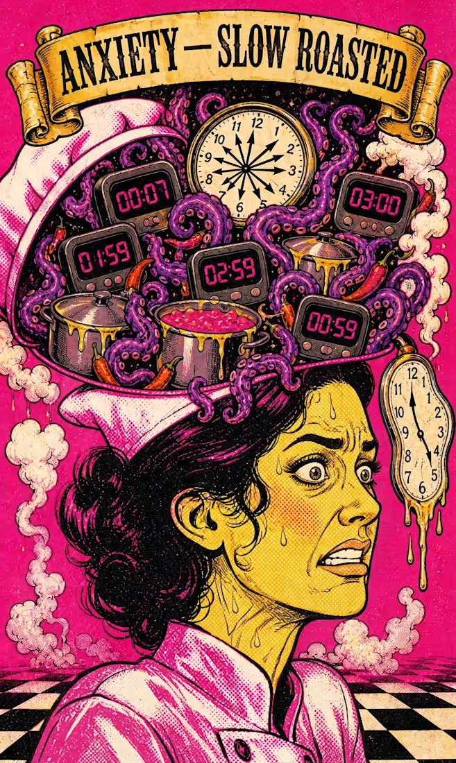
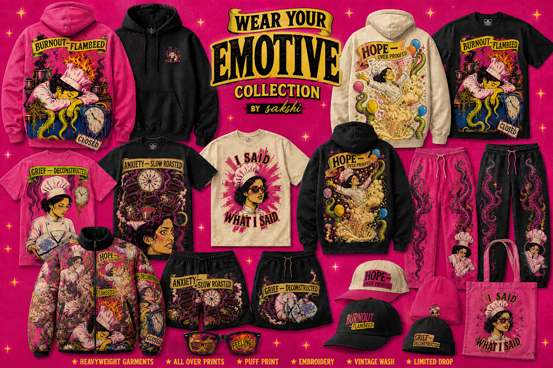
Wear Your Feelings — a pop-surrealist streetwear ecosystem 🧠🔥
Standard AI gave me generic clip art.
My Human by Design moment: overriding it, mapping every detail to real psychology — handwritten letters for Grief, exploding dough for Hope, a vinyl record for Nostalgia, a "CLOSED" sign for Burnout, grenade chilis for Rage.
Started as a cookbook concept. Became a full brand — apparel, sunglasses, hot sauce packaging, campaign reels — one Envato pipeline, start to finish.
@Envato gave it a canvas. Human taste gave it a soul.
Check out the raw walkthrough video below for the exact workflow breakdown. 🎬👇

walkthrough:


Nick (@nickbakeddesign) just shared with @Daniel G Bright and I how he uses AI to think like a dev, design better products, and close higher‑quality clients, while staying tiny on purpose.
New UnContrad episode is live now for indie designers, studio owners, and creators serious about playing the long game.
Watch Full Episode below ↓


What started as friends scheduling weekend classes somehow evolved into a community that partners with studios and hosts events.
Naturally, I couldn't resist giving it a brand identity 🥴
Here's the visual system I created for Pilates Pals, inspired by movement, connection, and making fitness feel a little less intimidating.

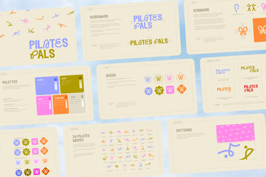
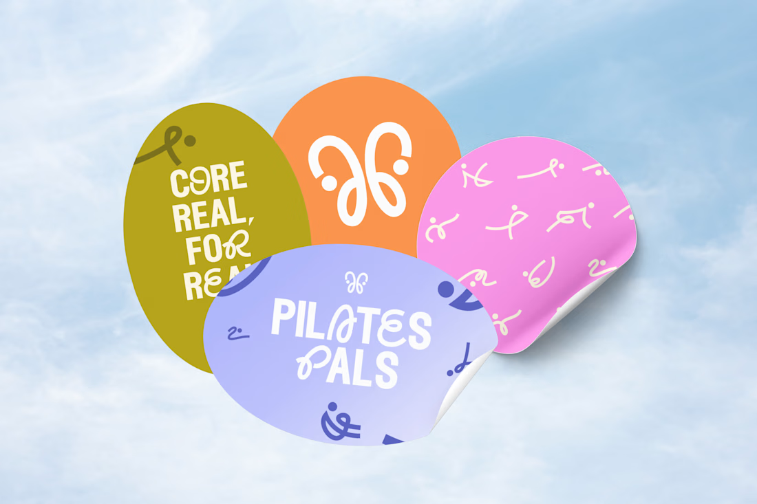
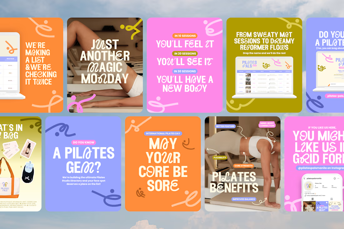

the branding, the posts, the logo, the deck. soo good








Trending

Claude
Claude has entered the design space. How are you using Claude Design?

Contra University
Learn from expert creatives how to earn more using next-gen AI tools.
creativeaiflow
Creative AI workflows are evolving. What tools do you use, and what are their strengths and weaknesses?
freelancerlife
Freelancer life is wins, pivots, and everything in between. What’s yours right now?