The network for creativity
Join 1.25M professional creatives like you
Connect with clients, get discovered, and run your business 100% commission-free
Creatives on Contra have earned over $150M and we are just getting started
Back to feedPost
Taste Test

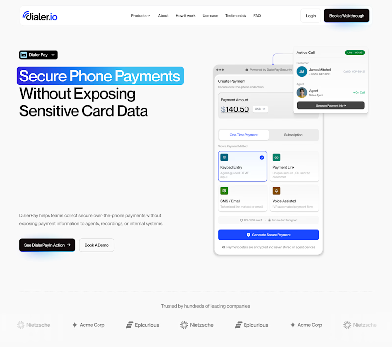
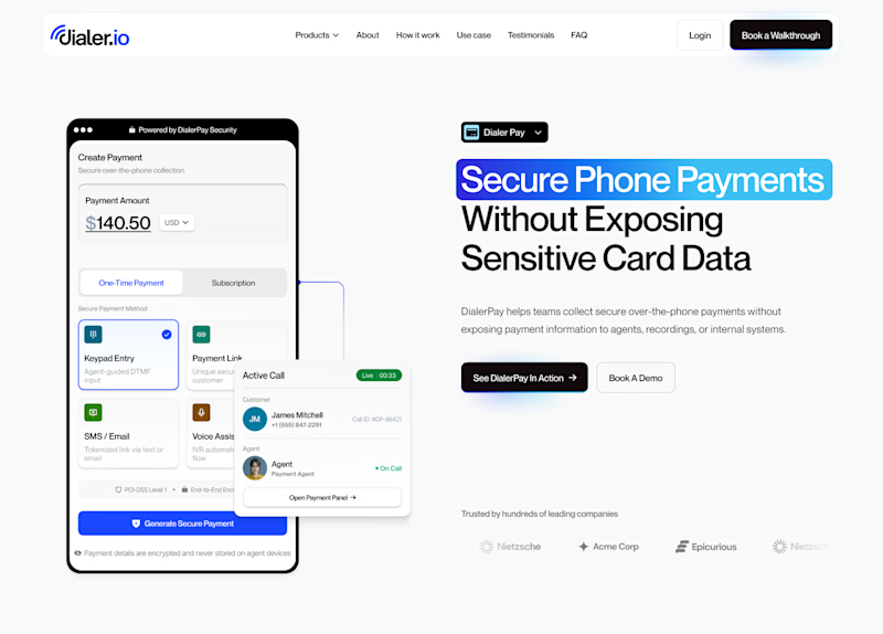
Hard to choose which layout I should go with 🤔


10 voted
31%
22 voted
69%
32 votes
Closed

Hero Section 2 pulling 69% makes sense, putting the trust signal copy right where the eye lands first on mobile is a stronger hook than section 1's layout. Was the vote split close to what you personally expected going in?

Going for section 2. It looks less crowded that section 1

In my opinion, I'll go with her section 1

Hero Section 1 for me, leading with the value prop headline before the phone mockup feels stronger for a fintech landing page. What's converting better in your testing so far?

I think section two has better information order. Text first then image.

Hero Section 2

Section 2 looks more professional and clean

Hero Section 2

Absolutely love the creative direction here. Feels fresh and unique also The layout structure and color harmony give this design a premium and modern feel.
The network for creativity
Join 1.25M professional creatives like you
Connect with clients, get discovered, and run your business 100% commission-free
Creatives on Contra have earned over $150M and we are just getting started
Related posts


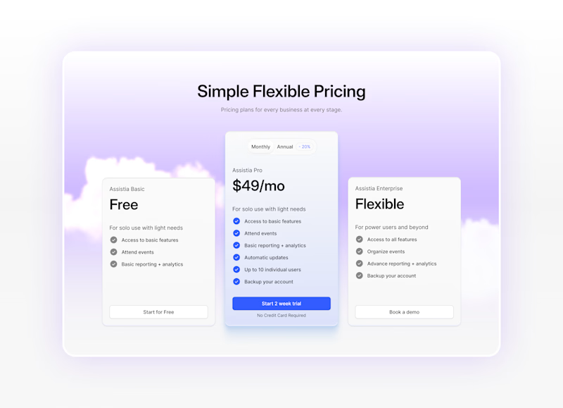
Pricing section with 2 versions.
Which one will make it easier to decide?
8 voted
35%
15 voted
65%
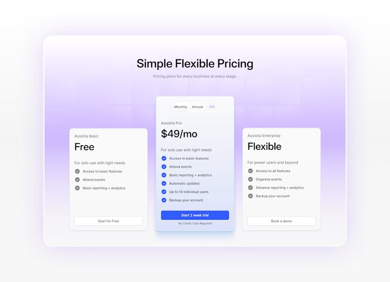
23 votes
Closed

Version 2, simple and clear



Awesome design !


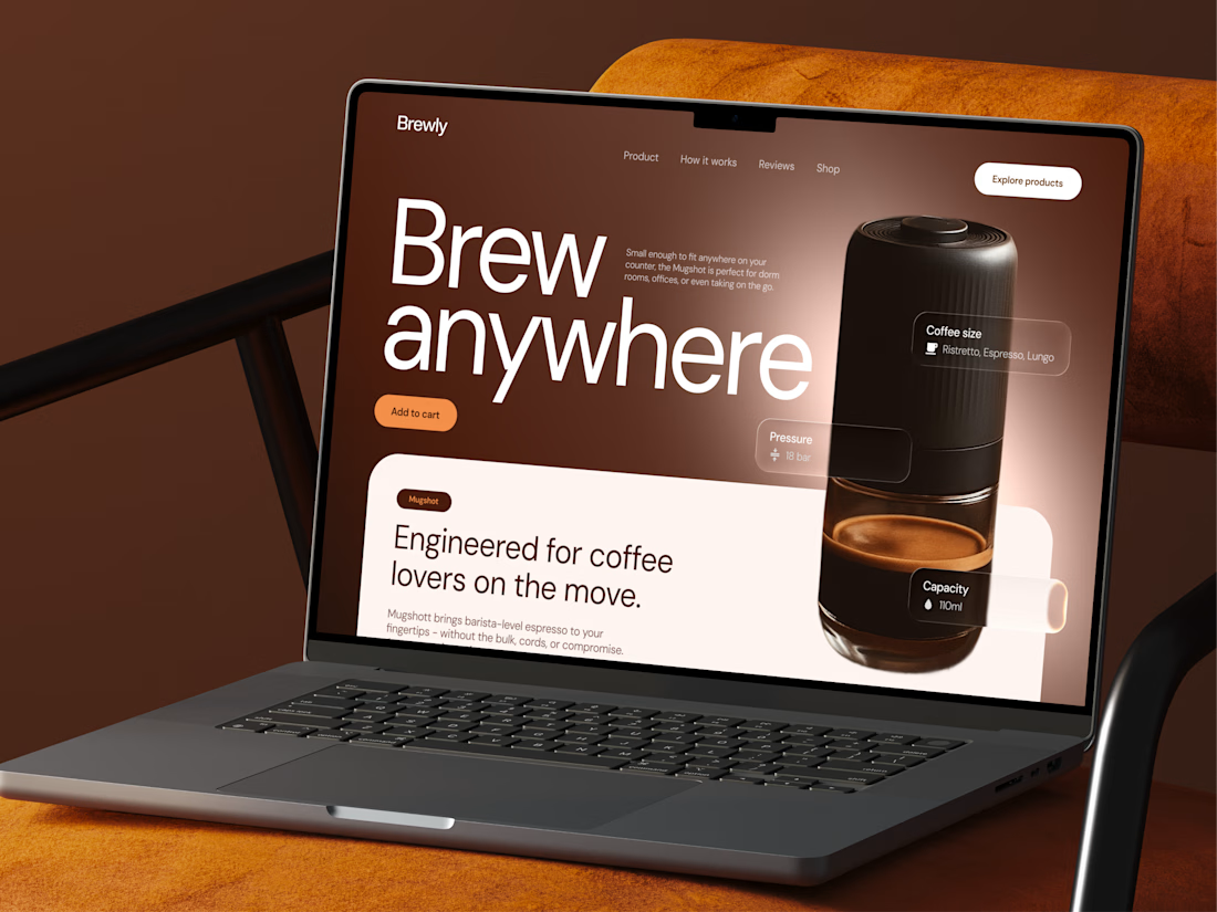
Check out a new concept of coffee maker machine ☕ What do you think?


Great attention to spacing and composition.







Trending

Claude
Claude has entered the design space. How are you using Claude Design?

Contra University
Learn from expert creatives how to earn more using next-gen AI tools.
creativeaiflow
Creative AI workflows are evolving. What tools do you use, and what are their strengths and weaknesses?
freelancerlife
Freelancer life is wins, pivots, and everything in between. What’s yours right now?