The network for creativity
Join 1.25M professional creatives like you
Connect with clients, get discovered, and run your business 100% commission-free
Creatives on Contra have earned over $150M and we are just getting started
Back to feedPost


Good job

Love the simplicity here, it gives the brand such a nice feel

Nice concept


Great design!


The first frame🔥

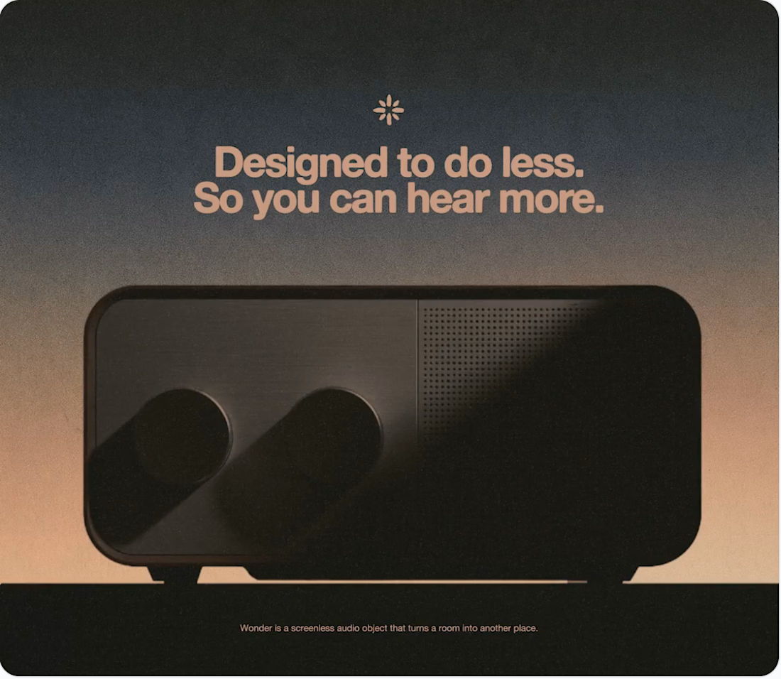
Restraint is so much harder to pull off than people think. What was the one element you fought hardest to keep out of this?

Super clean


so good


Fantastic work🔥👏👏

That line is great. Good design usually gets better when you can remove something without losing what matters.


Aesthetic at its peak 🙌 . Sam!

I like the conceptualisation

Wow. This looks really good. Exceptional work, man!

Amazing designs...👍

Great design and beautiful presentation.

Nice palette choice for the BG and type! 👌


Amazing work


Good design and look more feature


this colour combo 🤌


Nice work on this.


The color transition is making sense 👌


Amazing work Sam, love the color combo.


Loved the tagline

The network for creativity
Join 1.25M professional creatives like you
Connect with clients, get discovered, and run your business 100% commission-free
Creatives on Contra have earned over $150M and we are just getting started











Related posts




Clean and confident work! The green gradient with the mark feels very modern for fintech - trustworthy but not boring. The app screens look really polished. Curious how you landed on this mark, does it represent growth / movement?

Pulse Athletics... Branding & App design✨
Check it out
#app #sport #productdesign #uiuxdesign #uidesigner #uxdesigner #pulse #branding #brandidentity #brandstrategy #brandguidelines #logo #homepage


That's really stunning app design🔥🔥🔥
Great job Ziva🎉🎉🎉

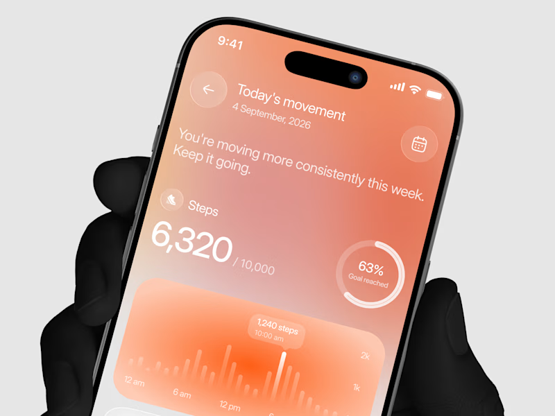
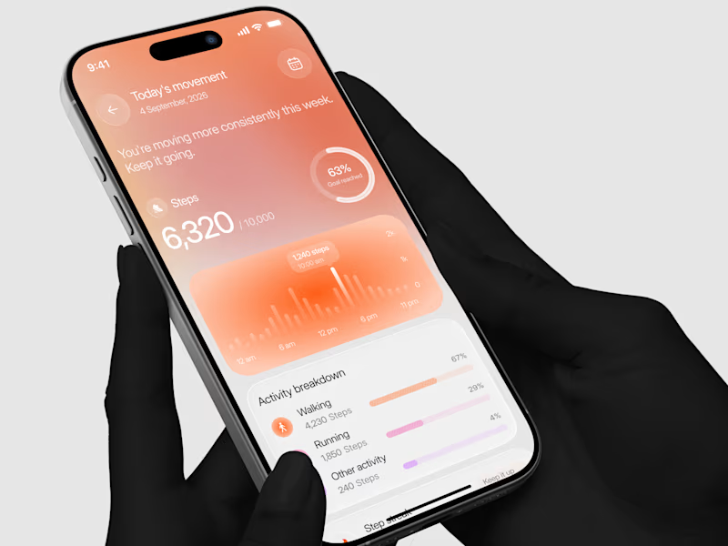
Designed a step tracking screen where you can see your daily progress and weekly trend in one glance.
Same screen, two shots. Which one would stop your scroll? 👀

11 voted
73%
4 voted
27%
15 votes
Closed


