The network for creativity
Join 1.25M professional creatives like you
Connect with clients, get discovered, and run your business 100% commission-free
Creatives on Contra have earned over $150M and we are just getting started
Back to feedPost
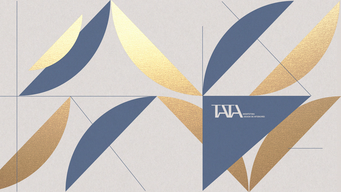
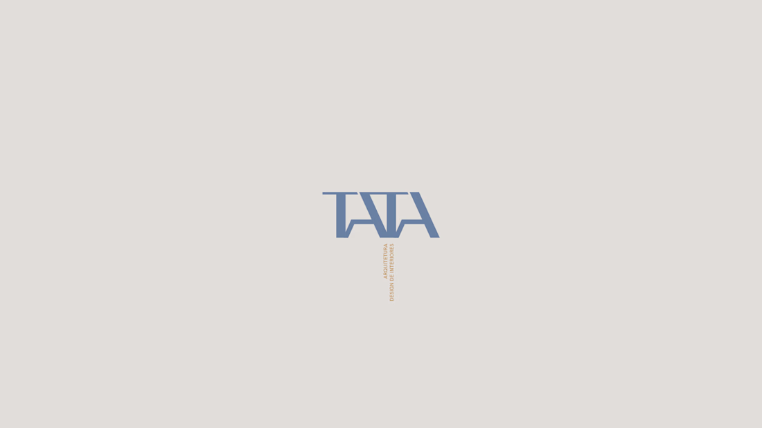
When creating the identity for TATA Arquitetura, my goal wasn't just to design a logo, it was to translate the way Tata creates spaces.
Her work blends modern art, boho influences, and natural materials into environments that feel personal, warm, and full of character. I wanted the brand to express that same feeling.
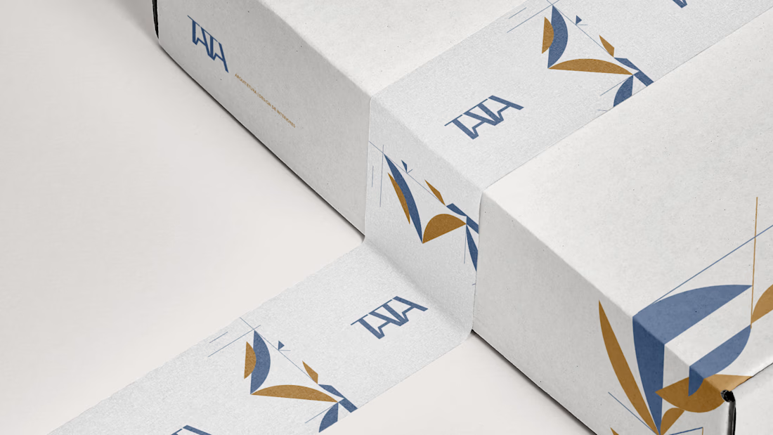
The visual system was built around modular shapes that connect, separate, and recombine, just like the objects, textures, and elements that come together to shape an interior. Every piece has its own role, but together they create something unique.
This project is a reminder that the strongest identities don't simply decorate a business, they reflect the way it thinks, creates, and connects with people.



Beautiful work Dhyogo! 💪

Lovely work!

Awesome


Beautiful!

Excellent Execution 🙌

Superb Design!

Thanks!

So Premium! 💯

Wow!
thanks!

Amazing

The best identities always have a strong narrative behind them, and this is a perfect example. Great work! 🔥

Thanks man!


The network for creativity
Join 1.25M professional creatives like you
Connect with clients, get discovered, and run your business 100% commission-free
Creatives on Contra have earned over $150M and we are just getting started

Challenges
View all


Related posts

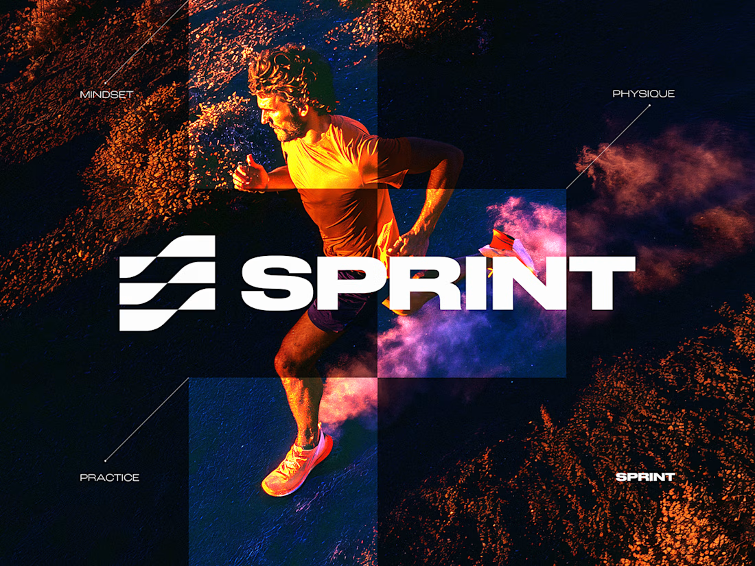
SPRINT — Experimental Brand Visual
A visual experiment built around an unused logo concept from a recent branding project.
The design was created manually, while exploring how AI-driven aesthetics are increasingly influencing contemporary visual language, even when AI itself isn’t part of the design process.
Logo design, art direction and visual exploration.



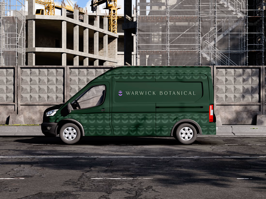
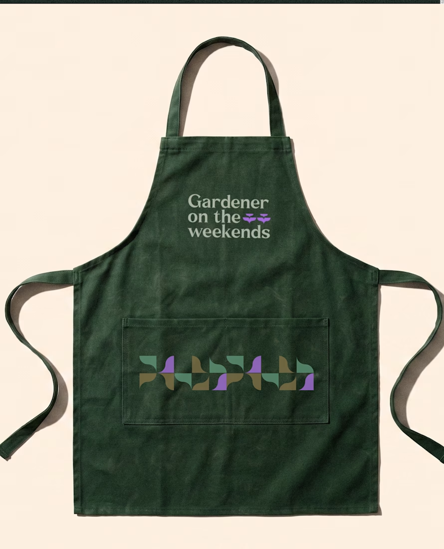
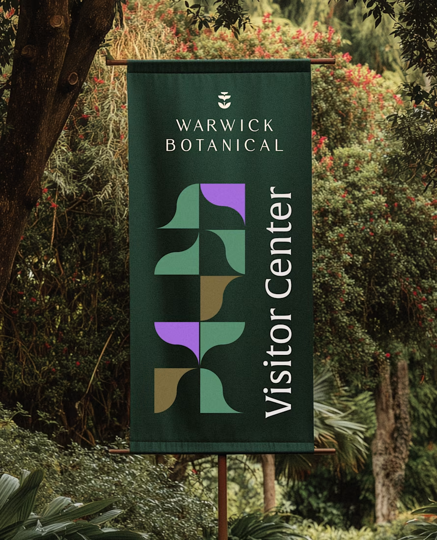
For brand identity, I like to show mockups to test of the identity system: the logo, pattern, and color palette all needed to work at a much larger scale without feeling overdesigned.
That’s where a flexible brand system really starts to prove itself.
Powerful greenish look 👌
A little preview of something I’m working on.
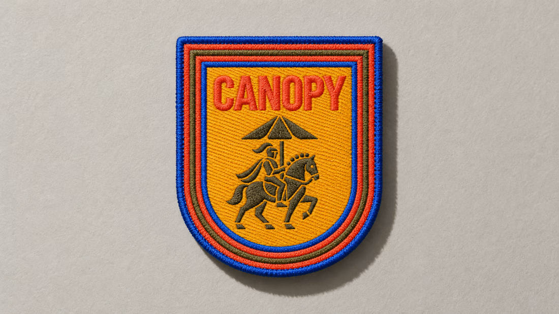
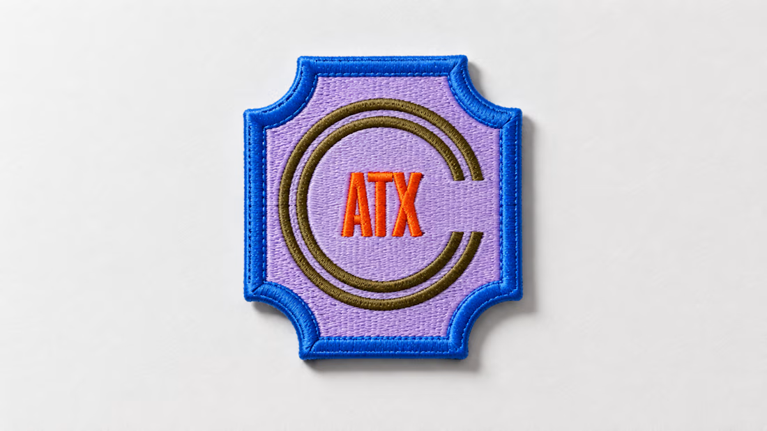
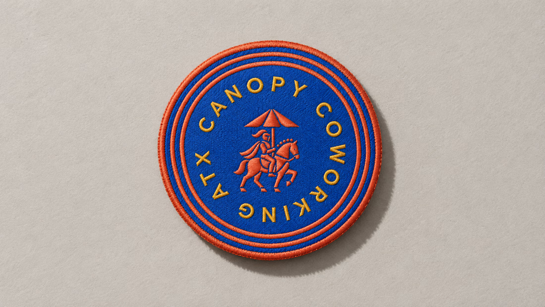
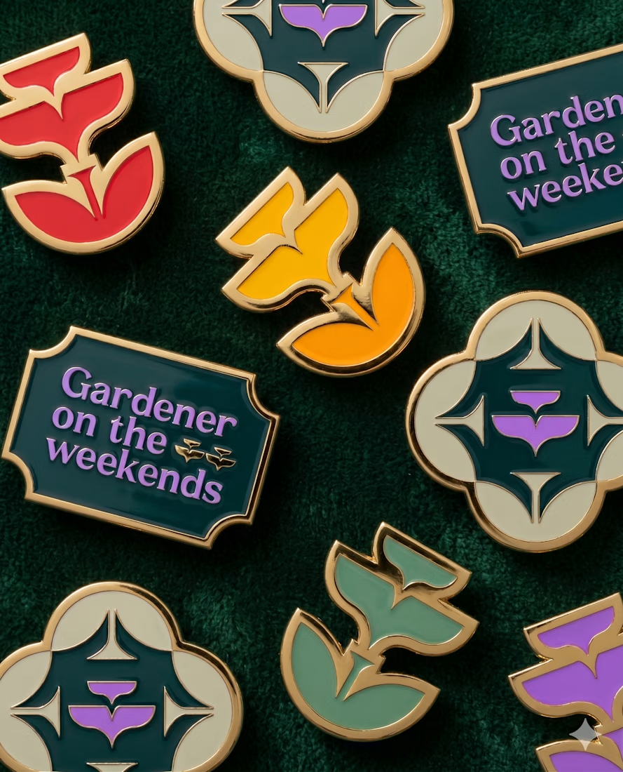
These embroidered patches are a small part of a much larger brand system, but details like this matter. The challenge is making sure the identity still feels distinct and intentional when it moves from screen to something physical you can hold in your hand.
That’s where a strong brand system starts begins to prove itself. More soon :)