The network for creativity
Join 1.25M professional creatives like you
Connect with clients, get discovered, and run your business 100% commission-free
Creatives on Contra have earned over $150M and we are just getting started
Back to feedPost

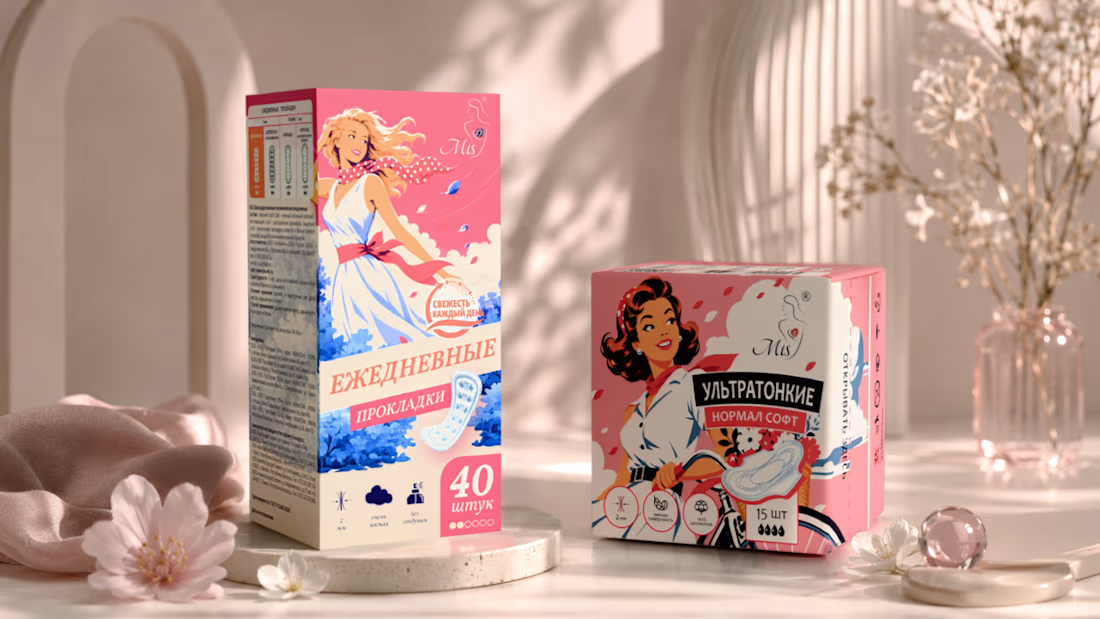
Retro Energy for Feminine Care Packaging
A bold packaging concept inspired by mid-century advertising illustration.
The MIS range combines expressive retro heroines, bright color accents and clear product hierarchy to create strong shelf impact across two formats: daily liners and ultrathin pads.
The network for creativity
Join 1.25M professional creatives like you
Connect with clients, get discovered, and run your business 100% commission-free
Creatives on Contra have earned over $150M and we are just getting started

Challenges
View all


Related posts

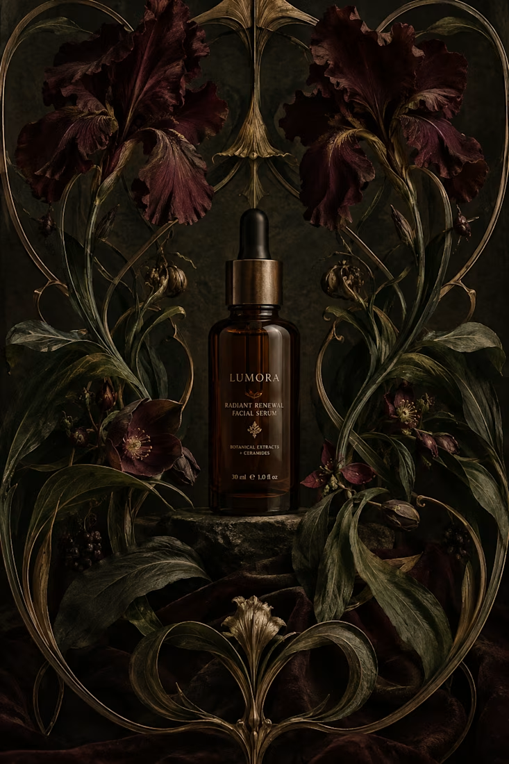
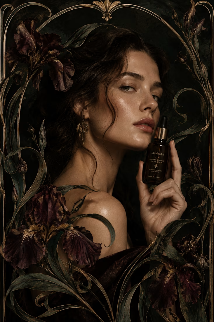
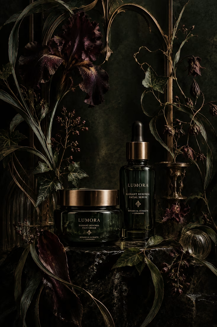
What would happen if a modern skincare product had to communicate without the visual language we associate with beauty today?
Instead, I went back to Art Nouveau, where typography, illustration, architecture, and ornament were treated as one visual system.
The subject actually felt surprisingly natural for the era. Art Nouveau was heavily inspired by nature, craftsmanship, beauty, and organic forms, all ideas that still show up constantly in skincare branding today.
One rule I refused to break: the decoration had to belong to the composition. It couldn't just be added on top to make something “look vintage.”
So... what modern product would you love to see reimagined in another design era? 👀


Reimagining modern skincare through Art Nouveau is such a refreshing take. Integrated ornamentation rather than surface-level decoration gives the packaging a deeply authentic, organic weight. Would love to see an electro functional tech brand reimagined in a Bauhaus or Brutalist framework!

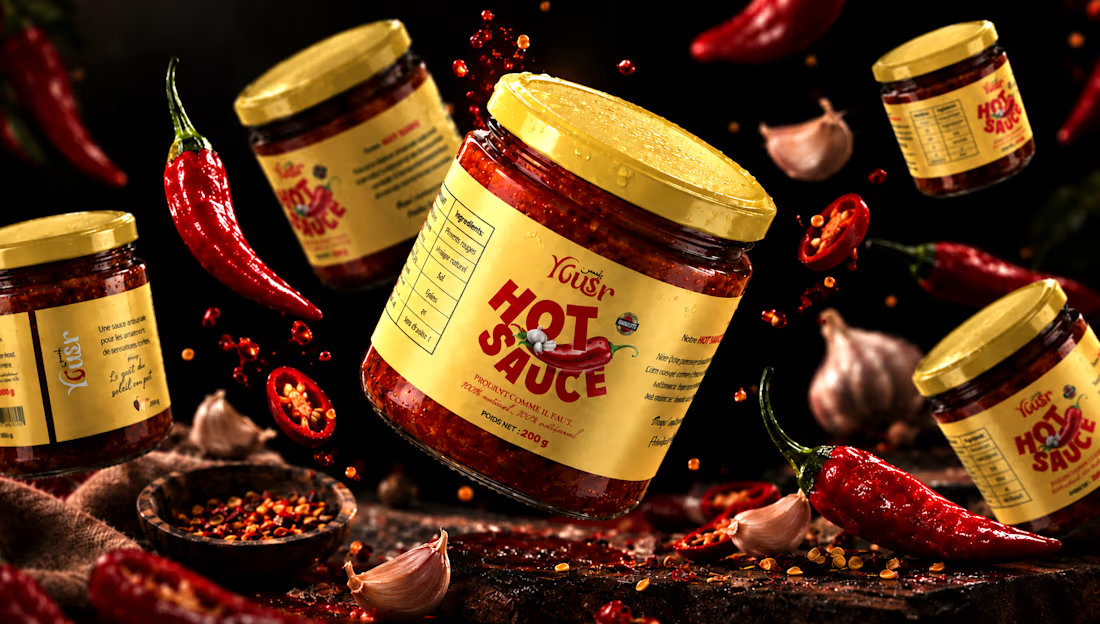
Yousr — Hot Sauce Brand Identity & Packaging Design
Turning bold flavor into a bold visual identity.
Yusr Hot Sauce is a food packaging project created to translate the intensity, heat, and character of the product into a striking visual experience.
The packaging combines a warm, distinctive color palette with bold typography and expressive graphic elements, creating an identity that immediately communicates the product's spicy and authentic character.
The visual direction was developed around the contrast between the rich red tones of the chili sauce and the warm cream of the label, creating a strong and recognizable presence across the product range.
From the label design to the final product presentation, every element was carefully considered to enhance the product's personality while maintaining clarity and brand consistency.
The final art direction brings the packaging to life through a dramatic food-focused environment, using rich textures, controlled lighting, and carefully composed ingredients to create an appetizing and memorable product experience.
A packaging identity designed to capture attention, communicate flavor, and give Yusr Hot Sauce a distinctive presence.
View the full project : https://www.behance.net/gallery/255675391/Yousr-Hot-Sauce-Brand-Identity-Packaging-Design
#PackagingDesign #FoodPackaging #HotSauce #LabelDesign #FoodBranding #ProductDesign #ArtDirection




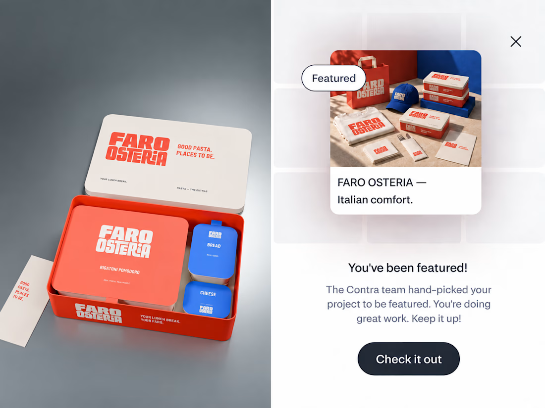
FARO OSTERIA just got featured on Contra! ✨
Really happy to see this one selected by the Contra team. I loved building the world around it, from the red pasta boxes and blue caps to the menu and street campaign.
Thank you, Contra, and everyone who has taken a look and supported the work.
Explore the project:
https://contra.com/community/eVKgBdEl-faro-osteria-italian-comfort-street
Independent concept. Creative direction, branding, packaging and AI assisted imagery by Mauricio Pontual / MP House Studio.


The red-and-blue packaging system feels wonderfully confident, and the tiny “featured” moment makes the presentation feel like part of the brand world. Great balance of restaurant warmth and editorial polish.