The network for creativity
Join 1.25M professional creatives like you
Connect with clients, get discovered, and run your business 100% commission-free
Creatives on Contra have earned over $150M and we are just getting started
Back to feedPost

Live Preview: https://consilia.framer.website/

consilia.framer.website
Consilia — Operational clarity, engineered systems
Consilia helps travel and hospitality teams turn fragmented tools into systems people trust.

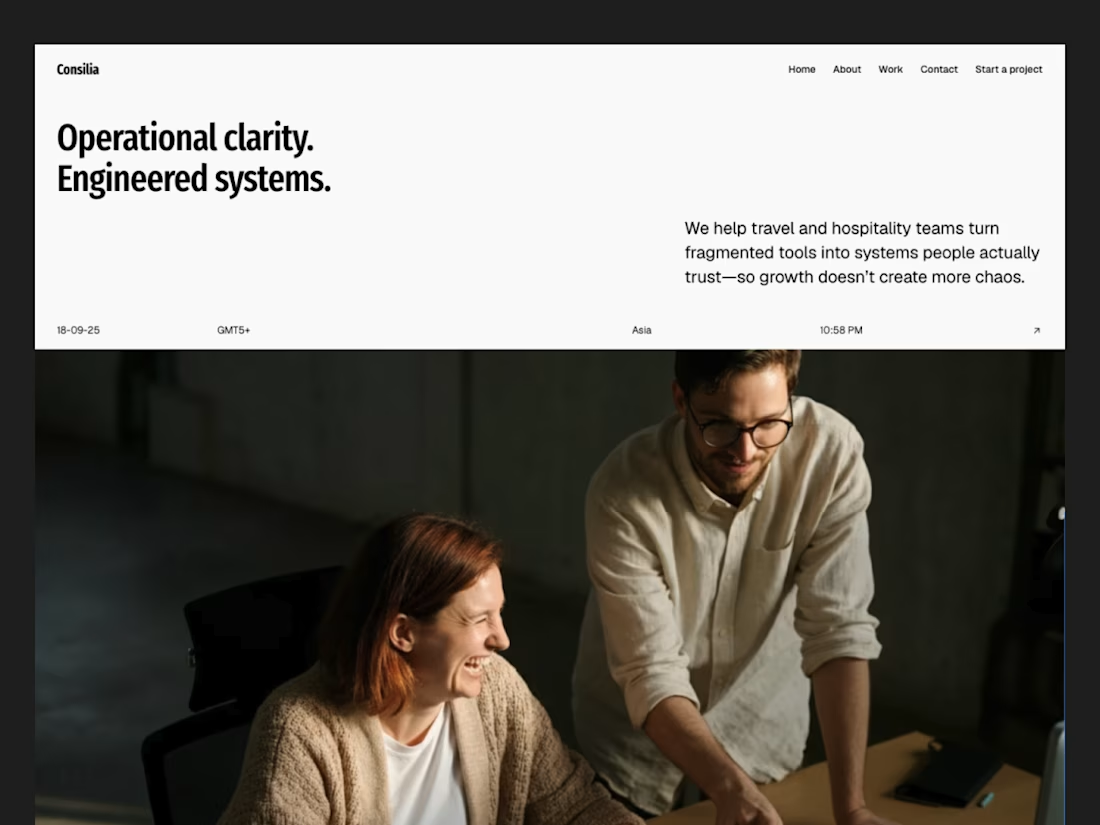
🚀 Consilia · Consultancies Framer Template
Live Preview: https://consilia.framer.website/
The network for creativity
Join 1.25M professional creatives like you
Connect with clients, get discovered, and run your business 100% commission-free
Creatives on Contra have earned over $150M and we are just getting started

Challenges
View all


Related posts

New site, fresh launch ✦
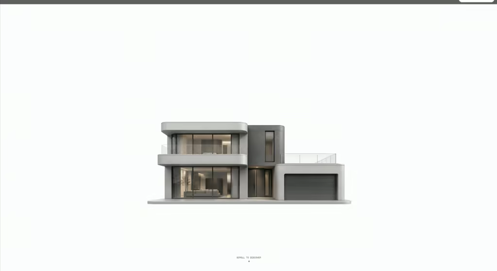
Designed and built LANDWISE — a tokenized real estate platform focused on making fractional property investing feel more accessible, transparent, and global.
For the hero, I wanted the interaction itself to communicate what the product is about.
Hovering over the building reveals property price tags — subtly suggesting that each building represents a tokenized real estate opportunity.
The goal was to make the concept understandable through the visual experience, without having to explain everything upfront.

Creative thinking

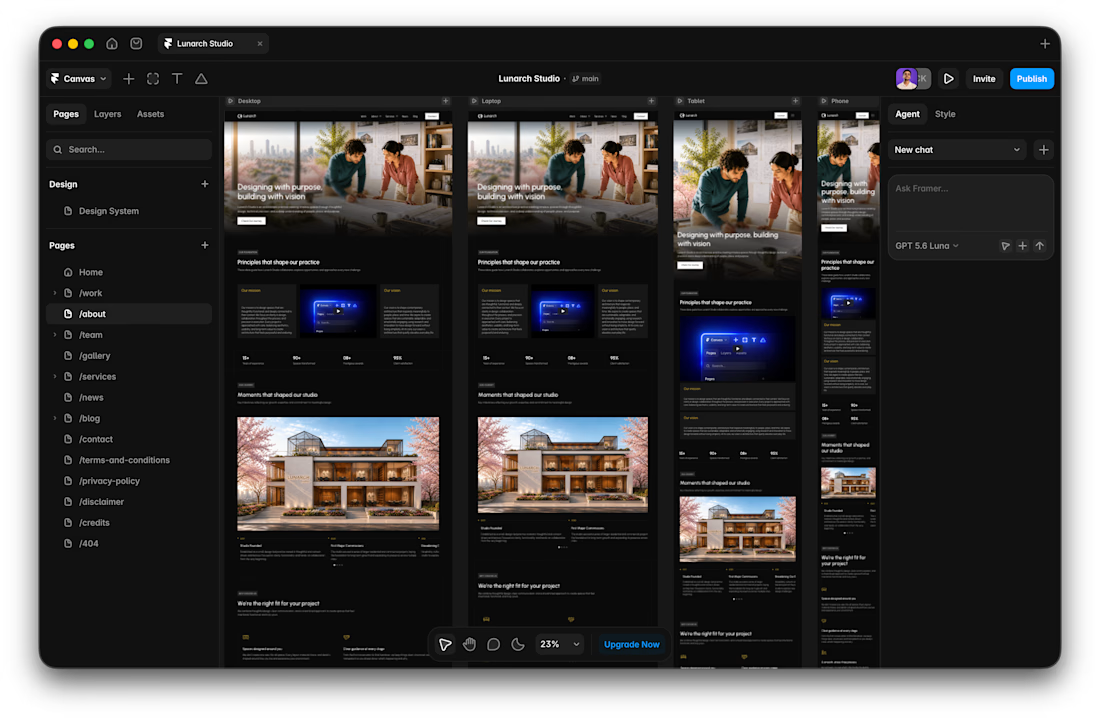
I usually don't stop at 3 breakpoints when building a website.
Most people think about: Mobile, Tablet, Laptop
I like adding one more: Desktop
Because what looks great at 1440px can feel completely different at 1920px...
- The layout gets too wide.
- Spacing starts feeling off.
- Content loses its balance.
So I like testing the system across: Mobile → Tablet → Laptop → Desktop
Not because every website needs exactly 4 breakpoints. But because responsive design isn't about making a few screen sizes work.
It's about making the whole system work.
Follow Rushabh for more website fundamentals, experiments, and things I learn while building for the web.



A calm interface doesn't have to feel static.
With RISE, the interactions are deliberately restrained.
A subtle hover gives just enough feedback to make the interface feel responsive, without breaking the slower, more considered visual language.
No big effect.
Just a small response at the right moment.

Restraint like this is way harder to pull off than a flashy effect, most sites can't resist doing too much. Was there an interaction you built and then cut because it felt like it was showing off?