The network for creativity
Join 1.25M professional creatives like you
Connect with clients, get discovered, and run your business 100% commission-free
Creatives on Contra have earned over $150M and we are just getting started
Back to feedPost


The network for creativity
Join 1.25M professional creatives like you
Connect with clients, get discovered, and run your business 100% commission-free
Creatives on Contra have earned over $150M and we are just getting started
Challenges
View all


Related posts

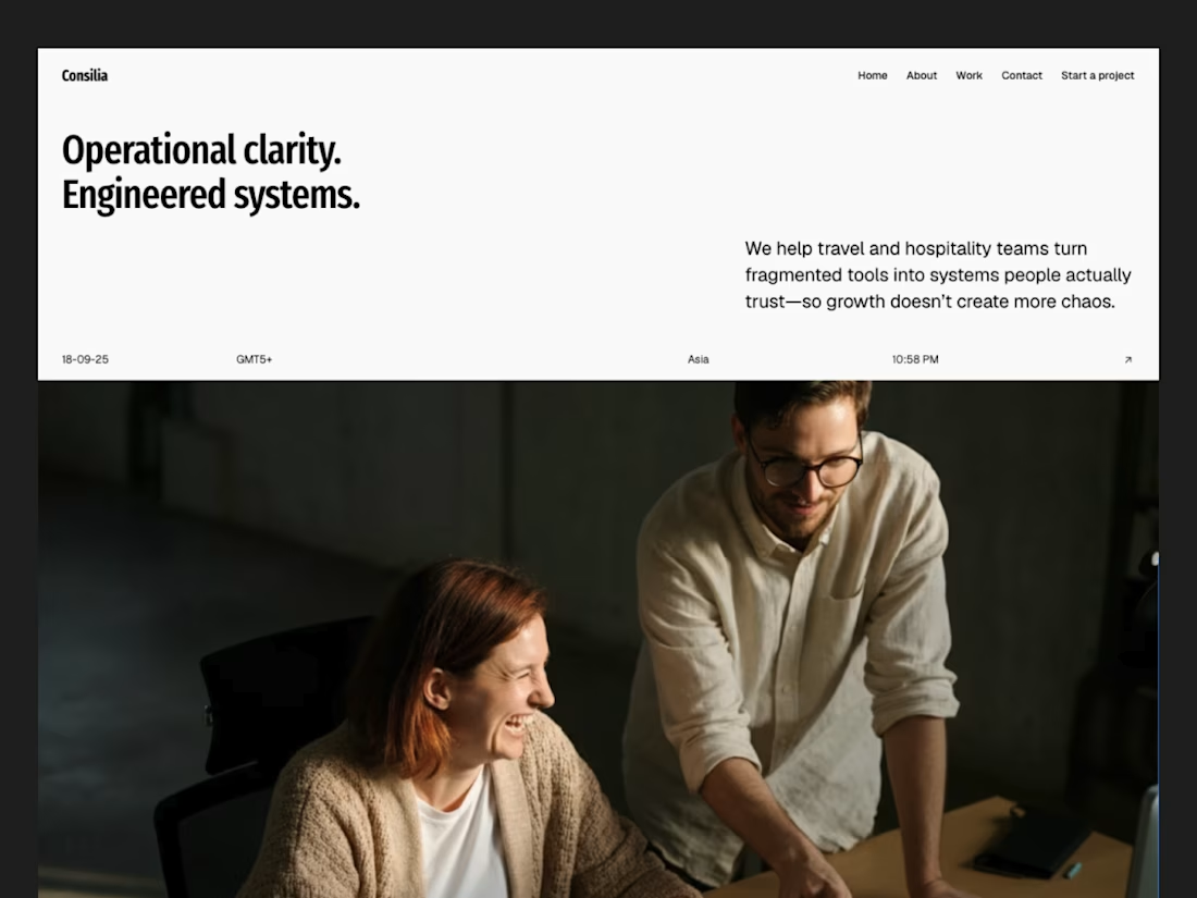
New Framer website is live now!!
Feel it here: https://realestatebeta.framer.ai/

It grabs my attention....Specially I love the header most!


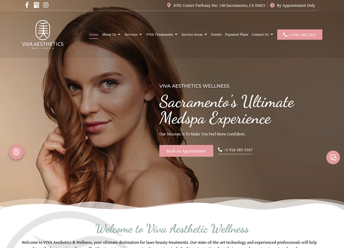
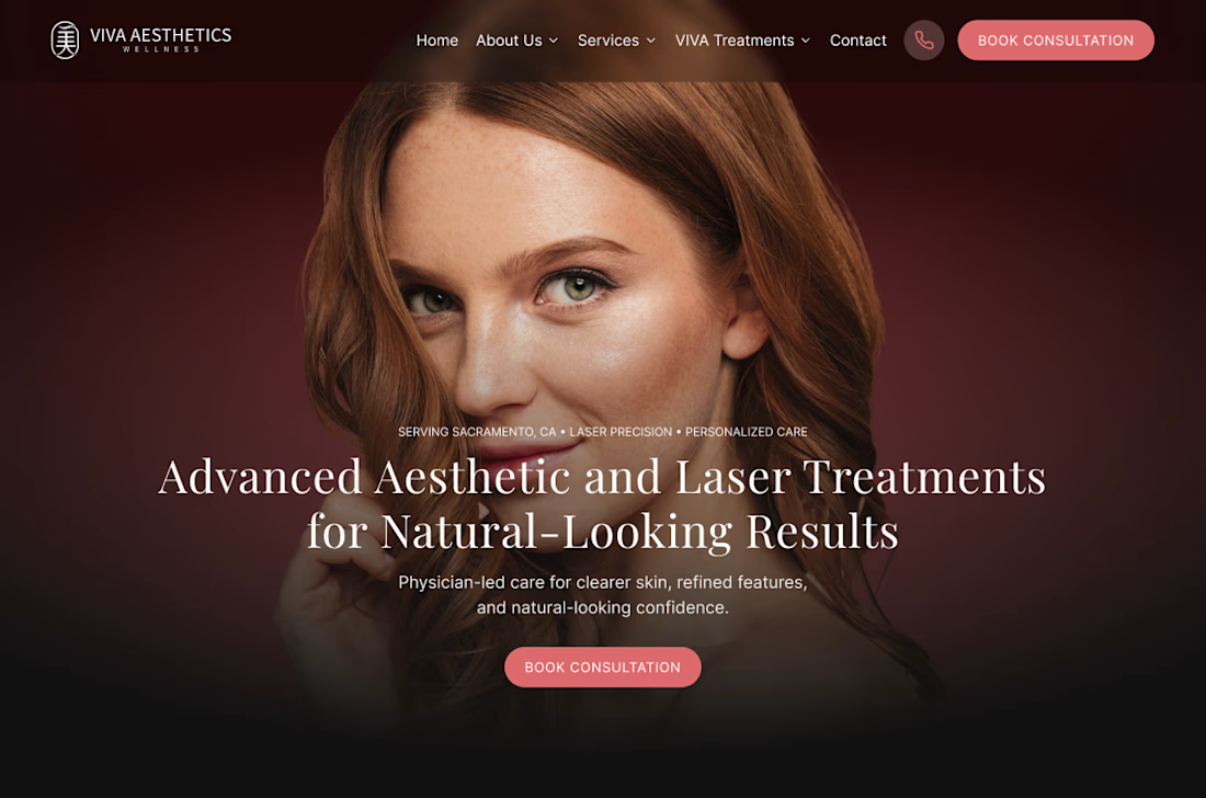
Viva Aesthetics Wellness — WordPress to Framer
A Sacramento medspa with real credentials, running on a site that asked too much of the person using it. Eight items in the navigation, treatments buried a few clicks down, and booking left to a phone number.
We moved them to Framer — not for the platform, but for what it let us do: rebuild the page structure instead of restyling it.
Eight nav items down to five. A hero that names the treatments and the physician-led care rather than promising an experience. Boulevard integrated as the booking platform, so there's one short, consistent path from landing on a page to holding an appointment. Sacramento named as the service area instead of spreading the menu thin.
The migration itself was the unglamorous half — a from/to redirect table built line by line before cutover so nothing already ranking got lost.
Full case study coming soon.




A recent client project I built in Framer ✨
→ Scroll-speed parallax
→ Text effects built with Framer Agent
→ Custom autoplay video sliders
Putting it all together has been the fun part.
Which detail caught your eye? ↓

Scroll-speed parallax is the one that caught my eye, it's a small detail but it makes the whole scroll feel intentional instead of just decorative. Did that come together quickly in Framer or was it more trial and error to nail the timing?