The network for creativity
Join 1.25M professional creatives like you
Connect with clients, get discovered, and run your business 100% commission-free
Creatives on Contra have earned over $150M and we are just getting started
Back to feedPost
A client asked me last week: “Why is there still a balance sitting in prepaid? I already paid all of it.”
Fair question. Honestly, it’s one of the most common things business owners get confused about.
Here’s how I explained it. When you pay your trade licence for the year, that money has left your bank. But you haven’t used the whole year yet. So the unused part isn’t an expense yet. It’s something you’ve paid for and still own, like a credit waiting to be used.
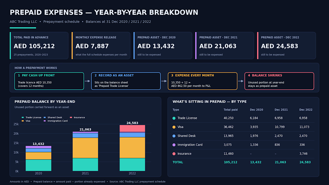
Say you pay 10,350 for a 12 month licence. Each month, 862.50 moves into expenses. Whatever hasn’t been used by 31 December stays on the balance sheet as prepaid.
The client still wasn’t fully getting it from the schedule alone, so I broke it down year by year. 2020, 2021, 2022. Same prepayments, just showing how much was used and how much was still left at each year end.
That’s when it clicked for them.
The visa, shared desk, insurance and licence costs all work the same way. Pay now, use over time, expense a little each month.
If your accountant keeps saying “prepaid” and you nod along, ask them to show you a schedule like this. It’s your money, you should be able to see where it is.
This is part of my contra series, where I explain accounting without the jargon.
#accounting #prepaidexpenses #smallbusiness #UAE


Great explanation! Breaking prepayments down year by year makes it much easier for business owners to understand how their money is accounted for and why balances remain on the balance sheet.

Thank you! 😊 Exactly, once you break it down year by year, the numbers make much more sense and business owners can see where their money is actually going.
The network for creativity
Join 1.25M professional creatives like you
Connect with clients, get discovered, and run your business 100% commission-free
Creatives on Contra have earned over $150M and we are just getting started





Related posts

How do you make a construction brand feel consistent from a business card to a building site?
Brixon’s identity brings angular lettering, an assembled geometric symbol, and a lime, black, and white palette together.
I carried those elements into stationery, brand guidelines, team identification, social graphics, and site signage, then brought the system into motion with Adobe After Effects.
The connecting decision: keep the geometry and layout structure consistent while the logo details, messages, and application previews change within the animated panels.
My contribution covered brand design, graphic design, and motion design.
What draws your attention first: the wordmark, the lime palette, or the rotating symbol?
See the full Brixon case study. If you’re shaping a construction or development brand, I’m available for brand identity and motion projects.

Incomparable work!


Niceee

A migration is not complete when the pages have moved. It is complete when the customer journey still makes sense.
For DVA, the work brought a Wix website, two lead funnels, a client portal, and segmented nurture automations into a clearer Kajabi experience.
Five checks I use before launch:
Map every public page and redirect.
Rebuild forms, tags, and follow-up paths.
Test offers and product access with a real user journey.
Check mobile pages and portal navigation.
Document what the client will manage after handoff.
#Kajabi #PlatformMigration #CourseCreator


two funnels, a portal, and nurture in one move. thats a lot of moving parts


