The network for creativity
Join 1.25M professional creatives like you
Connect with clients, get discovered, and run your business 100% commission-free
Creatives on Contra have earned over $150M and we are just getting started
Back to feedPost
Taste Test

Which one is your favorite?
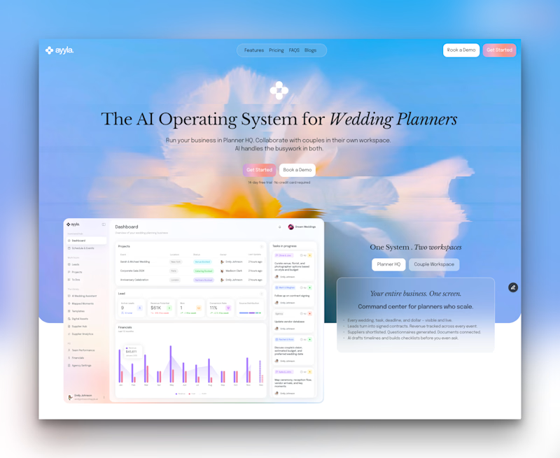
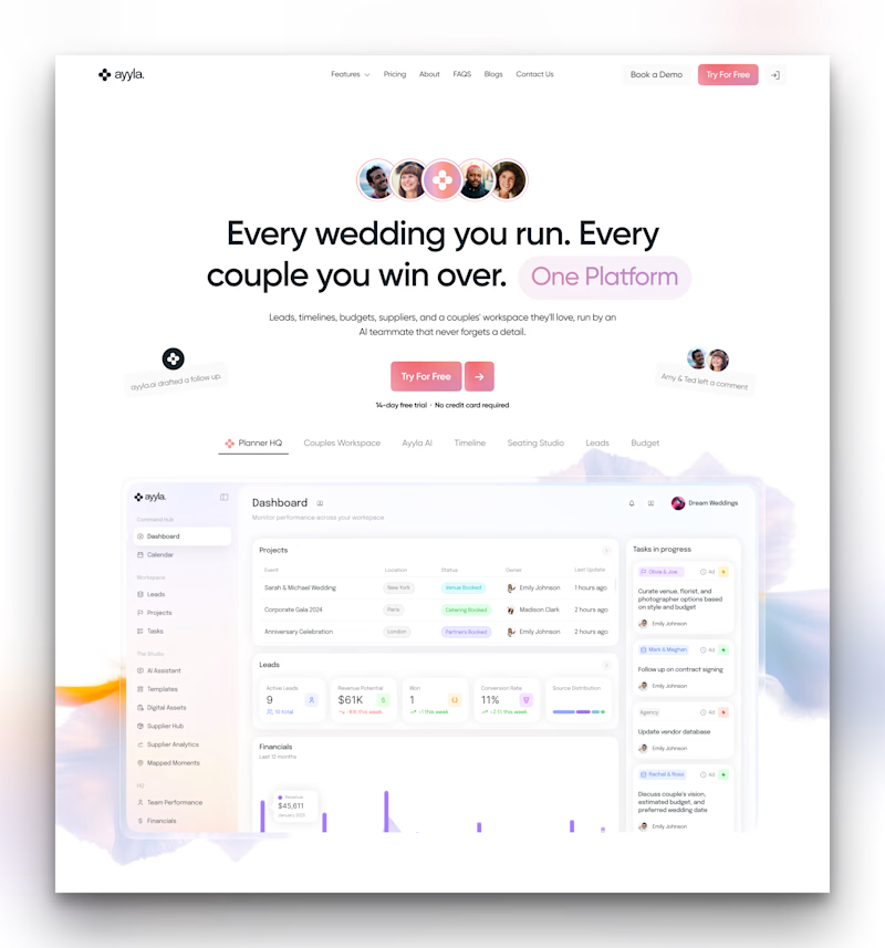
Old vs New same product, completely different energy.
Left: The original Ayyla hero
Right: The redesign we're working on
The new one keeps the same soul but brings in stronger hierarchy, better use of motion, and a hero that actually shows the product in context.
Which direction would you choose? 👇

24 voted
30%
56 voted
70%
80 votes
Closed

Thanks man

Voted Redesign, the softer palette and real product screenshot in context sell trust faster than the sunset hero does.
appreciate the feedback! Showing the actual product in use definitely feels more grounded than the sunset hero


Giving the hero section actual product focus and tighter hierarchy changes everything! Keeping the original brand soul while elevating the motion energy makes the redesign feel miles ahead
Thanks Abdul! Really appreciate you noticing the balance between preserving the original brand soul and elevating the hierarchy... :)


New one for sure. Stronger hierarchy and product focus make a huge difference.
Appreciate it, Kabir! Glad the improved hierarchy and product focus resonated with you.

Redesign highlights the actual platform better!
Thanks Celia! Exactly.. showing the actual product in action makes a world of difference

I vote for old one because i like the hero background 😊
Appreciate the feedback, Jihan! Hard to beat that original hero background's feel

Redesign looks much cleaner - Great work 😊
Thanks Leena! Glad to hear you like the cleaner look.


Well done !
Thanks Sahil! Really appreciate the support.

The redesign for me. Showing the actual product in the hero is the real upgrade here, since the original leaned on background mood and made the viewer guess what Ayyla does. Just watch that the stronger motion stays subtle enough not to compete with that clearer hierarchy.
Spot on feedback, Asif! That is a great point about keeping the motion subtle so it does not distract from the hierarchy. Will definitely keep an eye on that.

somehow the old design feels uniquely structured and creative, while new design feels usual as most of the SaaS are this way
Fair point, Daxesh. Finding that sweet spot between standing out and being instantly clear as a SaaS product is tricky. Appreciate the fresh perspective!

Redesign looks great
Thanks🙌 ! Glad you like how it turned out.

Redesign, good work 👍
Thanks Koonj! Really appreciate the support and glad you like the new look

Old one for me
Appreciate the feedback, Hassan! Is there a specific element from the old version you miss most?
honestly, the blue shade is what makes it look more cleaner and natural to me atleast, the new one is nice in its own way but old one seems unique
Totally agree, i miss that bg as well :)

I think the redesign
Thanks Prince! Would love to hear what stands out to you most about the new version


💯
😊

the choose the redesign. tho i also like the old one but if i would take myself as a client or potential user. i would be more attracted with the redesign version
Thank so much mate for the valuable feedback

I very much prefer the redesign. The colors are used much better there. In the Old design, the contrast between the blue taking over half the screen and the white below just doesn't match as well for me. The redesign feels much cleaner!
Appreciate the feedback! Fixing that drastic screen split and balancing the color flow across the page made a huge difference in making it feel seamless. Thanks for pointing that out!

The new one wins on hierarchy and product storytelling, especially with the motion. But I wouldn't dismiss the old hero, it has a more commanding hero presence; It grabs attention immediately. For me it feels like a trade-off between clarity and impact
Appreciate the thoughtful breakdown, Josephat! Balancing the immediate visual punch of the original hero with the clarity and storytelling of the redesign is definitely the fine line we're trying to walk

It's not even a competition, even if we don't focus on ux, cta etc just the colors, fonts, and UI make a huge upgrade.
Thanks, Talha! Glad to hear the updated color palette, typography, and general UI polish landed so well with you


Redesign
Thanks for checking it out and dropping a vote, Shehzad! Appreciate the support.
Thanks Mate😊

People can gravitate towards visuals and colors, but stating the actual value proposition is what makes a design work, great highlighting that main text nicely put, straight to the point.
Thanks! That was a huge priority for this pass.. getting the core value proposition front and center so visitors instantly understand what Ayyla does without guessing.

Outstanding work, I really like it! 🔥
Thanks so much! Really appreciate the kind words and support!

One of the best designs I’ve seen today. Really solid work 👏 The redesign gives the hero section so much more product focus and clarity.
Thank you so much! I’m really glad the added product focus and clarity landed well with you.
I’ll be dropping a full case study soon once the site is live! In the meantime, feel free to explore my other work on my profile as well.

I like the old one

Absolutly love ittt
Thanks

Love the changes for the new one man, you know your stuff! 🔥
Thanks so much, Tan! Means a lot coming from you. 🙌
The network for creativity
Join 1.25M professional creatives like you
Connect with clients, get discovered, and run your business 100% commission-free
Creatives on Contra have earned over $150M and we are just getting started

Challenges
View all


Related posts

Which cover gets your vote? 👀
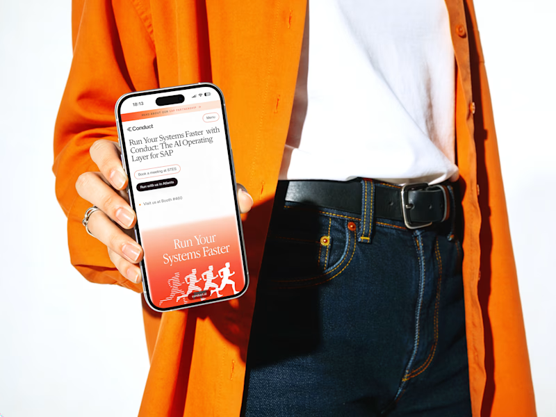
I’m finally sharing this case study and I’m stuck between these two.
1 or 2? Which one would you click first? 👇
14 voted
34%
27 voted
66%
41 votes
Closed


Experimenting with my components to create something special for you :)
A: Hero section created using Dither Engine
B: Pricing section created using Halftone Engine
Which one would you pick? 👀
👇 A or B ?
2 voted
67%
1 voted
33%
3 votes
Closed

Going with B on this. The halftone texture on the pricing section gives it personality without distracting from the conversion goal. Dither on the hero is cool but feels like it competes with the headline.

Client’s choice vs. Designer’s choice 👀
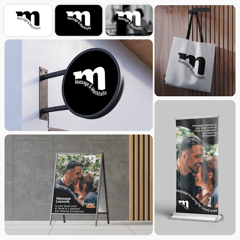
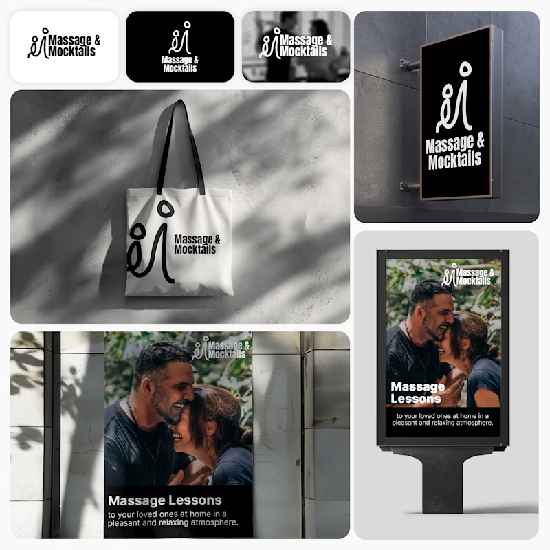
I’m currently working on a branding project for Massage & Mocktails — a concept built around couples learning massage together in a relaxed, social atmosphere.
These are two early, black & white directions from Stage 2 of my branding process, before moving into color, typography, and the full visual system.
The interesting part?
My client chose Concept 1. I chose Concept 2.
Now I’m curious what other creatives think.
Which direction would you choose — 1 or 2? And why?
Sometimes the most interesting part of branding is seeing how differently a client and a designer respond to the same brief.
21 voted
44%
27 voted
56%
48 votes
Closed
Concept 2 for me. That interlocking figure mark reads as two people meeting, which is the actual brief here, so it gives you more to build a system on. Concept 1 is the safer, more literal pick, which is usually why clients reach for it.