The network for creativity
Join 1.25M professional creatives like you
Connect with clients, get discovered, and run your business 100% commission-free
Creatives on Contra have earned over $150M and we are just getting started
Back to feedPost
Taste Test

Experimenting with my components to create something special for you :)
A: Hero section created using Dither Engine
B: Pricing section created using Halftone Engine
Which one would you pick? 👀
👇 A or B ?

2 voted
67%
1 voted
33%
3 votes
Closed

The contrast between the two engines makes the component system feel tangible—B has a really strong pricing rhythm.
Thanks, glad B stood out to you 🤝

Solid choice bro!

There is no comparsion at all! They both look great but I just think the halftone on pricing is a bit distracting, while the ditcher engine is muchc clearer, everything looks balanced and no element competes for attention. Great work 🙌
Liked your insights, thanks Leena :)

Going with B on this. The halftone texture on the pricing section gives it personality without distracting from the conversion goal. Dither on the hero is cool but feels like it competes with the headline.
Really liked your take on this bro!🤝


Looks great !
Thanks a lot Sahil🤝
The network for creativity
Join 1.25M professional creatives like you
Connect with clients, get discovered, and run your business 100% commission-free
Creatives on Contra have earned over $150M and we are just getting started



Related posts


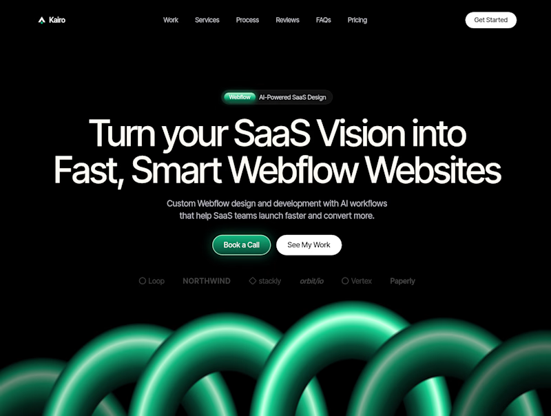
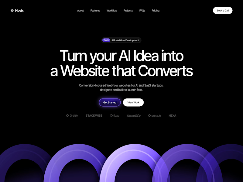

Both look great, but Violet & Black gets my vote! The purple accents give it a more modern, premium feel while keeping the design clean and focused on conversions. Amazing how a color change can create such a different brand personality. Have you tested which version performs better with visitors?

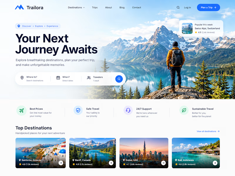
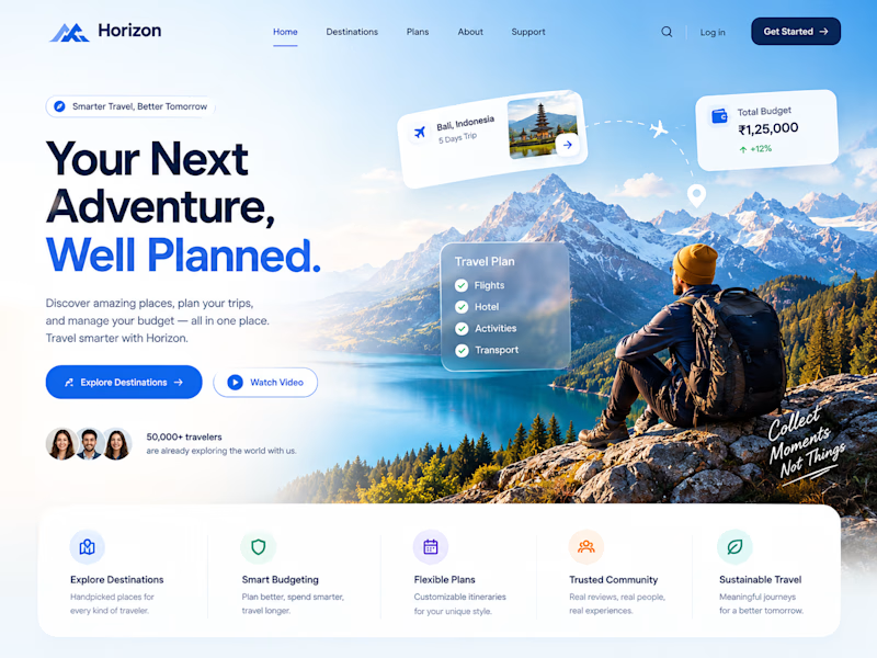
Two designs. One idea. Two different ways to experience travel. ✈️
What if planning your next trip felt less like managing a checklist and more like discovering a story waiting to unfold?
Trailora makes discovery feel effortless, while Horizon turns travel planning into a smarter, more structured experience.
Same industry. Different design directions.
Which direction would you choose: the freedom to explore or the confidence of a well-planned journey?
25 voted
71%
10 voted
29%
35 votes
Closed

Both are lovely! The second one feels more like an adventure, which fits travel well.

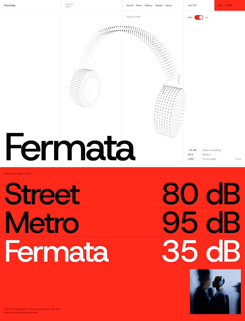
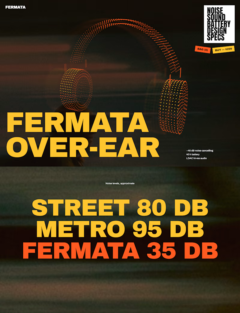
🎧 FERMATA — new over-ear headphones, coming soon.
A — Swiss poster: red, light blue, white and black. Clean grid, one grotesk typeface, product as a stipple 3D model.
B — Night edition: black, yellow and orange. Heavy condensed type, motion-blurred city photography, sticker details.
Both will have a scroll-driven 3D headphone (particles) as the hero.

56 voted
79%
15 voted
21%
71 votes
Closed


The Red Color Scheme looks nice