The network for creativity
Join 1.25M professional creatives like you
Connect with clients, get discovered, and run your business 100% commission-free
Creatives on Contra have earned over $150M and we are just getting started
Back to feedPost


New case study: Lintel sales dashboard
https://contra.com/p/vvqkvROm-lintel-sales-pipeline-dashboard-for-a-b2-b-saa-s?r=rh_design


The pipeline stage breakdown showing dollar amounts per stage instead of just a count is a smart touch, most dashboards stop at the count. Did Claude help scaffold that data structure, or was this purely a Figma exercise?

Great job man, love your take on the graph! 🎉

the pipeline stage bar with quoted/ordered/action required broken out is exactly what a sales lead actually scans for first. nice that you didn't bury it below the fold under generic KPI cards.

Stacking value-entering against value-won on one chart instead of two separate widgets is what actually answers the question managers ask — most dashboards make you mentally subtract two numbers from different cards to find that same gap.
The network for creativity
Join 1.25M professional creatives like you
Connect with clients, get discovered, and run your business 100% commission-free
Creatives on Contra have earned over $150M and we are just getting started







Related posts

After a long time finally
New case study: Conduct AI 🖥️
Designed and built in Framer.
Take a look 👇


Love the clean layout.


Clean work !

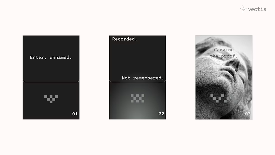
Just shipped VECTIS — a privacy protocol brand that treats your data like a medieval statue.
Not hidden. Not redacted. Carved permanently, with the name worn off centuries ago.
3 colors. 2 dither rules that never cross.
Full case study is live.