The network for creativity
Join 1.25M professional creatives like you
Connect with clients, get discovered, and run your business 100% commission-free
Creatives on Contra have earned over $150M and we are just getting started
Back to feedPost
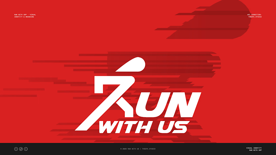
The R is a runner. That was the whole brief, really.
New case study: Run With Us — a visual identity for a running community built on pace, people and the discipline of showing up.
The mark is a runner mid-stride that doubles as the R in RUN. One uninterrupted gesture, drawn entirely from 45° strokes and a single arc. Because the symbol IS the first letter, the lockup never has to choose between icon and wordmark — it's both.
Under the surface, the system is strict:
→ One base unit (X = the cap height of "UN"). The symbol is exactly 3X tall, WITH US is ½X, clear space is X on every side.
→ Three colours doing all the work: Race Red, Carbon, Chalk White. No gradients, no second accent.
→ A monospaced labelling layer that reads like a race bib, a split time, a start list.
Then we put it where runners actually live: an embroidered cap, a metal pin, a race-day lanyard, a watch face showing pace, a hangar screen for the crew's first campaign line — "Every distance. One crew."


the R doubling as a runner is smart. was the 45 degree rule there from the start?

No, the rule was introduced to show running aspect of design

A runner mid-stride doubling as the R is such a clever lockup, Bilal. The strict grid behind it, with the 3X symbol height and clear-space rules, is proper identity craft. Every distance. One crew. is a great campaign line too.
The network for creativity
Join 1.25M professional creatives like you
Connect with clients, get discovered, and run your business 100% commission-free
Creatives on Contra have earned over $150M and we are just getting started







Related posts


Okaaaayy, new profile picture and a new project! 🥳
This is one i'm really proud of and shows the development in our studio. Not just a brand or a website, but 120+ app screens + full IOS development for Mercury 🌍
I'm super proud of this project! Please check it out :)) 👇


Huge congrats Chris! 🎉 120+ screens + full IOS dev for Mercury is massive! Love the growth of your studio - from brand to full product. The editorial typography card looks premium. Big inspiration for us building in the app space! Checking it out now 👏

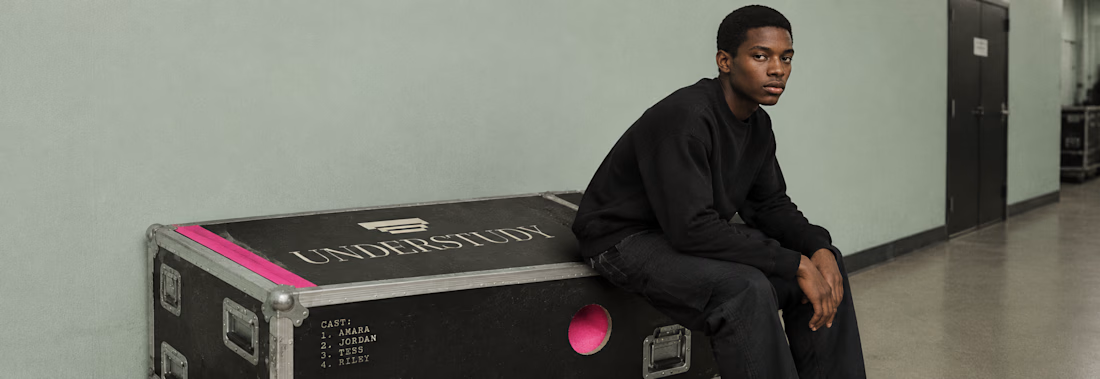
What happens when a brand’s best idea is a hole?
UNDERSTUDY is a theatre identity that opens circles onto doubled eyes, black voids and displaced cheeks, in hot pink Didone on pale sage, with the cast list as texture.
One cut, applied everywhere. Case study live Now.

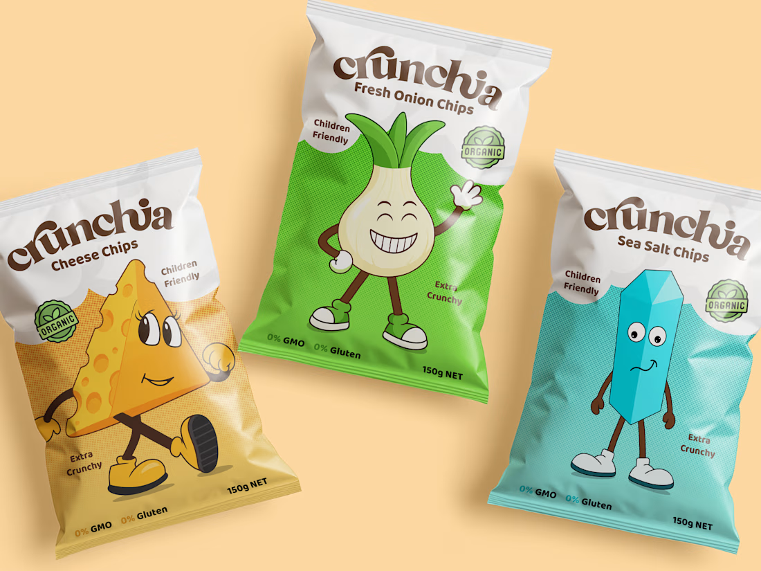
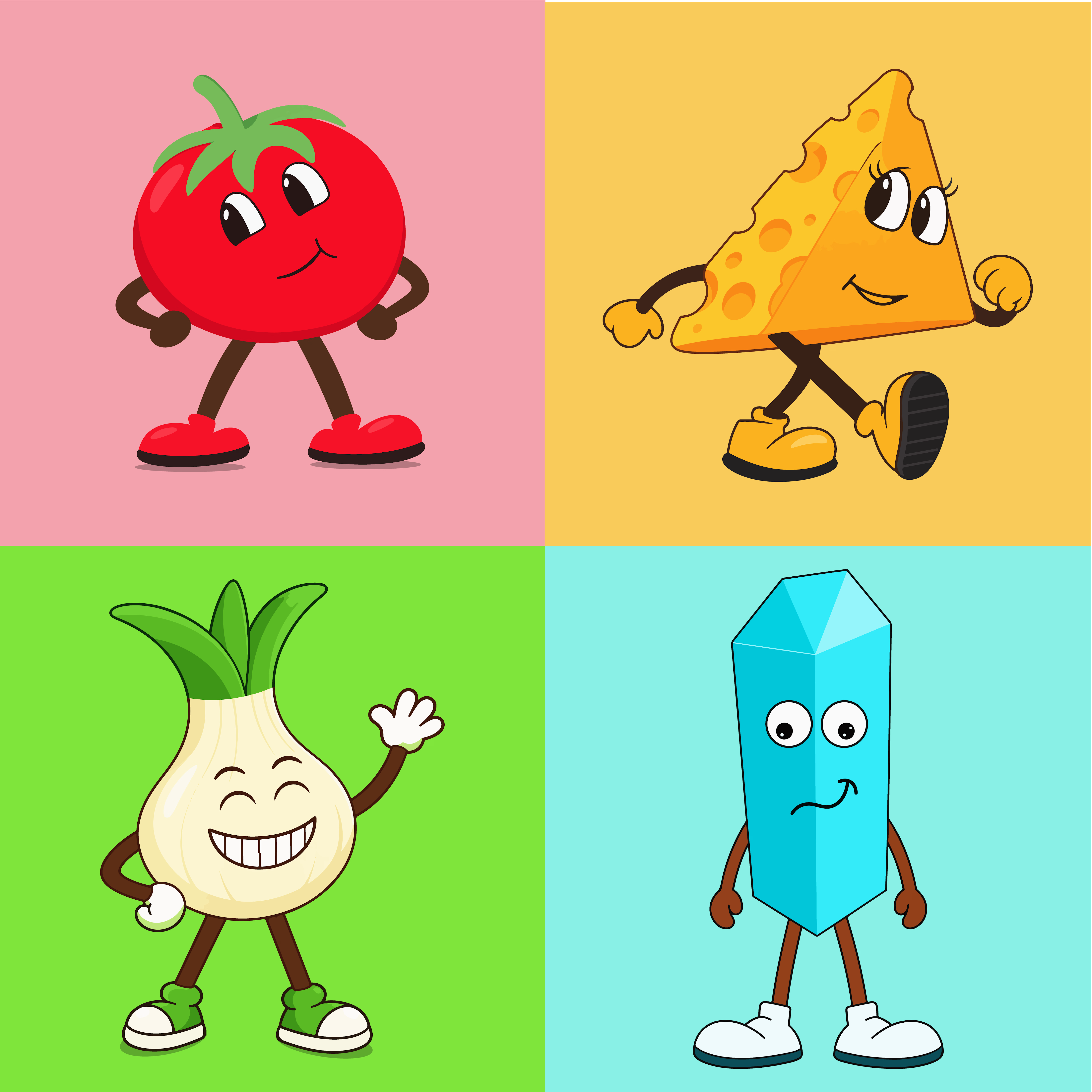
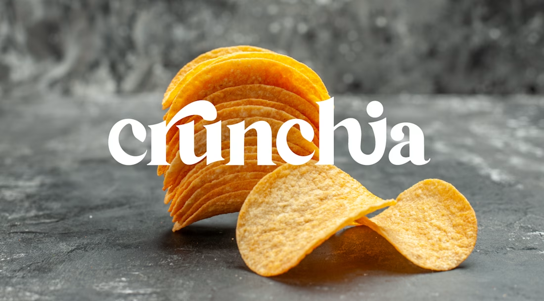
Crunchia – Brand Identity & Packaging Design
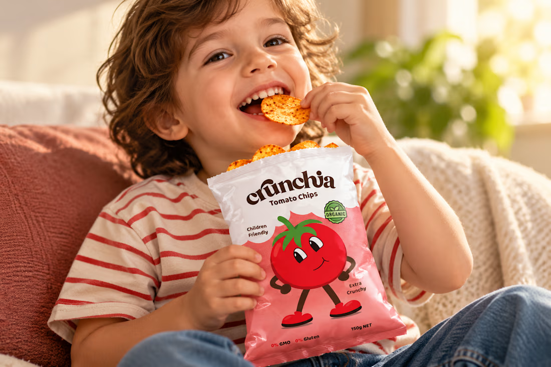
Developed a playful and eye-catching brand identity and packaging design for Crunchia, a tomato chips brand aimed at children and families. The project included a custom logo, vibrant packaging design, and a friendly tomato mascot to create a memorable and recognizable brand.
I also created realistic product mockups and lifestyle visuals to showcase the packaging and present the product in an engaging, market-ready way.