The network for creativity
Join 1.25M professional creatives like you
Connect with clients, get discovered, and run your business 100% commission-free
Creatives on Contra have earned over $150M and we are just getting started
Back to feedPost
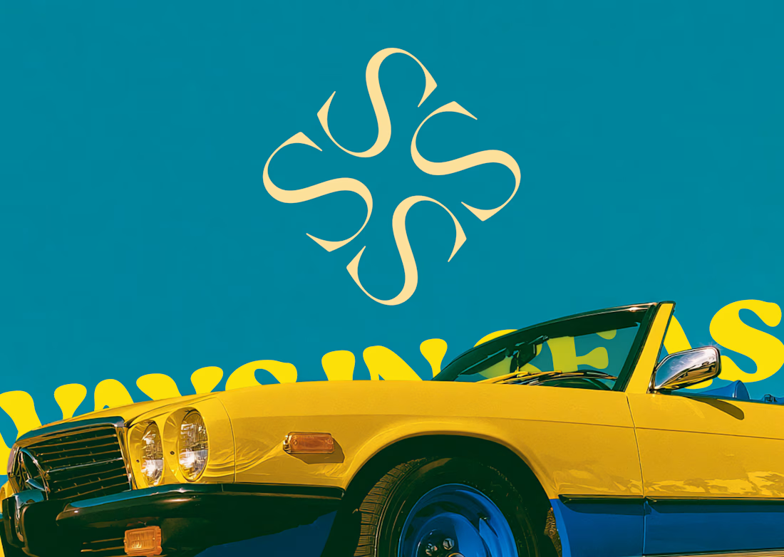
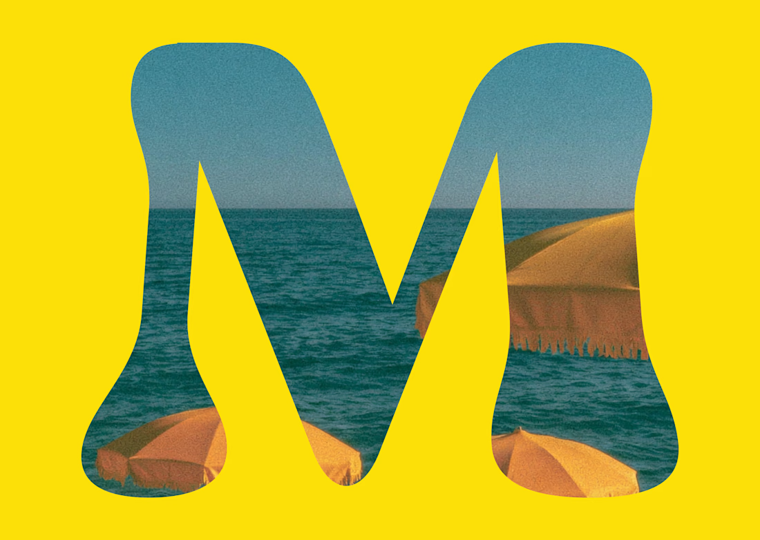
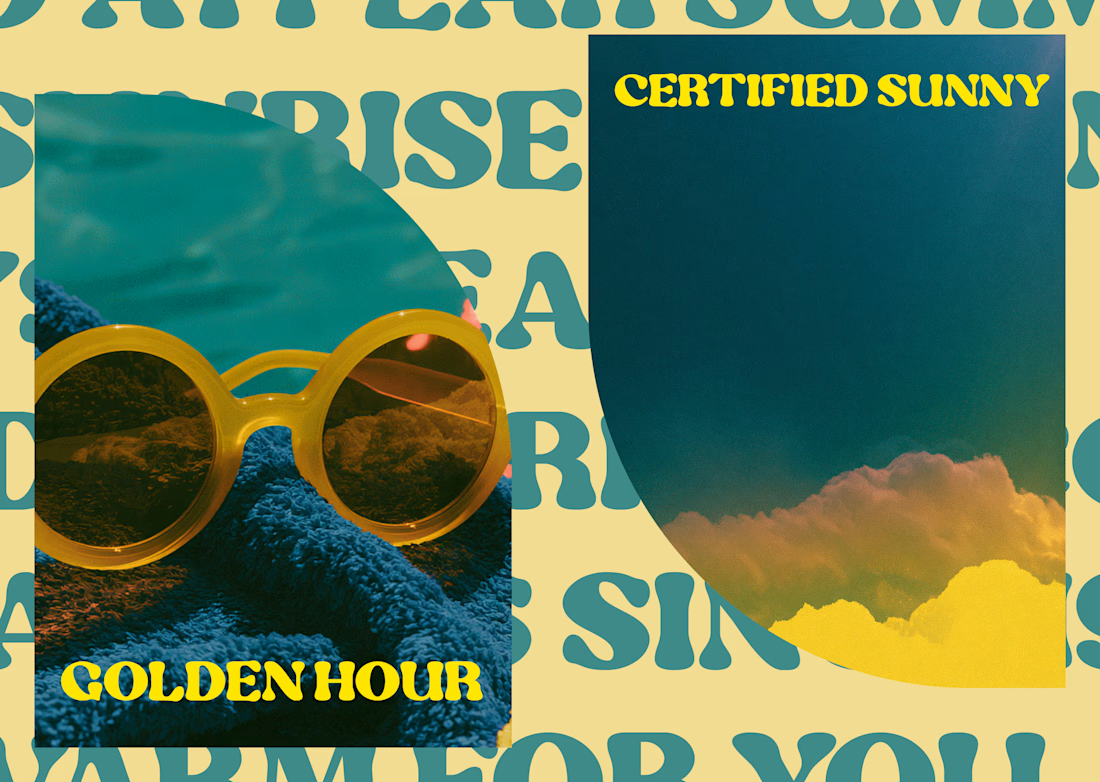
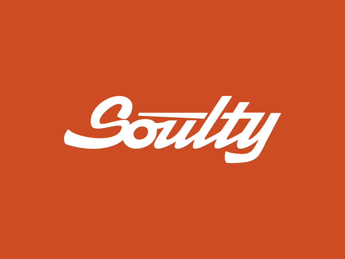
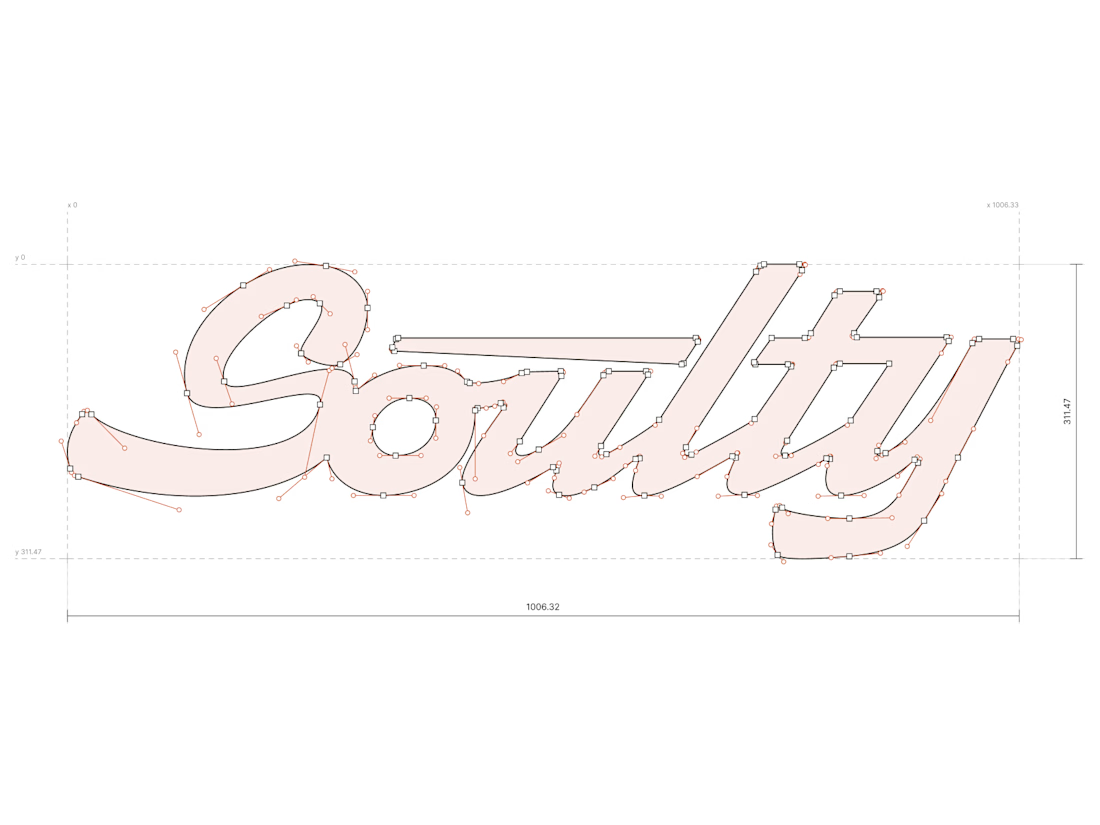
Designing logotypes is one of the things I enjoy most about my job and one of the most rewarding.
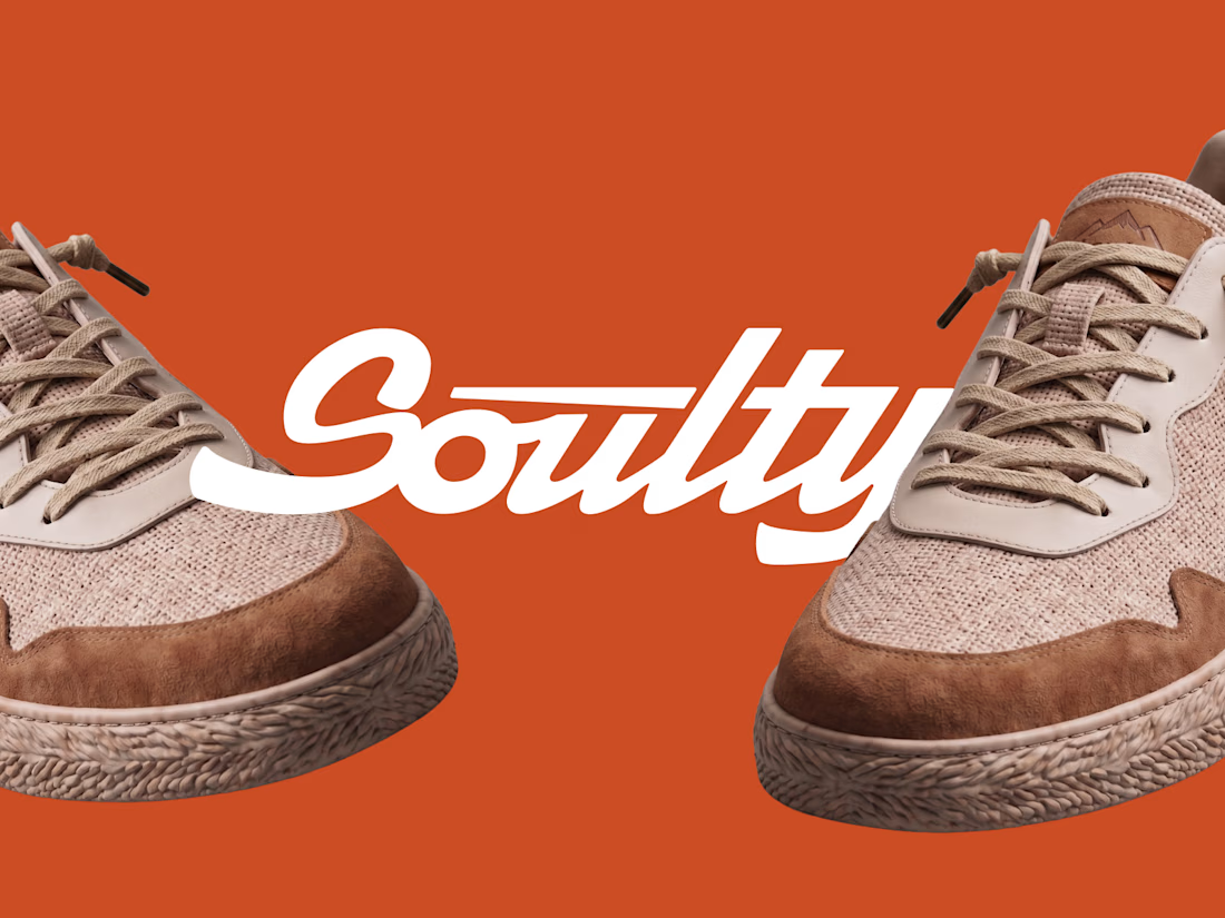
This direction wasn't chosen by Soulty, a new Italian summer footwear brand.
We moved on to another proposal that worked better for them, and I agree with that choice.
But I still really like the work done here.

Premium logo🔥

thank you man
welcome, mate! 🔥

Thank you


Even if it wasn’t the final direction, I can see why you still like it. There’s something really nice about the simplicity of this one.
Thanks a lot Kabir

Yes, exactly. The direction the client eventually chose was the right one.

Super cool! Do you start by sketching lettering by hand or go directly to vector?
Thank you Anita. I always start with the drawing. Then I vectorize it, do some print tests, make a few more changes on paper, and finally bring everything back to the computer. I work partly on paper and partly on the computer.


shame this one didn't make it
Yes, that's a shame, but it was the right thing to do

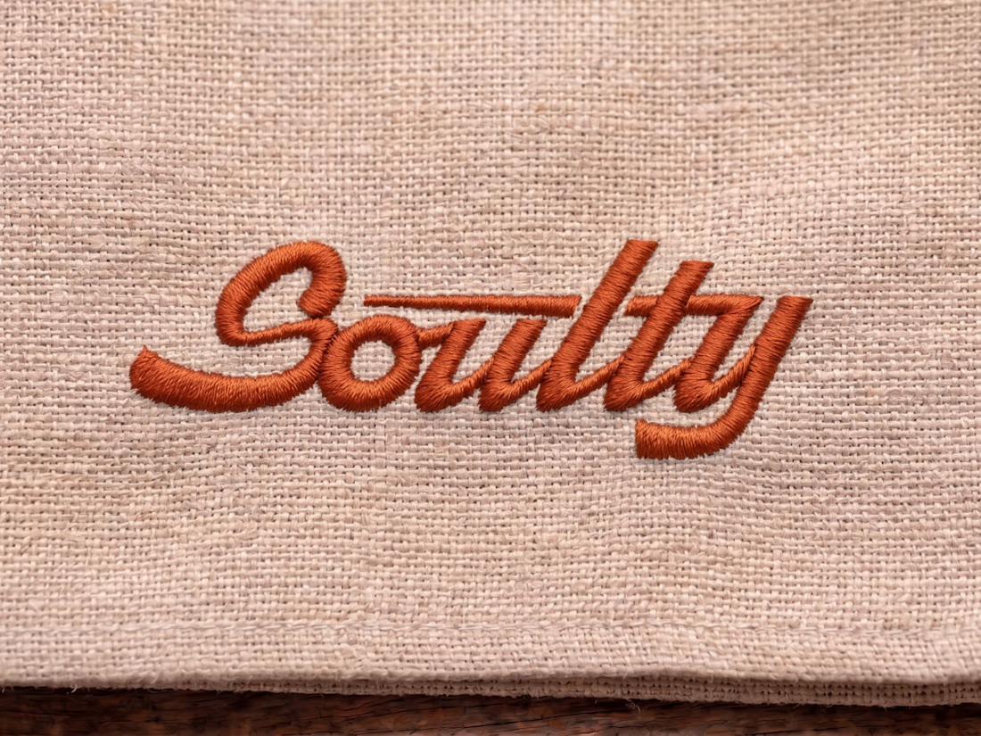
brilliant, that embroidered logo looks so realistic!
Glad you liked it. Thank you Nicolette

Like how you implemented a slight tilt to it to resemble movement. Nice work.
thanks Mario 😃

Rejected doesn't mean wrong — this still slaps. Great instinct on the type here.
thanx 🙏🏻

High-quality work, very inspiring!
thanks Abdul


Even unselected concepts show true craftsmanship! The personality and balance in this logotype are top notch
thank you so much Abdul

Fantastic logo! 🤝

The flow in that script "S" and the embroidered texture on the last one are both really nice. Rejected concepts you still believe in are always the hardest to let go of. What ended up winning the client over in the direction they actually picked?

So creative 👏
The network for creativity
Join 1.25M professional creatives like you
Connect with clients, get discovered, and run your business 100% commission-free
Creatives on Contra have earned over $150M and we are just getting started
Challenges
View all


Related posts


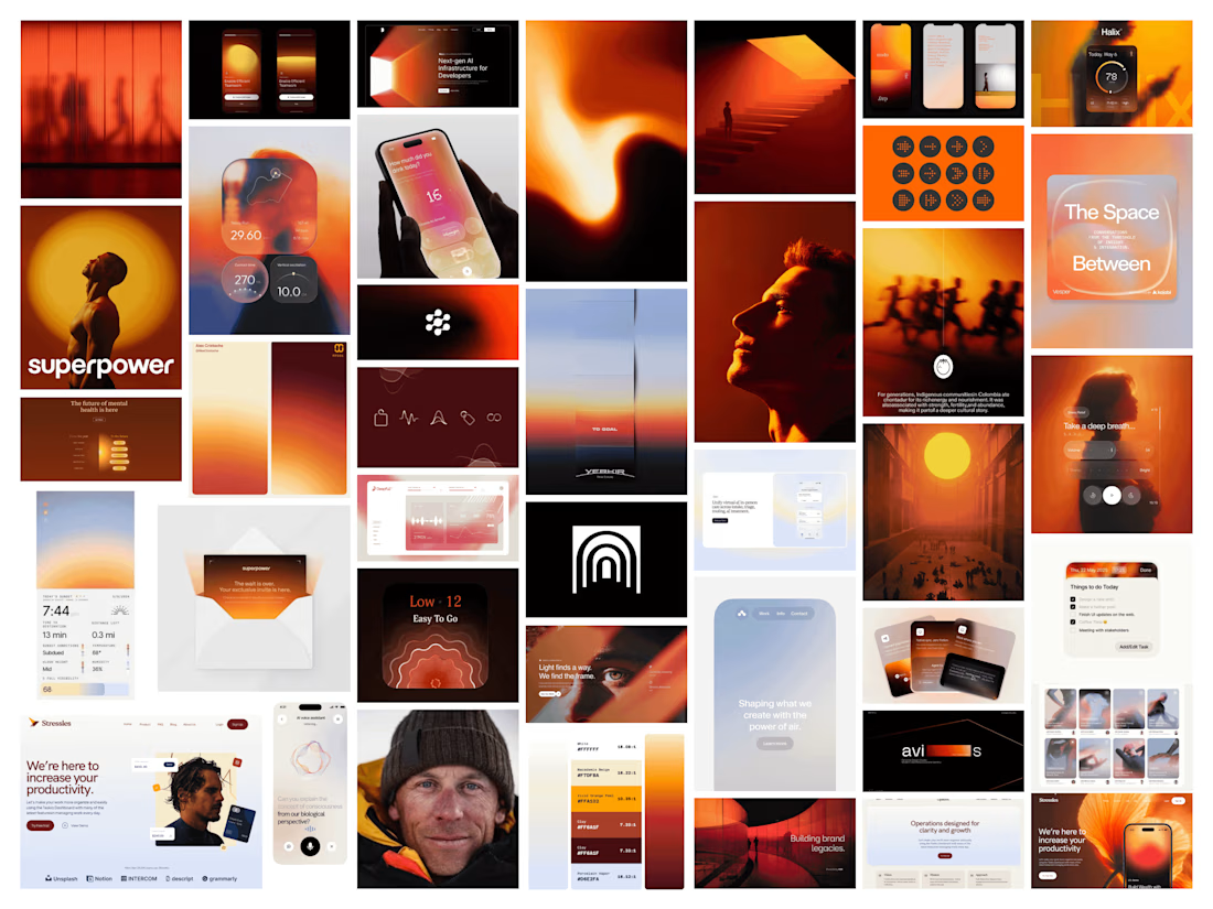

This looks great


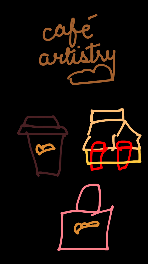
I gave ChatGPT the worst café branding brief imaginable.
Just a bunch of rough sketches and a very loose idea.
Then I asked it to turn the whole thing into a real-life café brand.
And somehow, in under 30 seconds, it managed to keep the little details I liked while turning them into something that actually felt cohesive.
Now I’m wondering how far you can push a terrible brief before it stops being terrible.


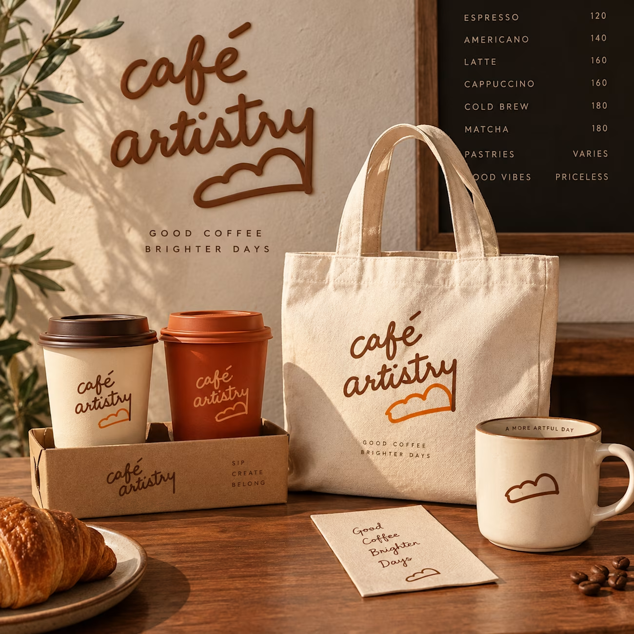

The jump from loose sketches to a cohesive café world is so satisfying—those little cup and bag marks carry through beautifully. I especially like how the roughness survived the polish instead of getting flattened.


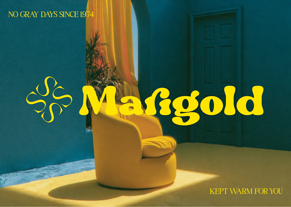
Marigold is a one day concept for envato's human by design challenge. i set the direction in real photography first then generated against that standard.