The network for creativity
Join 1.25M professional creatives like you
Connect with clients, get discovered, and run your business 100% commission-free
Creatives on Contra have earned over $150M and we are just getting started
Back to feedPost
Puresip — a fresh identity taking shape.
Built around one idea: make a fruit brand feel refreshing, natural and full of personality without falling into the usual “healthy juice” look.
From Spain, direct to you.
A little preview of the identity and digital direction before the full case study.

Impressive work man

Thanks hasan
You are most welcome David

The four bright juice cards against that muted net texture really pop. Avoids the usual healthy juice look, as you said.
Thanks rafee


Giving each flavor its own saturated color card makes the range so easy to scan, and the kiwi photo behind the green one is a fun touch 🥝
Exactly

Super clean work!
The network for creativity
Join 1.25M professional creatives like you
Connect with clients, get discovered, and run your business 100% commission-free
Creatives on Contra have earned over $150M and we are just getting started





Related posts

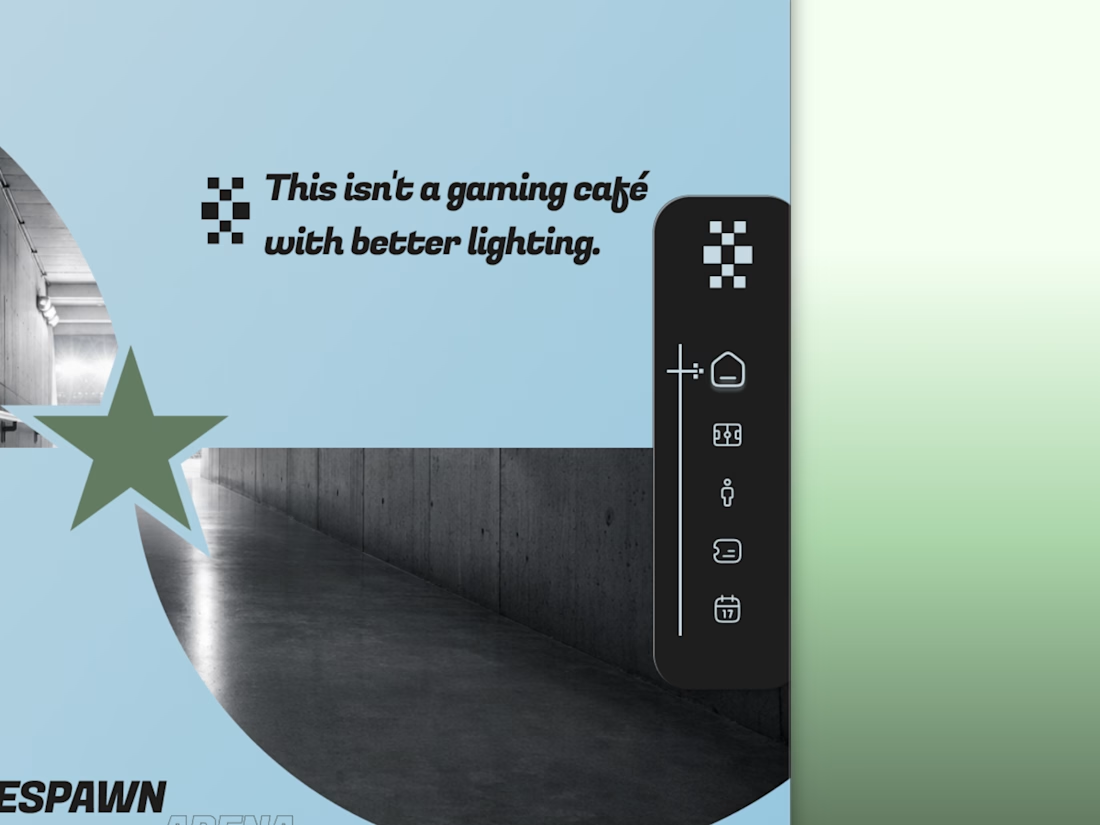
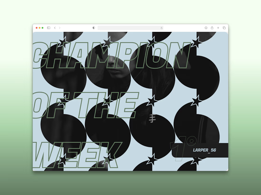
Every esports brand reaches for neon and a mascot.
RESPAWN ARENA reaches for a scoreboard.
Case study on the stadium-grade identity — typography, system, the whole build — dropping soon.

I think this could be my favorite Framer code component I’ve created. Meet Page Transition Studio, you can add animated transitions between pages across 10 styles. My favorites are vertical strips and centre split. What’s yours? Check the live preview here


Good work, like the interaction
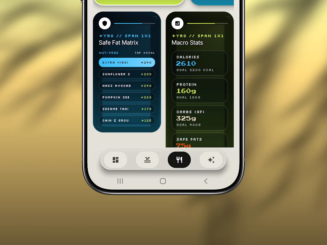
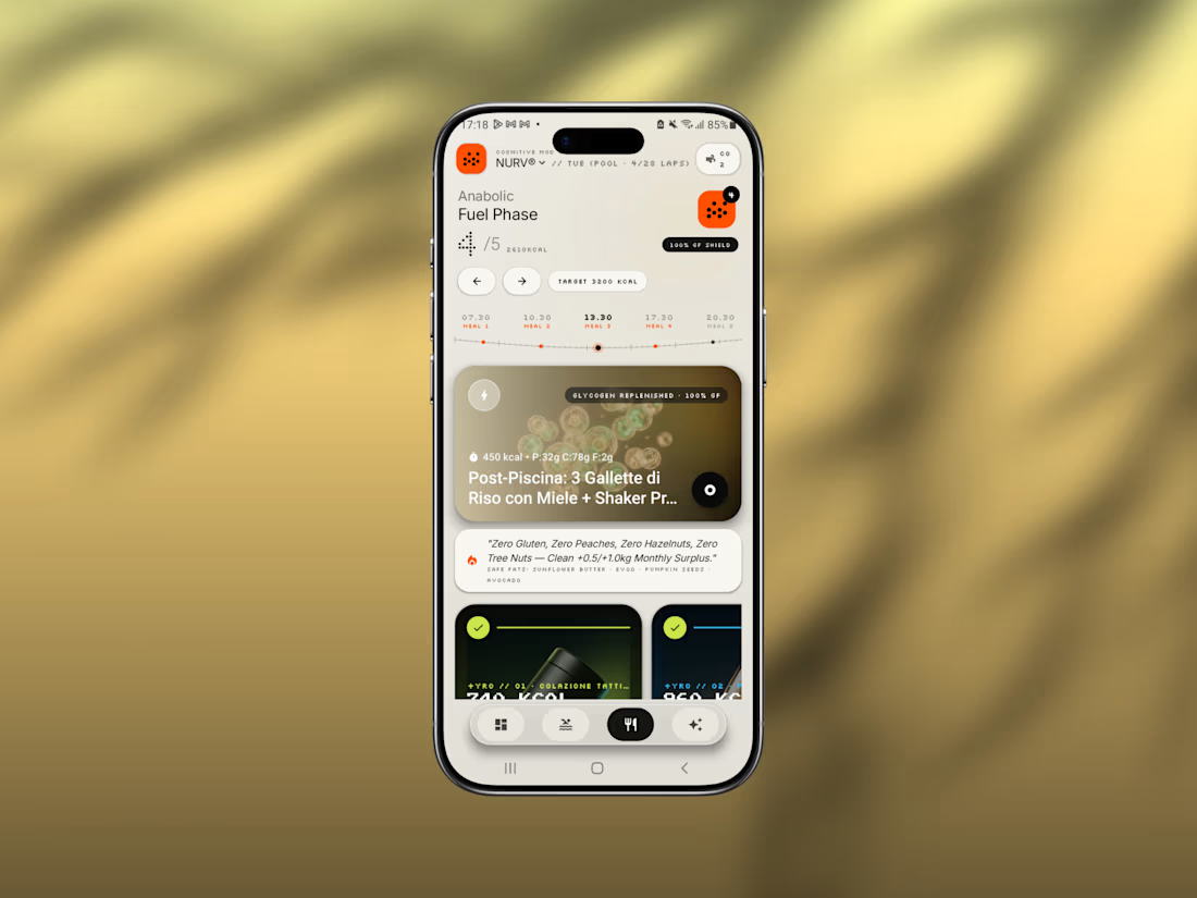
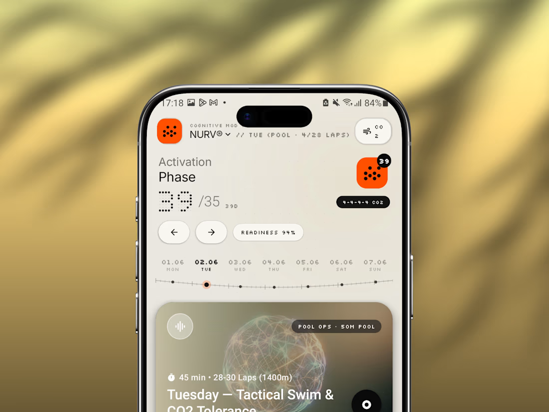
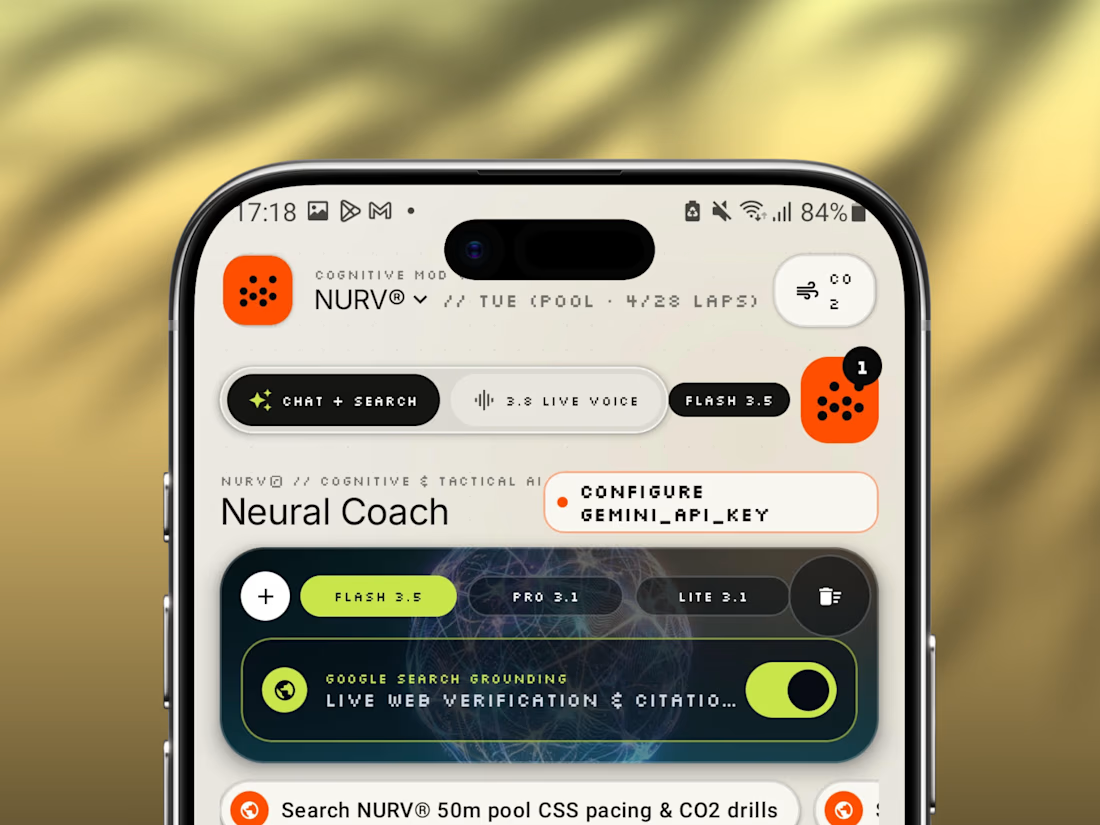
Friday app: NURV® 🟠
Swim training, nutrition and AI coaching in one Android app.
Dot-matrix numerals, a cream canvas, one hot orange accent. Built to feel like a lab instrument, not a fitness tracker.
Pool ops, fuel phases, CO₂ tolerance drills, all in one place.