The network for creativity
Join 1.25M professional creatives like you
Connect with clients, get discovered, and run your business 100% commission-free
Creatives on Contra have earned over $150M and we are just getting started
Back to feedPost
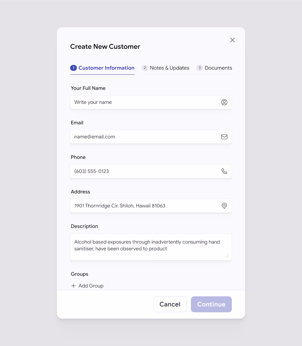
Most customer apps don’t lose users because of missing features.
They lose them because of poor UX.
We tested two approaches.
Version A focuses on clarity.
Version B focuses on completeness.
Here’s what we learned 👇
Version A wins.
Not because it does less — but because it does the right things first.
✔ Fewer fields = lower cognitive load
✔ Cleaner layout = faster decision-making
✔ Clear flow = quicker customer added
The result?
Higher completion rates and better activation.
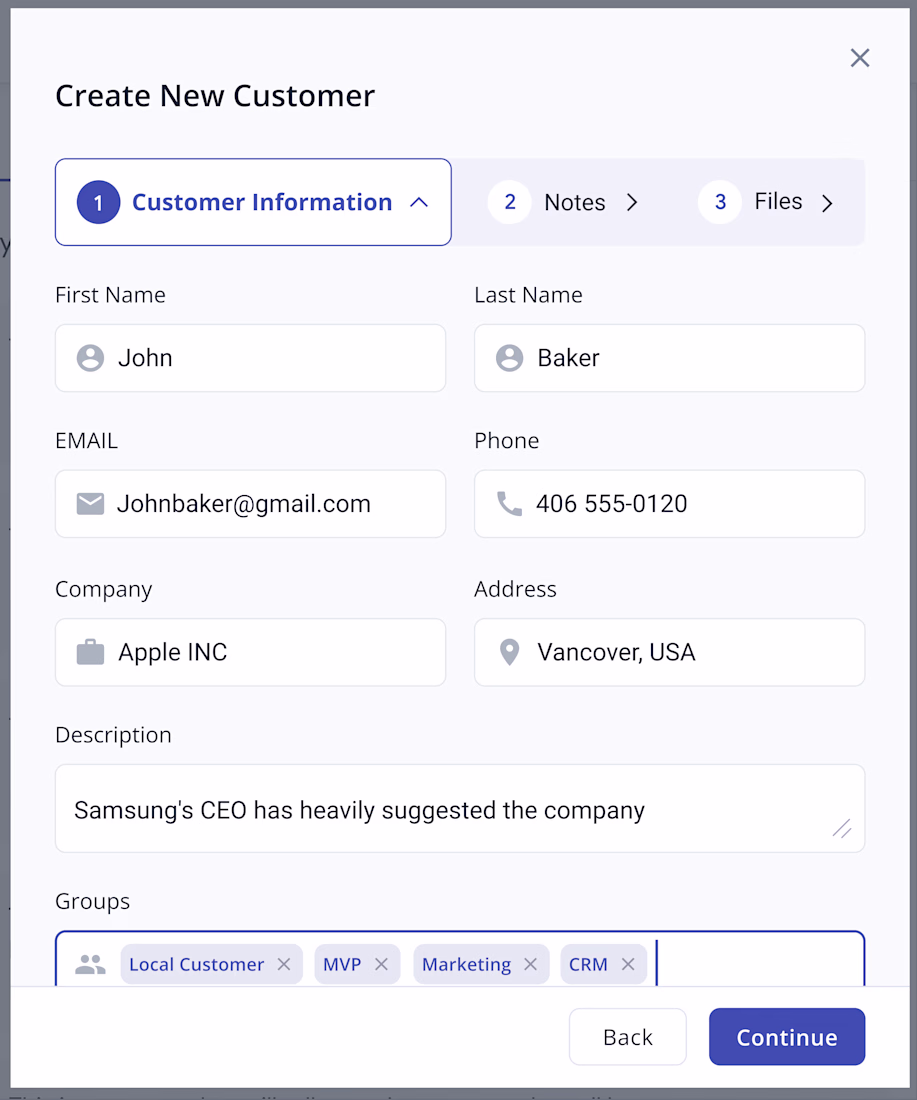
Version B looks powerful.
But power without clarity slows users down.
Great UX isn’t about showing everything your app can do.
It’s about helping users succeed in the first 30 seconds.
When onboarding feels easy,
conversion goes up.
Adoption follows.
Growth becomes natural.
Simple UX = better conversion.
The network for creativity
Join 1.25M professional creatives like you
Connect with clients, get discovered, and run your business 100% commission-free
Creatives on Contra have earned over $150M and we are just getting started
Related posts
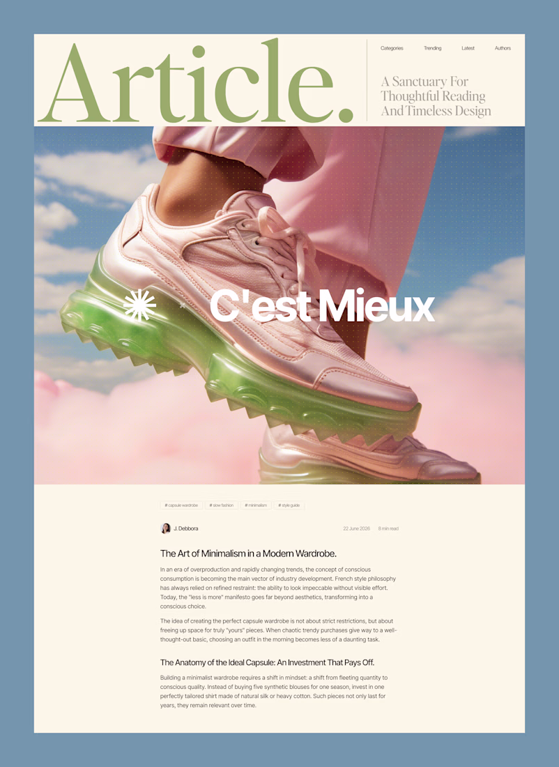
Why overcomplicating your layout kills readability.
Most content-heavy sites fail because they try to show everything at once. Sidebars, badges, related articles, and tiny fonts create cognitive overload. The user gets tired after two paragraphs and leaves.
Good design is about aggressive editing. You need to manage where the eye goes first.
In this layout, the hierarchy does all the work:
• A massive headline sets the mood and context instantly
• Generous white space prevents visual fatigue
• The clean grid ensures the reader actually focuses on the text
We don't need complex decorations to make a web page look expensive. We just need perfect typography and discipline.
Are you building a product or content platform that feels too cluttered? Drop a link below, and I’ll tell you where your users are getting stuck.
Love the color theme!
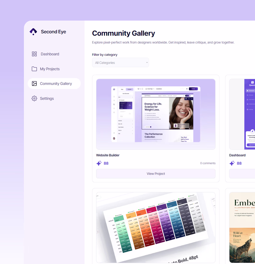
Hi everyone! 👁️ I built Second Eye for the @bubble #PromptAndCircumstance hackathon — and it's basically the brutally honest design critic every designer secretly needs.
Here's the idea: you drop in a design, and Second Eye scores it. Not with a vague "looks good" — but with a real breakdown across visual hierarchy, typography, color, spacing, accessibility, and usability. Every category gets a score, what's working, and what to fix. Then it tracks your progress over time on a dashboard, so you can actually watch your craft improve.
The heart of Second Eye is an analytics dashboard. It surfaces a designer's average AI score, total and published projects, peer ratings, and a score-trend chart — turning scattered feedback into measurable, trackable performance data that helps designers see how their work improves over time.
There's also a community side — a gallery where designers share work, leave critiques, and rate each other.
What I love about building this: it started as a single Bubble AI prompt. The AI gave me the skeleton — the layout, the data structure, the gallery. Everything after that was me reshaping it into something that actually works: the critique engine, the scoring logic, the trend chart, the whole community layer.
First time ever building on Bubble — and I shipped a real, working product. 🚀
Tools behind it:
Bubble AI (the foundation) · Claude by @AnthropicAI (logic + debugging) · ChatGPT (visuals)
Curious what your design scores? Go find out 👀
👉 https://second-eye.bubbleapps.io
Social: https://x.com/ruslana_prymak/status/2070560948583096531?s=20
Such a brilliant and highly practical tool! Every designer needs a brutally honest critic to catch spacing or accessibility slips before client reviews. Incredible execution for your first Bubble project—congrats on shipping! 👏🔥
97% of website visitors leave before a human can follow up.
I just published the full case study on an autonomous sale engine I designed to replace the entire top-of-funnel sales motion. No human required.
Here's what made it hard to design:
→ Two completely different audiences. One needed to feel seen in real time. The other needed to feel in control at 11pm.
→ The machine had to feel legible not like a black box. That meant designing the Sandbox: a split-screen interface where you can change the AI's knowledge and watch it respond live, before a single real customer sees it.
→ Every screen had to prove ROI, not just look good.
This isn't a cool UI case study. It's about how design decisions directly affect whether an AI agent earns trust or loses it on first use.
Full case study on Contra 👇
Check it out
Incredible
Trending
Claude
Claude has entered the design space. How are you using Claude Design?
Contra University
Learn from expert creatives how to earn more using next-gen AI tools.
MagicPath
The canvas is infinite, and exploration is becoming the workflow. How are you using MagicPath?
creativeaiflow
Creative AI workflows are evolving. What tools do you use, and what are their strengths and weaknesses?
freelancerlife
Freelancer life is wins, pivots, and everything in between. What’s yours right now?
