The network for creativity
Join 1.25M professional creatives like you
Connect with clients, get discovered, and run your business 100% commission-free
Creatives on Contra have earned over $150M and we are just getting started
Back to feedPost
Taste Test
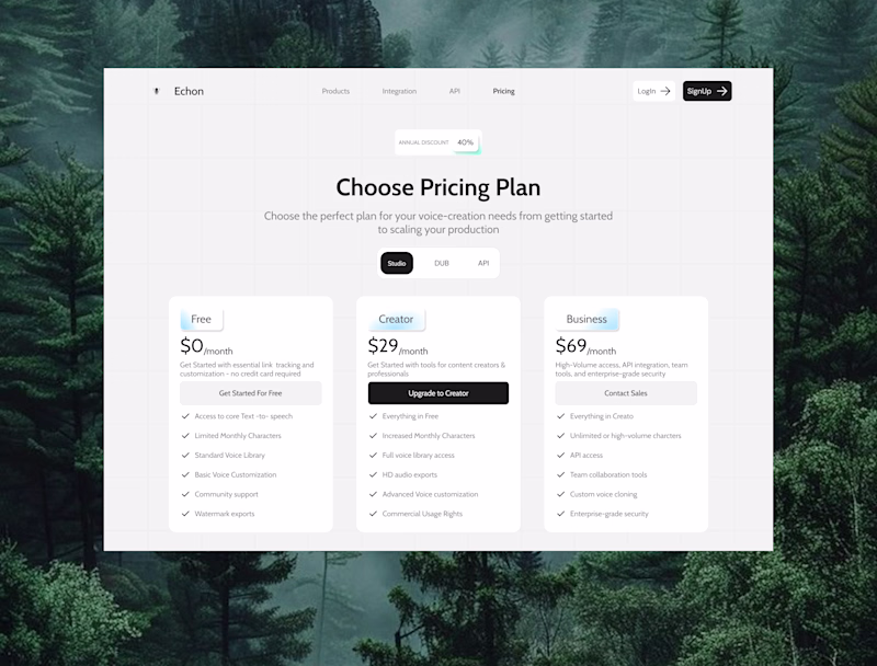
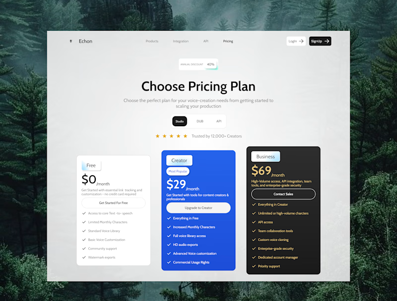
Pricing Page Redesign — Echon Voice AI
The brief: make users feel confident enough to click "Upgrade" without feeling pressured.
Here's what I focused on:
Visual hierarchy across the 3 tiers — Free, Creator, Business each feel distinct and intentional, not just different prices on identical cards
The Creator card is the money-maker, so it gets the spotlight — elevated, highlighted, with a "Most Popular" badge to reduce decision anxiety
Social proof ("Trusted by 12,000+ Creators") placed right above the cards — builds trust at the exact moment users are making a decision
The misty forest background adds atmosphere without competing with the content — softened with a white overlay so the cards stay the hero
Which is your fave?
3 voted
43%
4 voted
57%
7 votes
Closed
This simple stands out. The effort and thought behind it are obvious, and it shows in the final result. Keep pushing like this, you're building something remarkable.
Great work
The network for creativity
Join 1.25M professional creatives like you
Connect with clients, get discovered, and run your business 100% commission-free
Creatives on Contra have earned over $150M and we are just getting started
Related posts
Here's your contra post content for the SideQuest Social Feed:
What if your social feed wasn't just content to scroll but challenges worth actually doing?
We designed the SideQuest activity feed and messaging system, a gamified social experience that turns friend activity into motivation, nearby events into missions, and conversations into the starting point for real-world plans.
The design problem we solved: most social apps separate discovery, activity, and messaging into three completely different experiences. The result is an app people open out of habit, not intention.
What the design does instead, three screens, fully connected:
Activity feed that shows what your friends are actually doing: Alex completed a 3.8 km morning run and earned +120 XP. Sarah joined the Sunset Rooftop Meetup at 6:30PM with 8 people. Every card has a direct action, Try Challenge or Join Event, not just a like button.
Activity detail screen that turns a 5K morning run into a complete mission brief: distance, time, XP reward, coin drop, host profile, rival challenge system, and a single Start Run CTA that removes every reason not to go.
Messages screen that connects the social layer, Meet-up 2026, Party Night, and Ronald Richards confirming tomorrow at 9PM, all organized by All, Unread, and Groups with real conversation context visible without opening a thread.
My design decision: Map, Social, and Chats in the bottom nav aren't three separate apps. They're three layers of the same gamified world and the design makes that feel true from the first tap.
What feature would you add to make a social fitness app actually stick? 👇
Love the vibe of this one.
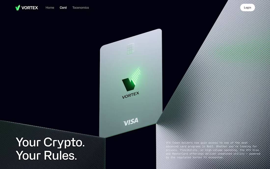
Crypto card products don’t need more features on the page. They need stronger trust signals.
For Vortex FX, we designed a crypto card landing page concept with a premium hero section, clean grid system, strong hierarchy, and controlled 3D animation that adds depth without visual overload.
Built to feel modern, structured, and conversion-driven.
This was created with a design subscription from FANCY — and yes, we’re currently open to new projects.
Looks great!
I’m currently designing the new landing page for SCI4DEV and got stuck between two hero section versions 👀
SCI4DEV is a technology company focused on AI solutions, automation, software development, and digital innovation for businesses, startups, and education.
Would love some honest feedback:
which version communicates the brand better? 👇
19 voted
49%
20 voted
51%
39 votes
Closed
version two without any doubt!
Trending
Claude
Claude has entered the design space. How are you using Claude Design?
Contra University
Learn from expert creatives how to earn more using next-gen AI tools.
creativeaiflow
Creative AI workflows are evolving. What tools do you use, and what are their strengths and weaknesses?
portfolioreview
The best portfolios tell a story, not just show a grid. Share yours for feedback.
freelancerlife
Freelancer life is wins, pivots, and everything in between. What’s yours right now?