The network for creativity
Join 1.25M professional creatives like you
Connect with clients, get discovered, and run your business 100% commission-free
Creatives on Contra have earned over $150M and we are just getting started
Back to feedPost
Taste Test
I’m currently designing the new landing page for SCI4DEV and got stuck between two hero section versions 👀
SCI4DEV is a technology company focused on AI solutions, automation, software development, and digital innovation for businesses, startups, and education.
Would love some honest feedback:
which version communicates the brand better? 👇
19 voted
49%
20 voted
51%
39 votes
Closed


version two without any doubt!

Damn 😭 The V2 also has its defenders, haha.
I think the more dynamic vibe is what attracts people. That's definitely making the decision harder now.
Thanks for the feedback.
you are welcome! <3


Love this!

V2 communicates better!

That’s actually a really good point. I’ve been leaning more toward V1 for exactly that reason, it feels more aligned with SCI4DEV’s positioning and gives the message more room to breathe. V2 was meant to feel more dynamic, but I agree it starts competing with the headline a bit.
Really appreciate the feedback 👊


V1 is way better

True, the CTA placement in V1 feels much more natural. People already expect that flow, so it makes the section easier to scan
The network for creativity
Join 1.25M professional creatives like you
Connect with clients, get discovered, and run your business 100% commission-free
Creatives on Contra have earned over $150M and we are just getting started
Related posts

Made a concept hero section for a skincare brand.
Pick what your skin needs and the serum drop changes right there. color, texture, product, price.
Then add to bag
If you run a beauty brand and your site is just photos and a buy button, message me.

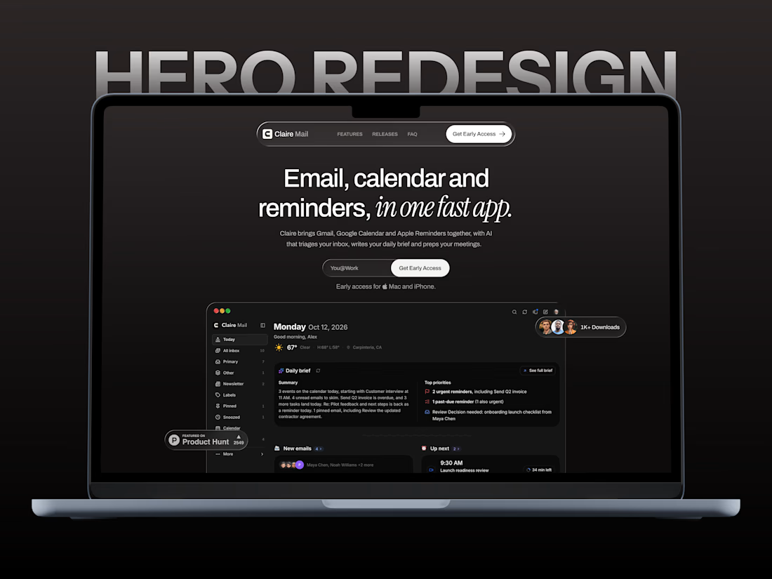
A hero redesign concept for Claire Mail, a new startup reimagining email, calendars, and reminders. ✳️
Explored a clean, minimal direction with bold typography, subtle details, and a dark visual style to give the product its own identity.
What do you think of this hero section?



Video-led hero for me. The big script Presence over the field sells a feeling in one glance, which is what wellness needs. The expanding gallery would work well as the second section.