The network for creativity
Join 1.25M professional creatives like you
Connect with clients, get discovered, and run your business 100% commission-free
Creatives on Contra have earned over $150M and we are just getting started
Back to feedPost
Taste Test
I’m currently designing the new landing page for SCI4DEV and got stuck between two hero section versions 👀
SCI4DEV is a technology company focused on AI solutions, automation, software development, and digital innovation for businesses, startups, and education.
Would love some honest feedback:
which version communicates the brand better? 👇
19 voted
49%
20 voted
51%
39 votes
Closed
V1 is way better
version two without any doubt!
Damn 😭 The V2 also has its defenders, haha.
I think the more dynamic vibe is what attracts people. That's definitely making the decision harder now.
Thanks for the feedback.
you are welcome! <3
Nice design , i will prefer the first one
I choose V2 all day
Love this!
ALthough am also a designer and i will be going for the first version because it has a clear CTA after customers land on it and then go throuh the content it has a btn that mae them take action immediately
Yeah, that makes sense. I think V1 feels clearer overall, especially with the CTA flow. It guides the user better once they land on the page instead of trying to grab attention with too much happening visually. Appreciate the insight 🧠
V2 communicates better!
That’s actually a really good point. I’ve been leaning more toward V1 for exactly that reason, it feels more aligned with SCI4DEV’s positioning and gives the message more room to breathe. V2 was meant to feel more dynamic, but I agree it starts competing with the headline a bit.
Really appreciate the feedback 👊
True, the CTA placement in V1 feels much more natural. People already expect that flow, so it makes the section easier to scan
The network for creativity
Join 1.25M professional creatives like you
Connect with clients, get discovered, and run your business 100% commission-free
Creatives on Contra have earned over $150M and we are just getting started
Related posts
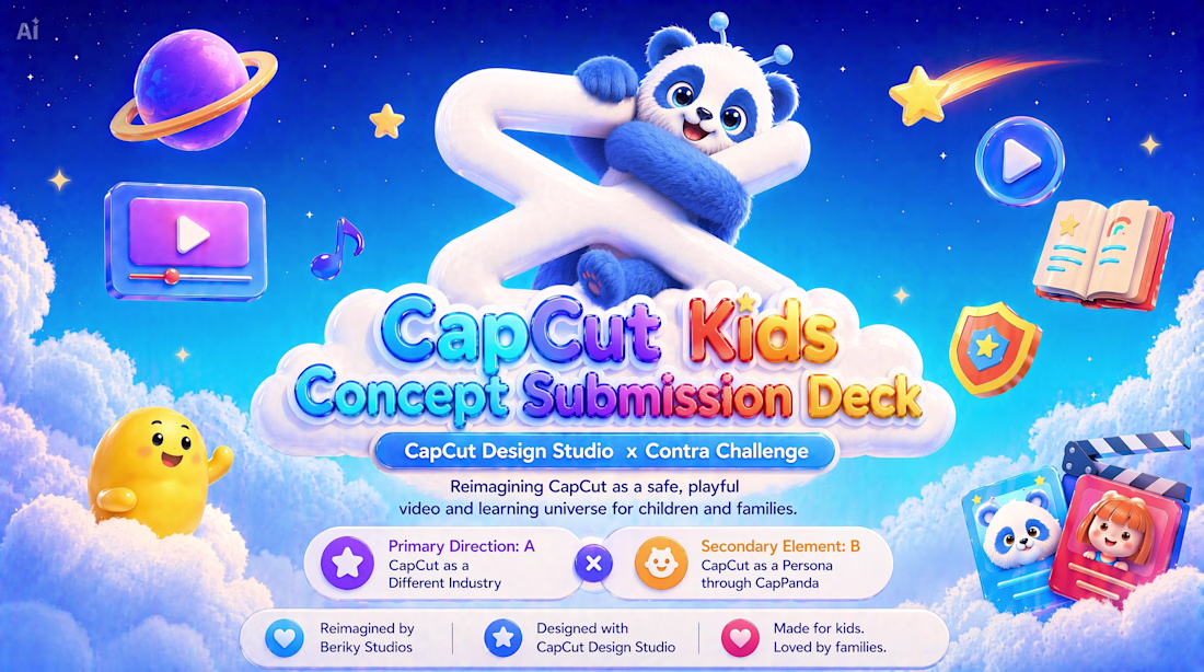
Work Title: CapCut Kids
Main Direction: Direction A — CapCut as a Different Industry
Secondary Element: Direction B — CapCut as a Persona through CapPanda
Concept Statement:
CapCut Kids reimagines CapCut as a safe, playful, and educational video platform for children and families.
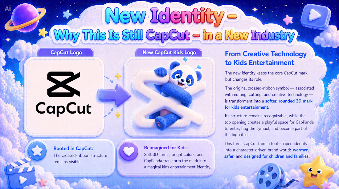
The concept translates CapCut from a creative technology tool into a new kids entertainment and learning universe where children can watch, learn, play, and explore through age-appropriate shows, interactive quizzes, creative activities, family experiences, and parent-controlled safety features.
The original CapCut mark remains the foundation of the identity. It is softened, rounded, and transformed into a friendly 3D form, welcoming CapPanda into the logo and turning the brand into a warmer, more emotional, character-driven world.
CapCut Kids keeps CapCut’s core spirit of accessible creativity and visual storytelling, while expanding it into a new industry built around trust, imagination, safety, and joyful design.
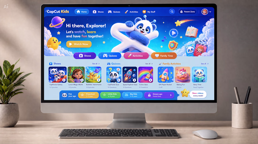
The project includes, among other elements:
• Logo evolution and new brand identity
• Mascot system
• Web platform experience
• Mobile app adaptation
• Social media ecosystem
• App store concept
Core Promise of CapCut Kids:
Watch. Learn. Play. Grow.
Created by: Beriky Studios
Built with: CapCut Design Studio
Presentation link: https://drive.google.com/file/d/1a4oWACWuQ_X1msoyzK-lNJeFNanR2MJN/view?usp=sharing
Full submission package link:
https://drive.google.com/drive/folders/13M7B_kjPnWI5tr2f9Ds31M1ofUW7C1Zn?usp=drive_link
The Post on X: https://x.com/Berikystudios/status/2063026056756359536
#CapCutDesignStudio
Awesome
A new component just got approved on the Framer Marketplace.
Hero sections are one of those things that look simple until you're actually building one.
I've built enough of them to know exactly where most go wrong.
Flexible. Ready to drop into any Framer project and immediately make the top of your page feel intentional, without starting from scratch every single time.
Now live on the Framer Marketplace. https://www.framer.com/marketplace/components/cursor-controller/
Genuinely can't wait to see what people build with it, if you use it in a project make sure to tag me.
Amazing work
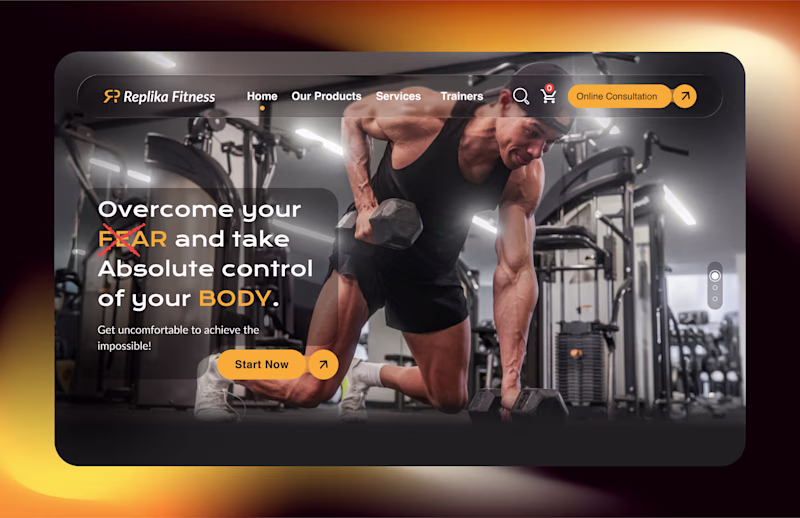
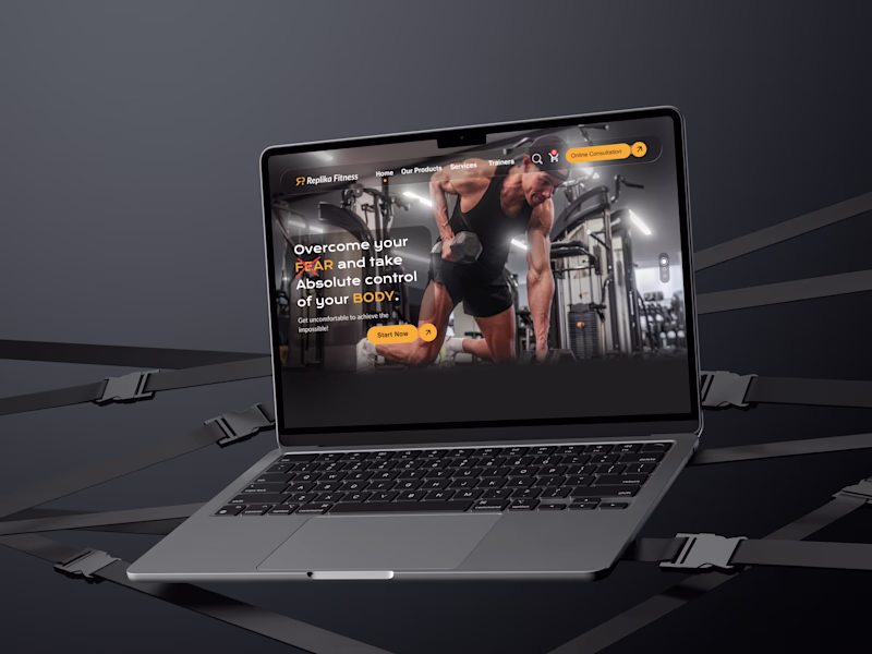
Which one is Better?
High-Fidelity Wireframe or Mockup.
I recently designed the landing for Replika Fitness which offers diverse range of services to its users based on subscription plans.
#UIUXdesigns #Mockups #HighFidelityWireframe #ReplikaFitness
3 voted
38%
5 voted
62%
8 votes
Closed
The Mockup makes sense a lot😊
Challenges
View allTrending
Claude
Claude has entered the design space. How are you using Claude Design?
Contra University
Learn from expert creatives how to earn more using next-gen AI tools.
creativeaiflow
Creative AI workflows are evolving. What tools do you use, and what are their strengths and weaknesses?
portfolioreview
The best portfolios tell a story, not just show a grid. Share yours for feedback.
freelancerlife
Freelancer life is wins, pivots, and everything in between. What’s yours right now?