Maria Rita Moreira Fernandes
Product Designer
New to Contra
Maria Rita is ready for their next project!
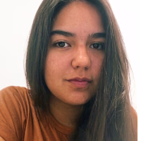
I redesigned the scheduling flow of a healthcare platform to reduce friction and simplify decision making throughout the journey.
After mapping the experience, I identified at least eight critical decisions across the flow. Many lacked clear interface guidance, increasing cognitive load and making the process more tiring than necessary.
The redesign focused on simplifying those moments. I made specialty selection the main entry point and displayed professionals directly, removing unnecessary branching between clinic or provider selection. I also reduced the filters to the most relevant criteria, location and price, while surfacing key information like pricing and next availability directly on the cards.
Another important change was postponing login until the confirmation step, allowing users to explore options before committing to sign up.
The final flow was reorganized into six steps with clearer progress indication, less visual noise, and more objective decisions throughout the experience.
Since access to the original product was limited after the professional selection stage, the remaining steps were designed based on existing platform patterns and transactional flow best practices to maintain consistency with the experience.
1
119
Designing experiences that feel intuitive, intentional and human.
This portfolio is a reflection of how I think through problems, translate ideas into interfaces and build visuals that connect strategy with usability.
Focused on UX/UI, digital products and visual storytelling.
1
119
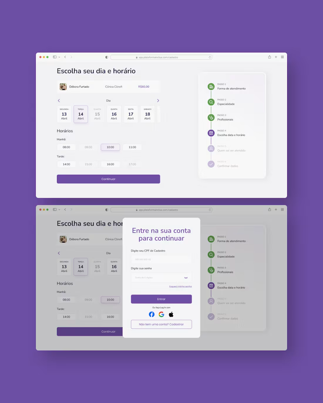
UI Design portfolio project. Redesign of a fictional digital bank's sign-up flow with a 62% abandonment rate. The solution reduced cognitive load per screen through a 10-step flow with single responsibility per screen and maximum 2 fields each, while integrating mandatory KYC compliance and conditional states on the success screen.
Published on Behance and LinkedIn.
3
177
Shared Living Task App
I recently published a project on Behance inspired by a real challenge: organizing tasks in shared apartments. The idea came from Ana Lara Carvalho and reflects a common situation for students who move to a new city and need to share responsibilities with roommates, often people they don’t know beforehand.
What started as a UI practice exercise became an important step in strengthening my product thinking. Before designing the screens in Figma, I structured the problem, mapped the main flows, and defined key features such as task creation, segmented notifications, and filtered history. The goal was to understand the system logic before focusing on visuals.
Throughout the process, I also challenged myself to improve my Figma skills, working with auto layout, creating and refining components, and adjusting typography hierarchy and spacing. Iteration played a central role: testing, simplifying, and reorganizing helped bring more intention to interface decisions.
This first version still has room to evolve, but it represents an important step in my growth as a designer, shifting my focus from purely visual outcomes to more thoughtful and structured product decisions.
Full case available on Behance:
https://lnkd.in/e_SGVsYP
2
154
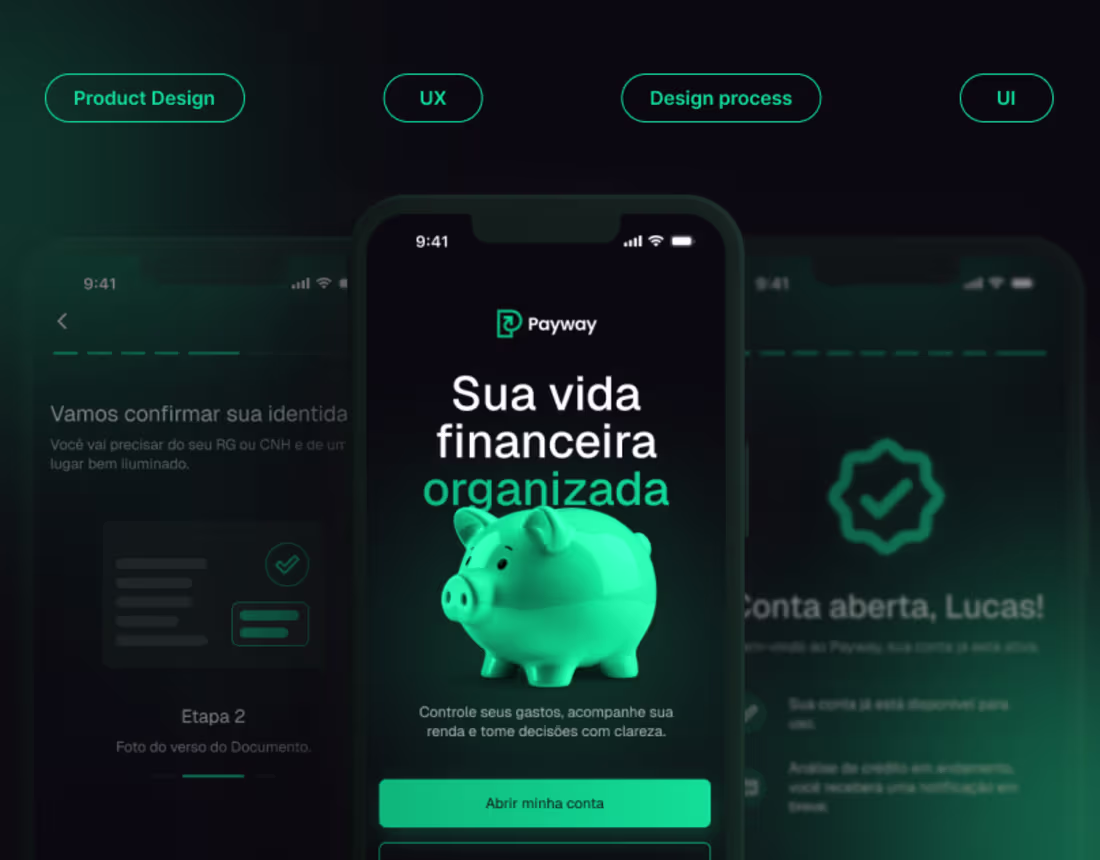
Development of social media content focused on gyms and fitness brands, prioritizing a strong, dynamic visual communication aligned with the brand’s positioning.
The project explores the strategic use of colors, typography, and visual composition to convey energy, movement, and motivation while maintaining clear communication and a consistent identity across all posts.
Each piece is designed to create visual impact on social media feeds, support campaigns, promote classes and memberships, and strengthen the gym’s digital presence in a professional and engaging way.
0
52
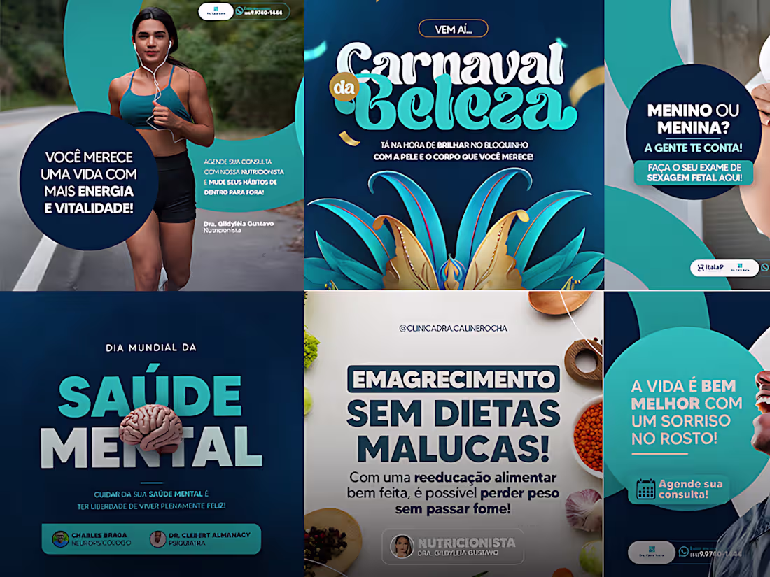
Development of social media content for a medical clinic, focused on creating a professional, trustworthy, and welcoming visual communication aligned with the clinic’s identity.
The project combines typography, color palettes, and clean layouts to deliver information clearly while maintaining an approachable and human-centered aesthetic. The visual direction was designed to balance credibility and accessibility across all content.
Each post was created to strengthen the clinic’s online presence, improve communication with patients, and support the promotion of services, health information, and institutional content in a cohesive and engaging way.
0
36