The network for creativity
Join 1.25M professional creatives like you
Connect with clients, get discovered, and run your business 100% commission-free
Creatives on Contra have earned over $150M and we are just getting started
Back to feedPost
Taste Test
What icon colour way system would you go for? 🍊🍇🍷🌊🐚
Client: VW bus wine tour company.
44 voted
49%
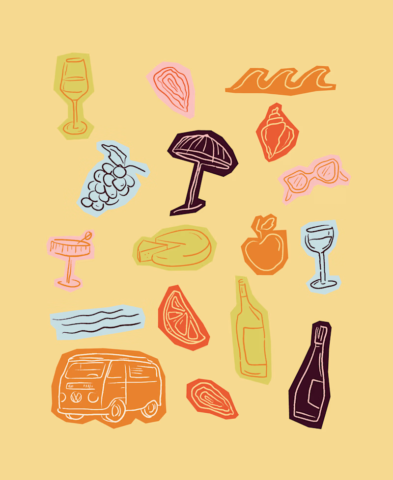
46 voted
51%
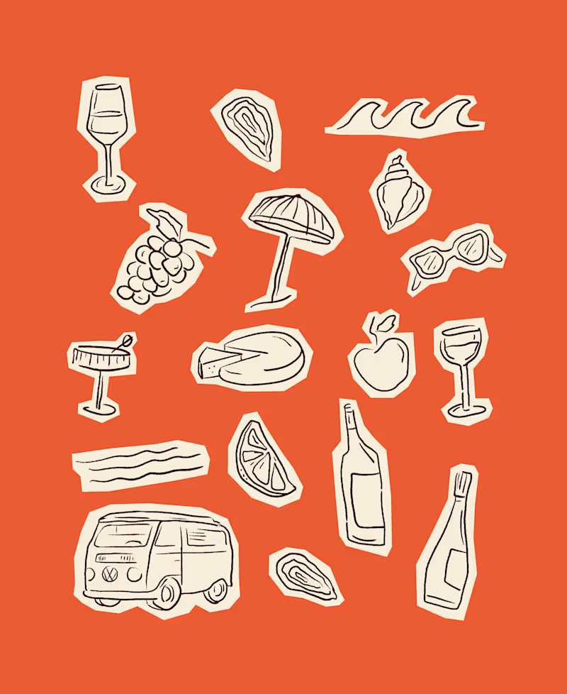
90 votes
Closed

I would actually have voted for the multi-colors if it wasn't for that dark option that just doesn't look cohesive and throws off the balance of the overall image. I think if the palette is revised, the multi-color has such a fun travel vibe.
I think it works absolutely perfectly as an alternative for black - I can definitely see the inspiration! I just wouldn't have made two not-black (as I always think of these colors in my palettes) icon fill choices amongst this set. It might be interesting if there were a bridge...

The multi-colour version has such a fun summer market feel, really fits the VW wine tour vibe perfectly!

Thanks @Stephanie Asoegwu! It was a fun project to work on and create for!

I will go with Multi Colours

Loving the multi-color option! Such great contrast!

I looove the multicolor!! Love the one color as well but definitely could see this as an alternate set of usage guidelines in the future!

multi coloured variant, its just so fun!

The multi color will be nice since It's a tour icon ... There we be place to celebrate in different colors

Multi Colors

one colour way system gives room for exploration across the system

This one is so tough, I like them both so much. I'd say the first just bc it's easy to stay consistent with this one. Then if you had to branch out with color you could simply change the background.
The network for creativity
Join 1.25M professional creatives like you
Connect with clients, get discovered, and run your business 100% commission-free
Creatives on Contra have earned over $150M and we are just getting started





Related posts

Winder is a bold brand identity built around a geometric W-inspired symbol, combining sharp angles and forward movement to represent progress, speed, and direction.
The identity uses a striking red and deep burgundy palette, supported by clean typography and a consistent visual system across brand guidelines, digital applications, and product mockups.
Progress in Motion.




Great logo it feels it really has an identity 🎉🎉


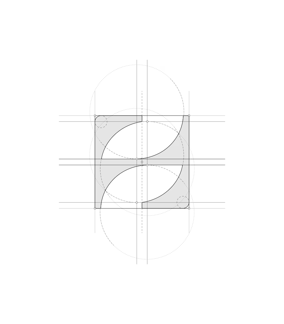
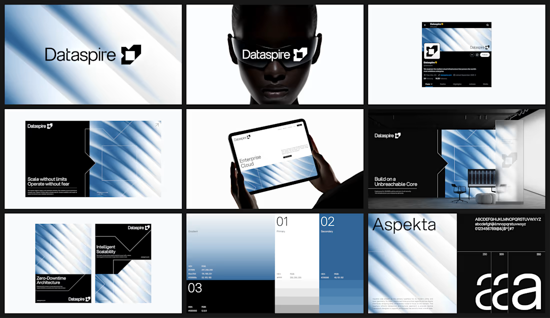


feels very sure of itself. i can picture this blown up on a conference stage