The network for creativity
Join 1.25M professional creatives like you
Connect with clients, get discovered, and run your business 100% commission-free
Creatives on Contra have earned over $150M and we are just getting started
Back to feedPost
Taste Test


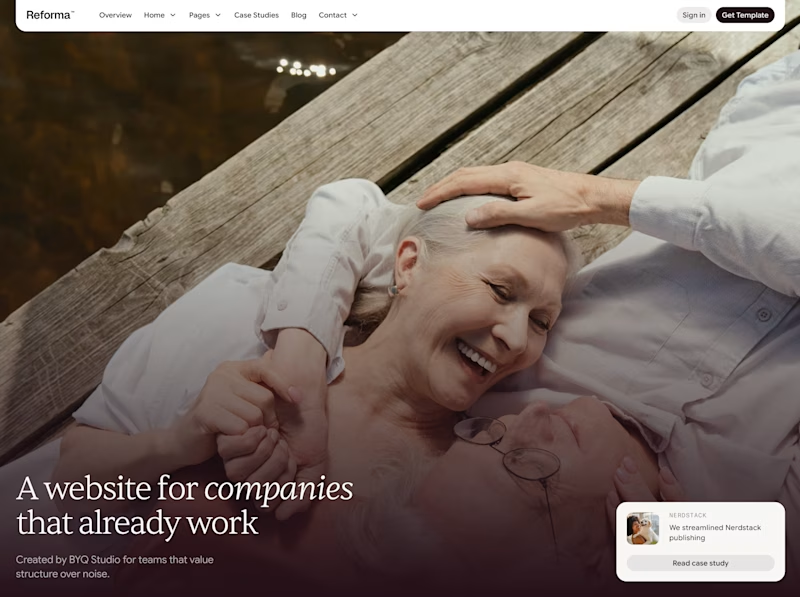
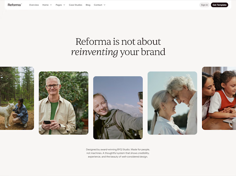

Gallery wins for me. It tells a broader story without relying on one image.

I like how the two compositions turn the same visual language into different reading rhythms—the full-bleed version feels immersive, while the row gives each portrait room to breathe.

Gallery works for me as well. It feels balanced and tells a story a bit more.


Amazing !

full frame!!

The Gallery layout gets my vote. Having room to look around immediately establishes a wider narrative, and with GSAP tagged, I can already imagine those individual portrait frames scaling up beautifully on scroll.


I’d choose Fullframe. It creates a stronger emotional hook and gives the homepage a more premium, confident first impression. The gallery feels useful, but the full image feels more memorable.


love both, but something about the gallery element adds a certain sentiment that i think feels truly human.

Both look really nice honestly. But the gallery feels more human

I think the gallery works better here. The headline is about people and not reinventing the brand, so the mix of portraits supports that message really well. The fullframe looks more dramatic, but the image feels a bit healthcare/lifestyle and doesn’t instantly match the B2B website context.

I'd go with full frame

Gallery for me. The fullframe version has stronger immediate impact, but the gallery feels more distinctive and gives the message more room to breathe. It also makes the brand feel more human by showing different people and moments at once.

gallery is better
The network for creativity
Join 1.25M professional creatives like you
Connect with clients, get discovered, and run your business 100% commission-free
Creatives on Contra have earned over $150M and we are just getting started

Challenges
View all


Related posts

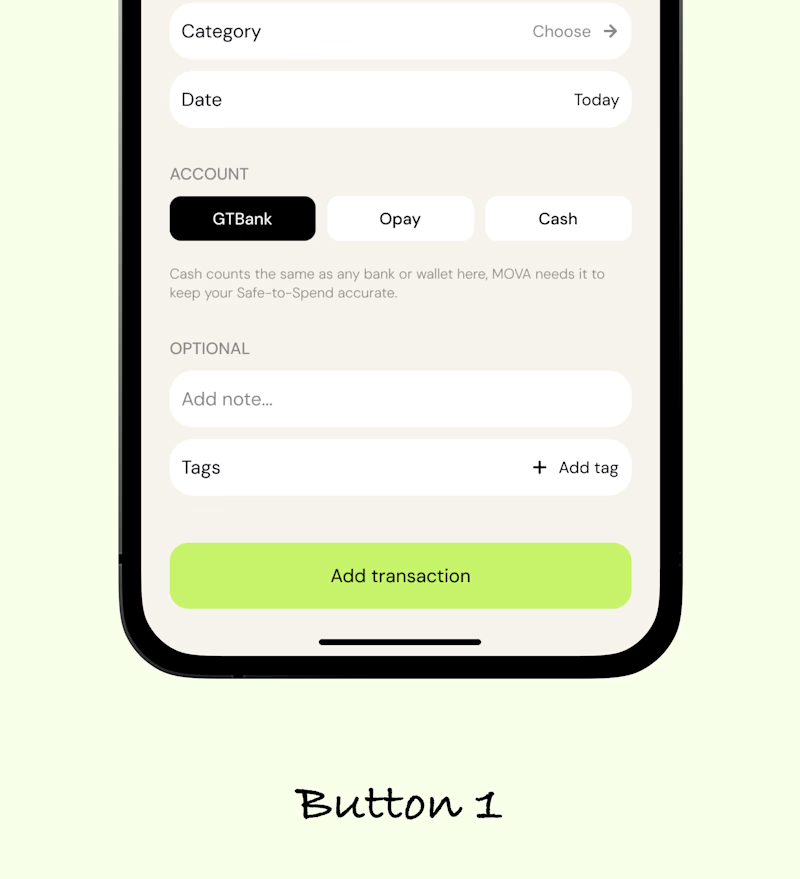
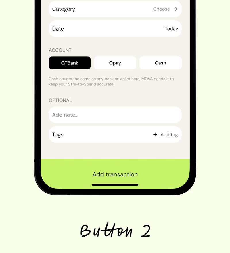

Button 1 does the work

Two different audiences, two different directions,
which one are you into?
58 voted
48%
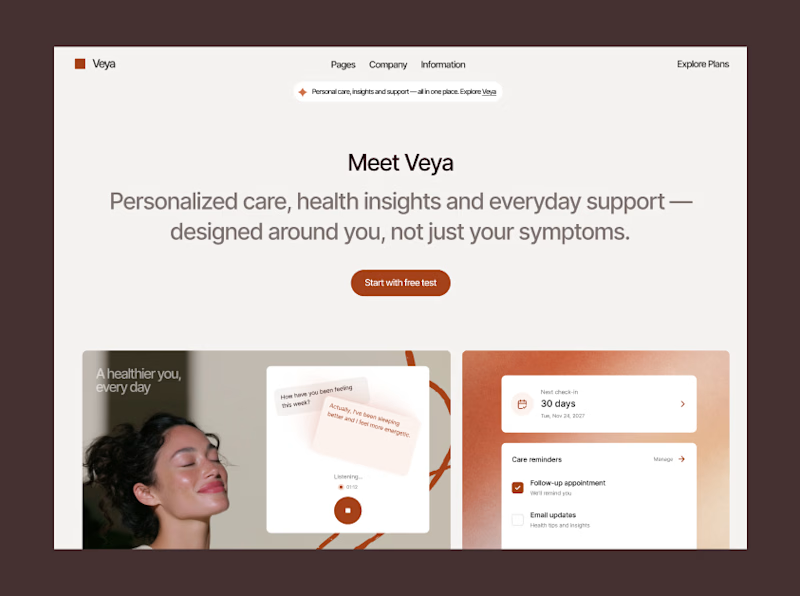
64 voted
52%
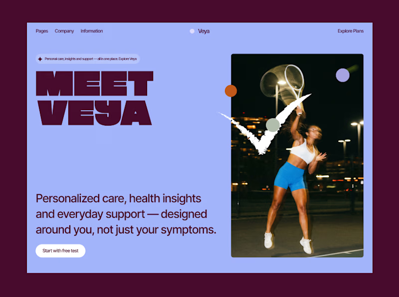
122 votes
Closed

Amazing designs 😊

Someone said FOOTER?
If you need a website that reflects your brand, I got one spot available for September 🙌

Boooom Mattia this is one crazy footer!! 🙌