The network for creativity
Join 1.25M professional creatives like you
Connect with clients, get discovered, and run your business 100% commission-free
Creatives on Contra have earned over $150M and we are just getting started
Back to feedPost

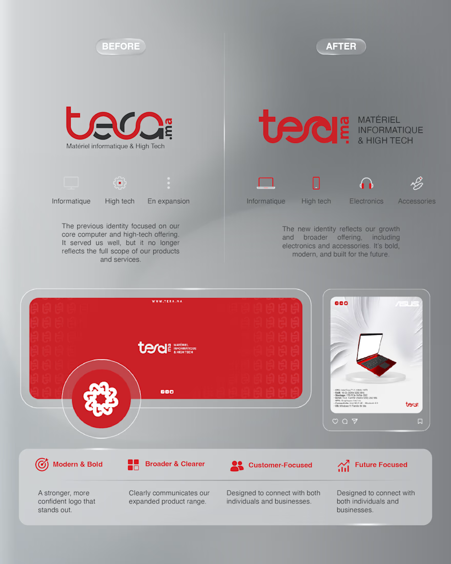
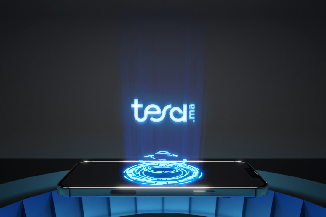
Proud to share my latest branding project for @teramaroc
The goal was to create a cleaner, bolder identity that reflects the brand's growth and expanded product offering while maintaining its recognition.

The network for creativity
Join 1.25M professional creatives like you
Connect with clients, get discovered, and run your business 100% commission-free
Creatives on Contra have earned over $150M and we are just getting started







Related posts

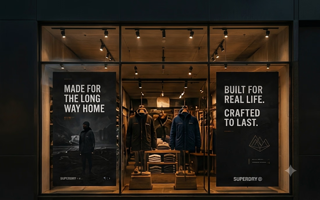
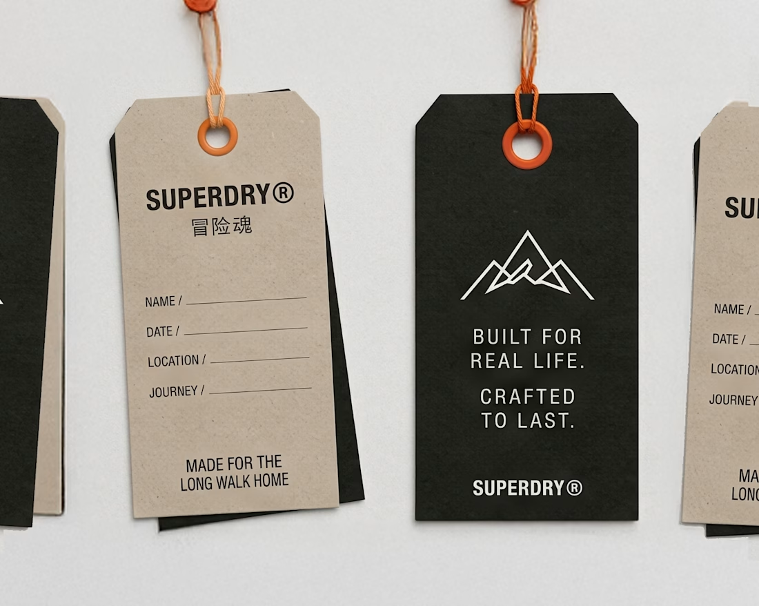
An existing brand identity showcased across a new campaign. This was one of my favourite projects ever!

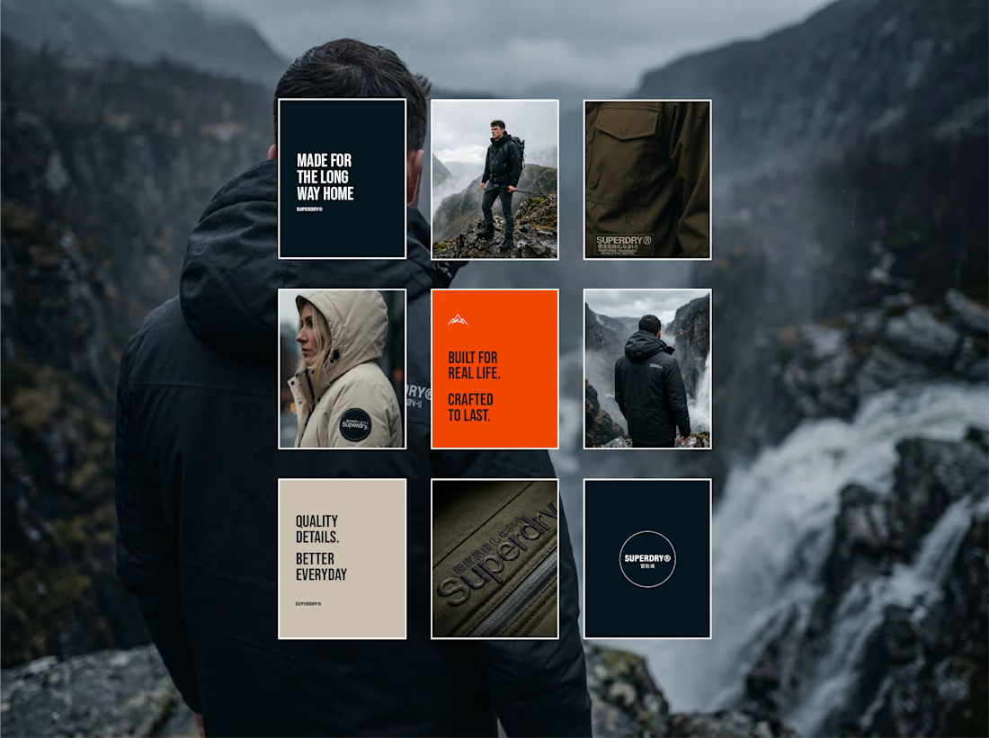
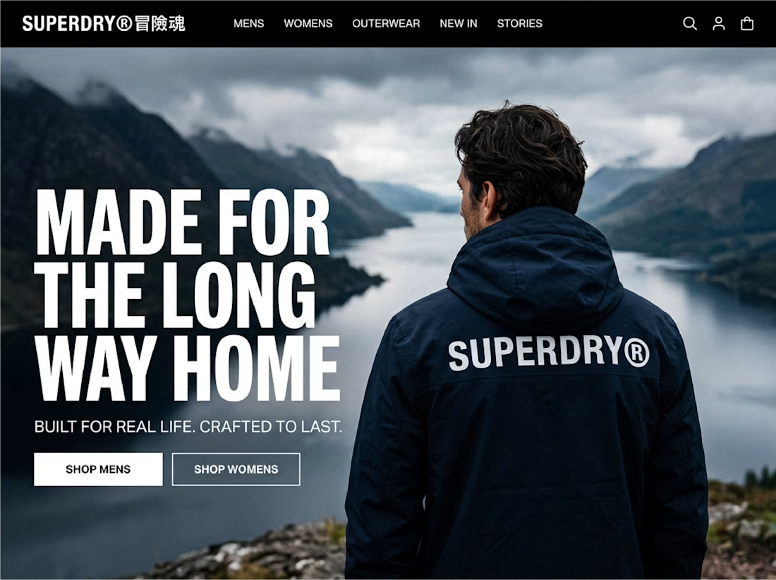

meet the insta-grid of a project i've been working on for a bit now! @Keia . has been a fabulous help in solidifying the direction of this fictional brand, & i'm so psyched to refine its original concept for one of my first-ever case studies. coming soon!




Aawww love it


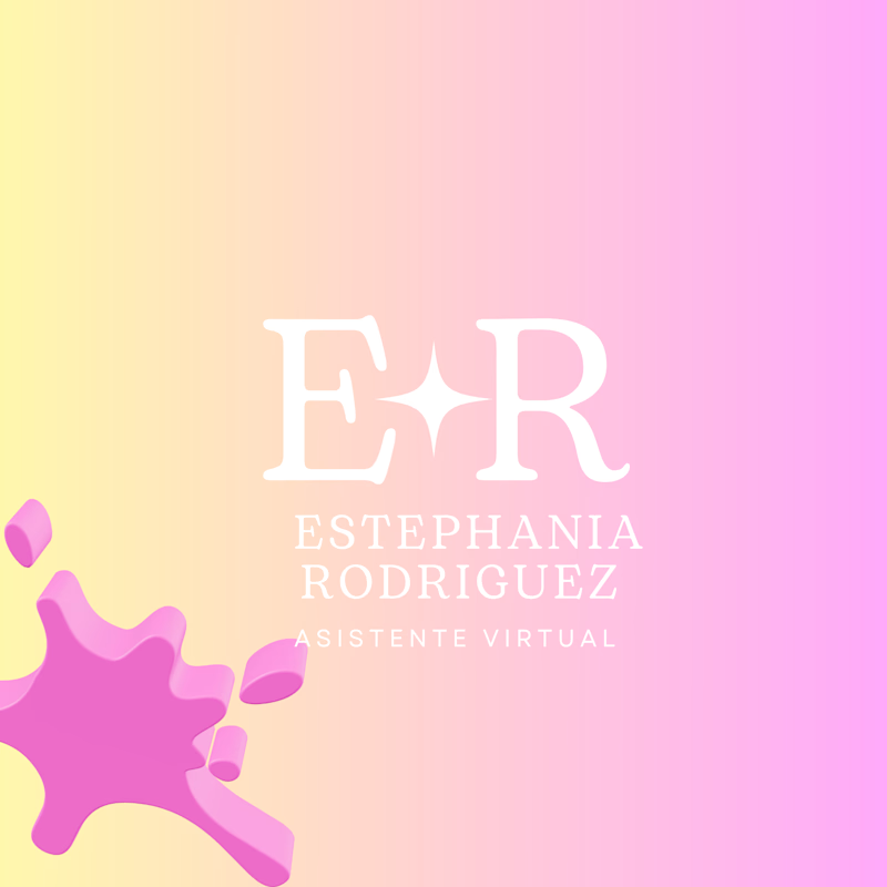
I'm exploring a fresh visual identity for my personal brand! ✨
Two different styles, one creative vision.
🤍 A — Minimal & Elegant
💗 B — Bold & Creative
Which one catches your attention first?
Your feedback will help shape my next creative projects. I'd love to hear your thoughts!
#LogoDesign #BrandIdentity #CreativeProcess #TasteTest #BeforeAndAfter #PersonalBranding
3 votes
Ends in 6h