The network for creativity
Join 1.25M professional creatives like you
Connect with clients, get discovered, and run your business 100% commission-free
Creatives on Contra have earned over $150M and we are just getting started
Back to feedPost
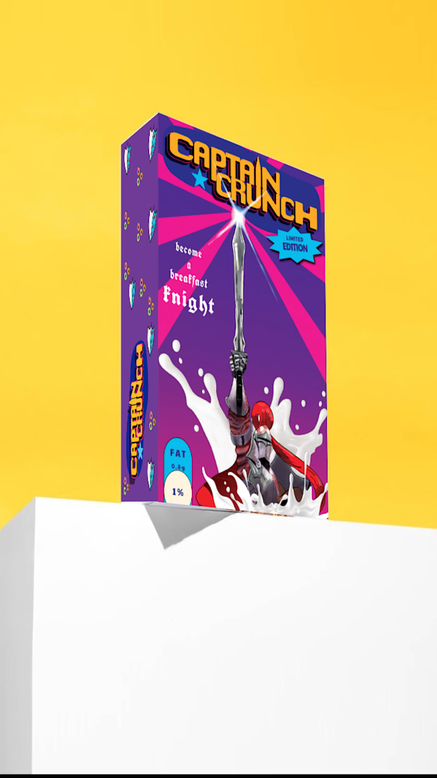
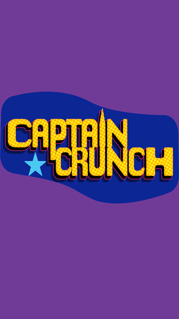
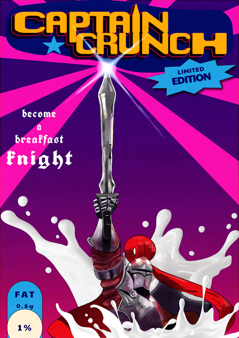
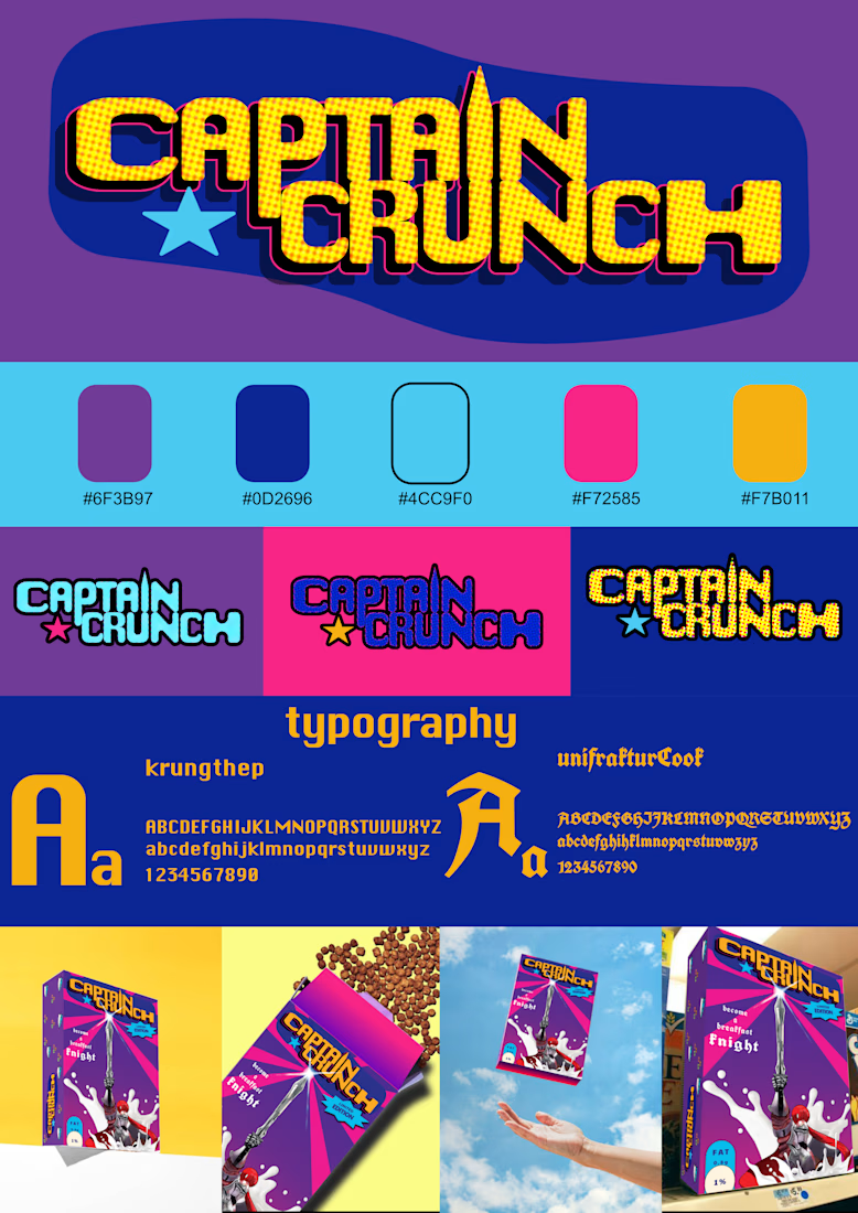
This is a concept cereal branding project aimed for kids age 4-10 with the idea that having breakfast is a quest. For this project i went with a hand drawn illustration and also made a custom logo for the brand.I chose colors which are not normally found in the cereal to make it stand out.

Looks nice


4 to 10 is a tough range to design for, the 4 year old and the 10 year old want totally different boxes

now that you mention it i think you are right because every age have their on preferences thanks for the tip i will definitely use it in the future
The network for creativity
Join 1.25M professional creatives like you
Connect with clients, get discovered, and run your business 100% commission-free
Creatives on Contra have earned over $150M and we are just getting started



Related posts

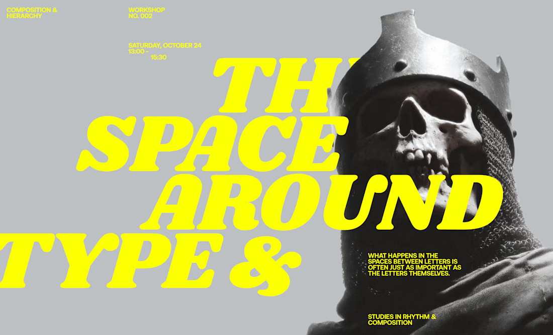
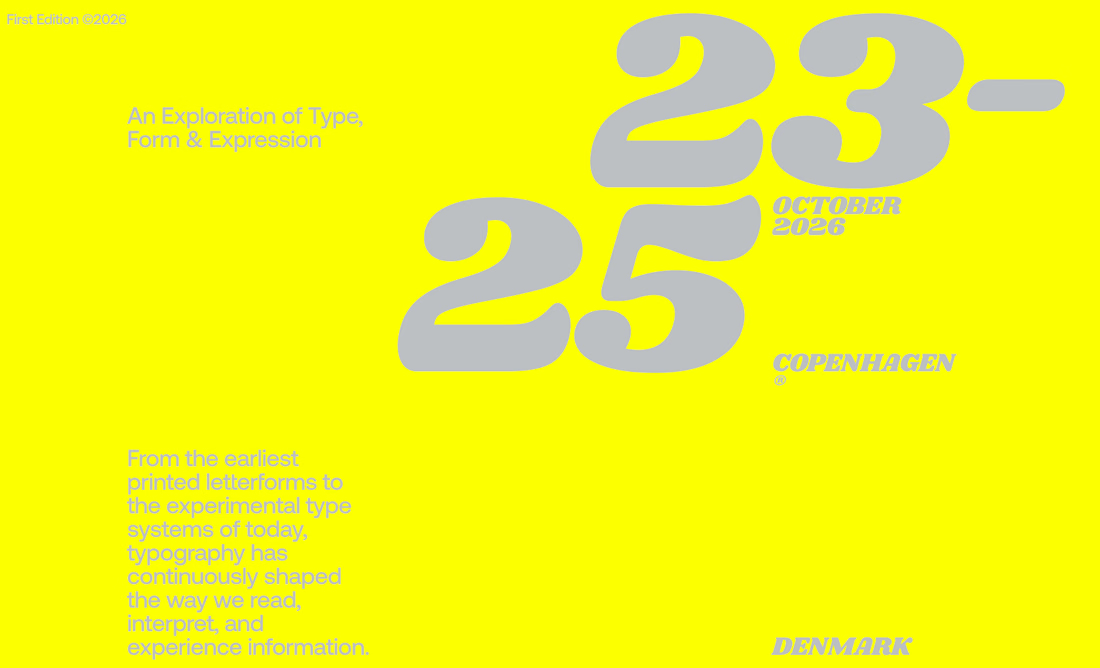
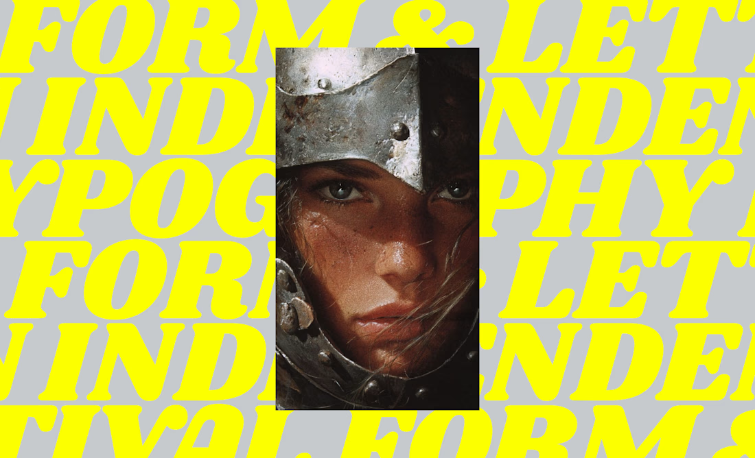
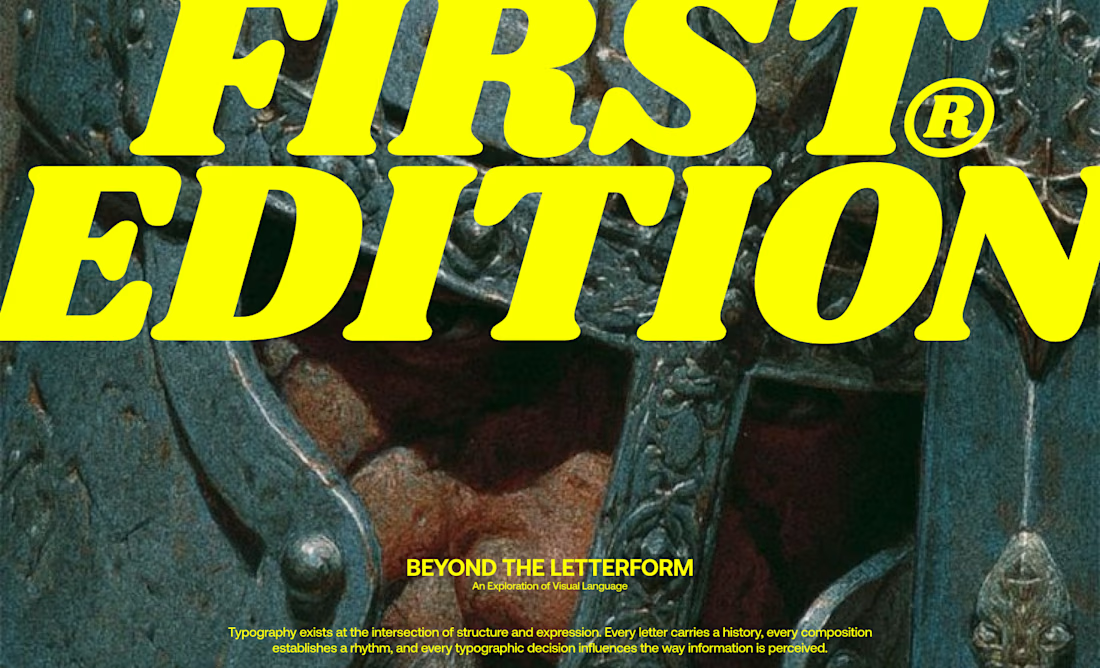
I designed a series of editorial-inspired layouts for a fictional typography event and workshop focused on the history of type.
↳ Master typography & layout - The foundation of timeless web design. Join 350+ designers inside my 13-hour online course https://typomonday.com/course


i love your compositions, always so inspiring:))


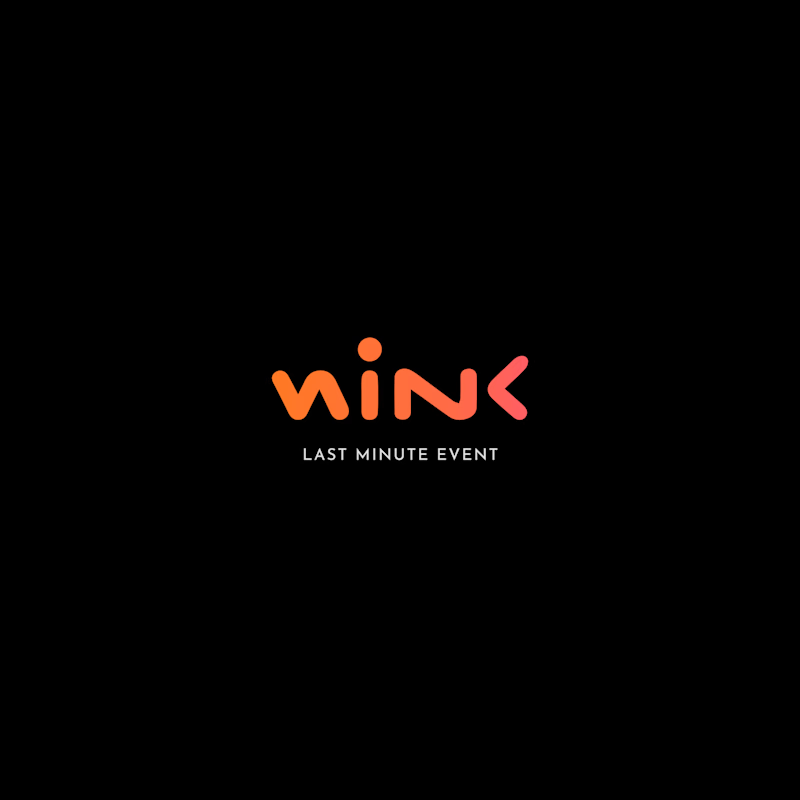
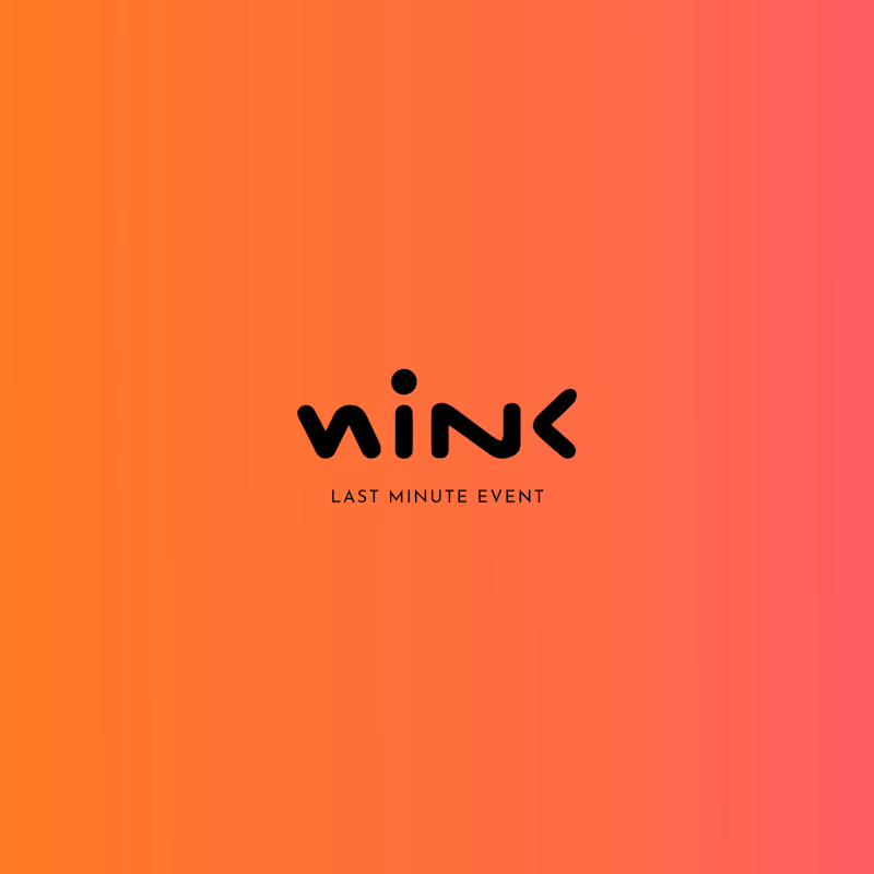
Two different colour directions, one brand identity. 🎨
Which version feels more impactful for this event brand?
🖤 Dark & Bold
🧡 Warm & Vibrant
What's your pick?
5 voted
71%
2 voted
29%
7 votes
Closed

Dark & Bold definitely takes the win for me. For an event brand, that high contrast gives off solid nightlife/exclusive vibes, and the coral accent pops really well against black.