The network for creativity
Join 1.25M professional creatives like you
Connect with clients, get discovered, and run your business 100% commission-free
Creatives on Contra have earned over $150M and we are just getting started
Back to feedPost
Taste Test
Working on an AI content calendar SaaS concept.
Less planning. More publishing.
Which direction do you prefer? 👇

20 voted
56%
16 voted
44%
36 votes
Closed

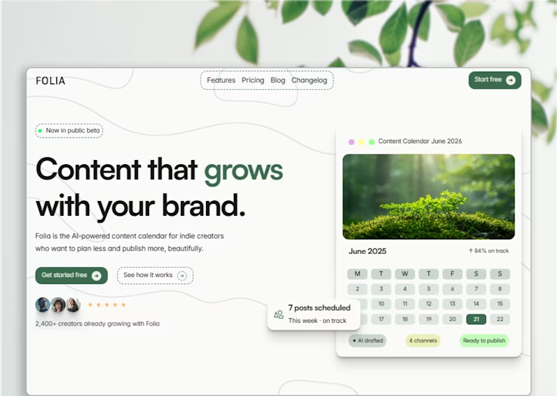
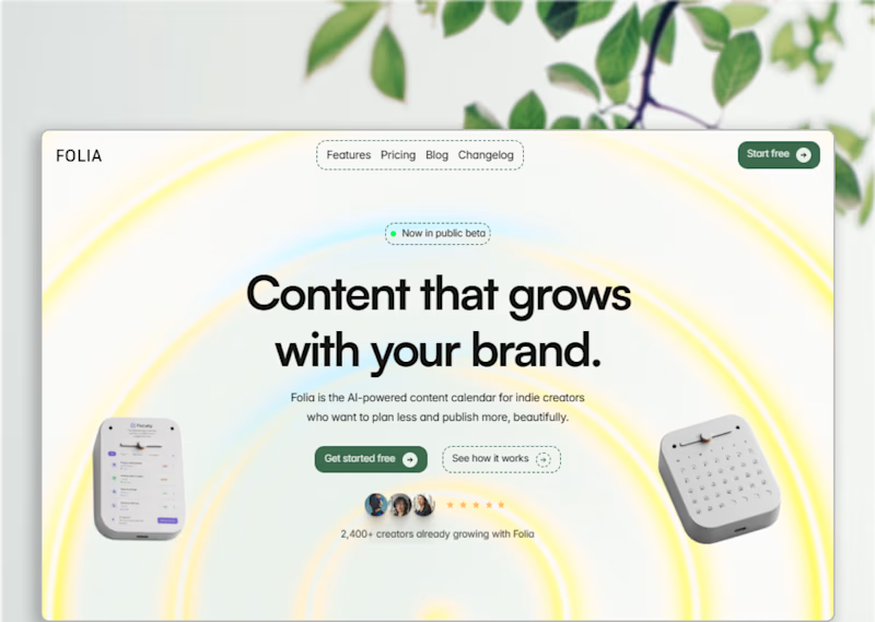
Gradient, more energy. The botanical direction with the soft glow has a lot more personality. The split layout feels more like a dashboard screenshot than a landing page.


Split layout

prefer the splitted layout

I definitely prefer the split layout on the right. Showing that big calendar card gives a much better idea of how the app actually works. Do think that those wavy background lines on the top left feel a bit distracting behind the navigation links. Did you try keeping that area completely clean to see if the text stands out more?


Good catch. The larger calendar card was meant to make the product feel more tangible at first glance
And you're probably right about the wave pattern behind the navigation. Since posting this version, I've actually reduced the opacity of the waves to make them less distracting. Thanks for taking the time to break it down.😍

I liked split layout, but one thing the wave below the logo it looks like it's going down and content says "content that grows" so I think it should go up and eventually if it is so it will draw attention to the button in navigation.

Split layout


Split layout will be my choice

Split layout communicates wayyy faster

The split layout is more neat and balanced

Eye catching!!

Split layout for me, I feel the yellow and blue shades are keeping that style away from feeling energetic


The gradient, more energy is cool for me
The network for creativity
Join 1.25M professional creatives like you
Connect with clients, get discovered, and run your business 100% commission-free
Creatives on Contra have earned over $150M and we are just getting started

Challenges
View all


Related posts

A SaaS website can explain every feature perfectly and still leave one question unanswered:
Why should I care?
That's why CORESPACE includes Stories.
Instead of only describing what the product does, Stories give those features context — showing how they're used and what they make possible.
Features explain the product.
Stories make it relatable.

The “why should I care?” framing is exactly the right antidote to feature tours. Turning real team stories into the connective tissue between the product and its impact makes the homepage feel human, not just informative.

I usually don't stop at 3 breakpoints when building a website.
Most people think about: Mobile, Tablet, Laptop
I like adding one more: Desktop
Because what looks great at 1440px can feel completely different at 1920px...
- The layout gets too wide.
- Spacing starts feeling off.
- Content loses its balance.
So I like testing the system across: Mobile → Tablet → Laptop → Desktop
Not because every website needs exactly 4 breakpoints. But because responsive design isn't about making a few screen sizes work.
It's about making the whole system work.
Follow Rushabh for more website fundamentals, experiments, and things I learn while building for the web.
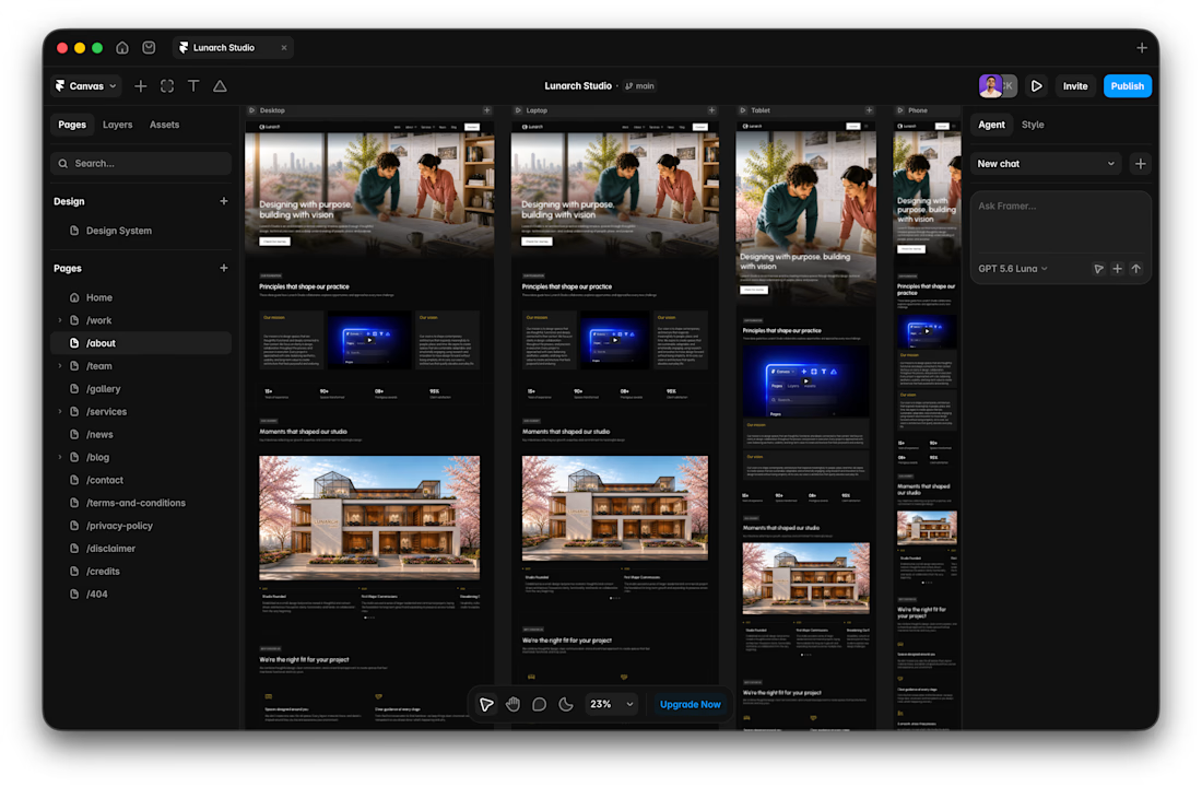

Wide screens expose spacing issues that laptop previews can hide.
A calm interface doesn't have to feel static.
With RISE, the interactions are deliberately restrained.
A subtle hover gives just enough feedback to make the interface feel responsive, without breaking the slower, more considered visual language.
No big effect.
Just a small response at the right moment.

Restraint like this is way harder to pull off than a flashy effect, most sites can't resist doing too much. Was there an interaction you built and then cut because it felt like it was showing off?