The network for creativity
Join 1.25M professional creatives like you
Connect with clients, get discovered, and run your business 100% commission-free
Creatives on Contra have earned over $150M and we are just getting started
Back to feedPost
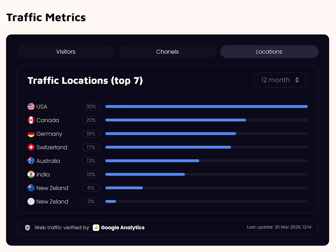
Taste Test
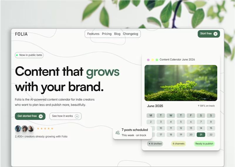
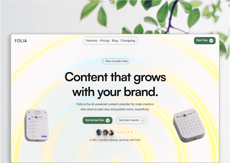
Split layout
Gradient, more energy. The botanical direction with the soft glow has a lot more personality. The split layout feels more like a dashboard screenshot than a landing page.
prefer the splitted layout
I definitely prefer the split layout on the right. Showing that big calendar card gives a much better idea of how the app actually works. Do think that those wavy background lines on the top left feel a bit distracting behind the navigation links. Did you try keeping that area completely clean to see if the text stands out more?
Good catch. The larger calendar card was meant to make the product feel more tangible at first glance
And you're probably right about the wave pattern behind the navigation. Since posting this version, I've actually reduced the opacity of the waves to make them less distracting. Thanks for taking the time to break it down.😍
Modern design.
I liked split layout, but one thing the wave below the logo it looks like it's going down and content says "content that grows" so I think it should go up and eventually if it is so it will draw attention to the button in navigation.
Split layout
Split layout will be my choice
The network for creativity
Join 1.25M professional creatives like you
Connect with clients, get discovered, and run your business 100% commission-free
Creatives on Contra have earned over $150M and we are just getting started
Related posts
Made a couple of mockup covers for my upcoming religious mobile app case study, but can't decide which direction feels stronger.
Which one are you picking?
24 voted
59%
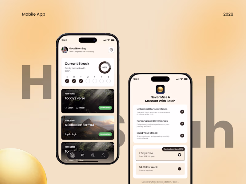
17 voted
41%
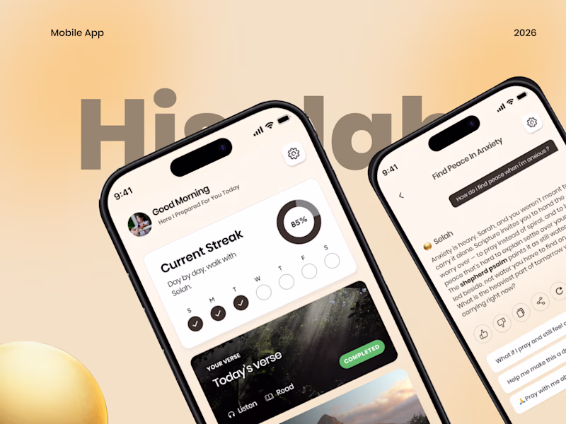
41 votes
Closed
amazing work
every SaaS product deserves a dashboard this clean.
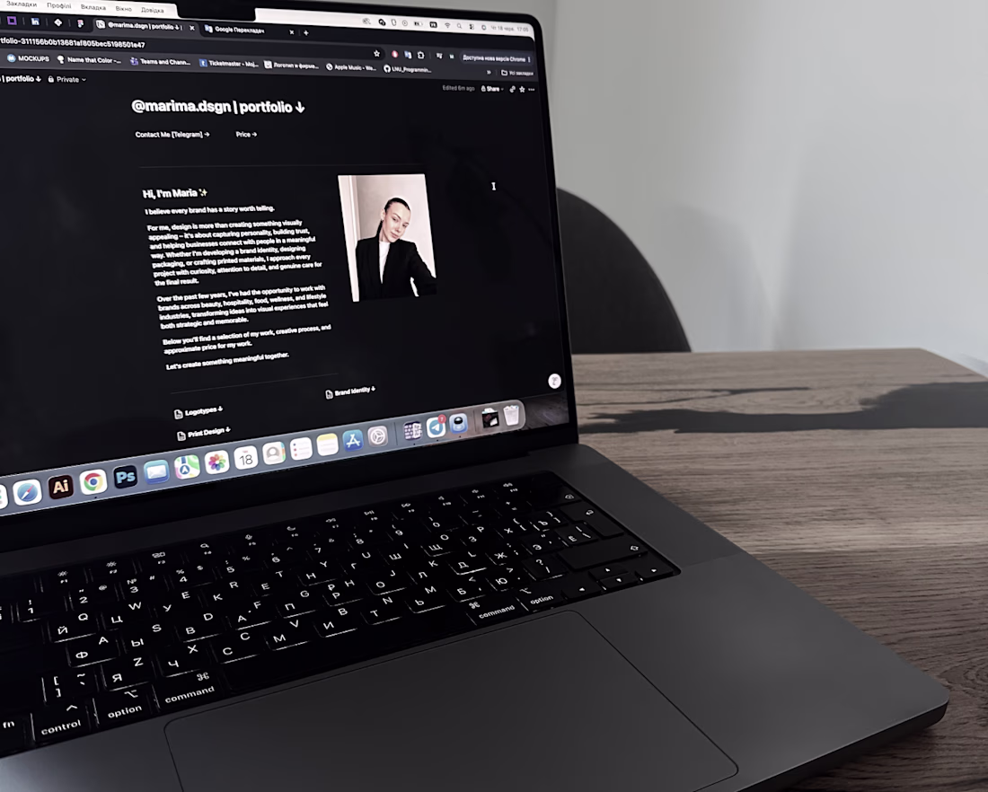
Spent almost the entire day working on my portfolio today 😅
This time, I decided to build it in Notion instead of relying solely on Behance. One thing I really enjoy is the flexibility - I can organize projects into categories, add information about my services, work process, pricing, and make navigation much easier for potential clients.
It feels less like a gallery of projects and more like a space where clients can quickly understand who I am, how I work, and whether we're a good fit.
The portfolio is still a work in progress and I'll continue improving it, but I'd love to hear your thoughts.
Have you ever used a Notion portfolio? Do you find this format comfortable and easy to navigate? Any feedback or suggestions would be greatly appreciated. ✨
Trending
Claude
Claude has entered the design space. How are you using Claude Design?
Contra University
Learn from expert creatives how to earn more using next-gen AI tools.
MagicPath
The canvas is infinite, and exploration is becoming the workflow. How are you using MagicPath?
creativeaiflow
Creative AI workflows are evolving. What tools do you use, and what are their strengths and weaknesses?
freelancerlife
Freelancer life is wins, pivots, and everything in between. What’s yours right now?