The network for creativity
Join 1.25M professional creatives like you
Connect with clients, get discovered, and run your business 100% commission-free
Creatives on Contra have earned over $150M and we are just getting started
Back to feedPost

I designed a restwear brand identity direction for Sleep Like a Goddess, built around softness, ritual, and elevated comfort.
Logo direction, color, typography, and launch-ready brand applications here:
https://www.canva.com/design/DAHIJq7Uz60/HAPUOEEUfKut4hkSviGEvg/edit
The network for creativity
Join 1.25M professional creatives like you
Connect with clients, get discovered, and run your business 100% commission-free
Creatives on Contra have earned over $150M and we are just getting started



Related posts

"Is it too late to eat?"
"Not yet."
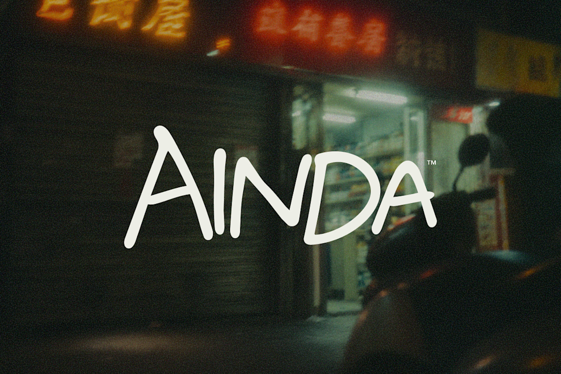
That's pretty much where AINDA started.
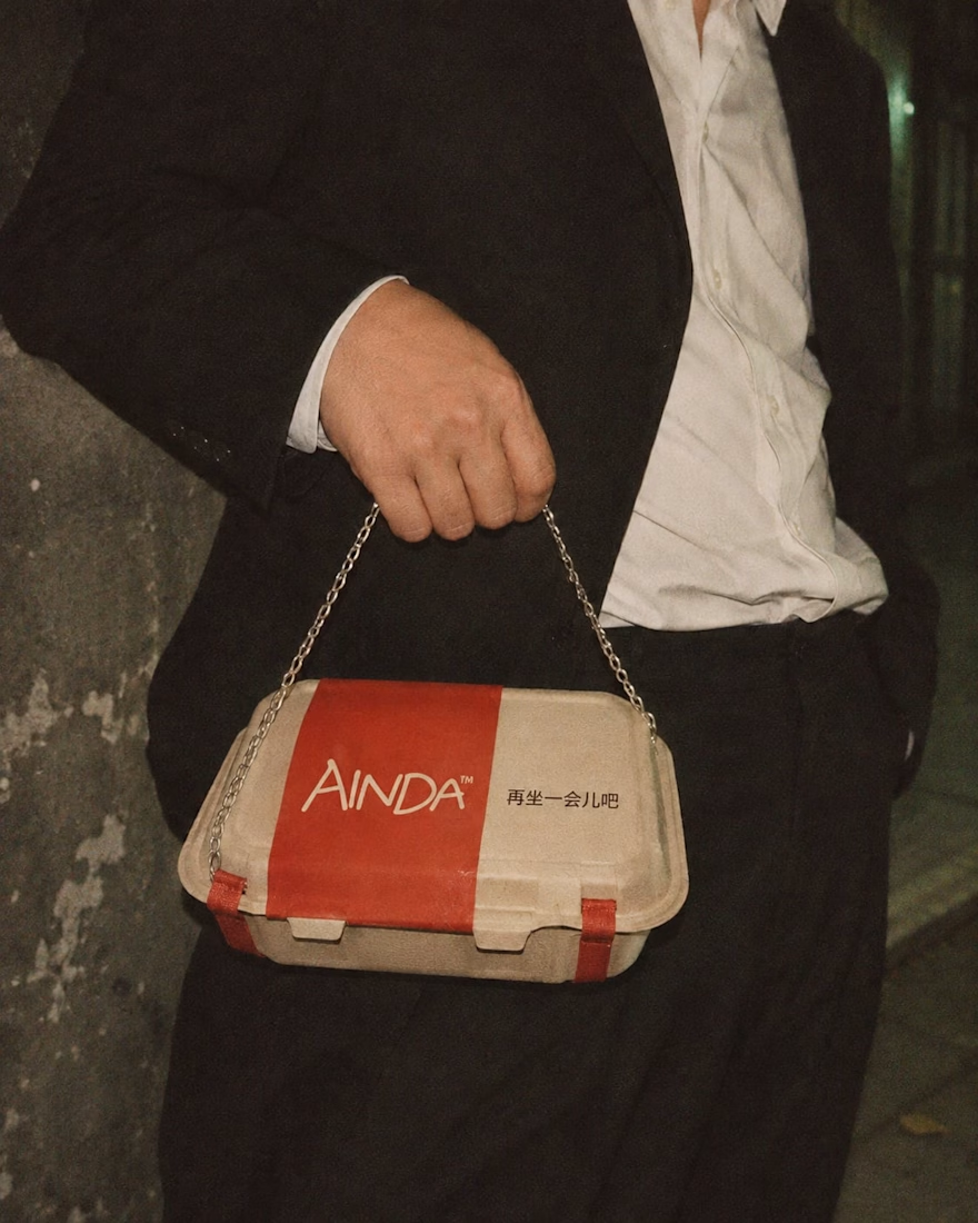
It's a fictional Chinese neighborhood restaurant I'm designing around the hours between today and tomorrow. Somewhere to have a proper meal, sit for a while, and maybe stay a little longer if the conversation isn't over.
I've been developing its identity around that everyday feeling, from the hand-drawn lettering and late-night atmosphere to the packaging and service objects, some of which have gotten a little out of hand.
Here are a few experiments from the project so far. Still a lot to explore.
The restaurant doesn't exist, but apparently its takeout already has places to be.

Love this! Turning a takeout box into a handbag is genius — strong brand storytelling. I do brand & packaging concepts like this too, my DMs are open for collabs. 🔥

A thoughtful brand deserves an identity that reflects its vision.
We collaborated with Noema to develop a distinctive logo and cohesive brand identity, creating a visual language that feels modern, refined, and meaningful.
From logo exploration to typography, color palette, and brand applications, every element was carefully crafted to establish a consistent and recognizable brand presence.
A balance of simplicity, character, and purpose.
Designed by Vektora Studio.
#BrandIdentity #LogoDesign #Branding #VisualIdentity #VektoraStudio

Beautiful work on Noema.

How do you make a construction brand feel consistent from a business card to a building site?
Brixon’s identity brings angular lettering, an assembled geometric symbol, and a lime, black, and white palette together.
I carried those elements into stationery, brand guidelines, team identification, social graphics, and site signage, then brought the system into motion with Adobe After Effects.
The connecting decision: keep the geometry and layout structure consistent while the logo details, messages, and application previews change within the animated panels.
My contribution covered brand design, graphic design, and motion design.
What draws your attention first: the wordmark, the lime palette, or the rotating symbol?
See the full Brixon case study. If you’re shaping a construction or development brand, I’m available for brand identity and motion projects.

Incomparable work!


