The network for creativity
Join 1.25M professional creatives like you
Connect with clients, get discovered, and run your business 100% commission-free
Creatives on Contra have earned over $150M and we are just getting started
Back to feedPost

I found a pizza place called The Oven. 4.8 stars, people genuinely love it, one review literally thanks them for bringing good food to the city. And they had nothing online except a Google listing. No website. Barely 200 followers on Instagram.
A business that's already earned real love from its customers, with zero digital home to match it. That gap is exactly what I do for a living, so for the Base44 x Contra Give It A Glow challenge, I built them one.
A few things I wanted to get right:
The homepage opens with a closed oven door. You tap the handle, it swings open like it's actually hot in there, and the site is revealed behind it. Not a random animation, it's literally their name doing the work.
The menu is a grid of closed pizza boxes. You tap one open to see what's inside, just like you would with a real box. No forced scrolling, no clutter, just sits there calm until you want to look.
Ordering happens through a WhatsApp button shaped like a pizza peel, the wooden paddle you use to slide a pizza in and out of an oven. Tap it, it slides into view, and it opens a WhatsApp chat straight to them with the order pre-filled.
None of this is decoration. It's a live, working site with a real automation behind it, built for a business that actually needed one.
This is what Layered Aesthetics is about. Brands that deserve better than what they've settled for, and don't always realize what the mess is costing them.
Check out the live site: https://oven-hearth-craft.base44.app
Twitter link: https://x.com/layeredaesthet/status/2076520329246384232?s=20
#GiveItAGlow @Base44
The network for creativity
Join 1.25M professional creatives like you
Connect with clients, get discovered, and run your business 100% commission-free
Creatives on Contra have earned over $150M and we are just getting started





Related posts

Every morning, bakeries guess how much bread people will buy. Whatever's left over goes in the bin.
So I designed Ragi Roi, a concept sourdough bakery in Kemang, Jakarta, that only bakes what's already been ordered.
How it works:
→ Pre-order by 8 PM in 3 taps, no account needed
→ The kitchen gets an exact bake sheet the moment orders close
→ Customers pick up warm bread from 7 AM and track their order live
→ Sold-out loaves get a waitlist instead of a dead end
→ A bread matcher helps undecided customers pick in 3 questions
Behind the counter, the owner runs everything from one board: bake sheet, orders, stock, waitlist and reviews.
Built end to end on @Base44, from brand and motion to automations.
The admin board password : 1234


nice work

A landing page should continue the conversation started by the ad.
For Corpus, a Pilates and physiotherapy studio, I designed campaign-specific entry points. Pilates, physiotherapy and RPG each needed a relevant starting point, while sharing one visual system.
The page keeps the brand’s warm, editorial character through typography, photography and movement. Clear service information and WhatsApp calls to action give that visual experience a practical next step.
My role covered art direction, responsive web design, interaction and AI-assisted front-end development.
This clip shows the general version. The responsive layouts follow the same visual language across desktop and mobile.
When designing campaign landing pages, do you start with one master page or with the individual ad journeys?

The WhatsApp handoff could preserve the service context too. A prefilled message naming Pilates, physiotherapy or RPG would help the studio understand why someone arrived, without making them explain the ad they clicked. I’d measure that click separately from a confirmed booking.


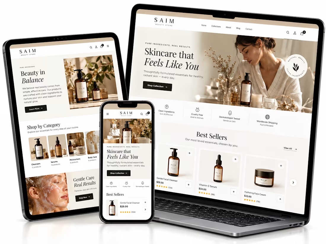
Shopify website setup project, I created a premium eCommerce homepage concept for a startup beauty brand.
Using Lovable, I developed a responsive design framework featuring elegant product showcases, intuitive navigation, clear shopping CTAs, ingredient storytelling, product benefits, customer review sections, FAQs, and email capture.
The goal was to establish a professional brand presence, simplify product discovery, and create a conversion-focused foundation for Shopify development.


The soft neutral palette suits the skincare angle really well, and the best sellers section with the star ratings reads cleanly across all three device mockups. Building the whole concept in Lovable is interesting. Did the generated layout hold up responsively out of the box, or did you rework parts of it by hand?