The network for creativity
Join 1.25M professional creatives like you
Connect with clients, get discovered, and run your business 100% commission-free
Creatives on Contra have earned over $150M and we are just getting started
Back to feedPost


Every letter of the wordmark was uniquely drawn in Adobe Illustrator as a guilloche pattern tile. I then built everything into custom Figma plugins that generate the result, so tash.cards can form unique words for its own communication.


Thank you! 🙌

This is striking Nikas! 👏 The layered guilloche lines in pink and blue against the black background look so precise. I like that you build figma plugins so the wordmark can create new words, since it makes the brand flexible and unique. Great work on tash.cards!
Thanks! 🙌

Cool design!
The network for creativity
Join 1.25M professional creatives like you
Connect with clients, get discovered, and run your business 100% commission-free
Creatives on Contra have earned over $150M and we are just getting started



Related posts

Brand work for Boofi, DeFi platform
We are working on visual direction, motion and animations


So cute! Love it!

Text on album covers is tacky? Whatever 🤌🏼 Vienna Starlight Boom 😒
Typography can ABSOLUTELY make an album cover.
During the pandemic, I got obsessed with album cover design. I'd spend hours looking at covers, researching the designers behind them, and trying to understand the decisions and creative processes that made them work.
It was one of those design rabbit holes I could never get tired of. 💀
I'm bringing that interest back with a new cover inspired by the music I love, including Neil Young's Harvest, Bandalos Chinos' Paranoia Pop and Uncle Acid & The Deadbeats' Vol. 1.
Looking at these alongside other great album covers, one thing stands out: typography CAN be the image!
I took inspiration and designed one as well!
What's an album cover where the typography is impossible to separate from the artwork? Show me your favorites.
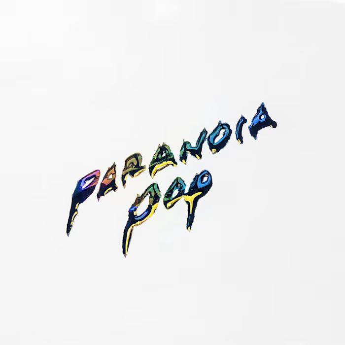
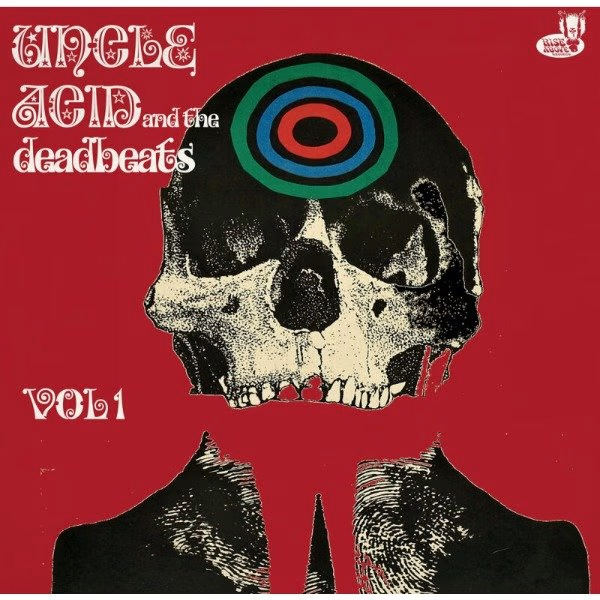
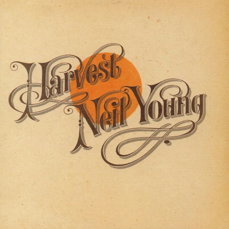
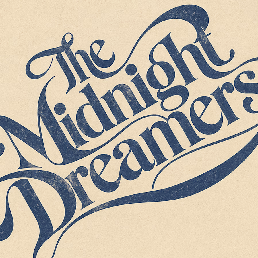

Reid Miles' Blue Note covers are my pick, where the cropped oversized lettering carries as much mood as any photo could. Your Paranoia Pop treatment has that quality too, the letterforms feel poured into the image rather than placed on it.

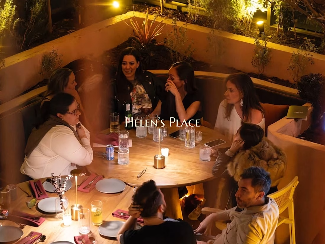
Some meals are about the food. Others are about the people around the table. At Helen’s Place, you get the best of both.
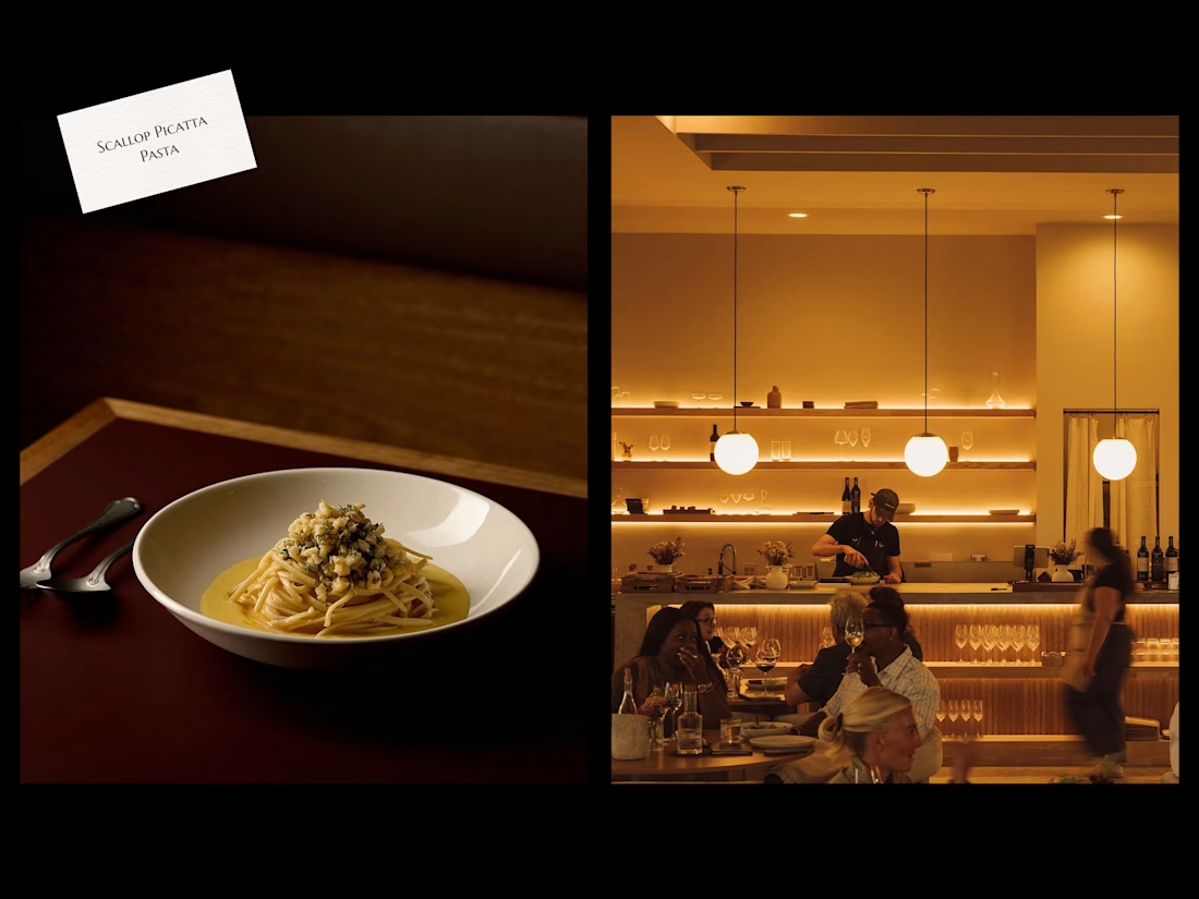
Rooted in the rich culinary traditions of the Mediterranean and Italy, guests enjoy the warm and welcoming ambiance of eating good food with family and friends.
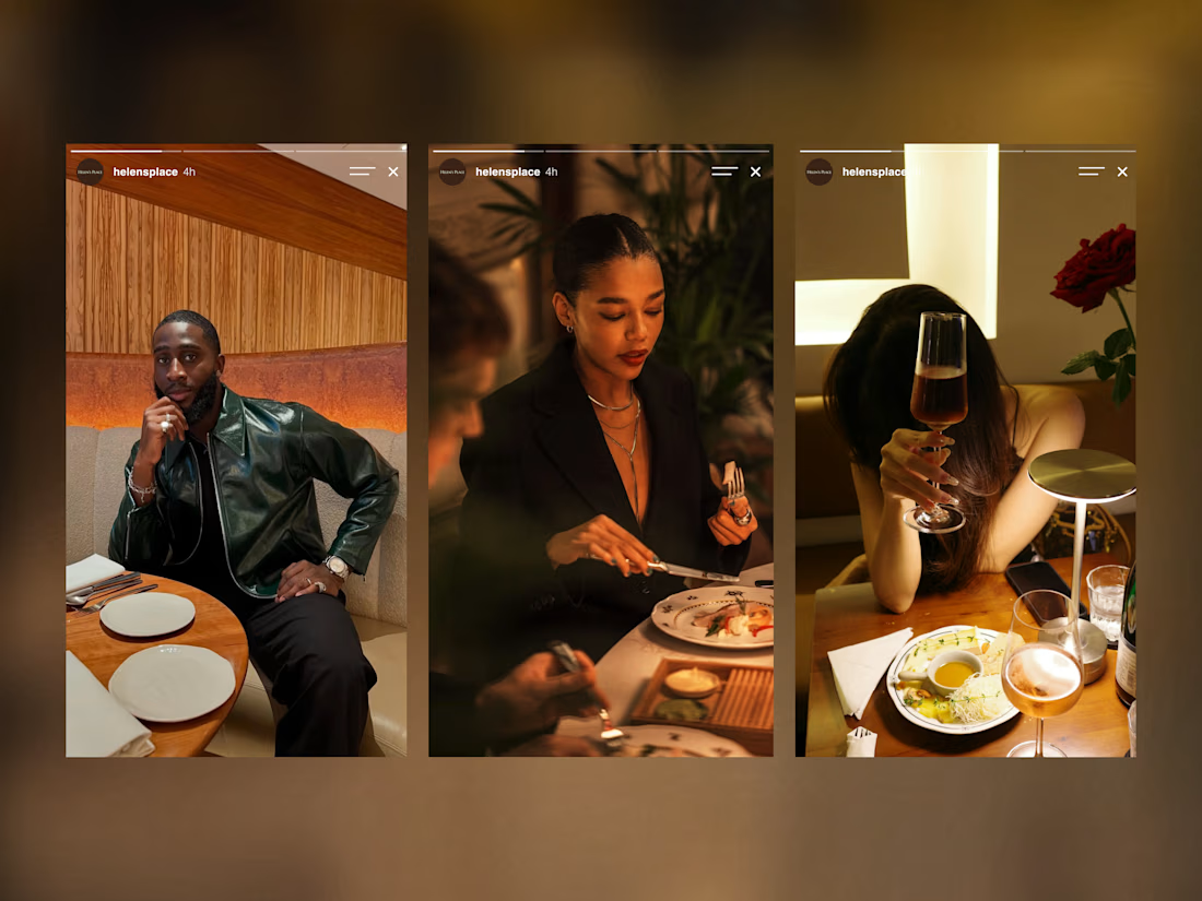
Great food brings you in. The experience is what keeps you coming back.
There’s no place, like Helen’s Place. 🌿
Check it out.

Beautiful work!