The network for creativity
Join 1.25M professional creatives like you
Connect with clients, get discovered, and run your business 100% commission-free
Creatives on Contra have earned over $150M and we are just getting started
Back to feedPost
Taste Test


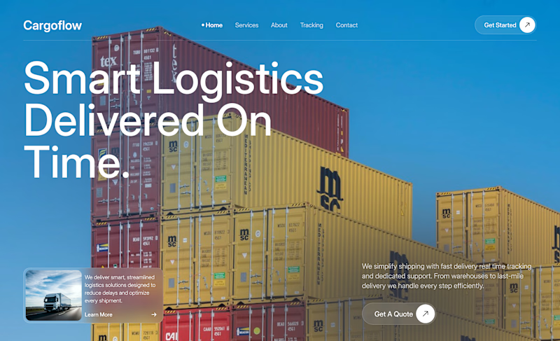
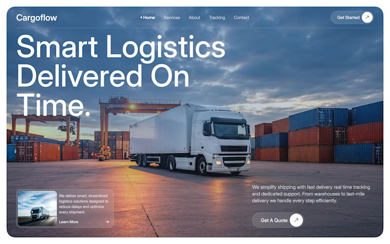

1 feels more energetic, but 2 feels more premium to me. Tough choice 👀

I’d go with 2. The cinematic image makes the brand feel more established.

2nd looks good


I’d pick 2. Feels more direct and gives that sense of speed right away.

second is better, maybe you can move "time" next to "on"

Option 2 the dynamic shot of the truck in motion conveys delivered on time way more effectively than still containers.

Go with 2


Direction 1 hits the mark! The visual hierarchy makes the speed and efficiency message crystal clear


2 looks good with the car, gives more of a brand vibe and clear view, that's why 100% are with 2
yeah, exactly

huge fan of 2!
The network for creativity
Join 1.25M professional creatives like you
Connect with clients, get discovered, and run your business 100% commission-free
Creatives on Contra have earned over $150M and we are just getting started
Trending
retrofuturism
Share your favorite designs from the past exploring the distant future. Or your own take on the aesthetic 🚀
halftone
Dots. Texture. Grain. Let's see your designs using the halftone technique.

Midjourney
Creatives are showing off what they're making with Midjourney.
colorgrade
Video editors sound off: How do you enhance the mood of your video in color grading?





Related posts


What actually creates activation in a focus product?
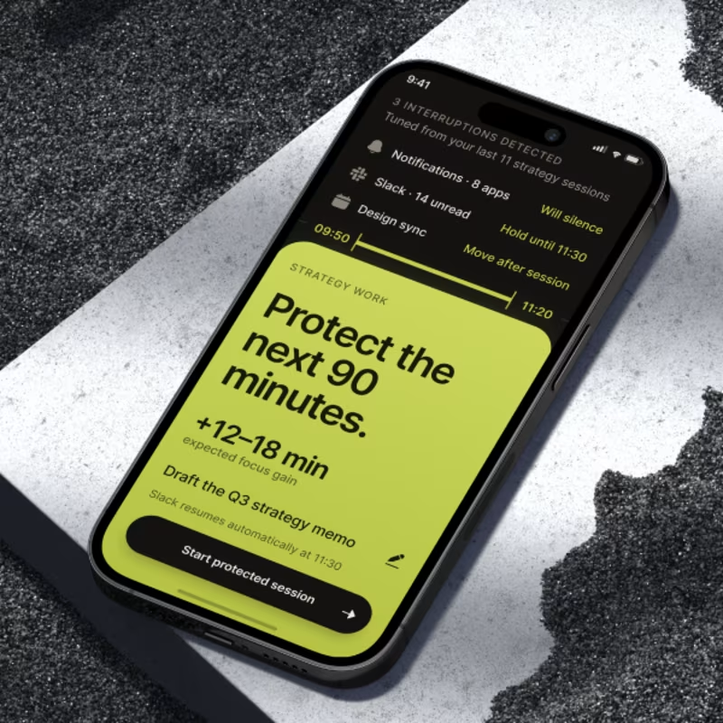
🛡️ A - Protection-first
The user immediately sees what the system will remove from their path: notifications, Slack, calendar conflicts & other likely interruptions
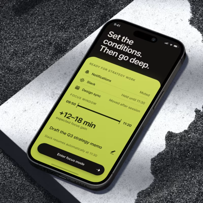
⚡ B -Preparation-first
The product first creates a sense of readiness for deep work: conditions are set, the focus window is clear, & the goal is defined
I’m less interested in which screen looks better
The real question is:
At what point does the user think, “Okay, this product can actually help me do better work”?
What creates a stronger activation moment — and potentially stronger retention?
🛡️A or⚡B
And one level deeper:
Should a productivity product sell users control over distractions, or confidence that they are entering the right conditions to do meaningful work?

23 voted
53%
20 voted
47%
43 votes
Closed

My gut says B wins on activation but A wins on retention. Protection feels urgent right in the moment, preparation is what actually makes someone open the app again tomorrow. Curious if your testing points the other way.

Same layout but two completely different feelings🙂↔️
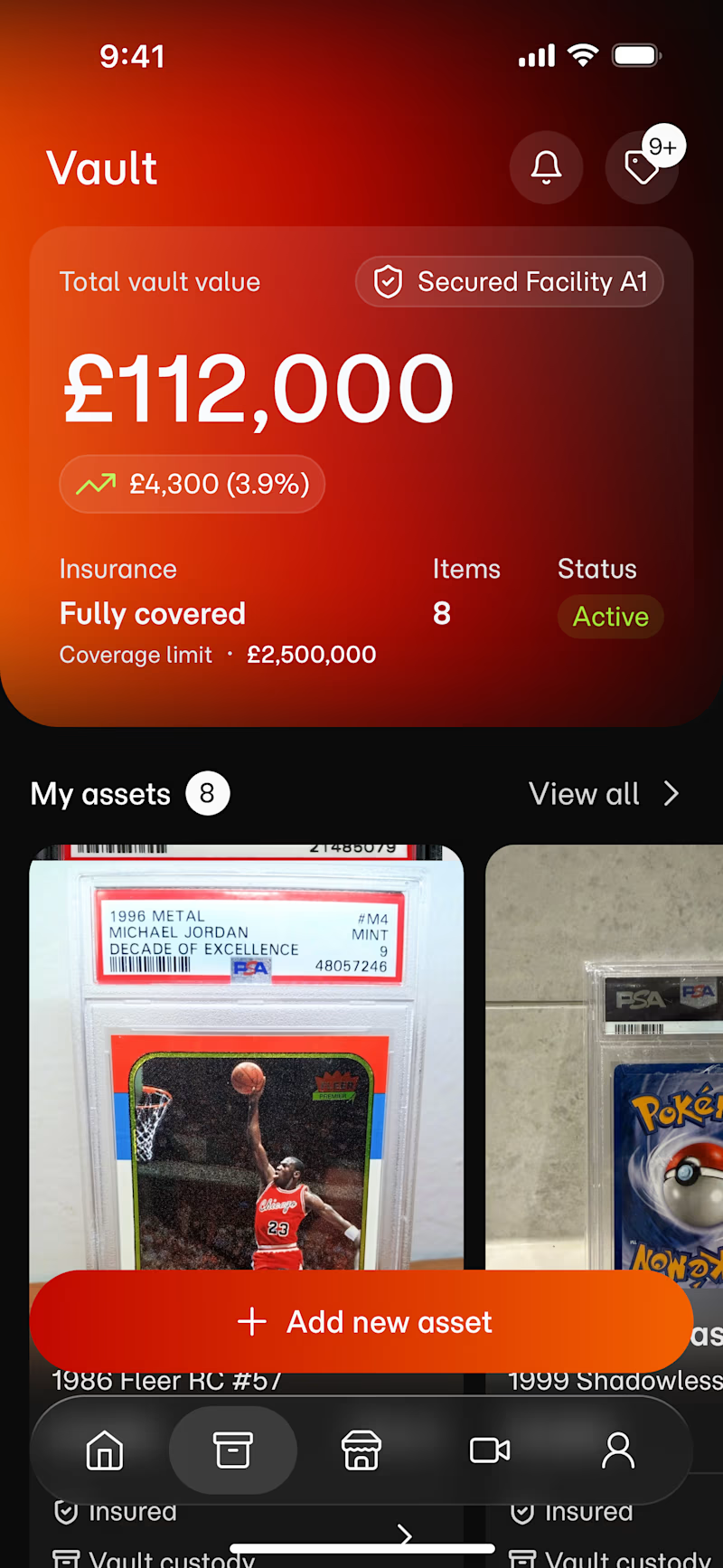
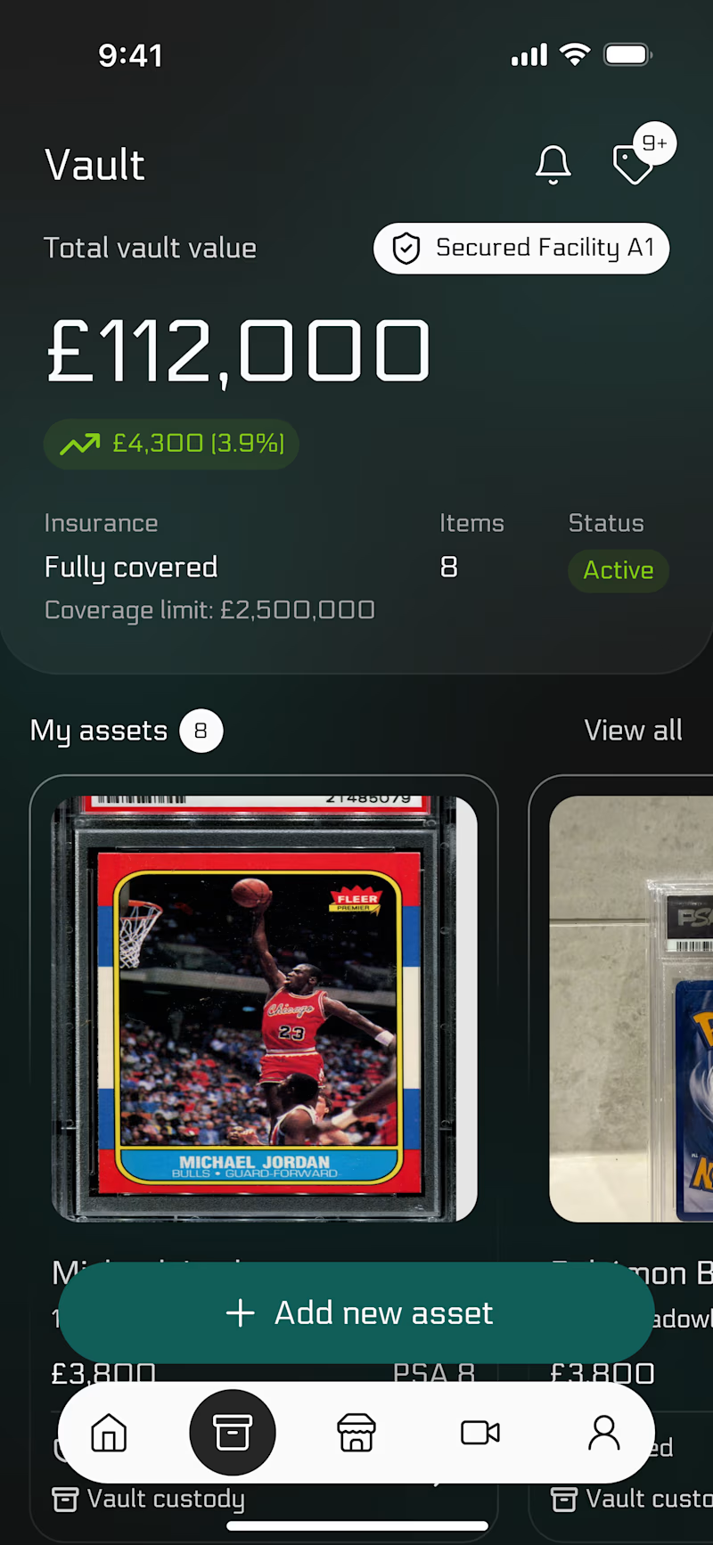
This is a vault app. The design has one job: make it feel safe to open.
🧮 The red one is alert.
🐊 The dark one is calm.
Which one would you trust with your collection?
52 voted
57%
39 voted
43%
91 votes
Closed
Red usually reads as 'something's wrong' rather than 'high value,' so my gut says the dark concept builds more trust when there's real money on screen. Have you tested this with actual users yet, or is this poll your first read on it?

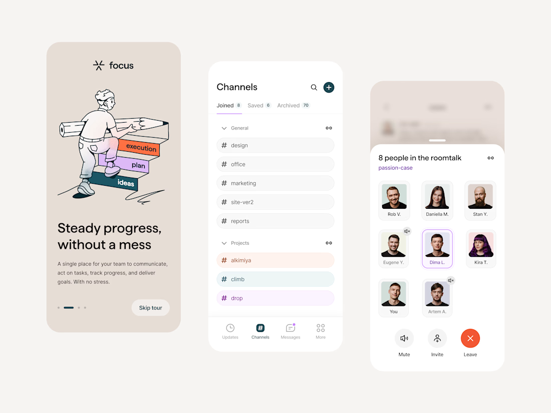
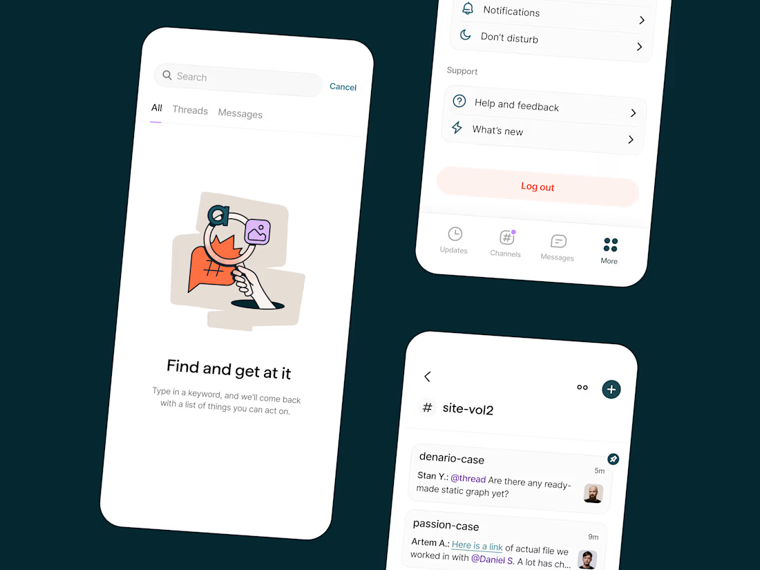
Team collaboration: Mobile app interface, Illustrations
A mobile app design exploration for team communication, built around one problem: threads bury important info, and people end up pinging each other just hoping for a reply, with no clarity on what actually needs attention. I solved it by sorting threads by priority and progress, so the screen only shows what matters right now. I also made the illustrations friendly on purpose, since async communication already feels distant enough without a cold interface making it worse.

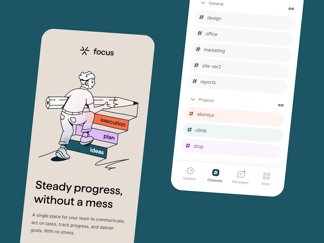

Love the illustrations!