The network for creativity
Join 1.25M professional creatives like you
Connect with clients, get discovered, and run your business 100% commission-free
Creatives on Contra have earned over $150M and we are just getting started
Back to feedPost
Taste Test

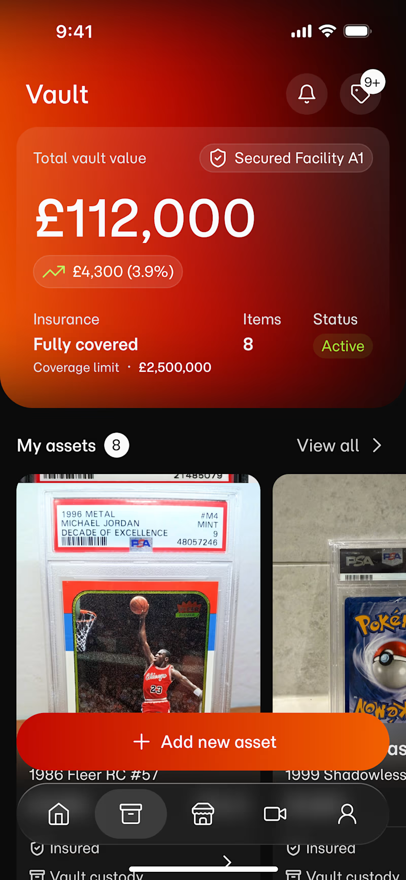
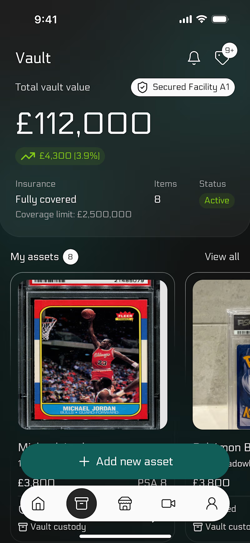
Same layout but two completely different feelings🙂↔️
This is a vault app. The design has one job: make it feel safe to open.
🧮 The red one is alert.
🐊 The dark one is calm.
Which one would you trust with your collection?
14 votes
Ends in 1d

Dark)


Red feels more unique 🚀

love both, but the red feels doubly energizing!

I'd choose green if the message is "safe to open", but red is more porminent and eye-catcheng for sure

Red😍

The Red Vibe is fantastic


Love orange one !!! amazing
The network for creativity
Join 1.25M professional creatives like you
Connect with clients, get discovered, and run your business 100% commission-free
Creatives on Contra have earned over $150M and we are just getting started
Trending
retrofuturism
Share your favorite designs from the past exploring the distant future. Or your own take on the aesthetic 🚀
halftone
Dots. Texture. Grain. Let's see your designs using the halftone technique.

Midjourney
Creatives are showing off what they're making with Midjourney.
colorgrade
Video editors sound off: How do you enhance the mood of your video in color grading?


Related posts

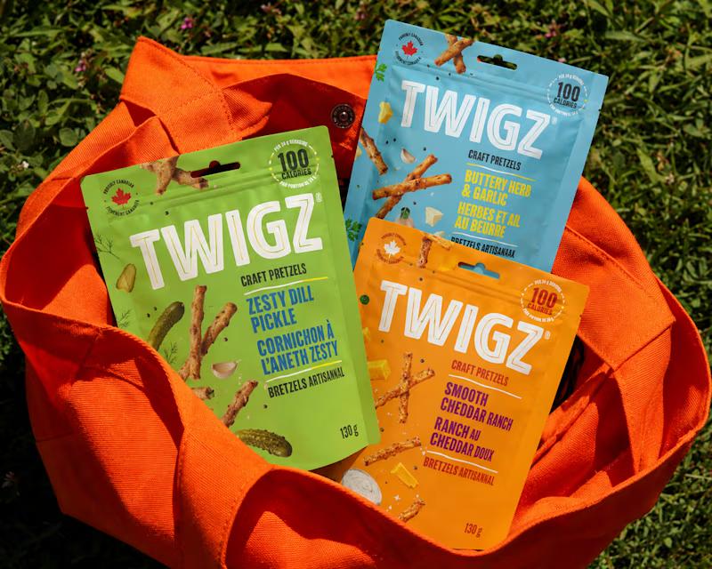
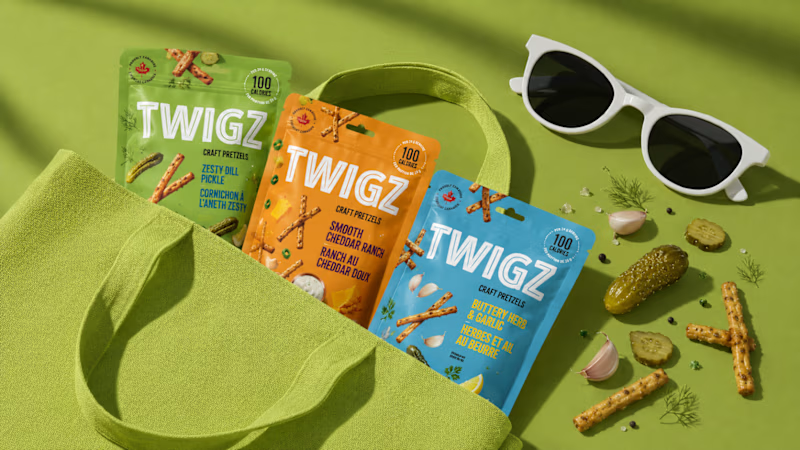
Which TWIGZ Product Mockup Direction Do You Prefer?
18 voted
67%
9 voted
33%
27 votes
Closed

Sunset pop without any second guesses! The orange really makes the packaging stand out. Great work😍


Incredible. Love the way you put this together

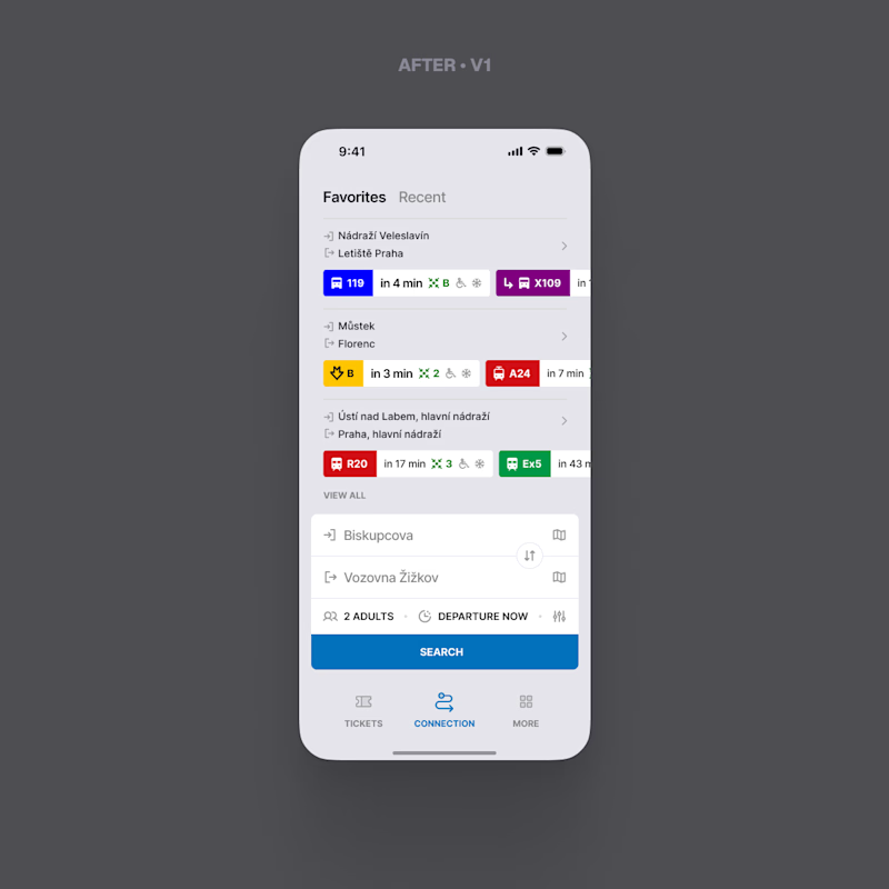
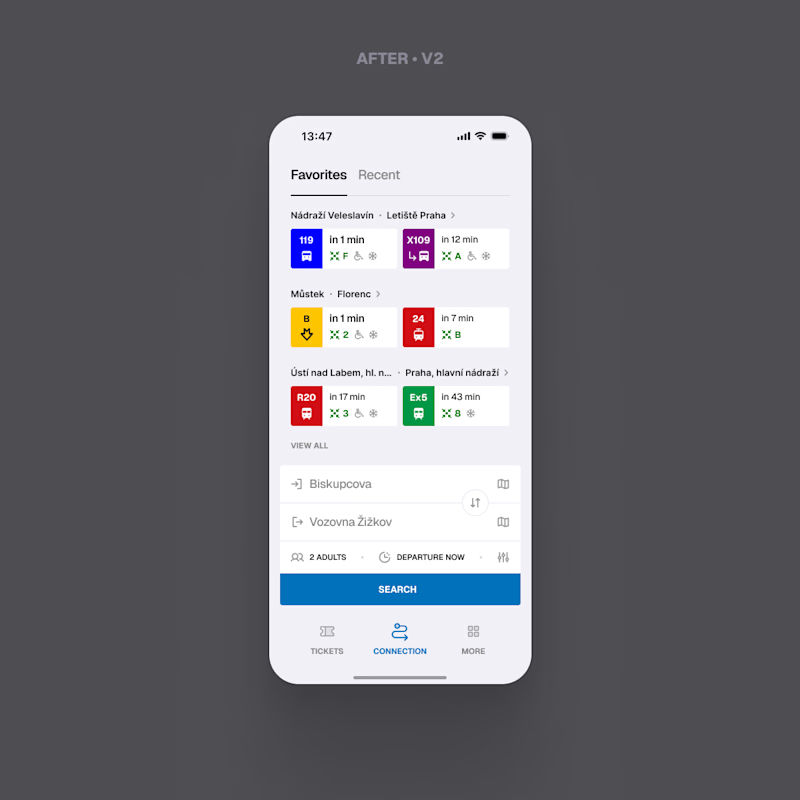
Round two. Last time you chose between the original screen and my version of it. This time both options are mine.
They answer the same question differently: what if the first departure does not work for you. V1 scrolls sideways, and the cut off card tells you there is more. V2 shows exactly two, the next one and the one after it, and moves the rest behind the chevron next to the route.
This is the last round of "same logic, better surface". After this one I stop polishing and start redesign: the whole flow, the structure, the UX, not just the pixels.
Which version should I carry into it?
1 voted
10%
9 voted
90%
10 votes
Closed
V2 for me. V1 hints there’s more, but the cut-off card almost feels accidental.