The network for creativity
Join 1.25M professional creatives like you
Connect with clients, get discovered, and run your business 100% commission-free
Creatives on Contra have earned over $150M and we are just getting started
Back to feedPost
Taste Test
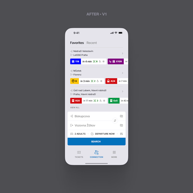
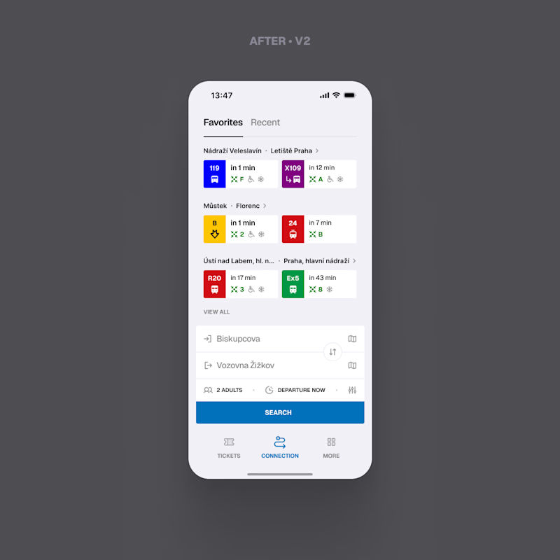
Round two. Last time you chose between the original screen and my version of it. This time both options are mine.
They answer the same question differently: what if the first departure does not work for you. V1 scrolls sideways, and the cut off card tells you there is more. V2 shows exactly two, the next one and the one after it, and moves the rest behind the chevron next to the route.
This is the last round of "same logic, better surface". After this one I stop polishing and start redesign: the whole flow, the structure, the UX, not just the pixels.
Which version should I carry into it?

1 voted
10%
9 voted
90%
10 votes
Closed

V2 for sure!

Thanks

Thank you!

V2's sideways scroll feels more forgiving for the case where the first option falls through. Have you actually tested which one keeps people from bouncing when that happens, or is this still a gut call?
Thanks! Small correction: V2 has no sideways scroll for options, it just shows two routes (fastest + next), with a chevron next to the destination for the full list.
So V2 surfaces the fastest route quicker and shows two right away, while V1 usually needs a scroll to see route...
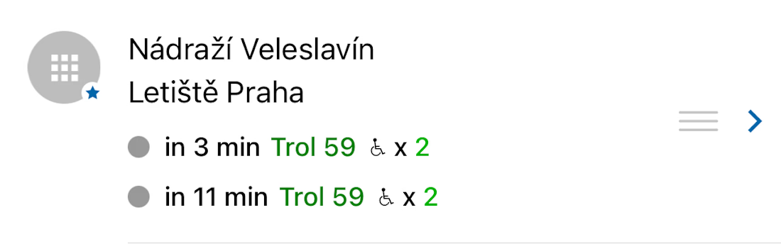

V2's chevron-behind-the-fold move quietly changes what "more options" means to the user. Once the full redesign starts, does that route hierarchy carry over, or is it back up for debate too?
Thanks, good catch! One correction: that chevron behavior isn't new, it's from the original app, I kept it as is on purpose.
As for the full redesign, the hierarchy is still open, nothing's decided yet 😊

V2 looks great! ❤️
Thanks!

I think option 2 works better for me. Also, I'd appreciate it if you'd join my A/B test.
Thank you!


v2, the cut off card thing always bugs me
Thank you!

V2 for me. V1 hints there’s more, but the cut-off card almost feels accidental.
Thanks! Fair point on V1, the cut-off was meant to hint at scrolling, but I see how it reads as accidental instead. Good feedback
The network for creativity
Join 1.25M professional creatives like you
Connect with clients, get discovered, and run your business 100% commission-free
Creatives on Contra have earned over $150M and we are just getting started








Related posts

Two Ads, Two Designs but Different Vibes:
Using the hours and the rest day, I came with these ads using the
software of SVGator combined with the transitions from Adobe After Effects.
Vote and let me know your opinions on which one and why?


12 voted
57%
9 voted
43%
21 votes
Closed


The Good Times website is live 👀
Most app sites start with a phone mockup and a list of features. This one starts with the problem, so you can see yourself in it first. The app shows up after that, as the answer.
https://goodtimestimer.com/
Built with Astro.


Great concept

Exploring Two Branding Concepts
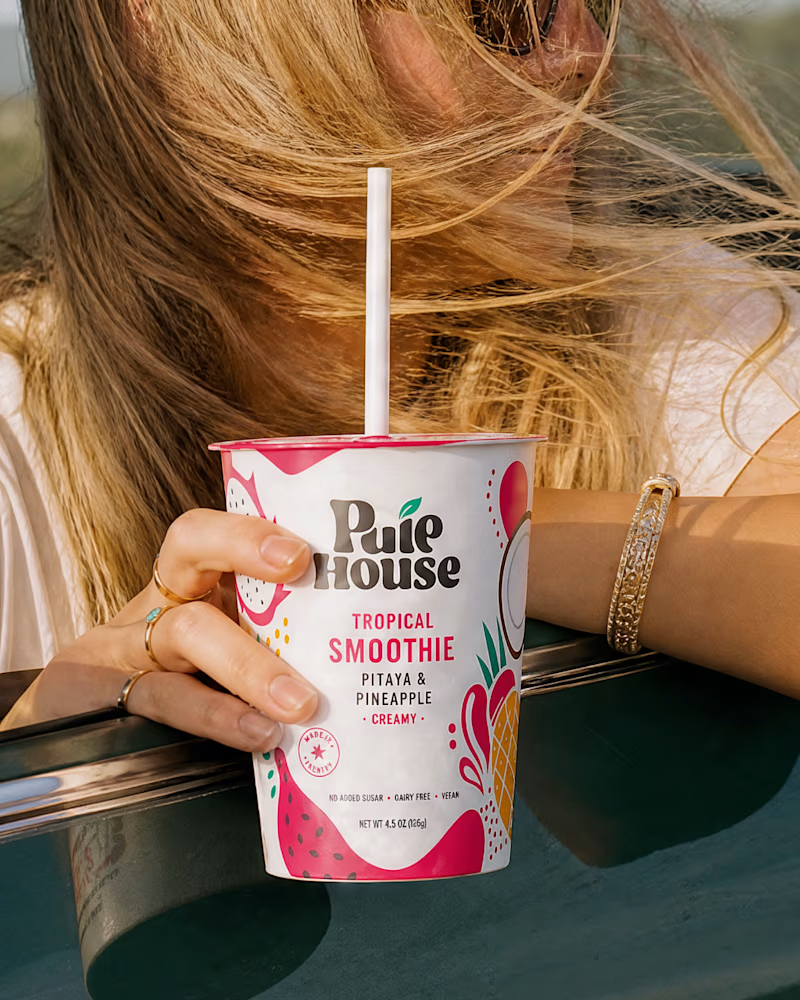
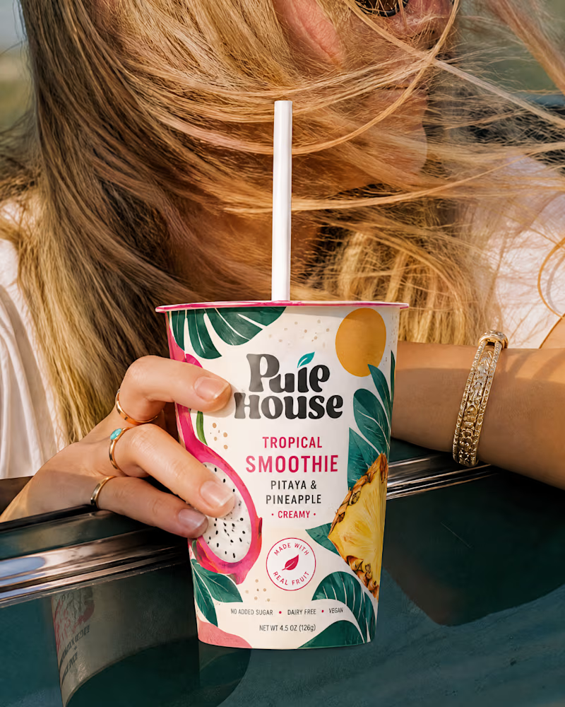
I explored two distinct visual directions for Pulp House, focusing on how color, composition, and design elements can shape a brand's identity.
This comparison reflects my approach to creating thoughtful, cohesive visuals that help businesses present their brands with confidence.
1 voted
5%
20 voted
95%
21 votes
Closed

'After' one is more catchy,, no doubt