The network for creativity
Join 1.25M professional creatives like you
Connect with clients, get discovered, and run your business 100% commission-free
Creatives on Contra have earned over $150M and we are just getting started
Back to feedPost
Introducing Current.
A premium Framer template for SaaS, AI, software, and technology products that need more than another polished landing page.
Current is built around one idea:
Make the product easier to understand, trust, and choose.
Instead of relying on generic dashboards, endless feature grids, and visual noise, it uses focused product storytelling, cinematic editorial visuals, and conversion-focused structure to explain what matters.
What's moving.
What needs you.
What's coming.
Built for teams launching a new SaaS product, AI company, software platform, or digital product.
Current → The Product Link

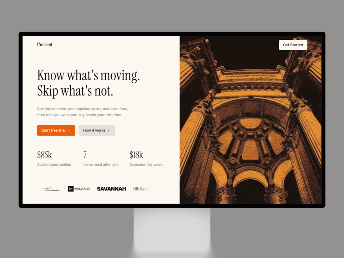

the architectural photo next to the dashboard stats is an unusual pairing for a SaaS template, works better than the generic gradient blob most of these go with.

Thanks, Rafee! I chose an architectural photo to give the template a grounded, real-world feel instead of a fake tech vibe
The network for creativity
Join 1.25M professional creatives like you
Connect with clients, get discovered, and run your business 100% commission-free
Creatives on Contra have earned over $150M and we are just getting started

Challenges
View all


Related posts

Custom liquid interaction built in Framer.
Turning a static hero into a responsive visual surface through cursor-driven distortion.


How do you adapt the cursor-driven effect for touch screens?

New site, fresh launch ✦
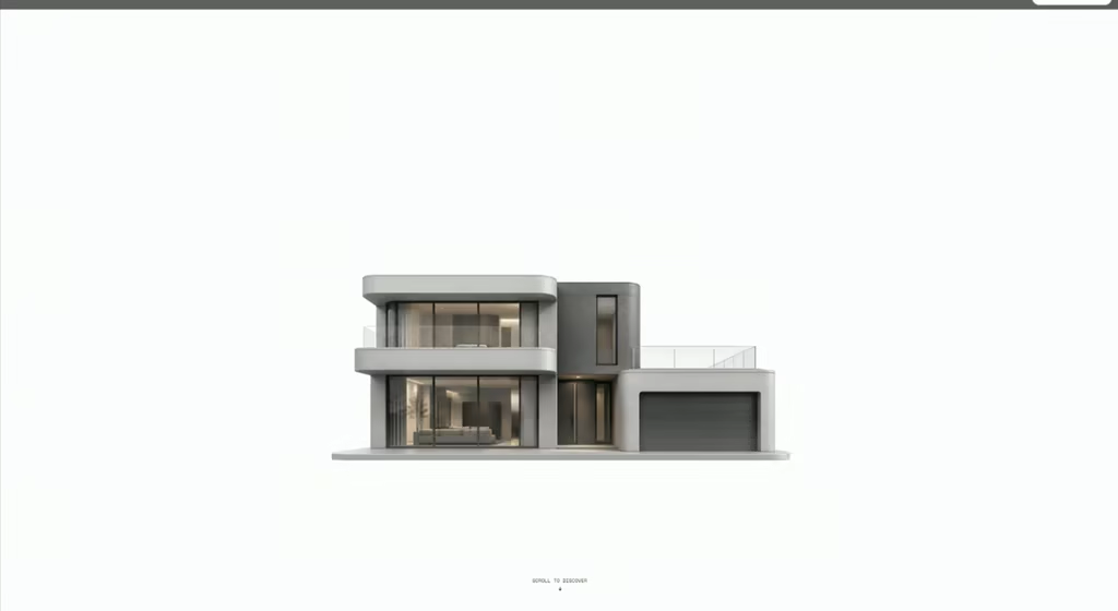
Designed and built LANDWISE — a tokenized real estate platform focused on making fractional property investing feel more accessible, transparent, and global.
For the hero, I wanted the interaction itself to communicate what the product is about.
Hovering over the building reveals property price tags — subtly suggesting that each building represents a tokenized real estate opportunity.
The goal was to make the concept understandable through the visual experience, without having to explain everything upfront.

Creative thinking

I usually don't stop at 3 breakpoints when building a website.
Most people think about: Mobile, Tablet, Laptop
I like adding one more: Desktop
Because what looks great at 1440px can feel completely different at 1920px...
- The layout gets too wide.
- Spacing starts feeling off.
- Content loses its balance.
So I like testing the system across: Mobile → Tablet → Laptop → Desktop
Not because every website needs exactly 4 breakpoints. But because responsive design isn't about making a few screen sizes work.
It's about making the whole system work.
Follow Rushabh for more website fundamentals, experiments, and things I learn while building for the web.
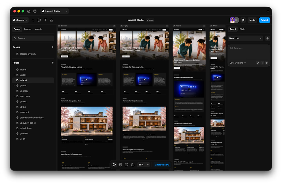
Wide screens expose spacing issues that laptop previews can hide.