The network for creativity
Join 1.25M professional creatives like you
Connect with clients, get discovered, and run your business 100% commission-free
Creatives on Contra have earned over $150M and we are just getting started
Back to feedPost
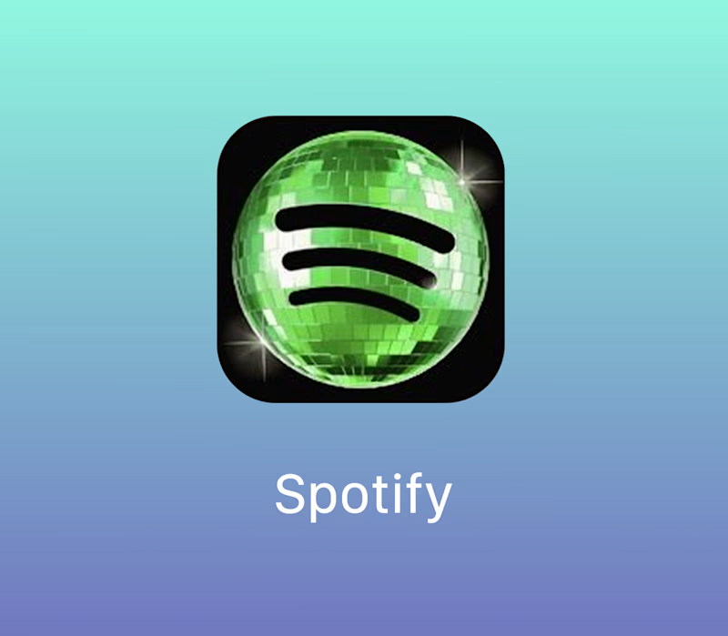
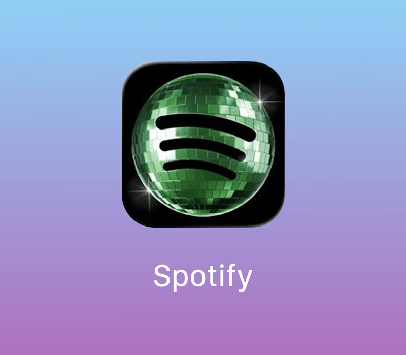
Taste Test


I know we have a war happening right now because of this icon, but what do you prefer?
40 voted
83%
8 voted
17%
48 votes
Closed

i went with option 2. It gives an aged vibe for the anniversary

the second, no doubt. if you go for the disco vibe, i say vibrancy should be embraced full-out!

I prefer the option 1, it looks amazing!


this is really hard =)
but for an app icon, I’m pretty sure it should be the lighter one so it stands out more among all the others

I really like the acid brat green one hahaha but i dont think this logo is the best solution >.<

The network for creativity
Join 1.25M professional creatives like you
Connect with clients, get discovered, and run your business 100% commission-free
Creatives on Contra have earned over $150M and we are just getting started






Related posts

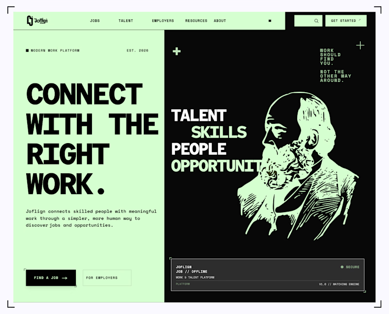
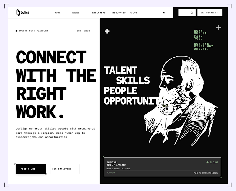

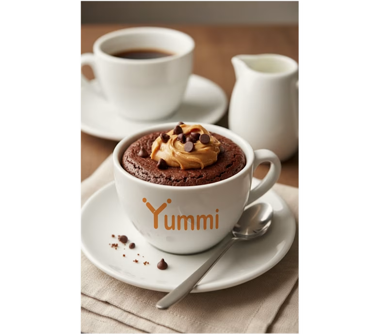
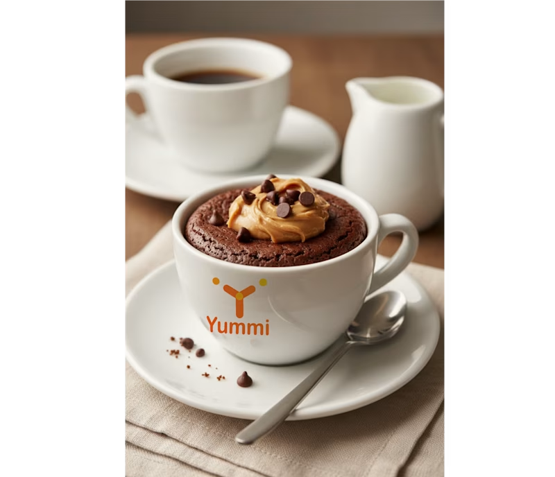
Brand identity concept for Yummi! 🍊 Which presentation do you like more for this brand?
👉 Option A: Clean minimalist log
👉 Option B: Real cafe logo
It's really hard for me to manage which logo is best to look in mokcup designs.
Let me know your thoughts in the comments!
5 votes
Ends in 1d

Smaller is better

Icon animations for a new project.
Having fun building this out 🙂↕️
