The network for creativity
Join 1.25M professional creatives like you
Connect with clients, get discovered, and run your business 100% commission-free
Creatives on Contra have earned over $150M and we are just getting started
Back to feedPost
Taste Test
Brand identity concept for Yummi! 🍊 Which presentation do you like more for this brand?
👉 Option A: Clean minimalist log
👉 Option B: Real cafe logo
It's really hard for me to manage which logo is best to look in mokcup designs.
Let me know your thoughts in the comments!
3 voted
43%
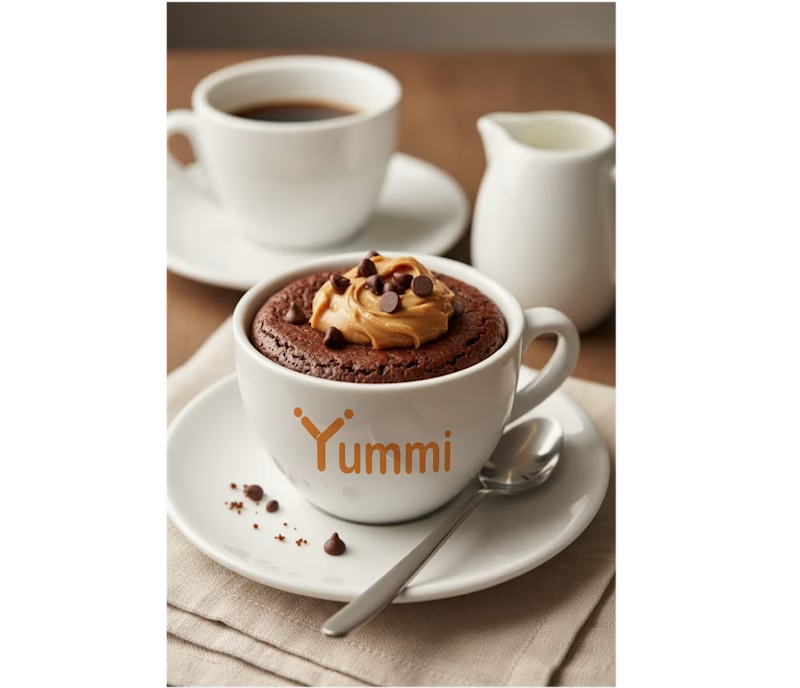
4 voted
57%
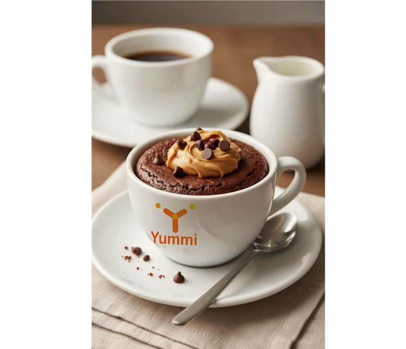
7 votes
Closed

I liked yummi 2nd logo. Its giving stylish looks

Thank a lot. That is what i wanna see a good concepts in my work I would my best to make it another good logo designs

Smaller is better
Thanks it reminds me a lot of concept

Thanks for the valuable feedback! Scaling down the clean logomark on the real cafe mockup really makes it pop."

Voted for the 1st logo. The clean orange wordmark sits better on the cup and stays readable.
Thanks for the valuable feedback! Scaling down the clean logomark on the real cafe mockup really makes it pop
The network for creativity
Join 1.25M professional creatives like you
Connect with clients, get discovered, and run your business 100% commission-free
Creatives on Contra have earned over $150M and we are just getting started



Related posts

YUZU Flavor Face-Off — Which One Wins?
39 voted
48%
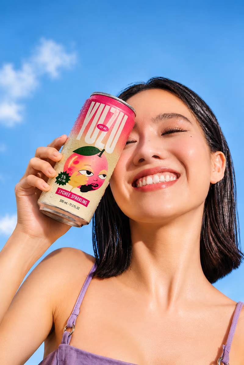
43 voted
52%
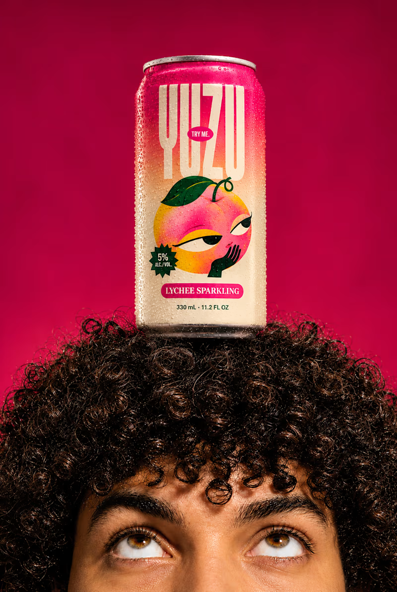
82 votes
Closed

Fresh & Bold gets my vote. That deep red makes the can impossible to miss, and the design lets the product do the talking instead of the lifestyle shot around it. Sweet & Playful is lovely photography, but on a shelf I think the red one is the one you'd actually pick up first.


A quick exploration of two different directions for a wellness product ad.
One focuses on the product, while the other brings more attention to the product information.
These are early explorations, just to get a feel for the brand and its visual direction.
I’d love to hear your honest thoughts. Which direction feels more effective, and what would you improve?
1 voted
50%
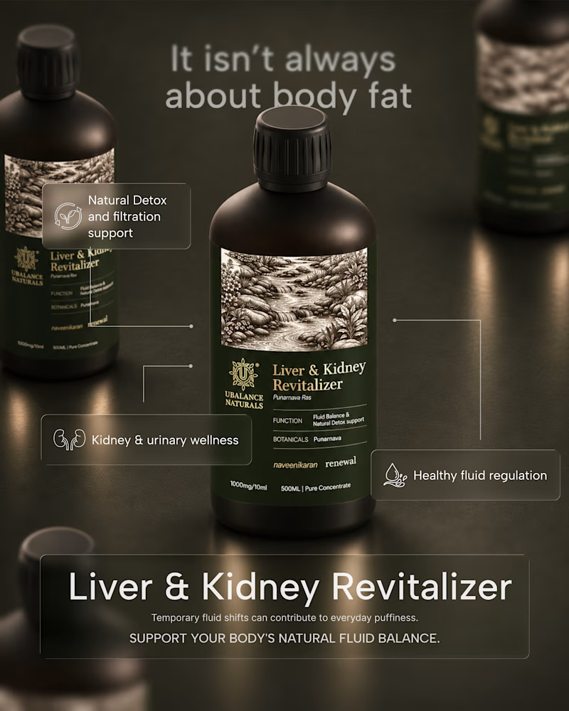
1 voted
50%
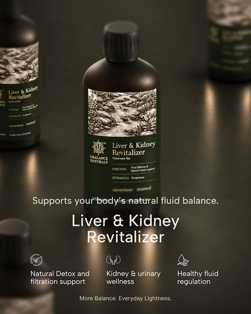
2 votes
Closed
Honest take: the information-first direction wins for me. "It isn't always about body fat" is a proper hook — it speaks to the actual worry behind the product, so it stops the scroll. The product-first shot is gorgeous, but it reads more like a product page image than an ad. One...


Currently exploring these 2 directions, which one do you pick?

1 voted
11%
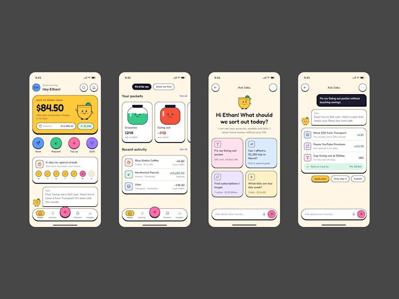
8 voted
89%
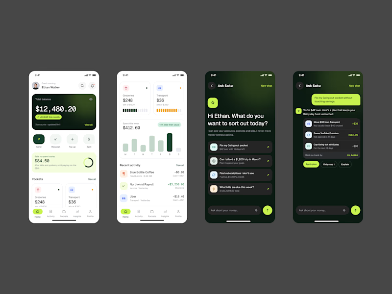
9 votes
Closed