The network for creativity
Join 1.25M professional creatives like you
Connect with clients, get discovered, and run your business 100% commission-free
Creatives on Contra have earned over $150M and we are just getting started
Back to feedPost

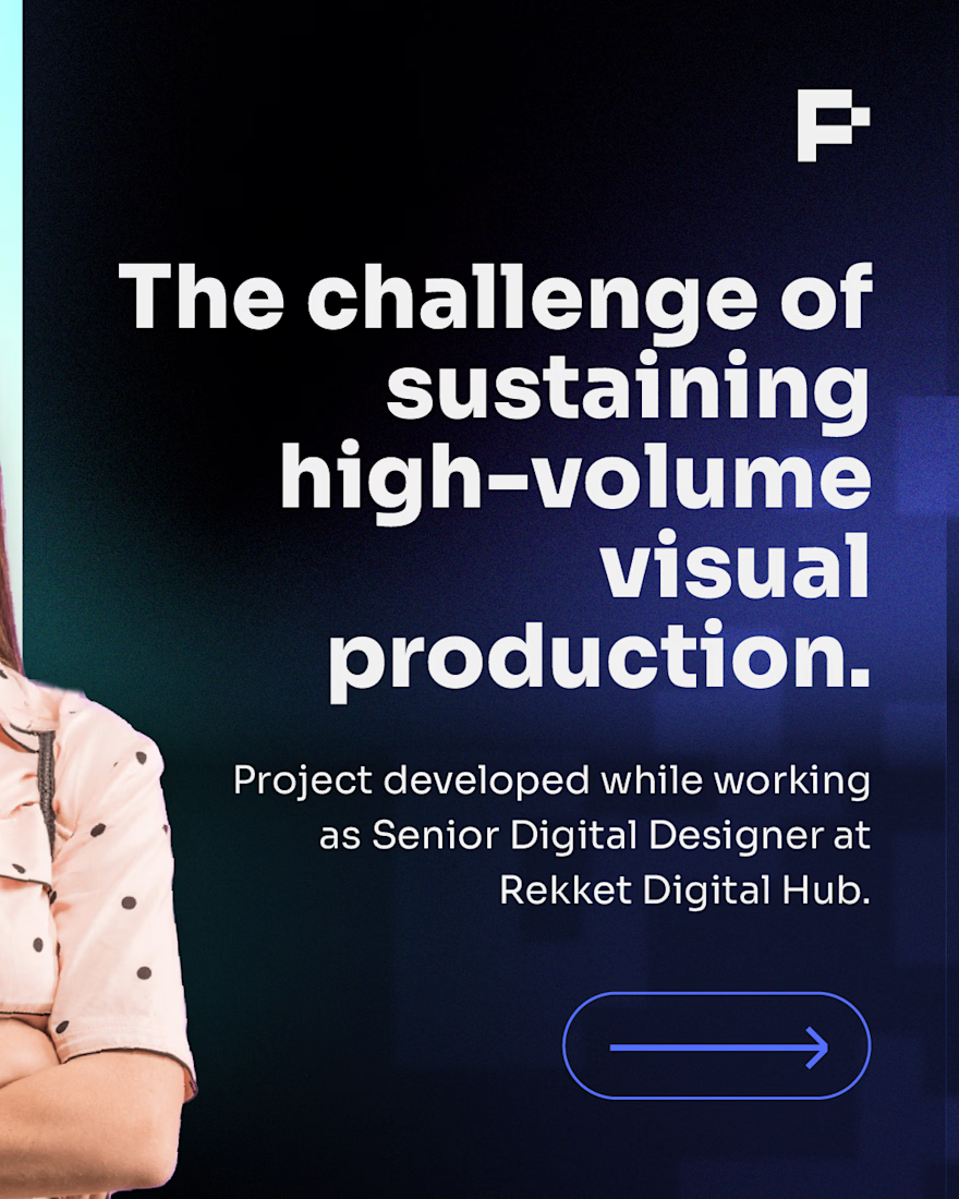
Scaling content isn’t just about producing more assets. It’s about keeping the brand clear and recognizable across every touchpoint.
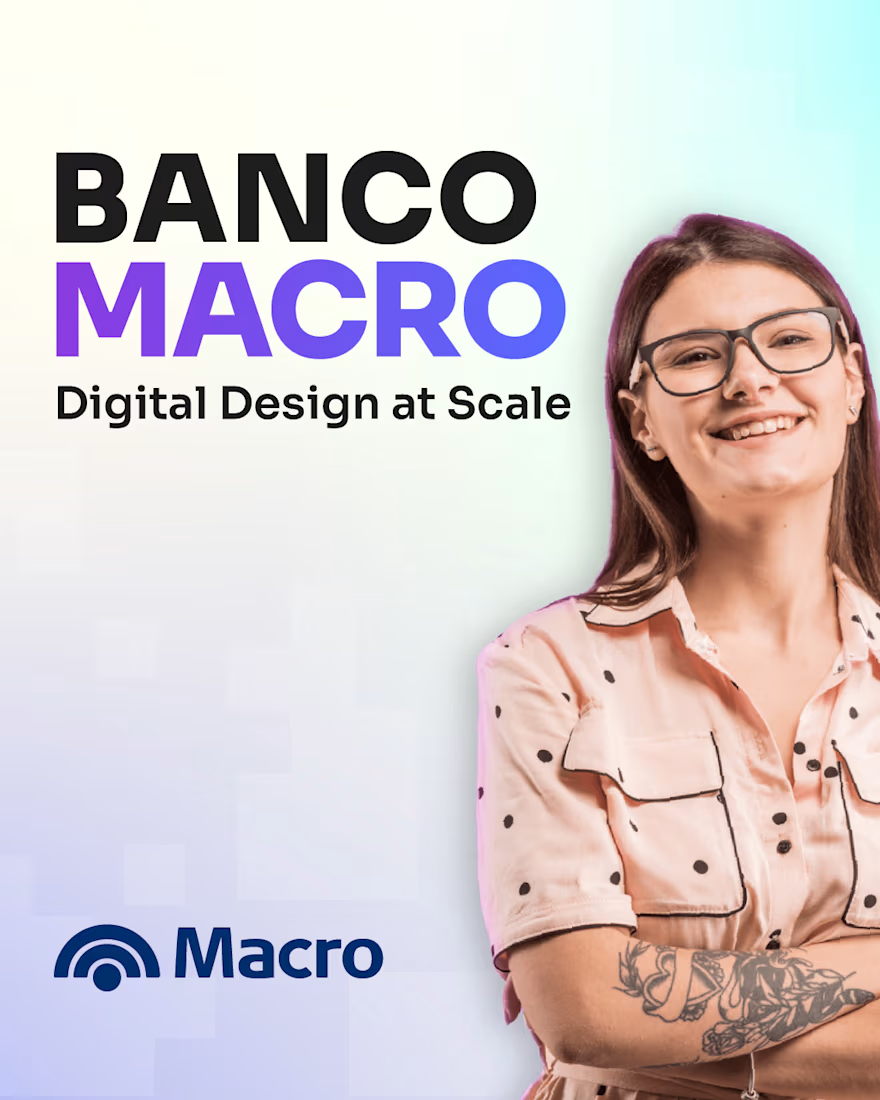
While working as Senior Digital Designer at Rekket Digital Hub, I created and adapted digital content for Banco Macro in a high-volume production environment.
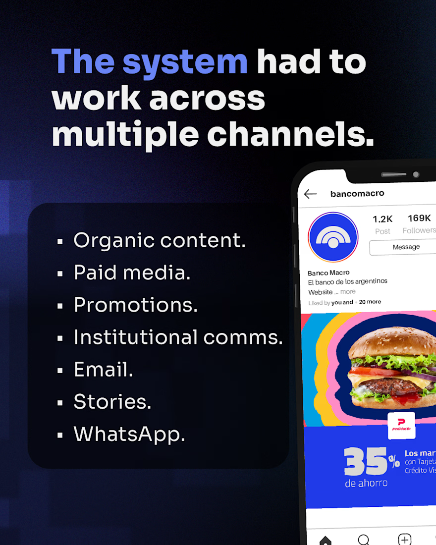
The visual system had to work across organic content, paid media, promotions, institutional communications, email, Stories and WhatsApp while staying consistent across formats and fast turnarounds.
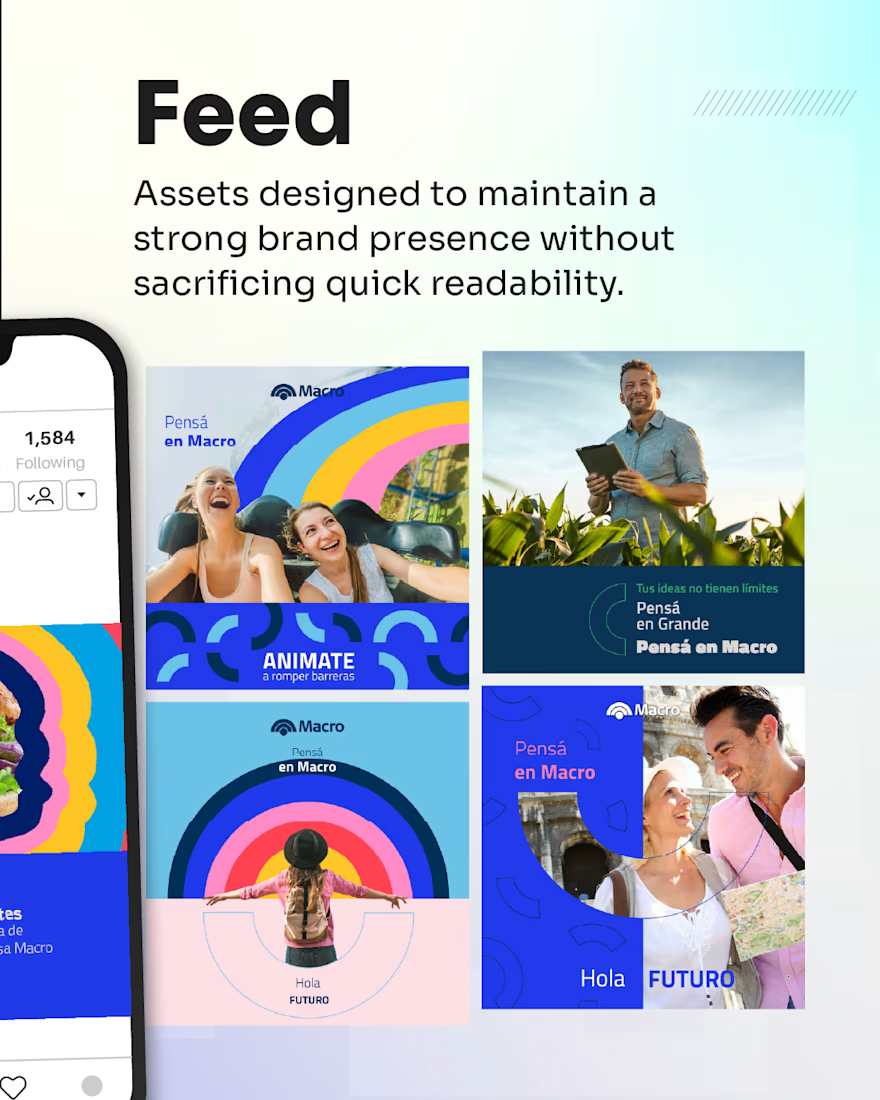
These frames show the challenge, the multi-channel scope, and how that system translated into feed content designed for quick readability without losing brand presence.
The goal: make everyday visual production scalable, clear and consistent.
Need branded content that can scale with your business? DM me.


The network for creativity
Join 1.25M professional creatives like you
Connect with clients, get discovered, and run your business 100% commission-free
Creatives on Contra have earned over $150M and we are just getting started



Related posts

New project! Me and @Mary Delaney helped out the folks at Balloon with a rebranding a redesign of their mascot! Check out the new appstore listing and stay tuned for much more!

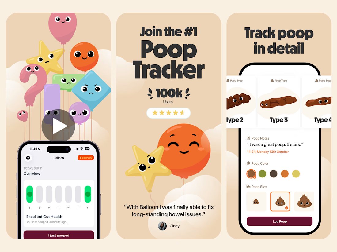



Everything has character! Good job. I like the little faces on the terds 🤣

Motion Design & Art Direction
I design motion from the first composition to the final frame, combining typography, graphic design and animation.
This self-initiated series shows how I work with timing, weight and visual hierarchy. Letters stretch and rebound, geometric forms trigger chain reactions, and transitions carry one composition into the next. Each movement follows the same graphic language while giving each film a distinct pace.
My focus is on how a design behaves over time: where the eye goes, how an element arrives, and when a transition needs to hold or accelerate.


Nice!

How do you make a construction brand feel consistent from a business card to a building site?
Brixon’s identity brings angular lettering, an assembled geometric symbol, and a lime, black, and white palette together.
I carried those elements into stationery, brand guidelines, team identification, social graphics, and site signage, then brought the system into motion with Adobe After Effects.
The connecting decision: keep the geometry and layout structure consistent while the logo details, messages, and application previews change within the animated panels.
My contribution covered brand design, graphic design, and motion design.
What draws your attention first: the wordmark, the lime palette, or the rotating symbol?
See the full Brixon case study. If you’re shaping a construction or development brand, I’m available for brand identity and motion projects.

Incomparable work!